The latest edition of "What’s !important," a recurring compilation of significant developments and discussions within the web development community, has been released, highlighting a robust collection of technical advancements. Issue #15, released recently, showcases a diverse range of topics, from cutting-edge CSS techniques like boundary-aware styling and accessible grid lane layouts to innovative approaches to time-based web design and practical solutions for common CSS challenges. The publication also touches upon new web platform features and ongoing efforts to refine the web’s foundational technologies.
Harnessing view() for Boundary-Aware CSS
A key feature of this issue is an in-depth exploration of "boundary-aware CSS" by Preethi Sam. The article meticulously explains how the view() function can be leveraged to create dynamic styling effects that respond intelligently to element boundaries. This technique allows developers to implement sophisticated visual treatments that adapt to the context in which an element is placed, offering a more fluid and responsive user experience. Sam’s work demonstrates practical applications, including visual effects that activate based on an element’s proximity to viewport edges or other containers, suggesting a significant leap forward in declarative styling control.
Complementing this discussion, an additional piece by the same author, published on the Master.dev blog, addresses the crucial aspect of making interactive elements "invisible but accessible." This article delves into the nuances of hiding elements from visual display while ensuring they remain discoverable and usable by assistive technologies. While acknowledging that further work is needed for full accessibility, the author points to potential solutions, such as a new value for the hidden attribute, as a promising direction for enhancing web accessibility standards. This dual focus underscores a growing emphasis on both aesthetic innovation and inclusive design principles.
Addressing Accessibility Challenges in Grid Lanes Layout
The evolving landscape of CSS Grid Layout, particularly its implementation for masonry-like layouts often referred to as "grid lanes," is another focal point. Dan Holloran’s contribution examines the recent arrival of native grid lanes, formerly known by less formal terms like "masonry layout." This development has been anticipated by developers seeking to replicate the popular Pinterest-style arrangement of content.
However, the issue of accessibility within grid lanes is critically examined by Manuel Matuzović. Matuzović highlights that the current implementation of grid lanes presents accessibility concerns. This critique, which has been a significant point of discussion in developer forums, points to potential issues with how screen readers and other assistive technologies interpret and navigate content arranged in such a manner.
In response to these concerns, Matuzović later proposed a potential solution involving the reading-flow CSS property. This progressive enhancement strategy aims to improve the accessibility of grid lanes by providing a more logical reading order for assistive technologies. While this approach shows promise, it is noted that it has yet to undergo extensive testing, indicating that the quest for fully accessible grid lane implementations is ongoing and requires further community validation. The timeline for this validation and potential browser support remains a key area of interest for web developers focused on inclusive design.
Innovative Time-Based Web Designs Emerge
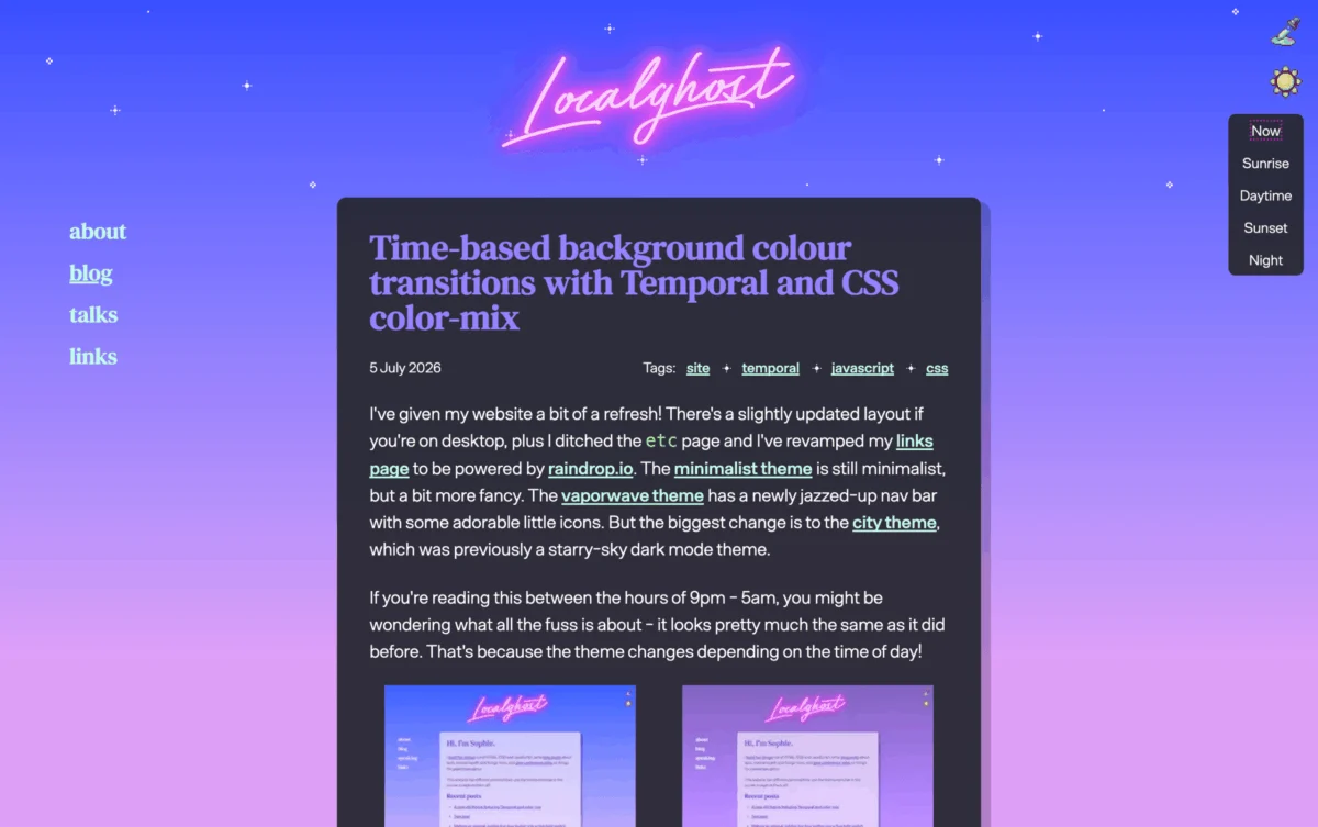
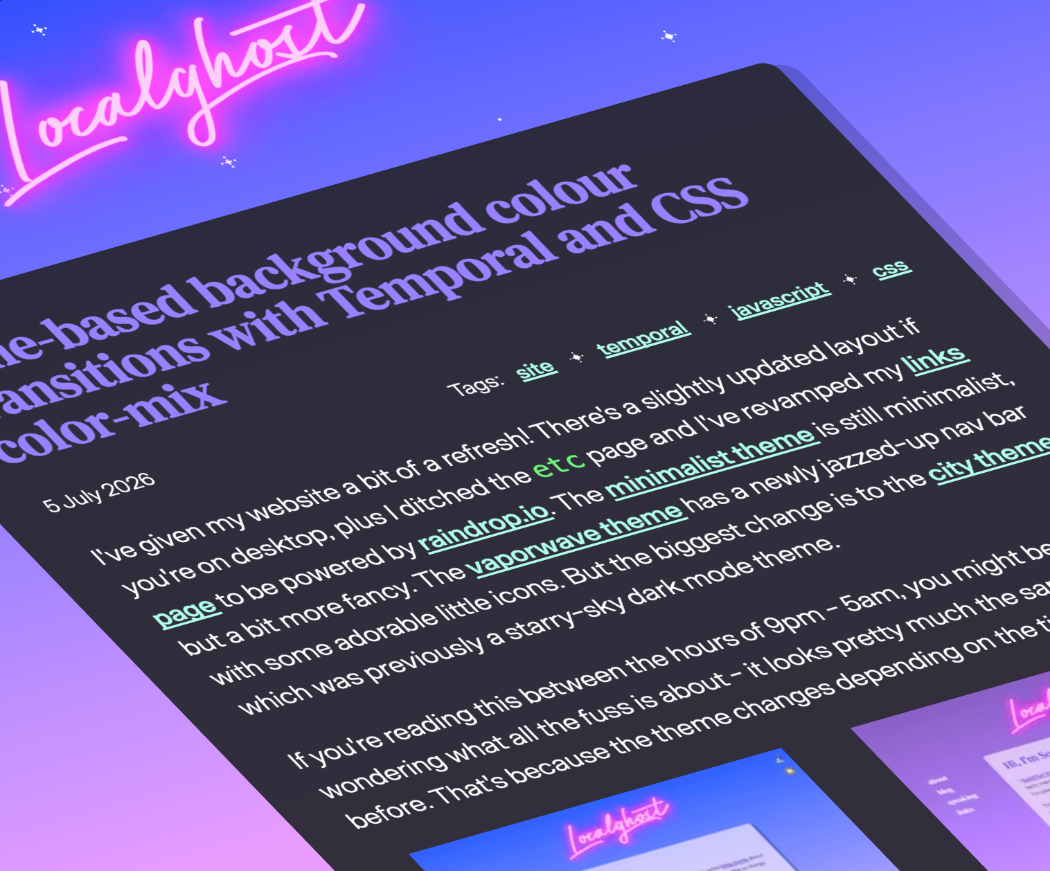
A particularly imaginative application of modern web technologies is showcased in Sophie Koonin’s article on creating "time-based website designs." Koonin demonstrates how to dynamically alter a website’s appearance based on the time of day, drawing parallels to the sophisticated dynamic wallpapers found on operating systems like macOS. This effect is achieved through the synergistic use of the Temporal API, a powerful tool for handling date and time in JavaScript, and the color-mix() CSS function.
The combination allows for seamless transitions in background colors or other visual elements as the day progresses. This innovation opens up new avenues for creating more engaging and contextually relevant user experiences. For instance, a website could subtly shift to warmer tones in the evening or adopt a brighter aesthetic during daylight hours, enhancing user comfort and immersion. The article presents compelling visual examples, illustrating the aesthetic and functional potential of such time-aware designs. The technical underpinnings, particularly the precise integration of JavaScript and CSS, represent a notable advancement in front-end development capabilities.
Resolving the Full-Bleed CSS Challenge
David Bushell addresses a persistent challenge in CSS: achieving "full-bleed" layouts. This refers to the intricate task of making an element span the entire width of the viewport, often while nested within other elements, without causing overflow issues. Bushell’s solution leverages modern CSS features, specifically container query units, to elegantly resolve this long-standing problem.
The ability to create elements that extend seamlessly to the viewport edges, regardless of their parent containers, is crucial for modern web design, enabling immersive visual experiences and consistent branding across diverse layouts. The article provides a clear explanation of the techniques involved, demonstrating how container queries offer a more robust and flexible approach compared to older workarounds. This solution is particularly impactful for designers aiming for edge-to-edge content, such as full-width hero images or background sections.
Further complementing this area, Temani Afif’s recent work on CSS-Tricks, which explores the innovative border-shape property, offers another advanced technique for achieving similar "breakout" effects. This adds another layer of sophisticated styling possibilities for developers pushing the boundaries of visual presentation. The continued development and application of these properties signal a maturing of CSS capabilities for complex layout and design challenges.
A Tool for Revisiting and Correcting CSS Design Decisions
In a somewhat meta development, the issue highlights "FixCSS," a project by Declan Chidlow that playfully addresses historical design choices within CSS. Inspired by the CSS Working Group’s acknowledgment of past design decisions they might reconsider, FixCSS offers a conceptual framework for "correcting" these perceived flaws.
The project humorously suggests, for instance, swapping border-radius for a hypothetical corner-radius. While not a functional tool for immediate web development, FixCSS serves as a thought-provoking commentary on the evolution of CSS and the constant re-evaluation of its syntax and functionalities. It underscores the community’s engagement with the language’s history and its ongoing desire for refinement, reflecting a desire for more intuitive and semantically clear design paradigms. The CSS Working Group’s own public list of "mistakes" further validates this sentiment, indicating a collective awareness of the language’s historical development and potential for improvement.
Enhancing Customizable <select> Element User Experience
Jake Archibald provides valuable insights into improving the user experience of customizable <select> elements. His article focuses on addressing specific sizing-related issues that can arise when developers opt for custom styling over native <select> components. The default <select> element, while functional, often lacks aesthetic flexibility, prompting developers to create custom versions.
Archibald’s detailed analysis and practical demonstrations offer crucial guidance for developers aiming to create custom <select> elements that are both visually appealing and functionally robust. The piece emphasizes the importance of considering factors like hit areas, scrollbar behavior, and overall visual consistency, particularly in the context of varying screen sizes and input methods. This is a must-read for anyone undertaking the task of customizing this fundamental form element, ensuring that the pursuit of aesthetic control does not come at the expense of usability. The examples provided, often featuring video demonstrations, offer a clear visual understanding of the UX challenges and their effective solutions.
A Comprehensive Overview of New Web Platform Features
The publication also rounds off with an extensive overview of "35 new web platform features" presented by Bramus and Una Kravets at Google I/O 2026. This segment, drawing from a recent developer conference, serves as a valuable resource for staying abreast of the latest advancements in web technologies. The features highlighted span a wide spectrum, from those still undergoing development and awaiting full support to recently released functionalities and those on the horizon.
The comprehensive list, often accompanied by video explanations, offers developers a roadmap of emerging tools and capabilities. These advancements are crucial for building modern, performant, and engaging web applications. Topics covered are diverse, ranging from new APIs for graphics and media to improvements in performance, accessibility, and developer tooling. This section underscores the rapid pace of innovation within the web platform and the continuous effort to equip developers with more powerful and expressive tools. The inclusion of a YouTube embed of the presentation further enhances accessibility and allows for a deeper dive into each featured technology.
In summary, "What’s !important #15" presents a snapshot of a vibrant and evolving web development ecosystem. The issue highlights a clear trend towards more sophisticated CSS capabilities, a renewed focus on robust accessibility practices, and the continuous introduction of new web platform features designed to empower developers. The collective content suggests a forward-looking community dedicated to both pushing creative boundaries and ensuring that the web remains an inclusive and accessible space for all users.