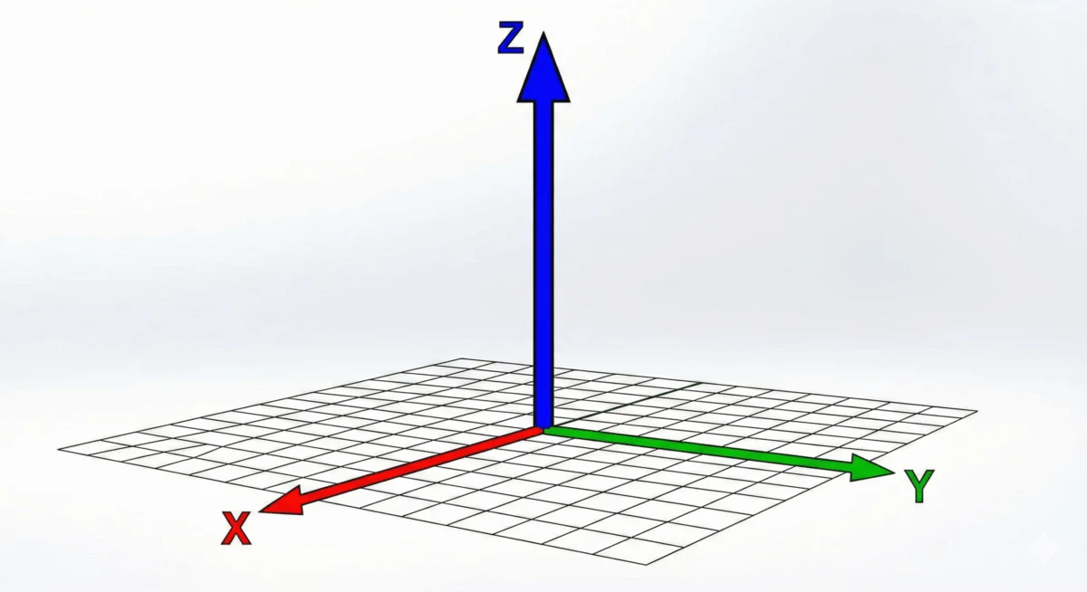
The CSS translateZ() function is a powerful tool that allows web developers to introduce a sense of depth to elements on a webpage, effectively shifting them along the Z-axis within a three-dimensional space. This capability, while seemingly straightforward, unlocks sophisticated visual effects and can even contribute to significant performance enhancements. However, its proper implementation hinges on understanding its relationship with perspective, a concept crucial for rendering 3D transformations in a 2D browser environment.
At its core, translateZ() manipulates an element’s position in depth. When a positive value is applied, the element appears to move closer to the viewer, while a negative value pushes it further away. This can create the illusion of objects appearing larger or smaller, not through actual scaling, but by altering their perceived distance. For instance, applying transform: translateZ(100px); to an element on hover can make it visually leap forward, creating an engaging user experience.
Crucially, translateZ() does not function in isolation. For its depth-altering effects to be visible, a perspective must be established. This is achieved either through the perspective() CSS function applied directly within the transform property or via the perspective CSS property set on a parent element. Without one of these perspective-defining mechanisms, any application of translateZ() will have no discernible visual impact, as browsers, by default, render content on a flat, two-dimensional plane.
The underlying mechanism behind this requirement is the nature of visual perception. In the real world, objects closer to us appear larger, and objects farther away appear smaller. This phenomenon is known as perspective. When translating elements in CSS, we are essentially simulating this in a digital environment. The perspective property or function dictates the strength of this simulated depth; a smaller perspective value creates a more pronounced, dramatic sense of depth, while a larger value flattens the perceived 3D space.
Understanding the Syntax and Arguments
The syntax for translateZ() is straightforward: translateZ(<length>). It accepts a single argument, which is a <length> value. This length can be positive or negative, expressed in various CSS units such as pixels (px), rems (rem), ems (em), or viewport units (vw, vh).
- Positive Lengths:
transform: translateZ(100px);ortransform: translateZ(5rem);will move the element closer to the viewer. - Negative Lengths:
transform: translateZ(-50px);ortransform: translateZ(-8em);will move the element further away from the viewer.
This simplicity in syntax belies the complexity of its visual outcome, which is entirely dependent on the presence of a defined perspective.
The Illusion of Size: translateZ() vs. scale()
A common misconception is that translateZ() is a direct alternative to the scale() CSS function or property. While both can alter the perceived size of an element, their underlying principles are distinct. scale() directly modifies the dimensions of an element, making it objectively larger or smaller. translateZ(), on the other hand, achieves a similar visual effect by manipulating the element’s depth. When an element moves closer to the viewer due to translateZ(), it appears larger because our visual system interprets proximity as an indicator of size. This is a fundamental difference in how the transformations are achieved and perceived, and it’s crucial for developers to distinguish between these two properties for precise control over visual design.
The Importance of Perspective and transform-style: preserve-3d
To truly appreciate and implement translateZ(), one must grasp the concept of the 3D rendering context in CSS. By default, HTML elements are rendered in a flat, 2D space, where the X and Y axes define width and height. The Z-axis, representing depth, is not inherently rendered or perceived.
To enable 3D transformations, including translateZ(), two key components are typically involved:

-
Perspective: As mentioned, either the
perspectiveproperty on a parent element or theperspective()function within thetransformproperty is essential. This establishes the vanishing point and the degree to which depth is rendered. Theperspectiveproperty is typically applied to a container, defining the viewing distance for all its 3D-transformed children. Theperspective()function, on the other hand, is applied directly to the element being transformed, setting its individual projection. -
transform-style: preserve-3d;: This property, when applied to a parent element, signals to the browser that its child elements should be rendered within a 3D space, respecting their Z-axis positioning. Withoutpreserve-3d, child elements would be flattened back into the parent’s 2D plane, negating any 3D transformations applied to them.
Consider a practical example: a div with the class box inside a parent div with the class parent, all contained within a div with the class scene.
<div class="scene">
  <div class="parent">
    <div class="box">This box will move closer.</div>
  </div>
</div>
To make translateZ() work on .box, the CSS would look like this:
.scene
  perspective: 800px; /* Establishes the overall depth perception for the scene */


.parent
  transform-style: preserve-3d; /* Allows children to exist in 3D space */


.box
  transform: translateZ(100px); /* Moves the box 100px closer to the viewer */
In this setup, the perspective property on .scene defines the focal length of the virtual camera. The transform-style: preserve-3d on .parent ensures that the .box is treated as a 3D object within that scene. When the user’s cursor hovers over .box and transform: translateZ(100px); is applied (perhaps via a :hover pseudo-class), the box visually moves forward.
It’s important to note the order of operations when using the perspective() function within the transform property. The perspective() function must be declared before any 3D transformation function like translateZ(). Incorrect ordering can lead to unexpected results or no visual change at all.
Correct:
.element
  transform: perspective(800px) translateZ(100px);
Incorrect:
.element
  transform: translateZ(100px) perspective(800px); /* This will not work as intended */
The perspective property, applied to a parent, is generally preferred for establishing a consistent 3D environment for multiple elements, simplifying the CSS and ensuring a cohesive visual experience. The perspective() function offers more granular control, allowing for unique perspective settings for individual elements, though it’s less common for general scene setup.
Performance Optimization: The translateZ(0) Hack
Beyond its aesthetic applications, translateZ() plays a significant role in optimizing web performance, particularly in scenarios involving animations and transitions. Modern web browsers utilize hardware acceleration, leveraging the Graphics Processing Unit (GPU) for rendering complex visual tasks, which is considerably faster than relying on the Central Processing Unit (CPU).
When CSS animations or transitions are complex or involve frequent repaints and reflows, they can sometimes be handled by the CPU, leading to choppy animations, flickering, and a sluggish user experience. By strategically applying translateZ(0), developers can "hint" to the browser that an element should be rendered on the GPU.
The translateZ(0) transform essentially tells the browser to place the element in a 3D context with no actual movement along the Z-axis. This subtle instruction often forces the browser to promote the element to its own rendering layer, which is then handled by the GPU. This can dramatically improve the smoothness and responsiveness of animations, making them appear more fluid and professional. This technique is particularly useful for elements that are frequently animated or have complex visual effects applied to them. It acts as a performance hack, shifting the rendering workload from the CPU to the more capable GPU, thereby optimizing the overall performance of the web page.

Historical Context and Evolution of 3D Transforms
The introduction of CSS 3D transforms, including translateZ(), marked a significant evolution in web design capabilities. Prior to their widespread adoption, achieving anything resembling 3D effects relied on complex JavaScript libraries or server-side image generation, both of which had limitations in terms of interactivity and performance. The CSS Transform Module Level 2 specification formally defined functions like translateZ(), bringing native, hardware-accelerated 3D rendering to the browser. This allowed designers and developers to create more immersive and dynamic user interfaces, moving beyond the limitations of flat, 2D layouts.
The initial adoption of these features was met with enthusiasm, as it opened up new avenues for creative expression. However, it also necessitated a deeper understanding of 3D space and perspective for effective implementation. Early implementations sometimes suffered from browser compatibility issues or performance bottlenecks, leading to the development of best practices and optimization techniques like the translateZ(0) hack.
Data and Browser Support
The translateZ() function is now a well-established feature within the CSS specification. According to data from Can I use, support for CSS 3D Transforms (which includes translateZ()) is extensive across all major modern browsers. This includes Chrome, Firefox, Safari, Edge, and Opera, with near-universal support for desktop and mobile versions. This widespread availability means developers can confidently incorporate translateZ() into their projects without significant concerns about user experience degradation due to browser limitations.
The CSS Transform Module Level 2 specification, which formally defines translateZ(), provides the authoritative documentation for its behavior and implementation. This ensures a consistent understanding and application of the function across different development environments.
Broader Implications and Future Trends
The ability to manipulate depth and perspective using translateZ() has far-reaching implications for web design and user interface development. It facilitates the creation of more engaging visual hierarchies, interactive elements that respond dynamically to user input, and immersive storytelling experiences. As web applications become increasingly sophisticated, the demand for rich, interactive, and visually appealing interfaces will only grow.
Furthermore, the performance benefits derived from GPU acceleration, facilitated by techniques like translateZ(0), are critical in the age of rich media and complex web applications. As developers continue to push the boundaries of what’s possible on the web, understanding and leveraging these low-level performance optimizations will be paramount.
Looking ahead, the evolution of CSS 3D transforms is likely to continue, with potential for more intuitive controls and advanced effects. The ongoing refinement of browser rendering engines and the increasing power of mobile devices suggest that 3D experiences on the web will become even more commonplace and sophisticated. From interactive product visualizations to immersive virtual tours, translateZ() and its related 3D transform functions are foundational tools for building the next generation of web experiences.
In conclusion, the translateZ() function is a cornerstone of modern CSS for creating depth and engaging visual experiences. Its effective use, coupled with a solid understanding of perspective and performance optimization techniques, empowers web developers to build richer, more dynamic, and performant websites. As the web continues to evolve, mastering these 3D transformation capabilities will remain a key skill for any forward-thinking designer or developer.