
Chrome Introduces Scroll-Triggered Animations, Ushering in a New Era of Interactive Web Experiences
Chrome has officially launched scroll-triggered animations, a groundbreaking feature that positions the browser as the first to natively implement this advanced web animation capability. Available in Chrome 146 and later versions, this innovation allows developers to create dynamic visual effects that respond directly to user scrolling behavior, offering a more engaging and intuitive web experience. This development marks a significant step forward in web animation, differentiating itself from existing scroll-driven animations and opening up new avenues for interactive design.
The core concept behind scroll-triggered animations is their ability to initiate and control animations based on specific scroll thresholds. Unlike scroll-driven animations, which synchronize animation progression directly with scroll movement or element visibility, scroll-triggered animations execute a defined animation sequence once a particular scroll point is reached. This mechanism can be conceptually likened to the Intersection Observer API in JavaScript, but applied directly within CSS for animation control.
Understanding the Mechanics: Scroll-Triggered vs. Scroll-Driven Animations
To fully appreciate the impact of scroll-triggered animations, it’s crucial to distinguish them from their scroll-driven counterparts. Scroll-driven animations, characterized by properties like animation-timeline: scroll() or animation-timeline: view(), tie the animation’s progress directly to the scroll position or the degree to which an element is visible within the viewport. These animations do not have a fixed duration; their playback is fluid and dependent on the user’s scrolling actions.
In contrast, scroll-triggered animations operate on a different principle. They are designed to play for a predetermined duration once a specific condition related to scrolling is met. The key differentiator lies in the timeline-trigger: view() property, which acts as a conditional activator. Instead of measuring the precise amount an element is within the viewport for continuous animation, timeline-trigger waits for the element to cross a defined threshold before initiating the animation.
Deep Dive into Scroll-Triggered Animation Implementation
The implementation of scroll-triggered animations involves a combination of familiar CSS animation properties and new declarative syntax. A typical animation, such as a background fade-in effect for a square element, begins with the @keyframes rule. For instance, a fade-bg-in animation can be defined to change the background color over a specified duration:
/* Define the animation */
@keyframes fade-bg-in
  to
    background: currentColor;
This animation is then applied to an element, like a .square, with a defined duration:
.square
  /* Declare animation */
  animation: fade-bg-in 300ms;
By default, CSS animations commence as soon as their declaration is processed. However, scroll-triggered animations introduce a mechanism to override this behavior. The timeline-trigger property, when used with the view() function, dictates when the animation should activate. The syntax timeline-trigger: --trigger view() entry 100% exit 0%; defines a trigger named --trigger. The view() function indicates that the trigger is based on viewport visibility. The entry 100% exit 0% defines a timeline range. This range specifies that the animation should trigger when the bottom edge of the element enters the viewport (entry 100%) and cease to be active (or untrigger) when the top edge exits the viewport (exit 0%). It’s important to note that entry 0% would trigger the animation when the top edge enters. The entry keyword relates to an element entering the viewport from the bottom, while exit pertains to it leaving from the top.
The animation-trigger property then specifies the behavior of the animation when the defined trigger is activated. For example, --trigger play-forwards; ensures the animation plays to completion in the forward direction.
.square
  /* Declare animation */
  animation: fade-bg-in 300ms;

  /* Animation trigger conditions */
  timeline-trigger: --trigger view() entry 100% exit 0%;

  /* Animation trigger settings */
  animation-trigger: --trigger play-forwards;
With play-forwards, the animation executes fully as soon as the square becomes completely visible. If no animation-fill-mode is specified, the animation’s styles are not retained after completion, resulting in a brief visual "flash."
Controlling Animation Persistence and Behavior
Achieving more sophisticated effects requires careful management of animation fill modes and actions. The animation-fill-mode property, or its shorthand within the animation property, dictates how styles are applied before, during, and after an animation. Common values include:
none: No styles are applied before or after the animation.forwards: The element retains the styles from the last keyframe of the animation.backwards: The element applies the styles from the first keyframe before the animation starts.both: Combines the effects offorwardsandbackwards.
When play-forwards is combined with forwards fill mode, the styles are retained. However, if the element scrolls out of view and then re-enters, the animation might restart, potentially causing a visual glitch or "flash" depending on the animation’s ending state.
To address this, developers have two primary methods:
-
The "Lock-In" Method: Utilizing
play-onceinstead ofplay-forwardsalongside theforwardsfill mode ensures the animation plays through exactly once and then permanently retains its styles..square /* Play once */ animation-trigger: --trigger play-once; /* Retain the styles */ animation: fade-bg-in 300ms forwards; timeline-trigger: --trigger view() entry 100% exit 0%; -
The "Back-and-Forth" Method: The
play-forwards play-backwardscombination offers a smoother experience. When the element is fully visible, the animation plays forward. As it leaves the viewport, it plays in reverse. This dynamic reversal prevents flashing, as the element animates backward as smoothly as it animates forward. Theforwardsfill mode can still be used here, as it ensures styles are retained regardless of the animation’s direction..square /* Play forward and backward, as appropriate */ animation-trigger: --trigger play-forwards play-backwards; /* Retain the styles either way */ animation: fade-bg-in 300ms forwards; timeline-trigger: --trigger view() entry 100% exit 0%;
The <animation-action> keyword set for animation-trigger provides a rich set of controls beyond just playback direction. These include none (for conditional trigger disabling), play (plays in the last specified direction), pause (halts animation), reset (pauses and resets progress to 0), and replay (resets progress to 0 without pausing). This comprehensive set of actions, coupled with fill modes and timeline ranges, allows for intricate animation sequences and the creation of exit animations directly within @keyframes rules.
Broader Implications and Design System Integration
The decoupled nature of these mechanics—animation actions, fill modes, timeline ranges, and the specific trigger properties—enables developers to reuse logic while maintaining flexibility. This modularity is a significant advantage for building scalable and maintainable design systems, reducing repetition and fostering a more component-driven approach to web animation.
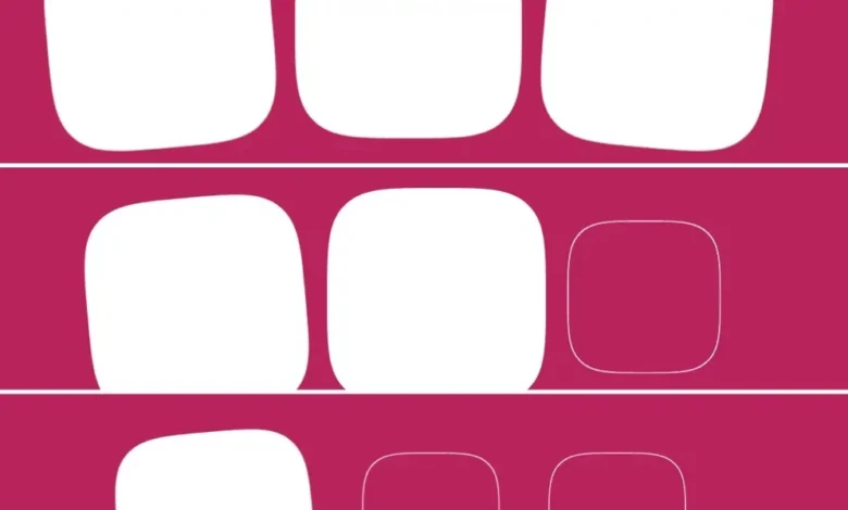
Consider a scenario involving multiple squares, each with distinct animations like scaling and rotation.
<div id="squares">
  <div class="square rotate-left"></div>
  <div class="square"></div>
  <div class="square rotate-right"></div>
</div>
/* Define animations */
@keyframes intensify
to
scale: initial;
background: currentColor;
@keyframes rotate-left
to
rotate: -5deg;
@keyframes rotate-right
to
rotate: 5deg;
.square
/* Set starting value */
scale: 70%;
The combination of shorthand and longhand properties, along with the modular design of the animation triggers, facilitates reusability. For instance, multiple animations can be applied and staggered using the same fundamental trigger settings.
A more advanced implementation might involve dynamically staggering animations based on the number of sibling elements. Using functions like sibling-count() and sibling-index() (though browser support for these specific functions may vary), developers can calculate entry points and animation delays on the fly, leading to more fluid and synchronized visual sequences.
/* Maximum entry · number of squares */
--stagger-interval: calc(100% / sibling-count());
/* Current squareâ™s index · stagger interval */
--entry: calc(sibling-index() * var(--stagger-interval));
/* Declare animation trigger conditions */
timeline-trigger: --trigger view() entry var(--entry) exit 0%;This approach allows for a cleaner codebase where animation staggering logic is centralized rather than being applied individually to each element.
Triggering Animations Between Elements
A particularly powerful application of scroll-triggered animations is the ability for one element to trigger animations in others. By consolidating the trigger and its ranges onto a single element, such as the first square in a series, subsequent elements can be made to animate in a staggered fashion.
In this model, all animations are initiated by animation-trigger once a specific portion of the first element enters the viewport. The timeline-trigger on the first element, defined with a view() function and an entry 50% range, acts as the master conductor. The --trigger ident links this master trigger to the individual animation-trigger properties on all elements, ensuring they respond to the scroll event initiated by the first square. The animation delay can then be calculated based on the element’s index relative to the total number of elements, creating a smooth cascading effect.
/* Define animations */
@keyframes intensify
  to
    scale: initial;
    background: currentColor;


@keyframes rotate-left
  to
    rotate: -5deg;


@keyframes rotate-right
  to
    rotate: 5deg;


.square
  /* Set starting value */
  scale: 70%;
/* Define animation name */
--base-animation: intensify;
/* Maximum delay · number of squares */
--stagger-interval: calc(300ms / sibling-count());
/* Current squareâ™s index · stagger interval */
--animation-delay: calc(sibling-index() * var(--stagger-interval));
/* Declare animation */
animation: var(--base-animation) 300ms var(--animation-delay) forwards;
/* Define animation trigger settings */
--animation-trigger: --trigger play-forwards play-backwards;
/* Declare for intensify, then for one of either rotate animations */
animation-trigger: var(--animation-trigger), var(--animation-trigger);
&:first-child
/* Declare animation trigger conditions */
timeline-trigger: --trigger view() entry 50%;
/* Declare active range end */
timeline-trigger-active-range-end: normal;
/* Append other animations */
&.rotate-left
animation-name: var(--base-animation), rotate-left;
&.rotate-right
animation-name: var(--base-animation), rotate-right;
A potential nuance arises with play-backwards. When animations are reversed, the calculated delay might not function as expected, leading to a less pronounced stagger. This behavior, while seemingly counterintuitive compared to animation-direction: reverse, is an area where developers might need to adapt their implementation strategies.
Mastering Timeline Ranges
Timeline ranges are a fundamental component of both scroll-driven and scroll-triggered animations, though their application differs. For scroll-driven animations, animation-range and its longhand properties are used. In scroll-triggered animations, the syntax is similar but involves distinct properties and two types of ranges: activation and active. The activation range defines the scrollable area where an animation can be triggered, while the active range determines where it remains "held" or visible, even if it falls outside the activation zone.
While complex timeline ranges offer granular control, common use cases are often covered by simpler configurations. view() entry 100% exit 0% (for full viewport visibility) and view() contain (which also accounts for elements larger than the viewport) are frequently sufficient. For those wishing to delve deeper, the animation-range property, although associated with scroll-driven animations, provides a foundational understanding of timeline ranges. Further exploration of the Animation Triggers specification is recommended for mastering the intricacies of timeline ranges within scroll-triggered animations.
The view() function itself plays a crucial role. In the context of scroll-triggered animations, view() represents the viewport. It can be modified to account for elements like fixed headers. For example, view(y 0 5rem) would adjust the timeline range along the y-axis to exclude a 5rem sticky header.
Conclusion: A Powerful, Yet Evolving, Toolset
Scroll-triggered animations represent a powerful and exciting addition to the web developer’s toolkit. While they share similarities with scroll-driven animations and leverage existing CSS features alongside newer concepts like dashed idents and timeline ranges, their unique approach to conditional animation execution offers significant creative potential.
The learning curve for scroll-triggered animations might appear steep due to the interplay of various CSS properties and concepts. However, the decoupled nature of these mechanics promotes flexibility and reusability, making them highly adaptable for complex design systems and interactive web experiences. As browser support solidifies and developers become more accustomed to these new capabilities, scroll-triggered animations are poised to redefine how we create dynamic and engaging content on the web. While the initial complexity might require careful study, the benefits in terms of enhanced user experience and sophisticated visual storytelling are undeniable.

