When a branding project falters, the root cause often lies not in the visual execution, but in the foundational strategy phase. This is where ambiguous terms like "modern," "trustworthy," "premium," "friendly," and "disruptive" are left undefined, creating a chasm between the intended brand message and the designer’s expected output. This critical, yet frequently overlooked, period is what industry professionals refer to as the "pre-concept phase." It is the crucial bridge between initial discovery and the nascent stages of visual design, ensuring that the eventual brand identity is not merely aesthetically pleasing, but strategically sound and deeply resonant with its intended audience.
At the outset of a branding initiative, designers typically receive a torrent of inputs: a client brief, summaries of stakeholder conversations, competitor references, and perhaps a mood board or a list of descriptive adjectives. The expectation is then for designers to translate these disparate elements into compelling visual concepts that "feel right." However, the notion of "rightness" becomes inherently subjective and difficult to ascertain when the core team has not reached a consensus on the fundamental message the brand aims to convey.
Consider a hypothetical scenario involving a health technology company. This firm, aiming to establish a strong market presence, expressed a desire for their brand to appear "modern, trustworthy, and disruptive." Initially, "disruptive" might suggest a bold, unconventional aesthetic. Yet, deeper exploration revealed that for this particular company, disruption had to be carefully calibrated within the conservative landscape of healthcare. Their primary clients were large governmental medical institutions, entities that prioritize credibility and stability. A brand perceived as overly rebellious, experimental, or visually ostentatious would likely undermine the very trust they sought to build. In essence, their interpretation of "disruptive" was nuanced, leaning more towards innovation delivered with assuredness rather than radical departure.
This example highlights a common pitfall: the problem is rarely the language used by clients, but rather its inherent breadth, which fails to provide sufficient guidance for design decisions. Before a designer can effectively translate strategic intent into visual form, these abstract descriptors must be rigorously refined. What specific facet of "modern" is desired? In what precise way should the brand be "trustworthy"? "Disruptive" in relation to whom or what? And critically, how far can the brand deviate from established category norms before alienating its target audience?
This article delves into the intricacies of this pre-concept phase. It examines the vital work undertaken after the project kickoff and before the first visual directions are explored. While the broader brand identity process for digital products encompasses strategy, concept development, implementation, and the creation of essential assets for product teams, this focus narrows to the foundational work that makes compelling concepts possible: in-depth research into the brand’s context, the meticulous uncovering of implicit assumptions held by stakeholders, and the systematic transformation of shared understanding into a robust visual framework. This process acts as a practical conduit, translating the brand’s intended meaning into tangible visual possibilities.
The initial, and arguably most critical, step in building this bridge is the brand workshop. This collaborative session is where broad discovery coalesces into a refined understanding of the brand’s unique context.
Stage 1: Researching the Brand Context
A comprehensive brand workshop typically addresses standard discovery topics: the business objectives, product or service details, competitive landscape, and target audience demographics. While a complete catalog of every pertinent question is beyond the scope of this discussion, the focus here is on a select set of inquiries that are often overlooked yet prove exceptionally valuable prior to any visual ideation. These questions are less about fact-gathering and more about clarifying perception. They guide the team in understanding what the brand must instill in its audience, where it needs to resonate with credibility, and which industry conventions it should either embrace or challenge.
Perception is the lynchpin of brand discovery, as a brand’s ultimate form is shaped within the minds of others. As Marty Neumeier eloquently stated in "The Brand Gap," "A brand is a person’s gut feeling about a product, service, or company." Given that a brand’s existence is fundamentally rooted in perception, the workshop must diligently clarify the precise perception the team aims to cultivate.
The critical perception-focused questions employed in this phase are designed to illuminate the underlying assumptions shaping individual opinions, rather than simply accumulating more subjective viewpoints. The significance of these questions cannot be overstated, as brand attributes frequently appear aligned on the surface but harbor vastly different interpretations. For instance, a stakeholder might declare the brand should feel "premium," a statement that might elicit nods of agreement from the entire team. However, one individual might interpret "premium" as refined and editorial, another as exclusive and high-priced, and a third as clean, minimalist, and serene. The word itself is shared, but its underlying meaning can lead to three entirely divergent visual systems.

Revisiting the health tech example, the client’s assertion that the brand should be "disruptive" serves as a potent illustration. In many sectors, "disruptive" might signal a move towards boldness, loudness, or unconventionality. However, given their clientele of large governmental medical institutions, disruption needed to be communicated through clarity, efficiency, and an unwavering sense of confidence, rather than outright rebellion. Had the term been taken at face value, the visual direction could have easily veered into territory that would erode the trust essential for their audience.
Similarly, a fintech team once expressed a desire for their brand to feel "bold" without compromising credibility. This single word introduced a productive tension. "Bold" could translate to vibrant color palettes, oversized typography, and a highly expressive visual system. However, within the financial sector, these elements must also convey signals of security, control, and competence. The crucial question wasn’t whether the brand should be bold, but rather what kind of boldness would still foster trust.
When teams can articulate the contextual meaning of these attributes, designers are liberated from the constraints of vague adjectives. They are instead presented with a more clearly defined design problem.
While strategically selected questions can unpack the verbal layer of brand strategy, words alone are rarely sufficient. To bridge the gap between language and visual direction, incorporating exercises that prompt stakeholders to engage with imagery, associations, and relative perceptions is paramount.
Jake Knapp, in GV’s "Three-Hour Brand Sprint," emphasizes a similar principle: "The point of these exercises is to make the abstract idea of ‘our brand’ into something concrete." The following two exercises are instrumental in translating stakeholder discourse about the brand into tangible material that can inform look and feel, design principles, and subsequent concept development.

These exercises also amplify stakeholder engagement. When clients are merely passive recipients of a strategy presentation, they may assent to proposals without fully recognizing the assumptions they are introducing into the process. However, when they are actively involved in placing competitors on a perceptual map, selecting images, or articulating the rationale behind a particular reference’s credibility, they become active participants. Their underlying attitudes, beliefs, and even disagreements become visible, providing an opportunity to address potential ambiguities before they derail initial concept reviews. The process typically begins by examining the external landscape of the category, followed by an inward focus on the brand itself.
Exercise 1: Competitor Perception Mapping
Prior to the workshop, a curated collection of competitor visual assets—screenshots of their brands, websites, product interfaces, social media visuals, and other discernible brand touchpoints—should be gathered. During the workshop, the client team is then tasked with positioning these competitors on a simple two-axis perceptual map.
The objective of this exercise is not to adjudicate which competitors possess "good" or "bad" design. Instead, it is to comprehend how the client team perceives the category. This includes identifying what appears credible, what feels generic, what leans too conservative, what seems overly experimental, and where potential visual territory might exist for the new brand.
The selection of the map’s axes should be dictated by the core tensions the brand aims to address. For instance, for a health tech company striving for perceived innovation while serving conservative medical institutions, the axes might be "Traditional vs. Progressive" and "Corporate vs. Human." For a fintech brand aiming to differentiate itself without sacrificing trust, the axes could be "Understated vs. Bold" and "Accessible vs. Exclusive."
Often, the most valuable outcome of this exercise is not the final map itself, but the emergent disagreements it fosters. One stakeholder might perceive a competitor as progressive, while another views it as merely generic. One might interpret a brand as premium, while another finds it cold. These divergences illuminate the varied interpretations of trust, innovation, credibility, and differentiation, precisely the ambiguities that necessitate resolution before design commences.

Exercise 2: Visual Brand Driver
Following the discussion of the competitive landscape, the conversation shifts inward. An exercise termed "Visual Brand Driver" is employed. Each stakeholder is instructed to select images for a series of unrelated categories: transport, typeface, activity, furniture, mood, object, animal, architecture, and drink.
Crucially, the instruction stipulates that the chosen images should represent the company, not the individual’s personal taste. For example, if the company were a form of transportation, would it be a silent electric car, a high-speed train, a private jet, a bicycle, or a delivery van? If it were a piece of furniture, would it be a plush lounge chair, a precise modular desk, or a substantial boardroom table?
After selecting the images, each participant is asked to provide four to five adjectives to justify their choices. This explanatory component is often more significant than the visual itself. The same object can hold diverse meanings for different individuals. A train might evoke speed, structure, reliability, mass accessibility, or a predetermined route. A lounge chair could suggest comfort, calm, informality, or a lack of urgency.
This exercise cultivates a deeper layer of brand perception by prompting stakeholders to think metaphorically and associatively, rather than directly describing the company. Patterns and contradictions become apparent. One stakeholder might envision the brand as refined and calm, while another sees it as energetic and experimental. One might characterize the company as precise and structured, while another describes it as warm and flexible.
These differences are not hindrances but rather valuable raw material, highlighting areas requiring clarification before the visual concept phase. This exercise also serves to decouple brand perception from aesthetic preference. A stakeholder might personally favor a particular image, but if it fails to accurately represent the company, it should be excluded from the exercise. This distinction is vital throughout the branding process, shifting the central question from "Do we like this?" to "Does this effectively communicate the right message about the brand?"

Once the workshop has illuminated the core assumptions, the subsequent client meeting can translate this shared understanding into a tangible visual foundation. This is still not the initial identity concept; rather, it is a working layer that bridges strategy and design. It allows the client to provide feedback on perceptions, visual principles, and early asset directions before the designer invests significant time in developing full-fledged concepts. This meeting is typically structured around three interconnected layers:
Look and Feel
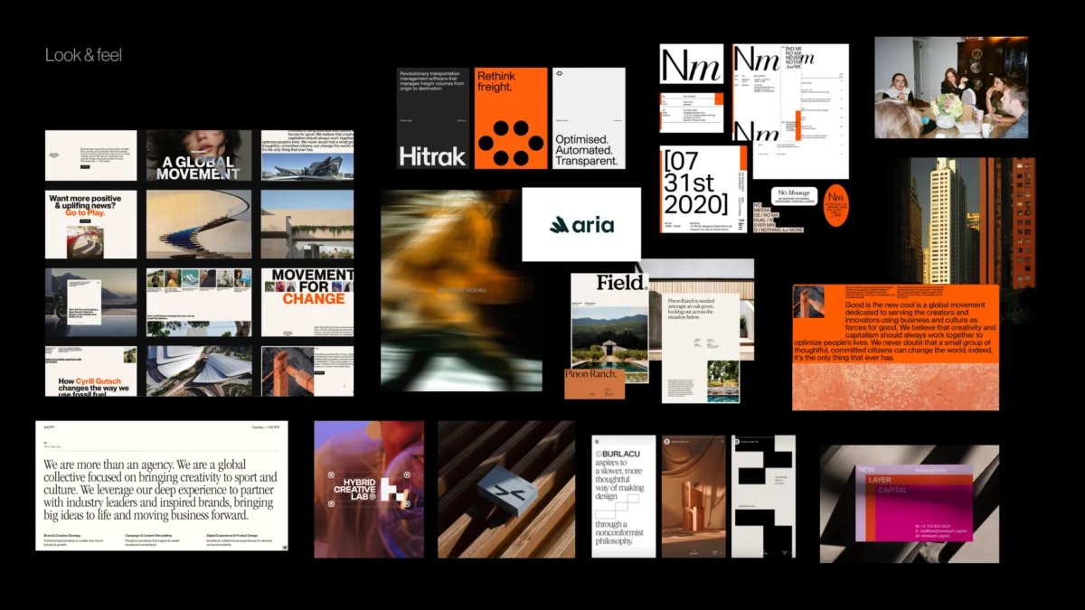
"Look and feel" boards are not mere compilations of visuals the team finds aesthetically pleasing. They are meticulously crafted perception boards. The designer curates references based on the workshop findings: desired perceptions, category tensions, competitor visual codes, stakeholder disagreements, and the overarching brand character.
If a brand needs to embody trustworthiness, modernity, and a human touch, the board should facilitate discussions about the specific manifestations of trust, modernity, and humanity that are appropriate. Is the brand intended to be calm and institutional, or warm and accessible? Is its progressiveness conveyed through precision or a more expressive, editorial tone? The aim is to allow the client to respond to perceived qualities before reacting to a logo, color palette, or fully realized visual system.
Design Code
"Design code" refines the direction by translating key brand ideas into specific visual principles. For a parenting app targeting the German market, the strategic imperative of "personalized support for your unique journey" might translate into organic shapes, handwritten lines, and softer compositions. The concept of "parenting is messy and magical" could manifest as soft gradients, layered imagery, and a playful irregularity. "Research-backed support for real life" might introduce elements like doctor consultations, data snapshots, infographics, and editorial layouts to establish credibility.
For a public relations agency specializing in prop tech companies, "momentum in motion" could be visually represented through lines, arrows, ripple effects, or motion blur. "Springboard" might be depicted as a moment of lift-off and elastic visual energy. "Building blocks" could inform the use of modular shapes or stacked compositions. At this stage, the team is not selecting the final graphic expression but testing the efficacy of visual metaphors before commencing concept design.

Brand Assets
The final layer distills the conversation into the fundamental building blocks of identity: typography, color, logo style, photography, illustration, and the overall graphic language. At this juncture, the team can address questions such as:
- Typography: Should it be sans-serif for modernity and clarity, or serif for tradition and authority? Is a highly geometric or a more humanist approach more fitting?
- Color Palette: What emotional impact should the colors convey? Should they be vibrant and energetic, or muted and sophisticated?
- Logo Style: Should it be abstract or representational? Minimalist or detailed?
- Photography: Should it be candid and lifestyle-oriented, or studio-shot and polished? Does it need to feature people, or can it be product-focused?
- Illustration: What style of illustration best complements the brand? Is it flat design, hand-drawn, or 3D rendered?
These discussions provide the designer with clear boundaries without predetermining the final identity. The subsequent step remains concept design, but the team is no longer operating from a foundation of vague adjectives or unspoken expectations.
Pre-Concept Checklist
Before embarking on the creation of the first concept, it is beneficial to pause and confirm that the team possesses sufficient "shared direction." This checklist is not intended to pre-empt every decision but to ensure that the designer is not initiating the process based on vague terminology, hidden assumptions, or unresolved disagreements.
Before creating the first concept, confirm that the team has:
- Clearly defined brand attributes: Beyond single words, what do terms like "modern," "trustworthy," or "disruptive" mean in this specific context?
- Identified category tensions: Where does the brand need to stand in relation to competitors and established industry norms?
- Agreed-upon perceptual territory: What specific feelings or associations should the brand evoke in its target audience?
- Established visual boundaries: What directions are explicitly to be avoided, and why?
This final point is particularly salient. A robust pre-concept phase not only guides the designer on what to explore but also clarifies what to steer clear of—directions that might be too expected, too cold, too playful, too conservative, too loud, too generic, or too far removed from what the audience can credibly accept. When the team can articulate these boundaries, evaluating the first concept becomes more straightforward. The conversation shifts from subjective reactions like "I like it" or "I don’t like it" to a more objective assessment: "Does this effectively communicate the brand we collectively agreed upon?"

The First Concept Should Not Be a Guess
The initial concept should not feel like a shot in the dark or a surprise reveal. Instead, it should represent a logical progression from a direction the team has already come to understand and support. This is not to say that intuition, experimentation, or creative risk should be removed from the branding process. Rather, it is about providing these elements with a more precisely defined problem to solve. When the team has clarified the brand character, tested visual perceptions, translated abstract ideas into concrete design principles, and deliberated on the foundational elements of the identity, the designer can explore with enhanced confidence.
The pre-concept phase does not aim to render the final identity predictable. Its purpose is to make the conversation surrounding it more meaningful. Instead of querying whether the work aligns with an individual’s private expectation, the team can pose a more insightful question: Does this visual direction effectively articulate what the brand needs to become?