In the dynamic landscape of digital content creation, the seemingly subtle choice of typography holds profound implications for audience engagement, brand identity, and overall user experience. Far from being a mere aesthetic consideration, font selection is a foundational element of effective blog design, directly influencing readability, emotional resonance, and even search engine optimization (SEO). A poorly chosen typeface can inadvertently deter readers, diminish content credibility, and impede the seamless consumption of information, underscoring the necessity for a strategic approach to digital font deployment.

The Foundational Importance of Strategic Typography
Typography serves as the visual voice of digital content, acting as the digital equivalent of an accent or tone. Just as spoken language conveys different nuances through varying inflections, fonts imbue written words with distinct emotional qualities and professional bearings. For content creators, particularly those establishing new blogs, the chosen font becomes an intrinsic representation of their personality, brand ethos, and commitment to reader accessibility. When carefully aligned with a blog’s thematic identity, typography fosters deeper reader connections and significantly enhances a platform’s distinctiveness in a crowded digital sphere.
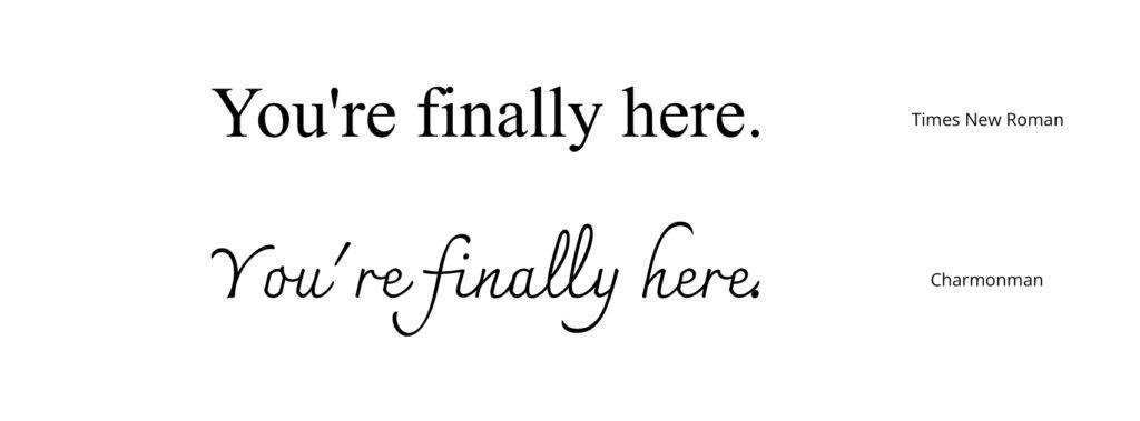
Research consistently demonstrates that superior typography directly correlates with improved readability, a critical factor for retaining audience attention across diverse content lengths. Clear, legible fonts mitigate eye fatigue, a common issue for readers consuming long-form content on screens, and are particularly beneficial for individuals with vision impairments, including dyslexia. This focus on readability extends beyond mere aesthetic preference, translating into tangible user experience benefits that encourage longer visit durations and repeat engagement.
An Overview of Leading Typefaces for Digital Platforms
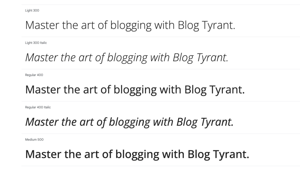
Extensive analysis and practical application across countless digital platforms have identified a curated selection of fonts that consistently deliver optimal performance in terms of aesthetics, readability, and versatility. These typefaces, ranging from historical sans-serif designs to modern neo-grotesque innovations, offer a spectrum of options to align with various blog niches and brand objectives.
1. Open Sans: The Ubiquitous Standard
Designed in 2010 by Steve Matteson, Open Sans has emerged as a quintessential typeface for web content, owing to its clean, neutral, and highly legible design. Its widespread adoption is evidenced by its staggering usage statistics, with an estimated 1.5 trillion views annually across the web. Historically serving as a default font for WordPress, Open Sans excels in versatility, offering multiple weights optimized for both headings and body text. Its spacious letterforms and inherent clarity make it equally effective for user interface (UI) elements, such as buttons and navigation menus, and for crucial marketing materials like newsletters, where unambiguous communication is paramount. Its integration into Google Fonts ensures broad accessibility and ease of implementation.
2. Roboto: Android’s Modern Humanist
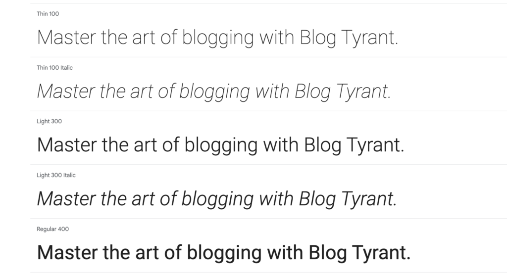
Introduced in 2011 by Christian Robertson as the primary typeface for Google’s Android operating system, Roboto is a neo-grotesque sans-serif celebrated for its harmonious blend of mechanical precision and humanistic curves. This unique design philosophy imbues Roboto with exceptional legibility, presenting a clean and minimalistic aesthetic without sacrificing approachability. Its geometric foundations and open letterforms ensure optimal balance and clarity across a multitude of device dimensions, making it an ideal choice for responsive blogs that anticipate traffic from mobile, tablet, and desktop users. Its continued use across Google Play, Maps, and Images underscores its robust performance and adaptability.
3. Montserrat: Urban Elegance and Modern Appeal
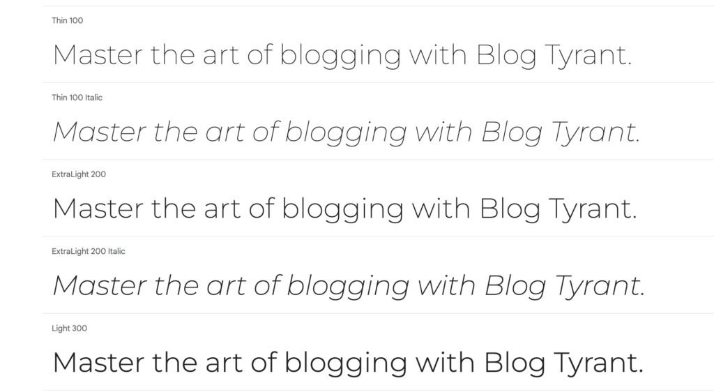
Julieta Ulanovsky’s Montserrat, launched on Google Fonts in 2011, draws inspiration from the vibrant urban typography found in her Buenos Aires neighborhood. This sans-serif typeface is lauded for its fluid lines, generous X-height, and sleek, minimalist aesthetic, evoking a distinct urban-chic appeal. With installations on nearly 17 million websites, Montserrat has become a go-to choice for creative niches such as interior design, photography, and fashion blogging. Its sophisticated yet understated character makes it particularly effective for logos, prominent headings, and impactful banners, contributing to a contemporary and stylish brand presence.
4. Helvetica: The Enduring Icon of Modernism
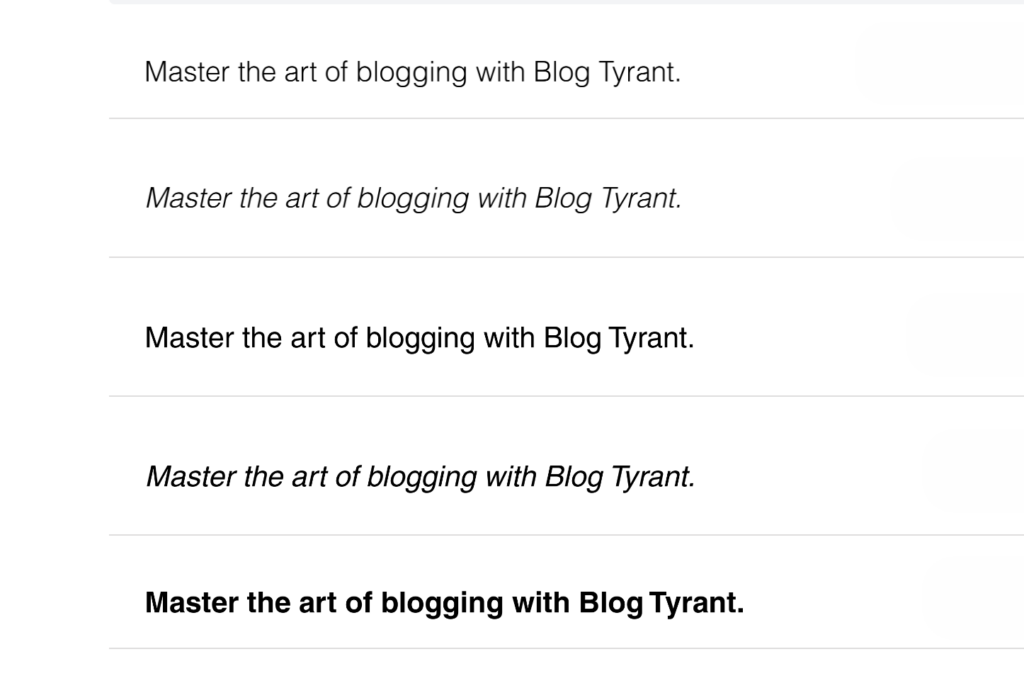
Helvetica, conceived in 1957 by Max Miedinger and Eduard Hoffmann, stands as arguably the most recognizable and widely adopted typeface globally. Its release marked a pivotal moment in design history, ushering in an era of minimalist, adaptable sans-serif fonts. Key characteristics include its immaculate lines, substantial X-height, and meticulously balanced negative space, all contributing to its unparalleled legibility. With a rich history of iterations from its predecessor, Neue Haas Grotesk, Helvetica has been embraced by countless global entities, including corporations like Nestlé and BMW, governmental bodies, and NASA. While numerous contemporary variants exist, the original Helvetica retains its inherent elegance and bold authority, making it a perennial choice for blog owners seeking a straightforward, readable, and modern typeface across any niche.
5. PT Sans: Boldness with Approachability
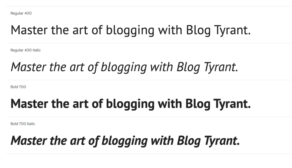
Commissioned by the Russian Federation and released in 2009, PT Sans is a versatile sans-serif font designed for official and public use. Its slightly curvy edges and compact structure impart a friendly and approachable demeanor, balanced by an appropriate degree of boldness. Highly legible, PT Sans pairs exceptionally well with larger text sizes and is available in a comprehensive range of weights, including bold, italic, and regular families. It is particularly effective for blog headings, titles, prominent marketing calls-to-action, and main navigation menus. Its natural synergy with Open Sans and its serif counterpart, PT Serif, allows for cohesive typographic pairings within a single design system.
6. Oswald: Gothic Revival for Digital Screens
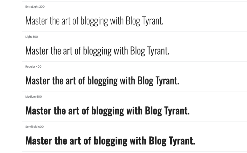
Oswald, designed by Vernon Adams and released in 2011, represents a modern adaptation of the classic Alternate Gothic typeface. While retaining the elongated lettering and slim proportions of its historical antecedent, Oswald has been meticulously redesigned with broader, more balanced letterforms to enhance digital screen readability without sacrificing its assertive character. The typeface has evolved to include light, italic, and bold versions, catering to contemporary design demands. Its classic yet powerful presence makes Oswald ideal for blog headers, impactful titles, compelling quotes, and any content requiring significant visual emphasis. It finds particular resonance in niches such as food, music, and arts, while also being sufficiently modern for technology and travel blogs.
7. Baskerville PT: Sophistication in Serif
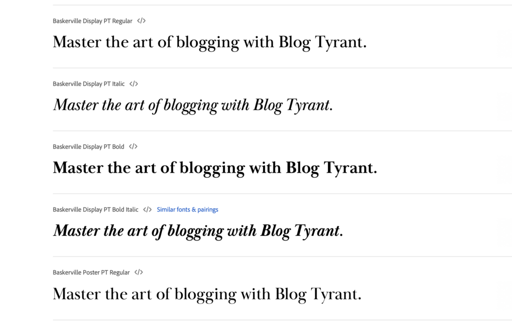
For blogs aiming for a sophisticated, classic aesthetic, Baskerville PT offers a compelling blend of vintage charm and modern refinement. A serif typeface, it features distinct tapers and strong contrast between its thin and thick strokes, characteristic of its 18th-century origins (John Baskerville, 1750s). Redesigned by Arina Alaferdova in 2016, Baskerville PT incorporates a vertical axis and rounded strokes that significantly improve its readability on digital interfaces. Multiple variations and weights are available to meet the demands of contemporary web design, making it suitable for academic, literary, or luxury-focused blogs seeking an air of authority and timeless elegance.
8. Charter: The Transitional Workhorse
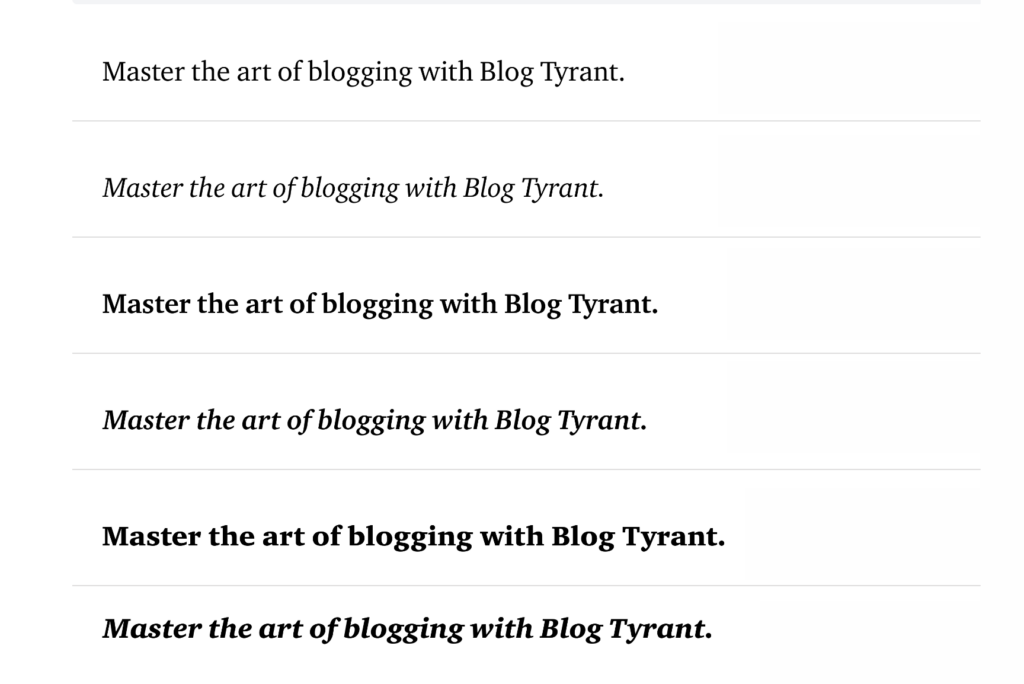
Matthew Carter’s Charter, developed in 1987, is classified as a "transitional" font, effectively bridging classic serif sensibilities with modern functionalism. Its subtle accents and nuanced contrast between stroke weights provide a vintage appeal, while its open letterforms and generous apertures ensure excellent readability in contemporary digital contexts. Originally engineered for optimal legibility even with low-resolution printers, Charter has proven remarkably enduring on modern smartphone screens due to its inherent clarity. Its serious yet welcoming tone makes it a versatile choice for a wide array of blogs, from contemporary fashion to literature, and it performs admirably in H1 headings, quotes, and captions.
9. Arial: The Ubiquitous Microsoft Standard
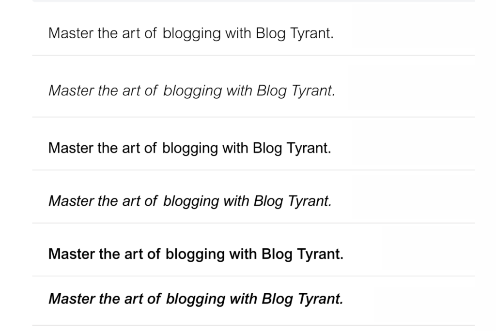
Despite sometimes being perceived as an unremarkable default, Arial holds a significant position in the typographic landscape. Co-designed by Robin Nicholas and Patricia Saunders in 1982, this sans-serif font was meticulously crafted for maximum versatility and readability. Its soft curves, uniform strokes, and clean lines contribute to a neutral yet professional aesthetic suitable for nearly any application. Recognized globally as the default font in Microsoft software, Arial’s familiarity and functional design make it a reliable choice for bloggers seeking a clean, legible, and universally understood typeface without stylistic flourishes. Its pervasive use across countless websites underscores its undeniable efficacy as a straightforward communication tool.
10. Raleway: Aesthetic Minimalism
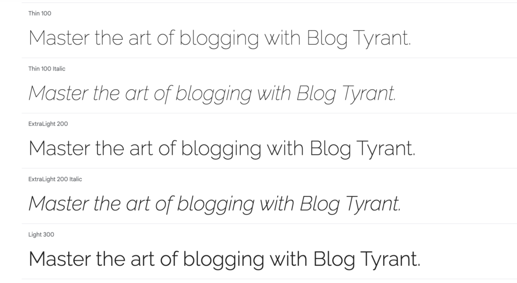
Raleway, initiated by Matt McInerney in 2010, is a sans-serif typeface that appeals strongly to proponents of minimalistic and aesthetic design. Characterized by geometric letters, smooth curves, and ample spacing, Raleway provides a visually pleasing reading experience. Distinctive features, such as its rounded ‘O’ and ‘C’, contribute to its unique yet elegant appearance. With multiple weights and bold/italic variations, Raleway is particularly well-suited for blogs aiming to cultivate an ambiance of luxury or sophisticated aesthetic. It performs exceptionally well for body text, author bios, and quotes, with its heavier weights also suitable for headings and banners to maintain thematic consistency.
11. Lato: Warmth and Humanism
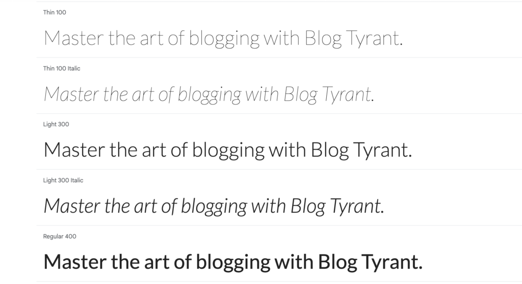
The Polish word for "summer," Lato, encapsulates the warm and approachable tone of Łukasz Dziedzic’s 2010 typeface. This humanist sans-serif font is distinguished by its semi-rounded letterforms, open apertures, and linear shape, rendering it sophisticated yet inviting. These characteristics ensure high readability across various sizes and formats. Lato has been widely adopted by design agencies and creative businesses seeking to convey a sense of warmth and personality without sacrificing professionalism. It is an excellent choice for blogs in creative industries, as well as home & interior design, education, and health niches, where a balance of expressiveness and clarity is desired.
12. Ubuntu: Open-Source and Approachable
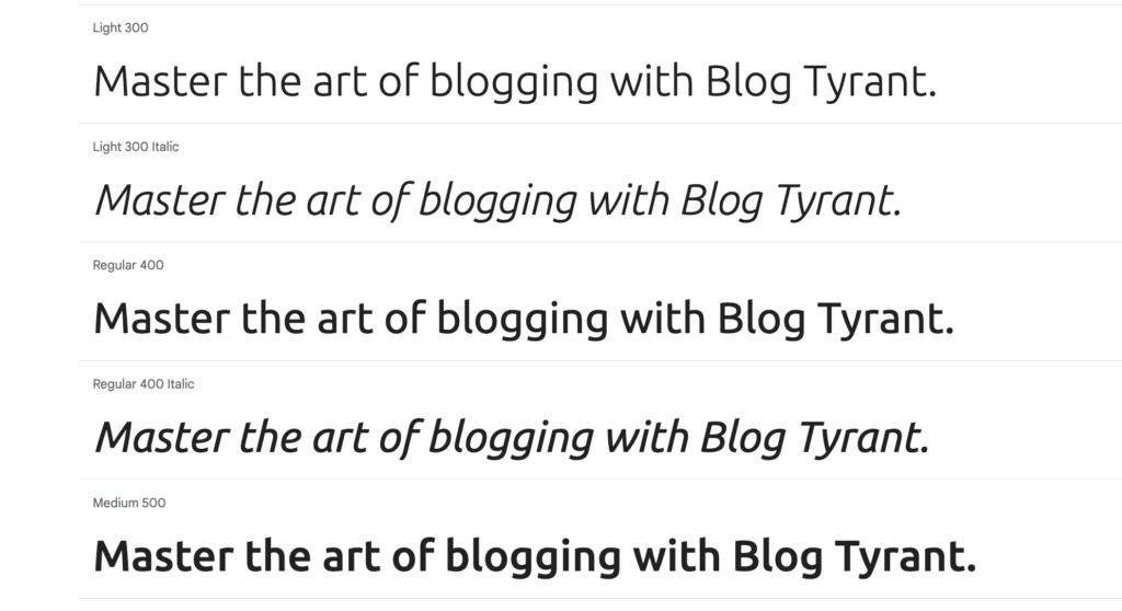
Ubuntu, another popular sans-serif font, originated as the official typeface for the Ubuntu operating system. Its "humanist" classification stems from its organic shapes and open letters, which contribute to a warm and friendly feel. Concurrently, its clean lines and balanced proportions maintain suitability for both professional and casual contexts. Developed under an open-source philosophy, Ubuntu’s font family is designed for customizability, though its inherent versatility makes it effective as is. It has been adopted by prominent entities like Yoast SEO. With high legibility and a range of weights, Ubuntu is particularly well-suited for body text and long paragraphs, extending its utility to travel, business, and food blogs.
13. Inter: The UI/UX Powerhouse
Designed by Rasmus Andersson, Inter has become a default choice for millions of UI designers, signifying its optimization for screen readability and visual appeal. This sans-serif typeface achieves its clarity through geometric letterforms, clean lines, and a high X-height. Meticulous attention to kerning and spacing further enhances its legibility and minimizes eye fatigue. Launched in 2016 and serving as the default font for Figma, Inter has undergone continuous development, with its latest 4.0 version introducing true italics and an optical sizing axis for enhanced readability at various sizes. Its minimalistic aesthetic and adaptability across diverse contexts make Inter a highly effective all-in-one font, despite its widespread adoption.
Technical Integration of Fonts into WordPress Blogs
Integrating new fonts into a WordPress blog can be achieved through several methods, each with varying degrees of complexity and potential impact on site performance. While manual addition of fonts via direct manipulation of style sheets is technically feasible, it is generally not recommended for beginners due to the risk of code corruption and the difficulty in reversing changes.
A more efficient and user-friendly approach involves leveraging specialized WordPress plugins. The "Custom Fonts" plugin by Brainstorm Force is a widely utilized solution. The process typically involves:
- Accessing the WordPress dashboard and navigating to Plugins > Add New.
- Searching for and installing the "Custom Fonts" plugin, followed by activation.
- Proceeding to Appearance > Custom Fonts, where users can enable "Preload Fonts" for optimized loading.
- Utilizing the "Add New Font" option to either upload custom font files directly or integrate fonts from services like Google Fonts.
- Saving the font after adding desired variations (e.g., weights, styles).
Upon completion, these newly added fonts become available for use within the site’s active WordPress theme or page builder, enabling seamless typographic customization. For visual guidance, numerous online tutorials and video guides, such as those demonstrating local font hosting, provide detailed step-by-step instructions.
Best Practices for Font Pairing and Performance
Effective font pairing is crucial for creating a harmonious and readable digital environment. Key principles include:
- Contrast: Pair fonts that offer sufficient visual contrast (e.g., a strong serif heading with a clean sans-serif body).
- Hierarchy: Establish a clear visual hierarchy where headings, subheadings, and body text are distinct.
- Mood Alignment: Ensure chosen fonts collectively convey the desired brand mood and tone.
- Limited Variety: Restrict the number of distinct font families to one or two to maintain consistency and prevent visual clutter.
- Tool Utilization: Tools like Fontjoy can assist in testing font compatibility and generating unique combinations based on contrast preferences.
Beyond aesthetics, font selection significantly impacts a blog’s SEO and overall performance. Prioritizing web-safe fonts and minimizing the number of font variations helps prevent excessive file loading, which can slow down page speed. Slow loading times negatively affect Core Web Vitals, a set of metrics Google uses to assess user experience, potentially impacting search rankings. Optimizing web fonts, such as self-hosting or preloading, can mitigate these performance concerns.
Furthermore, accessibility considerations are paramount. Fonts with clear letterforms, ample spacing, and sufficient contrast against background colors enhance readability for all users, including those with visual impairments. Adhering to these guidelines not only broadens a blog’s audience but also aligns with evolving web accessibility standards.
Conclusion: The Strategic Imperative of Typography
The impact of well-chosen typography on a blog’s success is often underestimated. Beyond superficial aesthetics, fonts profoundly influence reader engagement, brand perception, and technical performance. By thoughtfully selecting typefaces that balance readability, emotional resonance, and technical efficiency, content creators can significantly enhance their digital platforms. Adopting a strategic approach to typography, incorporating best practices for pairing, performance optimization, and accessibility, is not merely a design choice but a critical imperative for fostering a compelling and enduring online presence.