The Art Deco aesthetic has been a cornerstone of the global design lexicon for over a century, tracing its origins to the 1925 Exposition Internationale des Arts Décoratifs et Industriels Modernes in Paris. Characterized by geometric precision, bold symmetry, and a sense of opulent decadence, this movement transitioned from a luxury trend in the early 20th century to a permanent fixture in modern visual communications. Today, designers continue to leverage the style’s inherent glamour to inject a sense of timeless sophistication into everything from corporate branding and editorial layouts to digital user interfaces.
Historical Context and Evolution
Art Deco emerged as a reaction against the fluid, organic lines of Art Nouveau. It was heavily influenced by the rapid industrialization of the 1920s and the rise of the machine age. The aesthetic favored streamlined shapes, sunburst motifs, and zig-zag patterns, which were meant to convey progress and modernism. During the interwar period, this style dominated architecture—as seen in the Chrysler Building—and high-end fashion, eventually infiltrating typography.
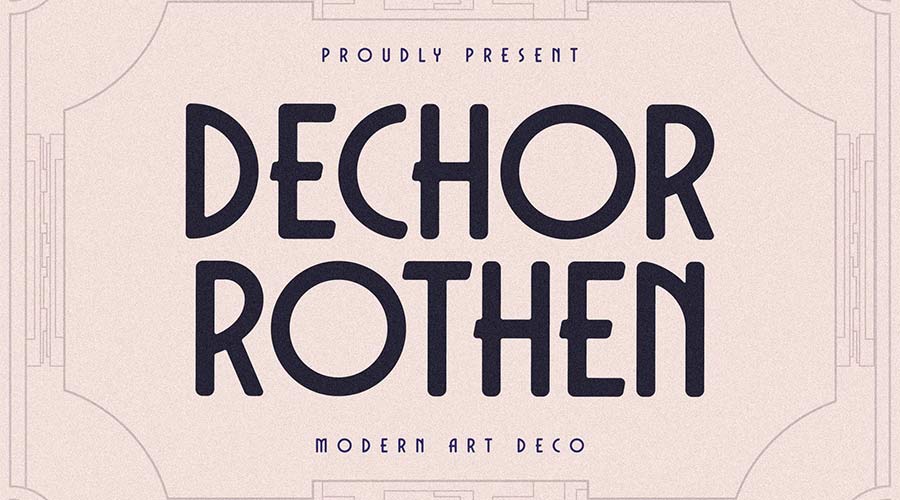
Typography from this era was defined by high-contrast strokes, elongated proportions, and a move toward sans-serif structures that broke away from traditional Victorian ornamentation. While the movement technically waned by the onset of World War II, its legacy persists. In contemporary design, the "Neo-Deco" movement utilizes digital tools to revive these vintage motifs, adapting them for high-resolution screens and print media.
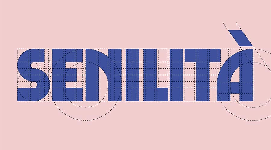
The Role of Typography in Modern Branding
Typefaces are the primary vehicle through which the Art Deco aesthetic is translated into modern contexts. Because Art Deco is inherently decorative, selecting the correct font is essential for maintaining readability while honoring the historical spirit of the movement. Designers today look for fonts that balance the high-fashion, "Great Gatsby" era charm with the practical requirements of modern accessibility.
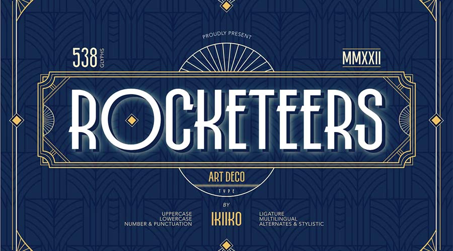
Data-driven design studies suggest that fonts featuring high contrast and geometric structure, such as those inspired by the 1920s, significantly increase brand perception of "luxury" and "prestige." Consequently, these typefaces are frequently employed by hospitality brands, luxury retailers, and boutique agencies seeking to establish a premium identity.

Curated Selection of Contemporary Art Deco Fonts
The following selection represents the best free-to-use fonts that capture the essence of Art Deco, categorized by their structural utility and stylistic leanings.
1. Geometric and High-Contrast Typefaces
These fonts rely on the classic, wide-set proportions synonymous with 1920s poster art.
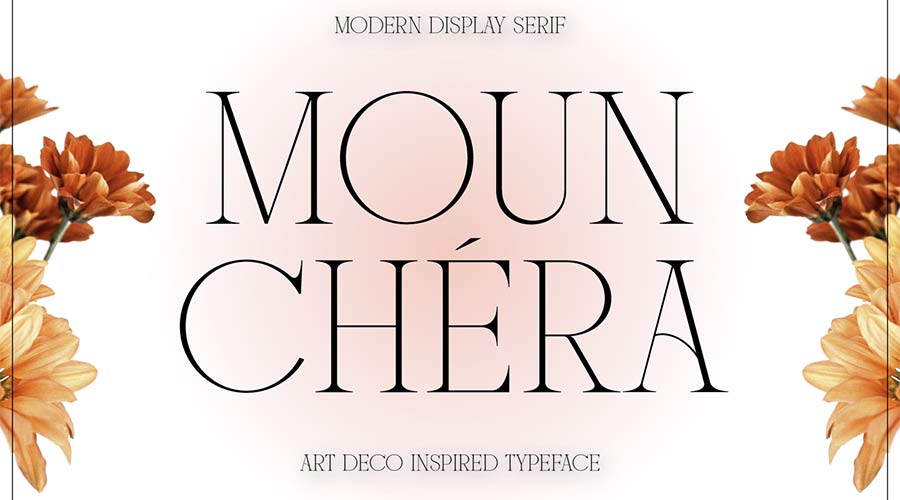
- Limelight: A quintessential high-contrast display font. Its wide characters are designed specifically for impact, making it ideal for editorial headlines or high-fashion advertising.
- Cocosignum Maiuscoletto: Drawing inspiration from Italian signage of the 1930s, this typeface offers five distinct weights, allowing designers to maintain a cohesive visual identity across multiple platforms.
- Italiana: Originally developed for newspaper headlines, this font provides a more refined, calligraphic take on the Art Deco style, perfect for sophisticated web typography.
2. Modern and Sans-Serif Interpretations
These fonts bridge the gap between historical nostalgia and modern, clean-lined utility.

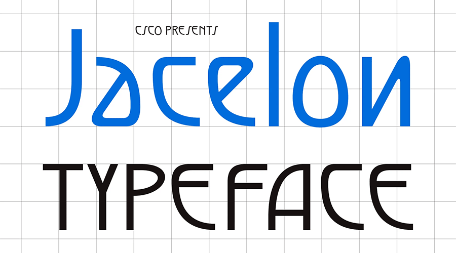
- Jacelon Art Deco Sans-Serif: Prioritizing legibility without sacrificing the geometric integrity of the movement, Jacelon is a versatile choice for modern UI design.
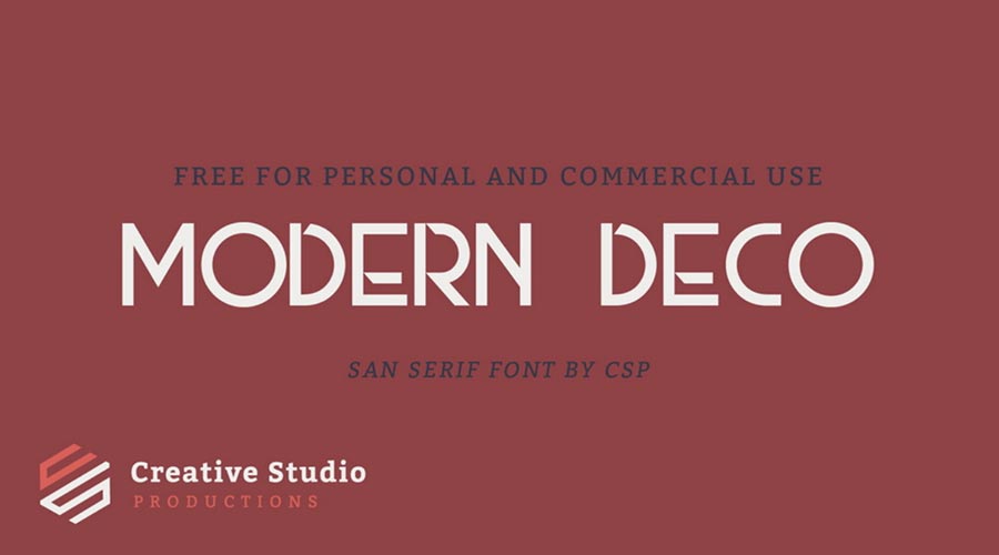
- Modern Deco: A clean, minimalist sans-serif that uses subtle, unconventional strokes to imply a retro feel, suitable for contemporary display scenarios.
- Monterio: Featuring four weights—light, regular, semibold, and bold—this typeface provides the flexibility required for complex print projects and brand systems.
3. Decorative and Specialty Fonts
These typefaces are intended for specific use cases, such as logos, monograms, or singular focal points.

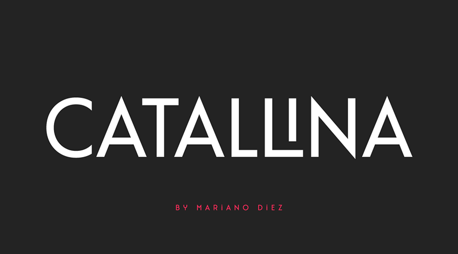
- Catallina: An all-caps font that includes over 50 ligatures, providing designers with the manual control needed for unique, snazzy logo marks.
- Art Deco Monogram Font: Specifically engineered for identity design, this typeface includes specialized sets and styles to create elegant, personalized branding.
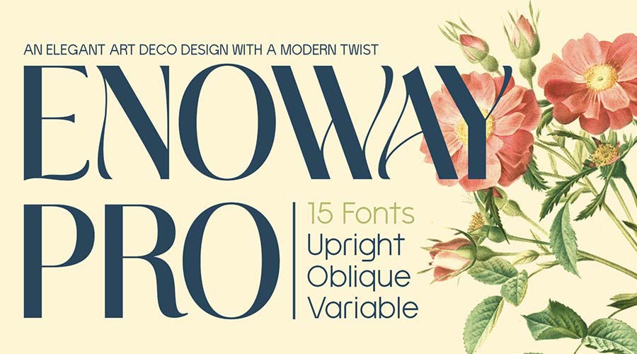
- Enoway Pro: A hybrid typeface that successfully merges the structural rigidity of Art Deco with the flowing, organic curves of Art Nouveau, resulting in a distinct, decorative aesthetic.
Timeline of Art Deco Typographic Influence
- 1920–1930: Peak popularity of hand-lettered Art Deco signage in European and American cities.
- 1950–1970: The mid-century modern movement temporarily overshadows Art Deco, leading to a decline in popularity.
- 1980–1990: A cultural resurgence of "retro" styles brings Art Deco back into fashion for film posters and album covers.
- 2010–Present: Digital font foundries begin digitizing historical archives, making high-quality, free-to-use Art Deco fonts accessible to a global demographic of designers.
Technical Considerations for Designers
When implementing these fonts, designers must consider the "hierarchy of impact." Because many Art Deco fonts feature extreme weights or condensed widths, they are best reserved for headers and decorative elements rather than body copy.

Professional design standards dictate that when using an Art Deco font for branding, the accompanying body text should be a highly readable, neutral sans-serif (such as Inter or Montserrat) to prevent visual fatigue. Furthermore, since many of these fonts are display-oriented, character spacing (kerning) adjustments are often necessary to ensure that the geometric shapes do not bleed into one another at smaller display sizes.
Broader Implications and Future Trends
The endurance of Art Deco is indicative of a broader trend in visual design: the cyclic return to maximalist and high-character aesthetics. As the digital space becomes increasingly saturated with generic, "flat" designs, the use of Art Deco typography serves as a differentiator. It provides a human, historical, and luxurious element that resonates with audiences seeking authenticity.
Looking forward, we can expect to see further hybridization of these fonts. We are currently seeing the emergence of "Tech-Deco," where the geometric symmetry of the 1920s is combined with modern, pixel-perfect precision. This evolution ensures that while the aesthetic is rooted in the past, it remains a vital, evolving tool for the designers of the future.
Summary of Resource Accessibility
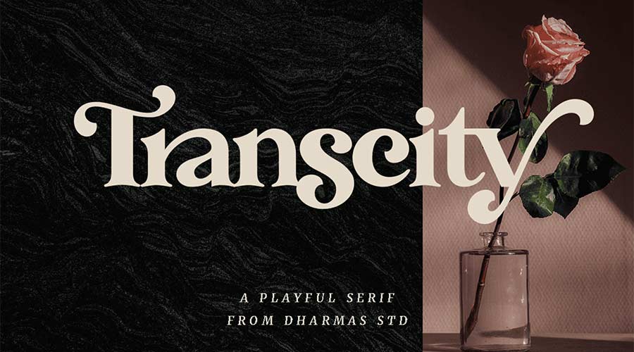
The fonts listed throughout this report represent a mixture of open-source and freemium models. Designers are encouraged to review the specific licensing agreements for each typeface, as "free" does not always equate to "commercial use." Platforms like Google Fonts, Behance, and Fontesk provide the most reliable access to these assets, often including documentation on weight, glyph coverage, and language support.
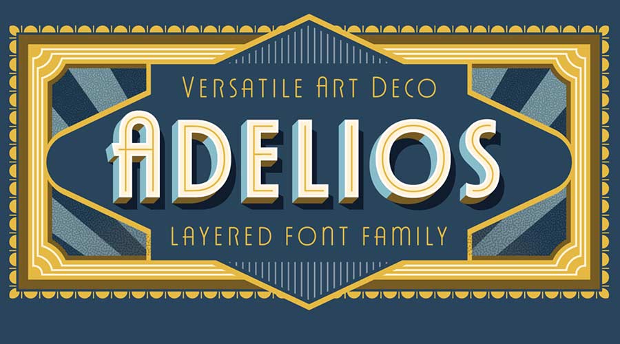
By integrating these historically significant typefaces into current workflows, designers not only pay homage to the innovators of the 20th century but also ensure that their projects benefit from the lasting power and psychological weight of the Art Deco movement. Whether it is a bold headline using "Tyllon" or a delicate monogram created with the "Art Deco Monogram Font," the goal remains the same: to create a visual experience that is as memorable as it is elegant.