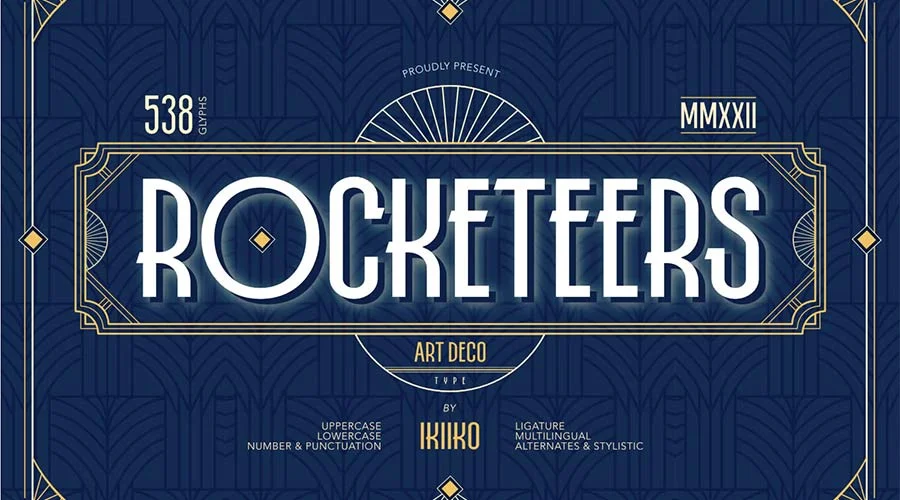
The Art Deco aesthetic has been a cornerstone of the global design landscape for over a century, tracing its origins to the 1925 Exposition Internationale des Arts Décoratifs et Industriels Modernes in Paris. Characterized by geometric precision, lavish ornamentation, and a celebration of modern materials, the movement signaled a shift away from the organic, flowing lines of Art Nouveau toward a streamlined, machine-age future. Today, this aesthetic remains a powerful tool for visual communicators, offering a blend of decadence and structural integrity that continues to resonate across digital and print media.
For modern designers, the most accessible entry point into this visual language is through typography. Whether through sharp, angular sans-serifs or high-contrast, elegant serifs, Art Deco fonts provide an immediate bridge to the era of the Jazz Age. By integrating these typefaces into branding, editorial layouts, or digital interface design, creators can evoke a sense of heritage and sophistication that is difficult to replicate with contemporary minimalist fonts alone.
A Century of Influence: The Chronology of Art Deco
The movement reached its zenith between 1920 and 1939. It was a period defined by rapid technological advancement, the expansion of the skyscraper, and the rise of international travel. Design during this time reflected a global optimism, manifesting in the stylized sunbursts, zigzags, and metallic palettes that have since become synonymous with "Roaring Twenties" iconography.
Following the onset of World War II, the movement largely subsided, replaced by the functionalism of the International Typographic Style. However, the late 1960s and 1970s saw a significant revival, as designers sought to reclaim the glamour of the pre-war era. In the current digital age, the influence of Art Deco has persisted, bolstered by a growing appreciation for retro-futurism and the demand for "premium" visual identities in competitive markets.
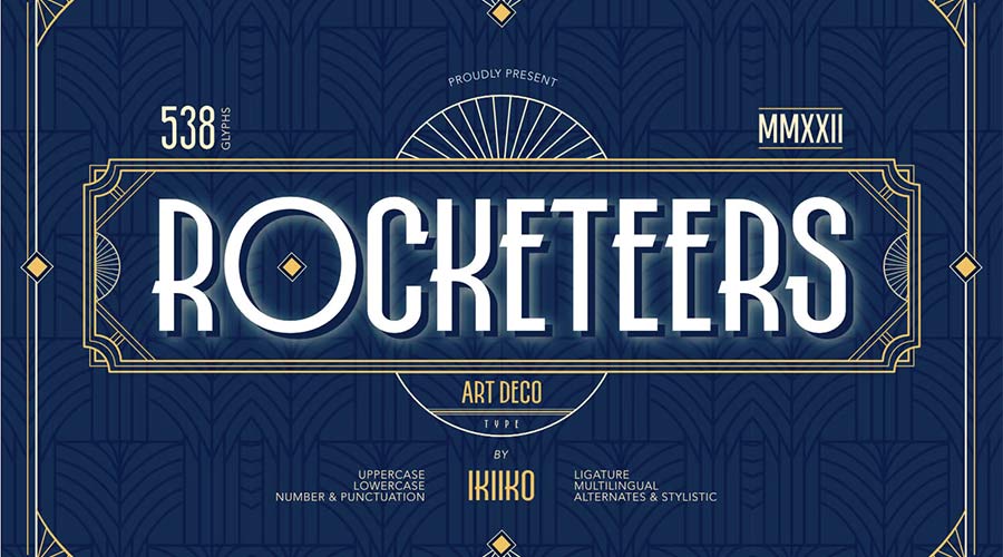
Technical Analysis: Typography as Brand Identity
When choosing an Art Deco font, designers must balance the aesthetic’s inherent decorative nature with modern requirements for readability. The following collection represents a diverse range of interpretations, from minimalist geometric shapes to ornate, display-oriented letterforms.

Geometric and Modernist Interpretations
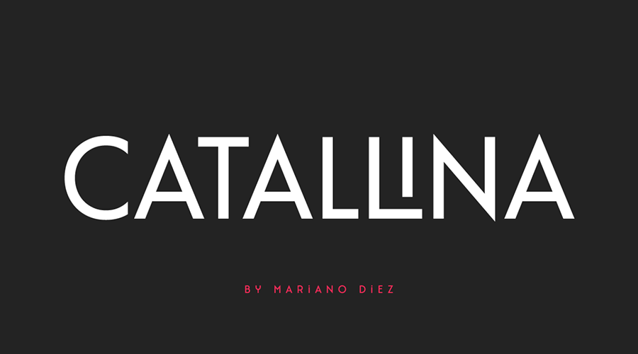
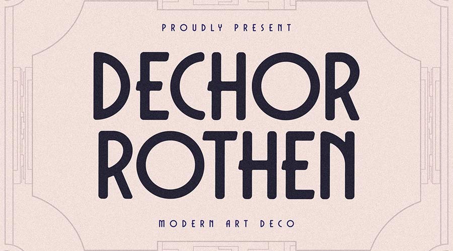
The Catallina font is a prime example of high-end, all-caps design, featuring over 50 ligatures that allow for bespoke logo creation. Similarly, the Dechor Rothen typeface utilizes rounded letterforms to soften the typical harshness of the era’s geometry, making it highly effective for luxury retail branding.
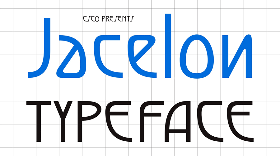
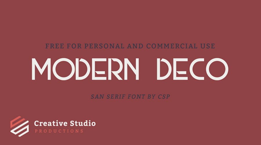
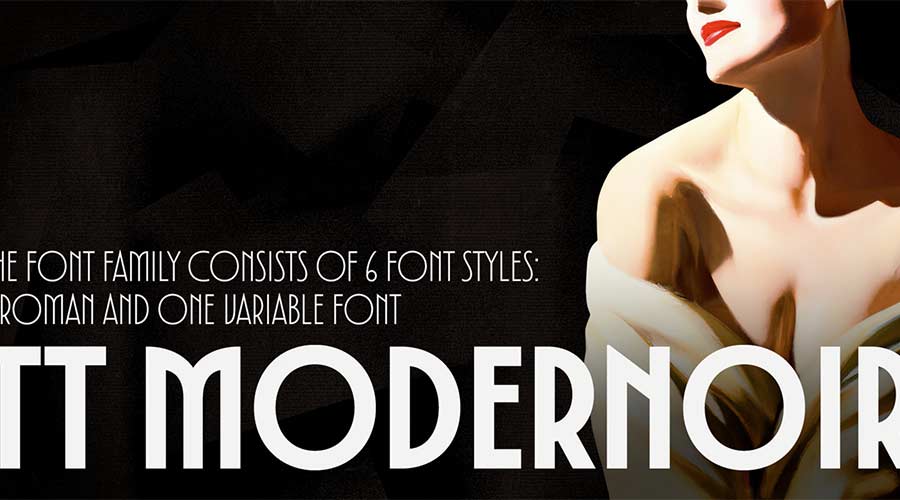
For designers prioritizing legibility without sacrificing the "Deco" look, the Jacelon Sans-Serif stands out. By stripping away some of the more elaborate flourishes of the 1920s, it adapts the spirit of the movement for 21st-century user interfaces. Modern Deco and the TT Modernoir family provide similar utility, offering multiple weights that allow for a hierarchy of information—essential for professional web and mobile layouts.
Bold and Expressive Display Type
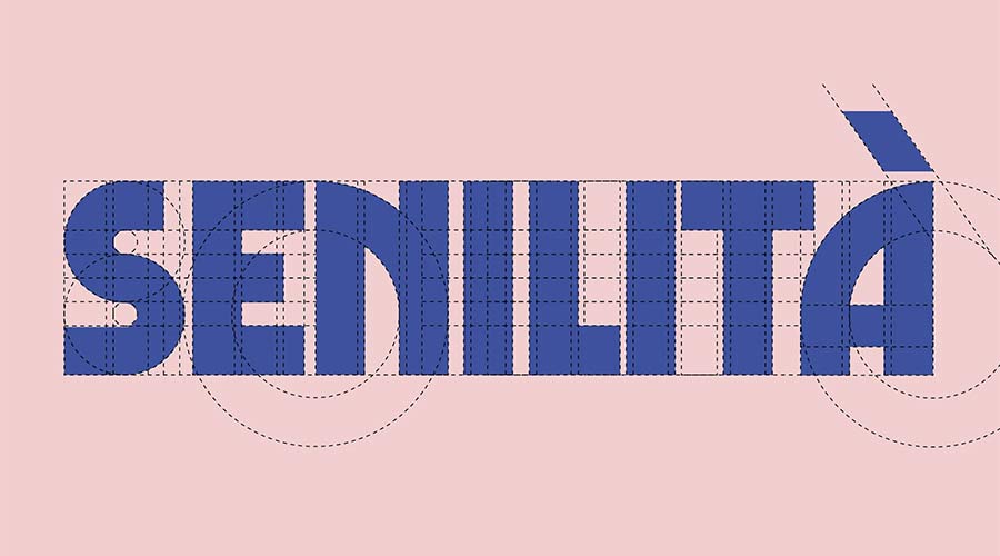
When the primary objective is to capture attention, extra-bold display fonts are required. Senilita serves this purpose, blending the heavy weight of contemporary display typography with the distinct cross-bars and slab-like proportions of the era. The Limelight font, with its high-contrast, extra-wide characters, draws direct inspiration from the movie posters and theatrical signage of the 1920s, making it an ideal choice for event branding or editorial headers.

The Tyllon Urban font bridges the gap between historical design and modern street culture. Its bold, aggressive geometry feels as comfortable in an urban mural context as it does on a high-fashion magazine cover. Similarly, Ring Link brings a technological, almost machine-inspired sensibility to the table, echoing the era’s fascination with industry and speed.

Comparative Data: Selecting the Right Weight
Designers are often faced with the challenge of choosing between "light" and "bold" variants to set a specific tone. Data-driven design suggests that:

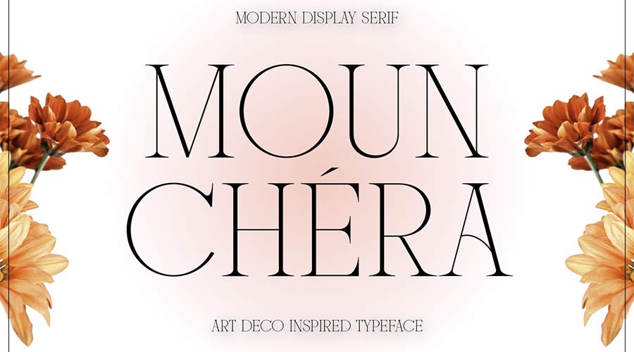
- Ultra-Thin Fonts (e.g., Mounchera, Quincento): Are best suited for high-end, luxury products. The thin lines convey exclusivity and minimalist elegance.
- Bold and Wide Fonts (e.g., Limelight, Tyllon): Are optimal for headlines, call-to-action buttons, and physical signage where visual impact is paramount.
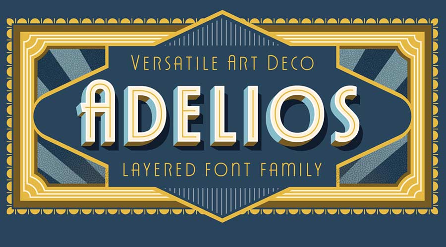
- Versatile Families (e.g., Adelios, Monterio, Cocosignum Maiuscoletto): Are the most cost-effective for long-term projects, as they provide a wide range of weights (light, regular, semibold, bold) to maintain visual consistency across different platforms.
The Role of Ligatures and Customization
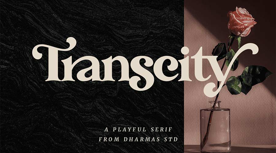
One of the defining features of high-quality Art Deco fonts is the inclusion of custom ligatures. These stylistic connections between letters, such as those found in the Transcity or the Art Deco Monogram font, elevate a design from a standard text block to a curated graphic element. For brands, utilizing these unique characters is a strategic move to prevent the "generic" look often associated with free, widely available typefaces.
Implications for Contemporary Design
The continued popularity of Art Deco indicates a broader cultural desire for craftsmanship in an era of mass-produced digital content. The use of these fonts is not merely a nostalgic exercise; it is a way for brands to communicate reliability, history, and elevated standards.
However, designers must be cautious of the "retro trap." Using these fonts in excess—or applying them to content that requires extreme clarity, such as body text or legal disclaimers—can hinder user experience. The consensus among design experts is that Art Deco typography should be reserved for high-impact areas: logotypes, primary headlines, and decorative dividers.
A Curated List of Essential Resources
For designers looking to expand their toolkit, the following fonts represent the current gold standard in free-to-access Art Deco typography:
- For Sophisticated Logos: Catallina, Art Deco Monogram, and Monsante.
- For Headlines and Titles: Limelight, Tyllon, and Buenos Aires (which offers a unique "sporty" take on the aesthetic).
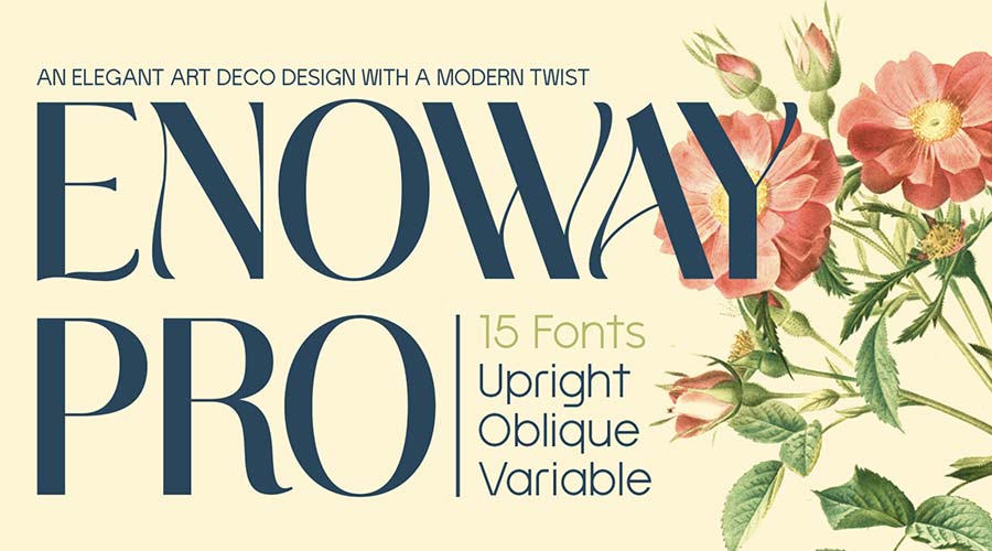
- For Editorial and Print: Italiana, which draws from 1930s Italian calligraphy, and Enoway Pro, which uniquely blends Art Deco with Art Nouveau influences.
- For Versatile Branding: Adelios and the Cocosignum Maiuscoletto family, which offer the broadest range of weights for complex visual systems.
Conclusion: The Future of a Classic Aesthetic
Art Deco has successfully transcended its historical origins to become a permanent fixture in the designer’s lexicon. As digital tools become more sophisticated, the ability to manipulate these classic forms—through variable font technologies and high-resolution rendering—ensures that the aesthetic will remain relevant.
By carefully selecting typefaces that balance historical authenticity with contemporary legibility, designers can continue to harness the "glamour and glitz" of the 1920s. Whether working on a boutique brand identity or a large-scale editorial project, the fonts featured here provide a solid foundation for creating work that is not only visually stunning but also enduring in its appeal. As we look toward the future of design, the lessons of the past—specifically the harmony of form and function championed by the Art Deco movement—remain as pertinent as ever.