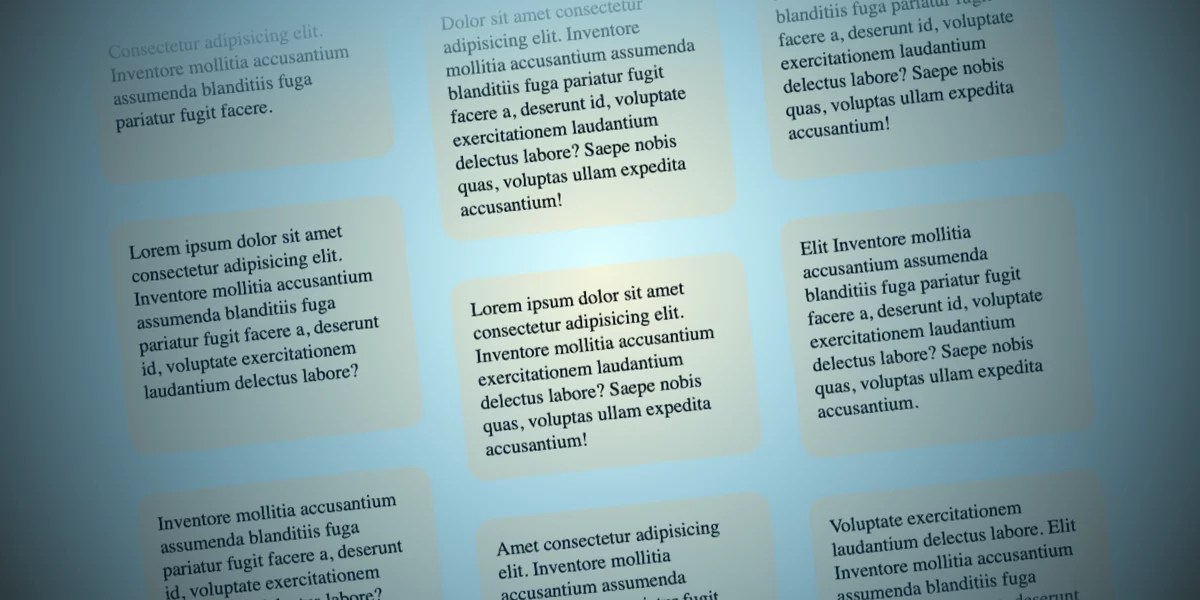
A novel web design technique, leveraging the power of modern CSS to create a visually striking effect of columns moving in opposing directions during user scroll, has emerged as a testament to the evolving capabilities of front-end development. While initially conceived as a potentially whimsical design idea, this approach has demonstrated significant potential for engaging user interfaces, particularly on larger screen formats. The core of this innovation lies in the sophisticated implementation of scroll-driven animations, a feature that dynamically ties animation playback to the user’s scrolling behavior. This article delves into the technical intricacies, conceptual underpinnings, and potential implications of this groundbreaking design pattern.
The foundation of this interactive design rests on a deceptively simple HTML structure. A parent container, designated by the class opposing-columns, encloses multiple child elements, each marked as opposing-column. Within these columns, individual items, identified by the class opposing-item, form the content that will animate. This hierarchical structure, as demonstrated in the provided markup, allows for granular control over the layout and animation of each component. The elegance of this approach lies in its minimal reliance on complex JavaScript, instead harnessing the declarative power of CSS to achieve sophisticated visual effects.
<div class="opposing-columns">
  <!-- Column 1 -->
  <div class="opposing-column">
    <div class="opposing-item">...</div>
    <div class="opposing-item">...</div>
    <div class="opposing-item">...</div>
  </div>
  <!-- Column 2 -->
  <div class="opposing-column">
    <div class="opposing-item">...</div>
    <div class="opposing-item">...</div>
    <div class="opposing-item">...</div>
  </div>
  <!-- Column 3 -->
  <div class="opposing-column">
    <div class="opposing-item">...</div>
    <div class="opposing-item">...</div>
    <div class="opposing-item">...</div>
  </div>
</div>Responsive Design Considerations and Initial Setup
Crucially, the implementation of this dynamic effect is primarily targeted towards larger screen resolutions, specifically screens with a width of 50rem (approximately 800 pixels) or more. This strategic decision acknowledges that the visual impact and functional clarity of opposing scrolling columns are best realized within a more expansive viewport. Smaller screens, often characterized by limited horizontal space, would likely diminish the aesthetic appeal and potentially compromise the user experience. The CSS for this responsive adaptation is as follows:
@media screen and (width >= 50rem)
  .opposing-columns
    display: flex;
    gap: 2rem;
    max-inline-size: min(90dvi, 50rem);
    margin-inline: auto;
This initial styling establishes the parent container as a flexbox, facilitating the side-by-side arrangement of the opposing-column children. A consistent gap of 2rem is applied between columns, ensuring visual separation. The max-inline-size property constrains the container’s width, preventing it from becoming excessively wide on very large displays, while margin-inline: auto centers the container horizontally.
Crafting the Illusion: Masking and Fading Effects
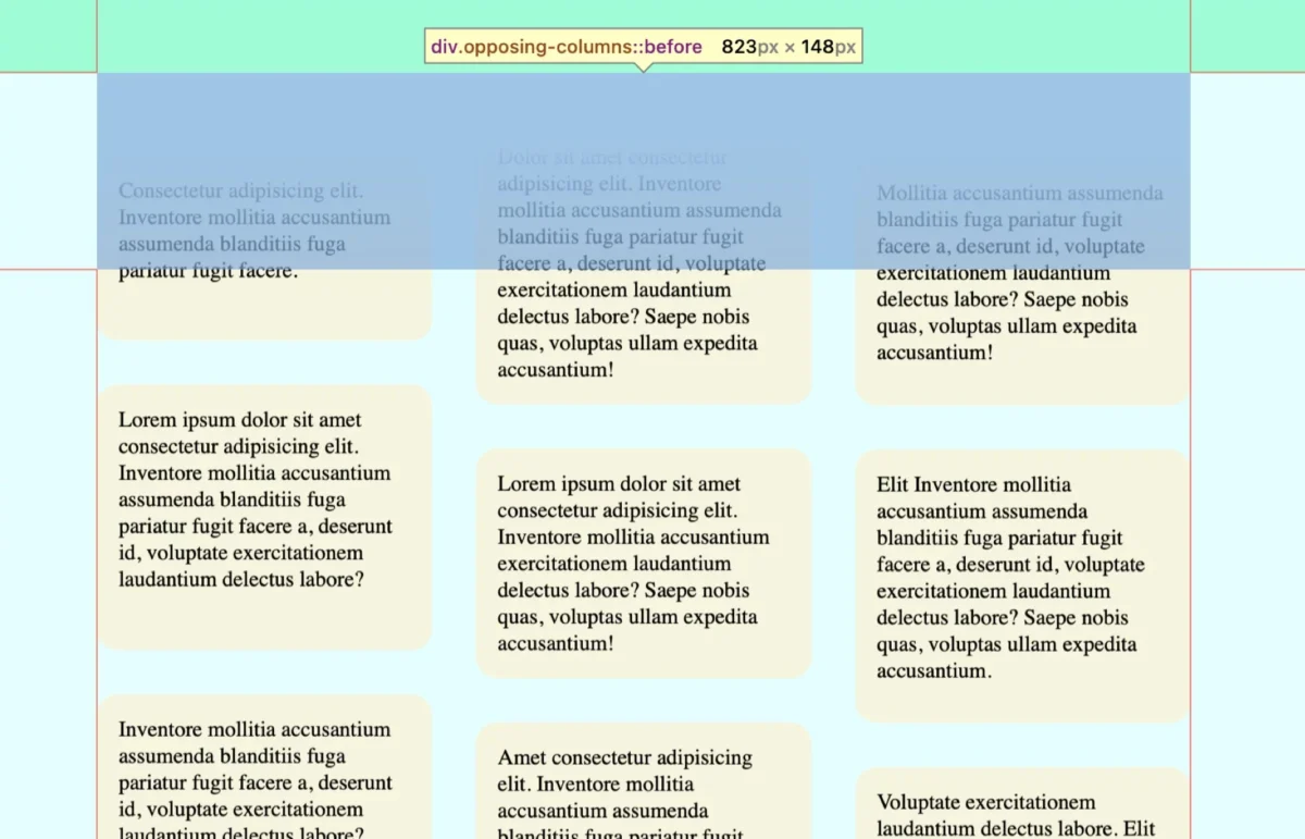
A key element in achieving the illusion of items disappearing as they scroll past the container’s boundaries is a sophisticated masking technique. This is accomplished through the strategic use of pseudo-elements (:before and :after) on the parent container, combined with gradient backgrounds. The goal is to create a visual cue that suggests items are fading out as they move beyond the viewport of the opposing-columns element.
This masking strategy is supported by a document-wide background color variable, --opposing-bg, which is set to lightcyan in this implementation. This variable is then applied to the parent container’s pseudo-elements.
@media screen and (width >= 50rem)
  :root
    --opposing-bg: lightcyan;
    background-color: var(--opposing-bg);


  .opposing-columns
    /* ... previous styles ... */

    &:before,
    &:after
      content: "";
      position: absolute;
      inset-inline: 0;
      block-size: calc(var(--opposing-mask) * 3);
      pointer-events: none;
      z-index: 1;
The z-index: 1 on these pseudo-elements ensures they are layered above the column items, allowing them to effectively mask content. The pointer-events: none property ensures that these pseudo-elements do not interfere with user interaction with the elements beneath them.
Furthermore, a variable named --opposing-mask is introduced, defining a vertical space that creates a buffer zone between the parent container and its child columns, as well as between the pseudo-elements and the parent. This variable plays a crucial role in the gradient masking effect.
@media screen and (width >= 50rem)
  :root
    --opposing-bg: lightcyan;
    --opposing-mask: 3rem; /* Example value */
    background-color: var(--opposing-bg);


  .opposing-columns
    display: flex;
    gap: 2rem;
    max-inline-size: min(90dvi, 50rem);
    margin-inline: auto;
    margin-block: var(--opposing-mask, 3rem);
    position: relative;
The margin-block property on .opposing-columns creates this vertical spacing at the top and bottom of the container. The pseudo-elements then utilize the --opposing-mask variable to define their block-size, creating the area for the gradient fade.
The actual fading effect is achieved through linear gradients applied to the :before and :after pseudo-elements. The :before pseudo-element, positioned at the top, features a gradient that transitions from the --opposing-bg color to transparent, effectively fading out content as it enters from the top. Conversely, the :after pseudo-element, at the bottom, employs a reversed gradient, transitioning from transparent to --opposing-bg, to fade out content as it exits downwards.
@media screen and (width >= 50rem)
  /* ... previous styles ... */

  .opposing-columns
      /* ... previous styles ... */

      &:before,
      &:after
        /* ... previous styles ... */


      &:before
        background-image: linear-gradient(
          to bottom,
          var(--opposing-bg) var(--opposing-mask),
          transparent
        );
        inset-block-start: calc(var(--opposing-mask) * -1);


      &:after
        background-image: linear-gradient(
          to top,
          var(--opposing-bg) var(--opposing-mask),
          transparent
        );
        inset-block-end: calc(var(--opposing-mask) * -1);


}
The inset-block-start and inset-block-end properties are used to position these pseudo-elements precisely, extending the masking effect beyond the immediate bounds of the parent container. This creates a seamless transition as items enter and exit the visible area.
Column Layout and Item Arrangement
To organize the items within each column and provide spacing, the opposing-column elements are styled as grid containers. This choice offers a concise way to manage the vertical arrangement of items and their spacing, overriding the default flex column behavior that would otherwise be required if using Flexbox exclusively.
@media screen and (width >= 50rem)
  /* ... previous styles ... */

  .opposing-column
    flex: 1 1 10rem; /* Flex properties for column resizing */
    display: grid;
    gap: 2rem;
The flex: 1 1 10rem; shorthand property on .opposing-column ensures that each column can grow, shrink, and has a base width of 10rem, contributing to the overall responsive layout. The display: grid; declaration turns each column into a grid container, and gap: 2rem; introduces consistent vertical spacing between the .opposing-item elements within each column.
The Core Innovation: Scroll-Driven Animations
The heart of this design lies in the implementation of scroll-driven animations, a powerful CSS feature that allows animations to be directly controlled by the user’s scroll position. This moves beyond traditional JavaScript-driven animations or simple CSS transitions by intrinsically linking animation playback to the act of scrolling.
The animation-timeline property is central to this concept. Instead of a default timeline that begins on page load, animation-timeline: view(); instructs the animation to synchronize with the element’s visibility within its scrollport. The animation-range property further refines this, specifying the precise points at which the animation should start and end relative to the element’s entry and exit from the scrollable area.

@media screen and (width >= 50rem)
  /* ... previous styles ... */

  .opposing-column
    /* ... previous styles ... */
    animation-timeline: view();
    animation-range: entry 0% cover 100%;
    animation-timing-function: linear;
Here, entry 0% signifies that the animation begins as soon as the element enters the scrollport, and cover 100% indicates that the animation completes when the element is fully covered (i.e., has scrolled entirely out of view). The animation-timing-function: linear; ensures a consistent, non-accelerated movement throughout the animation.
To achieve the opposing movement, three distinct @keyframes animations are defined: scroll1, scroll2, and scroll3. These animations control the transform: translateY() property, moving elements either upwards or downwards by a distance dictated by the --opposing-mask variable.
@keyframes scroll1
  from  transform: translateY(var(--opposing-mask));
  to  transform: translateY(calc(var(--opposing-mask) * -1));


@keyframes scroll2
  from  transform: translateY(calc(var(--opposing-mask) * -1));
  to  transform: translateY(var(--opposing-mask));


@keyframes scroll3
  from  transform: translateY(calc(var(--opposing-mask) * .66));
  to  transform: translateY(calc(var(--opposing-mask) * -.33));
These animations are then applied to the respective columns using CSS variables and :where() pseudo-classes for selective targeting, ensuring that the first column animates with scroll1, the second with scroll2, and the third with scroll3. The third animation is intentionally offset to create a staggered visual effect between the two outer columns.
@media screen and (width >= 50rem)
  :root
    /* ... previous styles ... */
    --animation-1: scroll1;
    --animation-2: scroll2;
    --animation-3: scroll3;


  /* ... previous styles ... */

  .opposing-column
    /* ... previous styles ... */


  :where(.opposing-column:nth-of-type(1))
    animation-name: var(--animation-1);


  :where(.opposing-column:nth-of-type(2))
    animation-name: var(--animation-2);


  :where(.opposing-column:nth-of-type(3))
    animation-name: var(--animation-3);
Accessibility and Fallback Mechanisms
A critical aspect of this implementation is its respect for user preferences regarding motion. The prefers-reduced-motion media query is employed to disable animations and remove the masking effects for users who have indicated a preference for reduced motion on their devices. This ensures a more accessible and comfortable experience for all users.
@media (prefers-reduced-motion: reduce)
  .opposing-column
    animation: unset;

    &:before,
    &:after
      content: unset;
For browsers that do not yet support scroll-driven animations, such as older versions of Firefox at the time of this writing, a fallback strategy is essential. This can be achieved using the @supports rule to conditionally apply styles. In the absence of scroll-driven animation support, developers can implement a traditional CSS animation timeline as a fallback, ensuring that the visual effect is still present, albeit without the direct scroll-driven interaction.
@supports (animation-timeline: view())
  /* Styles for browsers supporting scroll-driven animations */
Broader Implications and Future Potential
The successful implementation of this opposing columns effect using scroll-driven animations signifies a notable advancement in web design capabilities. It demonstrates that complex, dynamic visual experiences can be achieved with increasingly sophisticated CSS features, reducing reliance on heavier JavaScript solutions. This not only leads to potentially better performance but also enhances the maintainability and accessibility of web applications.
The implications extend beyond mere aesthetic appeal. Such interactive elements can significantly enhance user engagement by providing dynamic visual feedback and guiding the user’s attention through content. This could be particularly beneficial for websites that feature extensive portfolios, product catalogs, or data visualizations.
As browser support for scroll-driven animations continues to expand, it is anticipated that this technique will become a more prevalent tool in the web developer’s arsenal. Further experimentation and refinement of these concepts are likely to yield even more innovative and immersive user interface designs, pushing the boundaries of what is possible on the web. The ability to directly link animation to user interaction, such as scrolling, opens up a new paradigm for creating responsive and engaging digital experiences. Developers are encouraged to explore these emerging CSS features and contribute to the ongoing evolution of interactive web design.