The Evolution of CSS Shapes: Unpacking the Power of shape() and border-shape

The landscape of web design is constantly being reshaped by advancements in CSS, and recent developments in shape-creation tools are poised to revolutionize how developers craft visual elements. The introduction of the shape() function, now a baseline feature, alongside the corner-shape property, has significantly expanded the toolkit for designers. However, the most compelling innovation may be the emergence of the border-shape property, a powerful new tool that promises to simplify complex shape creation and decoration.
The rapid evolution of CSS shape capabilities might have flown under the radar for those not deeply immersed in the intricacies of front-end development. The shape() function, a new value for clip-path and offset-path, leverages SVG syntax to offer a more intuitive and accessible method for defining CSS shapes compared to the previously dominant path() function. This innovation is not merely an incremental improvement; it represents a paradigm shift in how developers can translate complex visual ideas into web-based elements. Its versatility allows for the expression of any SVG shape directly within CSS, enabling a seamless conversion of vector graphics into dynamic web components. To facilitate this transition, developer tools and converters have emerged, such as the SVG-to-CSS converter, which streamline the process of bringing intricate SVG designs into the CSS realm.

Complementing the shape() function is the corner-shape property. This property works in tandem with border-radius, offering predefined keywords like round, scoop, bevel, notch, and squircle to precisely control the form of an element’s corners. While corner-shape can be used to construct various common CSS shapes, its true power lies in its ability to enhance existing shapes by allowing borders and other decorative elements to conform to the custom corner profiles. This capability addresses a long-standing challenge in CSS development: applying borders to non-rectangular elements, which often required complex workarounds or was simply not feasible. Although browser support for corner-shape is currently limited, primarily to Chromium-based browsers, its potential for creating visually rich and unique interfaces is undeniable. The ability to seamlessly integrate borders and shadows with custom corner shapes marks a significant step forward in aesthetic control within CSS.
Enter border-shape: A New Frontier in CSS Styling
While corner-shape offers fine-grained control over individual corners, the border-shape property introduces a more comprehensive approach by enabling the shaping of the entire element. This property accepts the same values as clip-path, crucially including the powerful shape() function. The fundamental distinction between border-shape and clip-path lies in their interaction with element decorations.

Historically, clip-path and mask properties would clip or mask the entire element, including any applied borders or shadows. This made it exceptionally difficult, if not impossible, to apply borders to custom shapes without resorting to intricate layering techniques or JavaScript solutions. border-shape, however, circumvents this limitation. Instead of clipping the element, it "shapes" the element itself, allowing decorative properties like border, box-shadow, and outline to follow the defined shape. This fundamental difference transforms the creation of bordered CSS shapes from a complex undertaking into a straightforward process.
The syntax of border-shape is designed for ease of adoption. Developers familiar with clip-path will find the transition seamless, as the property essentially replaces one for the other. The synergy between shape() and border-shape is particularly potent, unlocking a vast array of creative possibilities. The shape() function, with its ability to define intricate paths and curves, becomes the engine that drives the border-shape property, enabling the creation of highly customized and visually striking elements.
Border-Only Shapes: Eliminating Workarounds

One of the most immediate and impactful applications of border-shape is the creation of border-only shapes. Previously, achieving this often involved complex hacks or multiple overlapping elements. With border-shape, it becomes as simple as applying a border to an element and then defining the desired shape using the border-shape property. For instance, a simple red border can be applied to a heart shape, a starburst, a flower, or a jagged rectangle without any fill, purely as an outline.
This capability not only simplifies development but also opens up new aesthetic avenues. Designers are no longer constrained by the limitations of standard rectangular borders. The ability to generate border-only versions of complex shapes, including blobs, wavy lines, and intricate frames, can be readily achieved with the assistance of online generators that are being updated to incorporate these new CSS features. This move away from cumbersome workarounds signifies a maturing of CSS for sophisticated visual design.
Cutout Shapes: Precision in Design

The border-shape property further enhances its utility through its ability to define two distinct shapes. This dual-shape syntax allows for the creation of cutout effects, where the border forms the area between an outer and an inner shape. The specification defines this as "Fill mode," where the first shape dictates the outer boundary and the second defines the inner boundary.
For example, by using inset(0) as the outer shape (a rectangle) and another shape as the inner boundary, a cutout effect can be achieved. This means that a custom shape can be cut out from a solid background, creating visually interesting compositions. The flexibility extends to replacing the inset(0) rectangle with other basic shapes like circle(). This eliminates the need for border-radius in many scenarios, as border-shape effectively overrides it when used with two shape values. The element is no longer defined by its corners but by the precisely defined boundaries of the shapes themselves. This level of control allows for the creation of complex, non-rectangular elements with perfectly conforming borders, such as custom-shaped frames or elements with internal voids.
The implications of this dual-shape capability are significant for UI design. It allows for the creation of elements that are not merely decorative but integral to the information architecture. For instance, a cutout shape within a larger background can be used to highlight specific content or to create layered visual effects that were previously only achievable with complex SVG manipulation or image editing.

Breakout Decorations: Pushing Design Boundaries
Beyond simple cutouts, border-shape introduces the concept of "breakout decorations." This refers to the ability of decorations, such as borders, to extend beyond the perceived boundaries of the element’s content. When using border-shape with two shape values, the content within the element adheres to its original rectangular form, while the border can be shaped to extend outwards.
This is achieved by manipulating the parameters of the inner and outer shapes. By making the outer shape larger than the inner shape and by carefully defining their dimensions, a "breakout background effect" can be simulated. For example, by setting the outer shape to extend to the viewport edges and the inner shape to be a small circle or even non-existent, a border can effectively fill the entire screen behind the content, creating a striking visual impact. This capability is particularly valuable for achieving full-bleed background effects or creating dynamic visual elements that interact with the surrounding page layout.

The ability to achieve breakout effects with CSS alone is a notable advancement, as it typically requires more complex grid layouts or absolute positioning techniques. border-shape offers a more declarative and straightforward approach. This opens up possibilities for creating visually engaging headers, footers, or section backgrounds that extend beyond the confines of their parent elements, contributing to a more immersive user experience.
Partial Decorations: Unbounded Creativity
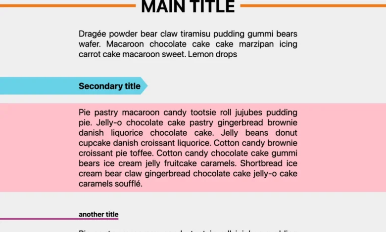
The versatility of border-shape extends to creating partial decorations, where borders or other embellishments are applied only to specific parts of an element, not necessarily conforming to the entire shape or extending outwards. This is achieved by strategically defining the shapes used within the border-shape property.

By leveraging the shape() function, developers can craft highly specific geometric forms that dictate where decorations appear. This allows for the creation of unique underlines, partial background fills, or corner accents that are not bound by the standard box model. The potential applications range from subtle typographic enhancements to dynamic visual elements that respond to user interaction. The key here is the unbounded nature of shape(), which can generate virtually any geometric form, and border-shape‘s ability to apply decorations along these forms. This means that the only limit to what can be decorated is the developer’s imagination and their mastery of the shape() function.
Shape Animation: Bringing Designs to Life
The introduction of border-shape also brings exciting possibilities for animation. The property is animatable, allowing for dynamic visual effects that were previously difficult or impossible to achieve with pure CSS.

One compelling animation technique involves animating the border-width value when using the two-shape syntax. This can create a reveal effect, where a shape is gradually unveiled as the border expands or contracts. This is particularly effective for hover effects, adding an interactive layer to static elements. Furthermore, these animations can be applied not only to standard HTML elements but also to images, enabling dynamic framing and visual embellishments for visual content.
Beyond simple width animations, the shape values themselves can be animated. This allows for more complex and fluid transitions, such as bouncing effects on blob shapes or morphing animations between different geometric forms. By replacing clip-path with border-shape in existing animation examples, developers can readily adapt and enhance them, infusing them with the added dimension of animated borders. The ability to animate decorations adds a new layer of dynamism to web design, making interfaces more engaging and interactive.
The potential for animation extends to the partial decorations as well. Subtle animations can be applied to titles or text blocks, creating engaging visual feedback for users. This could involve animated underlines that shimmer or grow, or background elements that subtly shift and transform on hover. The combination of border-shape and CSS animations provides a powerful toolkit for creating rich, interactive user experiences without relying on JavaScript.

Broader Implications and Future Outlook
The emergence of shape() and border-shape signals a significant maturation of CSS for visual design. These properties empower developers to create more complex, nuanced, and aesthetically sophisticated interfaces with greater ease and efficiency. The ability to define shapes using familiar SVG syntax and to apply decorations that conform to these shapes eliminates many of the historical limitations of CSS.
While browser support for these features is still evolving, their increasing adoption in modern browsers indicates a clear direction for the future of web design. As support expands, we can anticipate a surge in creative applications of these new CSS capabilities. The availability of tools and resources, such as CSS shape collections and online generators, will further democratize the use of these advanced features, enabling designers of all skill levels to implement cutting-edge visual designs.

The impact of border-shape is particularly profound for graphic design on the web. It bridges the gap between static vector graphics and dynamic web elements, allowing for the creation of designs that are both visually striking and functionally integrated. The ability to create border-only shapes, cutout designs, breakout decorations, and animated borders opens up a vast canvas for creative expression.
As developers continue to explore the full potential of shape() and border-shape, we can expect to see innovative uses emerge across various web applications, from marketing websites and e-commerce platforms to interactive data visualizations and game interfaces. The ongoing development and standardization of these CSS features promise to make the web an even more visually rich and dynamic medium. The journey of CSS shapes is far from over, and border-shape represents a significant leap forward in its ongoing evolution.