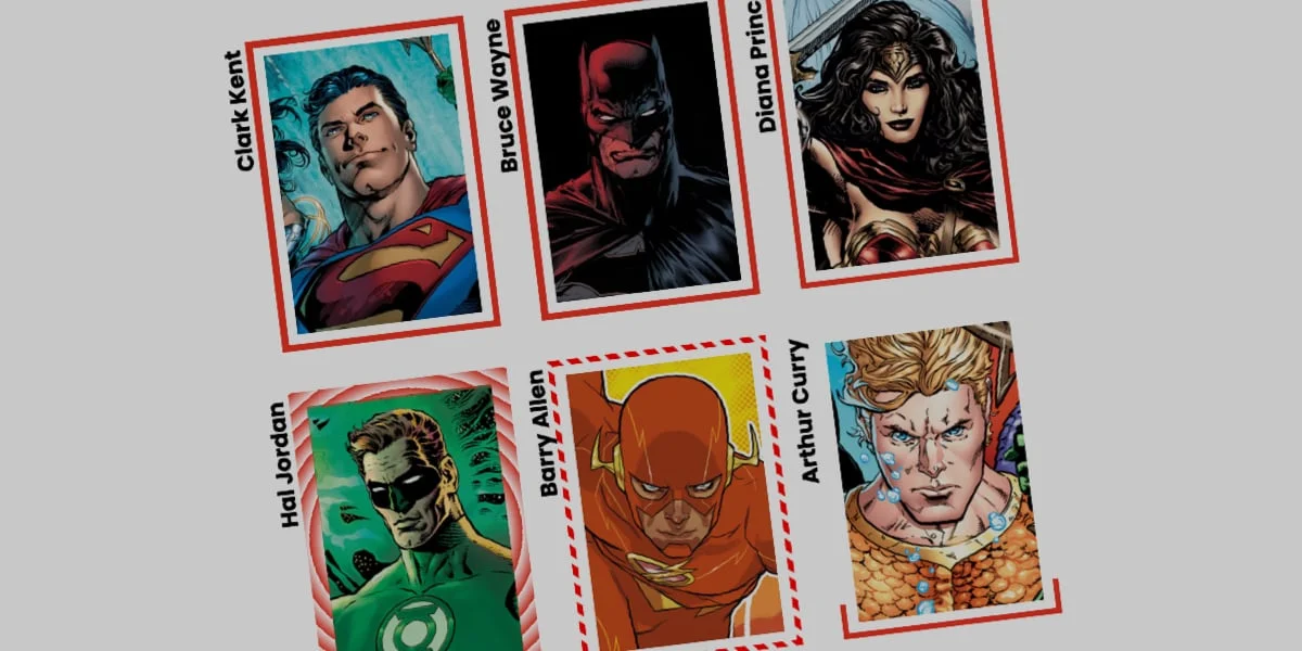
The Evolution of CSS Border Styling
The Cascading Style Sheets (CSS) standard has undergone a profound transformation over the past decade, moving away from static, rigid layouts toward dynamic, hardware-accelerated visual presentations. Among the lesser-utilized yet remarkably powerful features in the modern web developer’s toolkit is the border-image property. While this capability is far from novel—having first entered the W3C candidate recommendation stages years ago—it remains frequently overlooked in favor of standard, uniform border declarations such as solid, dashed, or dotted lines.
Recent developer discourse, spearheaded by frontend authorities like Andy Clarke, has reignited interest in revisiting border images to evaluate their modern utility. When combined with advanced CSS features such as Houdini custom properties, the border-image property transcends its traditional limitations, allowing developers to construct fluid, engaging user interface animations that were previously achievable only through JavaScript or heavy SVG implementations.
Traditional border properties are strictly bound by the geometric dimensions of an element, typically constrained to solid hex values, RGB strings, or basic alpha transparencies. By contrast, border-image permits the integration of complex raster graphics, vector files, and sophisticated multi-stop CSS gradients directly into an element’s bounding box. Despite a notable limitation—specifically, that border images do not inherently curve to match border-radius shapes—creative workarounds have unlocked unprecedented design patterns across modern web applications.
Comparative Technical Analysis: Border Images versus CSS Masks
To understand the specific advantages of animating border-images, industry experts often weigh them against alternative methodologies, such as CSS masking techniques popularized by developers like Temani Afif. While CSS masks offer intricate clipping paths and shape-fitting capabilities, they often introduce performance overhead and complex geometric calculations that complicate responsive design.
The border-image property excels in efficiency, particularly regarding rendering performance and code maintainability. Because the browser natively handles the repetition and slicing of the underlying image asset via properties like border-image-slice, developers can scale complex visual designs uniformly across all four sides of an element without recalculating coordinate matrices.
Furthermore, the integration of border-image-width and border-image-outset provides granular control over spatial positioning. Developers can effortlessly push animated gradients away from the core content container, creating a glowing, detached halo effect that responds dynamically to user interactions. This efficiency makes border-image an ideal candidate for high-performance micro-interactions, such as hover states on interactive cards, navigation buttons, and focus rings.
Step-by-Step Implementation: Building a Dynamic Card Component
Implementing an animated border-image workflow requires a structured approach to both HTML markup and CSS rule declarations. Consider a standard component architecture, such as a user profile card containing basic textual metadata and a background raster image.
The foundational HTML markup remains intentionally minimalist:
<div class="card">
  <strong>Bruce Wayne</strong>
</div>
The corresponding base styles establish the structural geometry and position the background asset using standard CSS positioning models:
.card
  width: 250px;
  aspect-ratio: 0.69;
  position: relative;
  background: center / 90% no-repeat;
  background-image: url("batman.jpg");
  padding: 1.5rem;
  box-sizing: border-box;
To introduce the border effect, developers apply longhand border-image properties to ensure explicit control over the rendering pipeline. By decoupling properties such as border-image-source, border-image-slice, and border-image-width, engineers gain precise insight into how individual parameters influence the visual output.
Initialising the Linear Gradient Border Effect
The transition from a static border to a dynamic, animated boundary begins with the implementation of a linear gradient. In standard CSS specifications, animating or interpolating directly between complex gradients is impossible because browsers cannot smoothly transition numerical percentage stops without specialized property registration.
To circumvent this limitation, developers leverage the CSS Houdini @property API to register custom animatable variables. This allows the browser to treat custom properties—such as a percentage-based variable representing a gradient stop—as native numeric values capable of smooth interpolation.
@property --p
  syntax: "<percentage>";
  initial-value: 0%;
  inherits: false;


.card
  width: 250px;
  aspect-ratio: 0.69;
  position: relative;
  background: center / 90% no-repeat;
  background-image: url("batman.jpg");

  border-image-source: linear-gradient(-45deg, red var(--p), transparent 0%);
  border-image-slice: 1;
  border-image-width: 4px;
  border-image-outset: 6px;

  transition: --p 0.4s ease-in-out;

  &:hover
    --p: 100%;
In this configuration, the initial state defines a fully transparent gradient where both the primary color (red) and the secondary color (transparent) originate at the 0% mark. Because the transparent stop succeeds the color stop, the browser renders the entire border as transparent. Upon user interaction (:hover), the custom property --p transitions to 100%, effectively drawing the red linear gradient around the perimeter of the element in real time.
Advanced Variations: Conic Gradients and Tiling Patterns
Beyond standard linear gradients, developers can expand the visual vocabulary of their user interfaces by incorporating conic gradients, dynamic rotation angles, and repeating slicing behaviors.
By utilizing conic-gradient alongside border-image-repeat: round, developers can create intricate, expanding color wheels that tile seamlessly across the border perimeter without clipping artifacts. The round value instructs the browser to dynamically adjust the scale of individual tiles, stretching or compressing them slightly to fit an exact integer number along the border length.
Registering multiple custom properties enables complex, multi-variable animations:
@property --n
  syntax: "<number>";
  initial-value: 1;
  inherits: false;


@property --a
  syntax: "<angle>";
  initial-value: 0deg;
  inherits: false;


.card
  border-image-source: conic-gradient(from var(--a), #3b82f6 var(--a), transparent 0%);
  border-image-width: 6px;
  border-image-slice: var(--n);
  border-image-repeat: round;
  transition-property: --n, --a;
  transition-duration: 0.6s;
  transition-timing-function: cubic-bezier(0.4, 0, 0.2, 1);

  &:hover
    --n: 15;
    --a: 360deg;
In this advanced implementation, hovering over the container triggers a simultaneous transition of the slice depth (--n) and the gradient rotation angle (--a). The visual result is an evolving, multi-tiered border pattern that rotates through a complete three-hundred-and-sixty-degree cycle while modulating its structural density.
Industry Implications and Performance Considerations
The growing adoption of CSS Houdini properties and advanced border-image manipulation signifies a broader shift toward declarative, CSS-first animation strategies within modern web architecture. Historically, creating complex border animations required mounting heavy JavaScript execution loops or rendering resource-intensive SVG DOM nodes, both of which degrade runtime performance on mobile devices and low-power hardware.
By offloading layout interpolation and paint calculations directly to the browser’s native CSS rendering engine, developers achieve buttery-smooth, sixty-frames-per-second animations. Furthermore, keeping styling logic within stylesheets drastically reduces JavaScript bundle sizes, simplifies automated testing pipelines, and improves overall maintainability across enterprise-grade codebases.
As browser support for CSS Houdini features reaches near-universal status across modern desktop and mobile engines, techniques involving animated border images are expected to transition from experimental design novelties to standard practices in high-end user interface engineering. Frontend teams are encouraged to audit existing static UI components to identify opportunities where subtle, performant border transitions can enhance visual hierarchy and elevate the overall user experience.