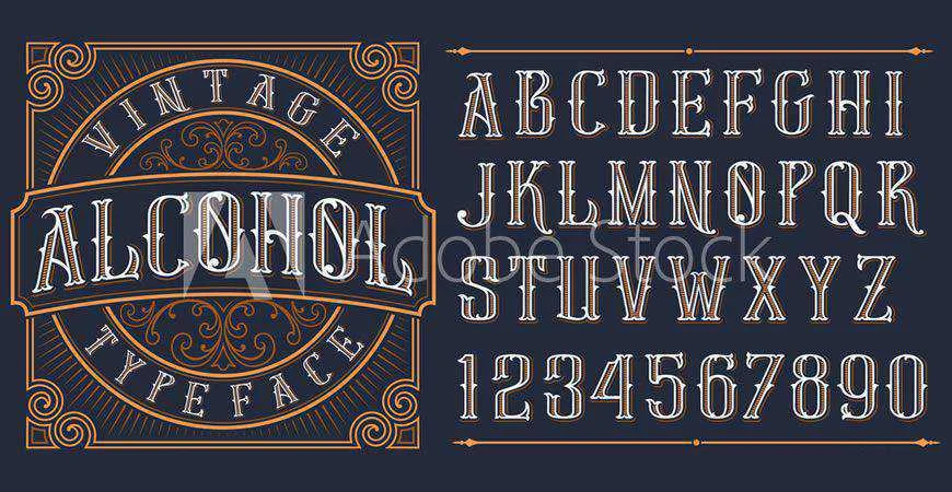
Typography serves as the silent ambassador of any brand, acting as the primary vehicle for visual communication before a consumer even processes the specific name of a business. In the competitive landscape of modern digital design, the selection of a logo font has evolved from a simple aesthetic choice into a strategic business decision. A font does more than render letters; it establishes authority, evokes emotional responses, and dictates the perceived value of a service or product. As businesses increasingly operate across omnichannel platforms, the necessity for versatile, scalable, and distinct typography has reached an all-time high.
The Anatomy of Brand Perception
Design experts and psychologists have long noted that typography acts as a subconscious trigger. Research into consumer behavior indicates that users make a judgment about a brand’s trustworthiness and quality within 50 milliseconds of visual exposure. Serif fonts, characterized by the small strokes at the ends of letters, are historically associated with heritage, reliability, and academic prestige. Conversely, sans-serif fonts—stripped of these decorative flourishes—are perceived as modern, minimalist, and technologically advanced.
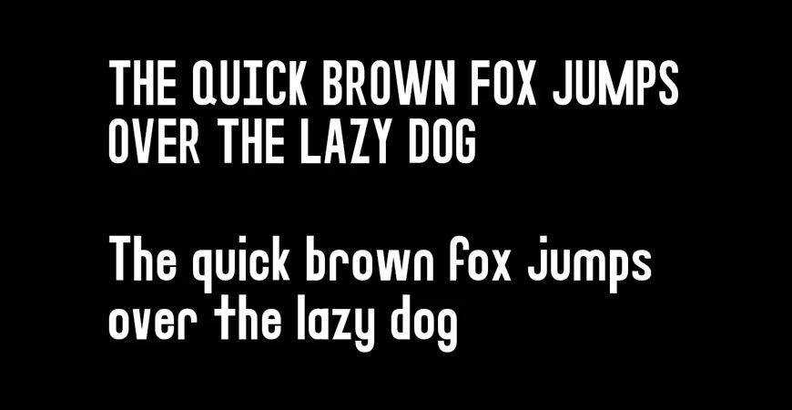
When a design agency or a startup chooses a typeface, they are effectively choosing a voice. A script font communicates intimacy and luxury, often favored by boutique hospitality brands and fashion houses. Geometric fonts, which rely on mathematically precise shapes, convey order and efficiency, making them the standard for architectural firms and technology conglomerates. The challenge for modern designers lies in balancing this psychological impact with technical utility.
Technical Requirements and Scalability
A logo must function with equal efficacy on a multi-story billboard as it does on a favicon in a web browser tab. This requirement for "responsive typography" has shifted the industry focus toward fonts with expansive weight ranges and high legibility.
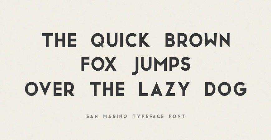
A technical audit of a typeface before implementation should include:
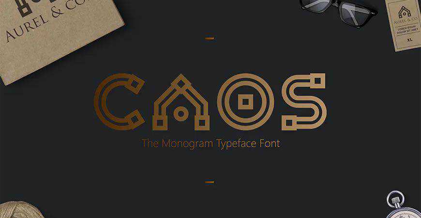
- Kerning and Spacing: The ability for the font to maintain legibility when tracked out (spaced widely) or tightened for a compact logotype.
- Glyph Completeness: Access to extended characters, ligatures, and alternate glyphs that allow a brand to create a unique monogram or wordmark.
- Format Flexibility: The font must support standard web-ready formats (WOFF2) to ensure consistent rendering across high-resolution displays and mobile devices.
Strategic Categorization of Typeface Styles
To streamline the selection process, designers typically categorize fonts based on their functional application. The following segments represent the current industry standards for modern branding:
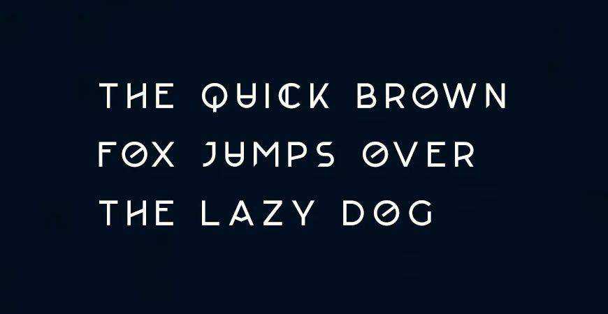
Minimal and Geometric Frameworks
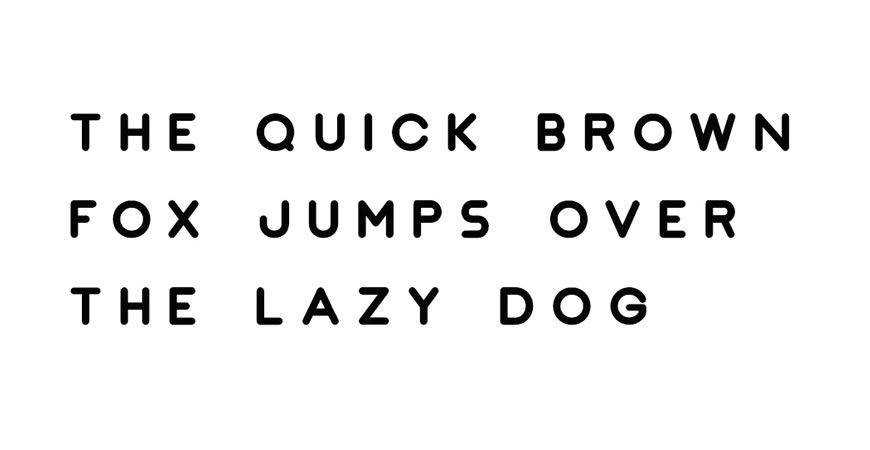
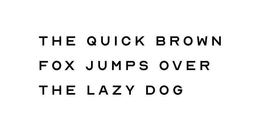
Minimalism remains the dominant trend in corporate identity. Fonts such as Nord and JUST Sans exemplify the shift toward "clean" aesthetics. These typefaces are designed for flexibility, often providing seven or more weights. For a global corporation, the ability to transition from a bold, high-contrast logotype to a refined, lightweight secondary typeface within the same family is invaluable for maintaining visual consistency.
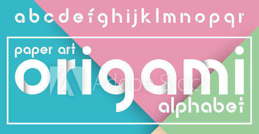
The Return of the Monogram
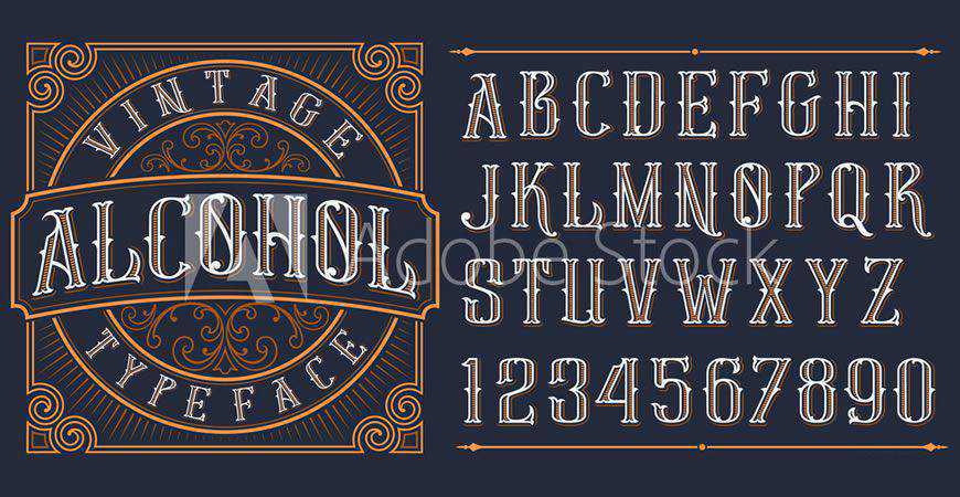
In the luxury and high-fashion sectors, the monogram has seen a resurgence. Typefaces like Augor allow for the creation of intricate, sophisticated marks that serve as the primary brand asset. The utility of these fonts lies in their ability to be modified—designers often treat these letters as vector shapes, carving into them or merging them to create a unique symbol that stands apart from standard alphabets.
Expressive Scripts and Brush Lettering
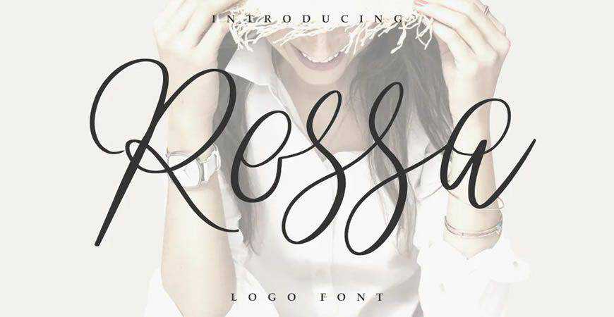
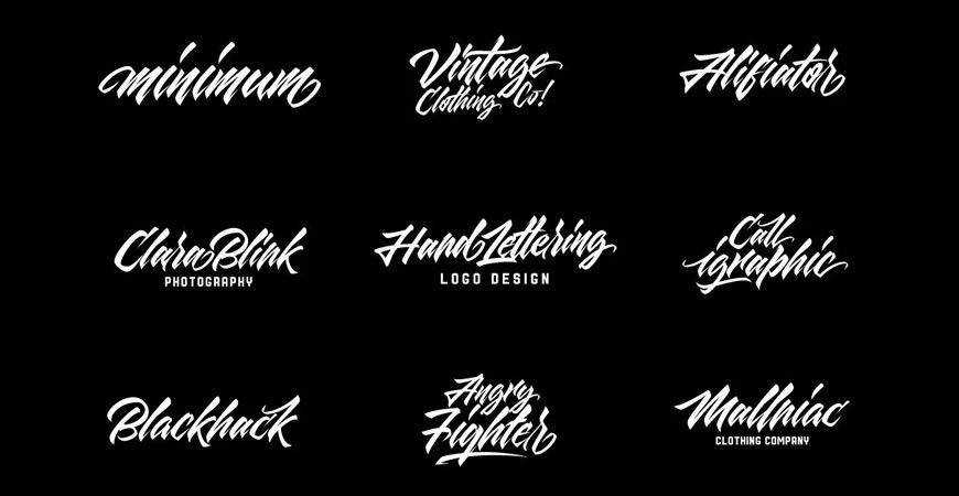
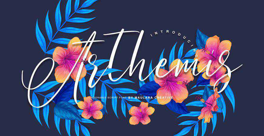
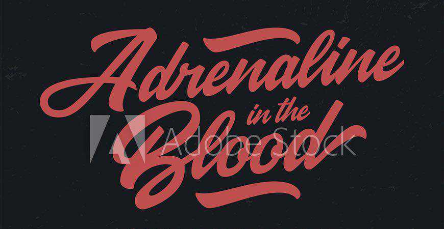
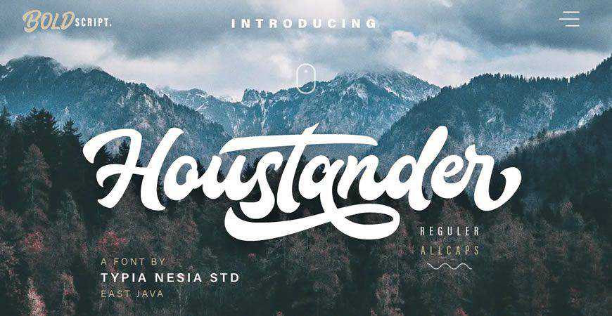
While minimalism is standard for tech, the creative and lifestyle sectors prioritize movement and personality. Script fonts, such as Rossa or brush-style fonts like Quick Silver, inject a human element into the branding process. These fonts are essential for brands attempting to bridge the gap between "corporate" and "approachable." The use of hand-painted or calligraphic typefaces creates a narrative of craft and exclusivity, which is highly effective in the artisanal food and beverage markets.
The Legal Landscape of Font Licensing
A frequent point of friction in the design industry is the misunderstanding of font licensing. Many designers operate under the misconception that a font downloaded from a free repository is automatically cleared for commercial use. This is rarely the case.
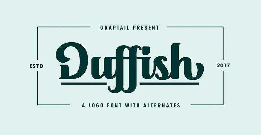
Commercial licensing involves a tiered structure. A "Desktop" license typically permits the use of the font to create physical assets like logos and packaging, but it does not necessarily cover the embedding of the font on a website or in an app. "Webfont" licenses are billed based on page views, and "App" licenses are often based on the number of active users.
Failure to secure the appropriate license can lead to significant financial liability for a client. As a professional standard, agencies are now required to maintain a "License Registry," ensuring that every font used in a client’s identity has a traceable commercial permit. Before a logo is finalized, it is the responsibility of the lead designer to verify that the font’s EULA (End User License Agreement) explicitly allows for the modification and commercialization of the typeface as a logo.
Evolution and Future Trends in Type Design
The trajectory of font design is currently leaning toward variable fonts. Unlike traditional static fonts, variable fonts allow the designer to adjust weight, width, and slant along a continuous axis within a single file. This technological advancement means that a brand’s logo can technically "breathe"—subtly adjusting its thickness or width based on the screen size or light conditions of the device it is viewed on.
This adaptability is not merely a gimmick; it is a response to the fragmentation of media. As brands move from static print advertisements to dynamic digital environments, the logo is no longer a fixed object. It is a living component of a brand system. The fonts of the future must be as dynamic as the screens they inhabit.
Practical Application: A Selection Checklist
When presenting font options to a client, the decision should be grounded in a set of objective criteria rather than subjective preference:

- Brand Archetype Alignment: Does the font align with the brand’s core values (e.g., trust, playfulness, tradition)?
- Legibility Audit: Can the text be read at 16 pixels on a mobile device? Can it be read from 20 feet away?
- Distinctiveness: Does the font contain unique characteristics (such as an unusual ‘g’ or a specific terminal) that prevent the logo from looking generic?
- Licensing Verification: Has the commercial license been purchased and documented?
- Pairing Potential: Does the primary logo font have a legible, neutral companion typeface for body text and secondary information?
Final Considerations for Brand Managers
The selection of a logo font is a foundational step that influences every subsequent design decision, from the color palette to the choice of photography. By investing time in selecting a typeface that is both aesthetically resonant and technically robust, a brand sets the stage for long-term consistency.

Designers are encouraged to move beyond trends and focus on the longevity of the typeface. A font that is "in style" today may look dated in five years. The most successful logos, such as those of iconic heritage brands, utilize typefaces that are structurally sound and visually balanced, ensuring that the identity remains relevant as the business grows. As the design industry continues to evolve, the ability to curate typography with precision and legal diligence will remain the hallmark of a high-tier creative professional. By prioritizing clarity, versatility, and legal compliance, designers can ensure that their work not only makes an immediate impression but also sustains the brand’s reputation for years to come.