
Creating Opposing Scrolling Columns with Modern CSS Scroll-Driven Animations
The landscape of web design is constantly evolving, with developers and designers pushing the boundaries of user experience. One such innovative technique, which might initially seem like a whimsical idea, involves creating columns of content that move in opposite directions as a user scrolls through a webpage. This effect, initially conceived by a designer and now becoming more accessible through modern CSS features, offers a unique visual dynamic that can engage users in novel ways. This article delves into the technical implementation of this concept, focusing on the power of scroll-driven animations and the underlying CSS properties that make it possible.
Understanding the Core Concept: Scroll-Driven Animations
At its heart, this design technique leverages the nascent capabilities of CSS scroll-driven animations. These animations depart from traditional timeline-based animations, which are typically triggered by page load or a set delay. Instead, scroll-driven animations synchronize the progress of an animation with the user’s scroll position within a designated area. This allows for highly interactive and context-aware visual effects that feel intrinsically linked to user interaction.
It is crucial to note that this particular demonstration is designed to respect user preferences for reduced motion. Individuals who have enabled reduced motion settings in their operating systems will not experience the animation, ensuring a more accessible and comfortable browsing experience. As of the development of this technique, support for these advanced CSS features is primarily observed in browsers like Chrome and Safari, with ongoing development and broader adoption anticipated across other browser engines.
Technical Implementation: Building the Foundation
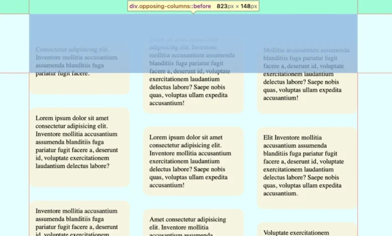
The structural foundation for this effect is remarkably simple, relying on a hierarchical HTML structure. A parent container, .opposing-columns, encloses individual column elements, .opposing-column. Each of these columns, in turn, contains the actual content items, .opposing-item. The complexity and visual flair are then handled almost entirely through CSS.
HTML Structure:
<div class="opposing-columns">
  <!-- Column 1 -->
  <div class="opposing-column">
    <div class="opposing-item">...</div>
    <div class="opposing-item">...</div>
    <div class="opposing-item">...</div>
  </div>
  <!-- Column 2 -->
  <div class="opposing-column">
    <div class="opposing-item">...</div>
    <div class="opposing-item">...</div>
    <div class="opposing-item">...</div>
  </div>
  <!-- Column 3 -->
  <div class="opposing-column">
    <div class="opposing-item">...</div>
    <div class="opposing-item">...</div>
    <div class="opposing-item">...</div>
  </div>
</div>
This minimalist HTML approach underscores the power of CSS in modern web development, where semantic structure is paired with sophisticated styling to achieve complex visual outcomes.
Styling the Parent Container and Masking Effect
To ensure this dynamic effect is visually impactful and doesn’t disrupt the user experience on smaller screens, it’s typically applied within a media query targeting larger viewports (e.g., screen and (width >= 50rem)). The parent container, .opposing-columns, is styled to enable flexbox layout, establishing horizontal spacing between the columns.
/* Applied on larger screens */
@media screen and (width >= 50rem)
  .opposing-columns
    display: flex;
    gap: 2rem;
    max-inline-size: min(90dvi, 50rem); /* Constrains width */
    margin-inline: auto; /* Centers the container */
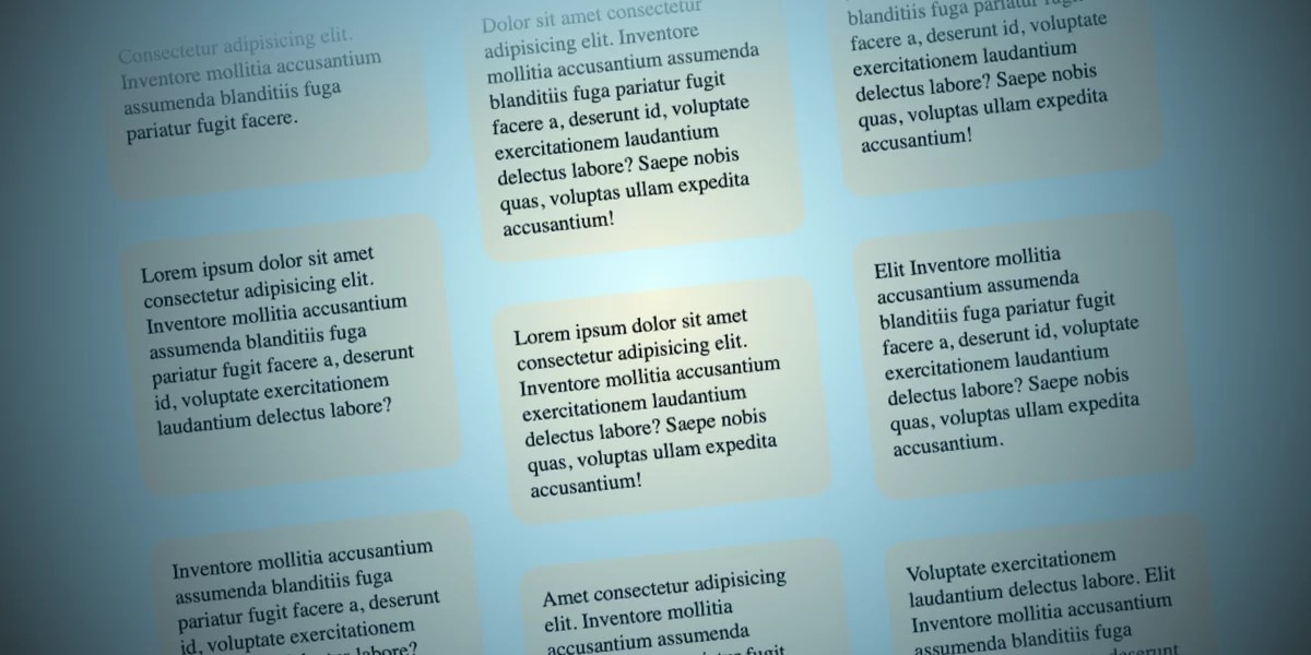
A critical aspect of creating the illusion of items disappearing as they scroll past the container is a "masking" effect. This is achieved not by directly manipulating the opacity of the items, but by strategically using pseudo-elements and background gradients.
First, a custom property, --opposing-bg, is defined on the :root element to establish a consistent background color. This color will be used to create the fading effect.
@media screen and (width >= 50rem)
  :root
    --opposing-bg: lightcyan; /* Example background color */
    background-color: var(--opposing-bg);

  /* ... other styles */
Next, the :before and :after pseudo-elements of the .opposing-columns container are styled. These pseudo-elements are positioned absolutely to span the full width of the container and are given a calculated block-size (height) based on another custom property, --opposing-mask. This creates a buffer zone above and below the actual content. Crucially, pointer-events: none; ensures these pseudo-elements don’t interfere with user interactions, and z-index: 1; places them above the column items, allowing them to effectively mask the content as it scrolls.
@media screen and (width >= 50rem)
  /* ... */
  .opposing-columns
    /* ... existing styles */
    position: relative; /* Establishes a positioning context */

    &:before,
    &:after
      content: "";
      position: absolute;
      inset-inline: 0; /* Spans horizontally */
      block-size: calc(var(--opposing-mask) * 3); /* Calculated height */
      pointer-events: none;
      z-index: 1; /* Stacks above column items */
The --opposing-mask variable is also applied to the margin-block of the .opposing-columns container, creating vertical spacing between the container and its content.
@media screen and (width >= 50rem)
  :root
    --opposing-bg: lightcyan;
    --opposing-mask: 3rem; /* Defines the mask buffer size */
    background-color: var(--opposing-bg);


  .opposing-columns
    display: flex;
    gap: 2rem;
    max-inline-size: min(90dvi, 50rem);
    margin-inline: auto;
    margin-block: var(--opposing-mask, 3rem); /* Applies vertical spacing */
    position: relative;

  /* ... */
The fading effect is achieved by applying linear gradients to the :before and :after pseudo-elements. The :before pseudo-element, positioned at the top, uses a gradient that transitions from the --opposing-bg color to transparent, effectively hiding items as they enter the top of the container. Conversely, the :after pseudo-element, at the bottom, uses a gradient that transitions from transparent to the --opposing-bg color, masking items as they exit the bottom. The inset-block-start and inset-block-end properties are used to position these pseudo-elements outside the direct flow of the container, aligning them with the defined mask buffer.
@media screen and (width >= 50rem)
  /* ... */
  .opposing-columns
    /* ... */
    &:before,
    &:after
      /* ... existing styles */


    &:before
      background-image: linear-gradient(
        to bottom,
        var(--opposing-bg) var(--opposing-mask), /* Solid color to transparent */
        transparent
      );
      inset-block-start: calc(var(--opposing-mask) * -1); /* Positioned above */


    &:after
      background-image: linear-gradient(
        to top,
        var(--opposing-bg) var(--opposing-mask), /* Transparent to solid color */
        transparent
      );
      inset-block-end: calc(var(--opposing-mask) * -1); /* Positioned below */
This clever use of pseudo-elements and gradients creates the illusion that content is gracefully fading in and out of view, controlled by the scroll position.
Column Layout and Item Arrangement
Each .opposing-column is configured as a flex item within the .opposing-columns container, allowing them to distribute available space. They are set to grow and shrink as needed, with a defined basis for their initial size.
@media screen and (width >= 50rem)
  /* ... */
  .opposing-column
    flex: 1 1 10rem; /* flex-grow, flex-shrink, flex-basis */
To manage the spacing between items within each column, a grid layout is employed. This provides a concise way to apply consistent gaps between the .opposing-item elements.
@media screen and (width >= 50rem)
  /* ... */
  .opposing-column
    flex: 1 1 10rem;
    display: grid;
    gap: 2rem; /* Space between items */
While Flexbox could also achieve this, Grid offers a slightly more streamlined approach when the primary requirement is to create distinct vertical spacing between child elements.
Implementing the Animation: The Scroll-Driven Magic
The core of the opposing motion lies in the animation-timeline property. This property allows animations to be driven by scroll progress rather than a fixed duration. The view() function is particularly well-suited for this scenario. It tracks an element’s progress as it enters and exits the scrollable area (the "scrollport").
The animation-range property, used in conjunction with view(), defines the specific points within the scrollport where the animation should start and end. entry 0% cover 100% signifies that the animation begins as soon as an element enters the scrollport (at 0% of its entry) and concludes when it is fully covered by the scrollport (at 100% of its exit).

@media screen and (width >= 50rem)
  /* ... */
  .opposing-column
    /* ... */
    animation-timeline: view(); /* Drives animation by scroll progress */
    animation-range: entry 0% cover 100%; /* Defines animation bounds */
    animation-timing-function: linear; /* Constant animation speed */
To achieve the opposing motion, three distinct CSS @keyframes animations are defined. These animations use transform: translateY() to move the column items.
scroll1: Moves items upward from a positive offset (entering the top) to a negative offset (exiting the bottom).scroll2: Moves items downward from a negative offset (entering the bottom) to a positive offset (exiting the top).scroll3: Provides a slightly offset and less pronounced movement, intended for the middle column to create a staggered effect.
@keyframes scroll1
  from  transform: translateY(var(--opposing-mask));
  to  transform: translateY(calc(var(--opposing-mask) * -1));


@keyframes scroll2
  from  transform: translateY(calc(var(--opposing-mask) * -1));
  to  transform: translateY(var(--opposing-mask));


@keyframes scroll3
  from  transform: translateY(calc(var(--opposing-mask) * .66));
  to  transform: translateY(calc(var(--opposing-mask) * -.33));
These animations are then assigned to the respective columns using animation-name and custom properties for easy management.
@media screen and (width >= 50rem)
  :root
    /* ... */
    --animation-1: scroll1;
    --animation-2: scroll2;
    --animation-3: scroll3;


  /* ... */
  .opposing-column
    /* ... */


  :where(.opposing-column:nth-of-type(1))
    animation-name: var(--animation-1); /* Apply animation 1 to the first column */


  :where(.opposing-column:nth-of-type(2))
    animation-name: var(--animation-2); /* Apply animation 2 to the second column */


  :where(.opposing-column:nth-of-type(3))
    animation-name: var(--animation-3); /* Apply animation 3 to the third column */
Respecting User Preferences: Reduced Motion
A critical ethical and accessibility consideration is respecting users’ desire for reduced motion. The @media (prefers-reduced-motion: reduce) query is employed to disable these animations and the masking effect when the user has indicated a preference for less motion.
@media (prefers-reduced-motion: reduce)
  .opposing-column
    animation: unset; /* Disable animations */

    &:before,
    &:after
      content: unset; /* Remove pseudo-elements */
This ensures that users who may experience discomfort or distraction from animations can still have a visually coherent and accessible experience.
Broader Implications and Future Outlook
The advent of scroll-driven animations, as demonstrated by this opposing columns effect, represents a significant leap forward in CSS capabilities. This technology opens up a new realm of possibilities for creating highly dynamic and interactive web experiences that are directly tied to user behavior.
From a performance perspective, scroll-driven animations are generally optimized to be more efficient than JavaScript-based scroll event listeners, as they are handled natively by the browser’s rendering engine. This can lead to smoother animations and a more responsive user interface.
The current browser support landscape, while growing, still presents challenges for widespread adoption without fallbacks. Developers can utilize the @supports rule to conditionally apply scroll-driven animation styles only when browser support is detected, providing a graceful fallback to traditional animation timelines or static content for unsupported browsers.
@supports (animation-timeline: view())
  /* Styles for scroll-driven animations */
As browser vendors continue to implement and refine support for scroll-driven animations, we can anticipate a surge in creative applications. This could include everything from immersive storytelling experiences and dynamic data visualizations to enhanced product showcases and interactive learning platforms. The ability to directly link animations to user scroll provides a powerful new tool for designers to guide user attention, convey information, and craft engaging digital narratives. The "silly idea" of opposing columns moving in sync with the scroll has evolved into a tangible demonstration of the exciting future of web animation.


