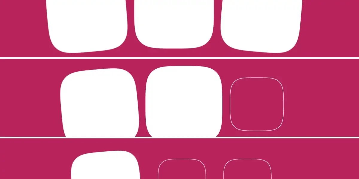
Chrome has officially launched scroll-triggered animations, marking a significant advancement in web development as the first browser to implement this feature. This new capability, available in Chrome 146 and later, allows developers to create dynamic and responsive user interfaces that react to a user’s scroll behavior in novel ways. Initially showcased through a demo where a square’s background fades in over 300 milliseconds only when the entire element is within the viewport, this feature promises to redefine interactive web design.
The introduction of scroll-triggered animations represents a distinct evolution from previously established scroll-driven animations. While scroll-driven animations synchronize animation progress directly with scroll progression (using animation-timeline: scroll() or animation-timeline: view()), scroll-triggered animations operate on a threshold-based system. They initiate and play out animations for a fixed duration once a specific scroll point, or "threshold," is met. This behavior is conceptually similar to the JavaScript Intersection Observer API but is now integrated directly into CSS.
Understanding the Mechanics of Scroll-Triggered Animations
At its core, scroll-triggered animation leverages CSS’s @keyframes rule to define the animation itself. For instance, a simple fade-bg-in animation can be defined to change the background color of an element:
/* Define the animation */
@keyframes fade-bg-in
  to
    background: currentColor;
This animation is then applied to an element, such as a .square class, with a specified duration:
.square
  /* Declare animation */
  animation: fade-bg-in 300ms;
However, by default, CSS animations commence as soon as their declaration is applied. Scroll-triggered animations modify this behavior by introducing the timeline-trigger property. Instead of animation-timeline: view(), which measures the degree of an element’s visibility, timeline-trigger: --trigger view() entry 100% exit 0%; dictates that the animation should activate only when the element fully enters the viewport. The --trigger acts as a named identifier, linking the trigger condition to the animation. The entry 100% exit 0% defines a "timeline range," specifying the scroll zone where the animation is active. In this context, entry 100% means the animation starts when the bottom edge of the element enters the viewport, and exit 0% means it stops being active when the top edge exits.
The animation-trigger property then dictates how the animation behaves once triggered. For example, animation-trigger: --trigger play-forwards; ensures the animation plays to completion once the .square becomes entirely visible. Without an explicit animation-fill-mode, the animation, in this case, acts as a brief "flash" of the background change, as the styles are not retained after the animation concludes.
Navigating Animation Fill Modes and Actions
To achieve persistent visual effects, developers must combine animation-trigger with animation-fill-mode. The forwards keyword in animation: fade-bg-in 300ms forwards; ensures that the styles applied at the end of the animation are retained. When animation-trigger is set to play-forwards and animation-fill-mode is forwards, the animation plays once when the element is fully visible and its final state is preserved.
However, a common challenge arises when an element exits and re-enters the viewport. If the animation restarts upon re-entry, it can lead to an undesirable "flash" effect, especially if the animation’s end state differs significantly from its initial state. Two primary methods address this:
The "Lock-In" Method: play-once
The play-once keyword for animation-trigger offers a solution. When combined with forwards fill mode, the animation plays exactly once and does not restart, even if the element leaves and re-enters the viewport. This ensures a permanent application of the final animation state.
.square
  /* Play animation only once */
  animation-trigger: --trigger play-once;

  /* Retain the styles after animation completion */
  animation: fade-bg-in 300ms forwards;

  timeline-trigger: --trigger view() entry 100% exit 0%;
The "Back-and-Forth" Method: play-forwards play-backwards
An alternative approach is to use play-forwards play-backwards. This allows the animation to play forward when the element is entering or within the viewport and reverse as it exits. This creates a seamless transition without any flashing because the element animates backward as smoothly as it animates forward. The forwards fill mode still ensures that the styles are retained, even though the animation’s direction can change dynamically.
.square
  /* Play forward and backward as needed */
  animation-trigger: --trigger play-forwards play-backwards;

  /* Retain styles regardless of animation direction */
  animation: fade-bg-in 300ms forwards;

  timeline-trigger: --trigger view() entry 100% exit 0%;
A Spectrum of Animation Control: <animation-action> Keywords
Beyond play-forwards, play-once, and play-backwards, the <animation-action> property supports a range of keywords offering granular control:
<animation-action> |
Effect |
|---|---|
none |
Disables triggers conditionally, useful for specific entry/exit conditions or complex multi-trigger scenarios. |
play-forwards |
Allows the animation to play from start to end. |
play-backwards |
Allows the animation to play in reverse, from end to start. |
play-once |
Plays the animation in whichever direction (forward or backward) is encountered first. |
play |
Plays the animation in the last specified direction, defaulting to forward if none is set. |
pause |
Halts the animation at its current progress. |
reset |
Pauses the animation and resets its progress to the beginning (0%). |
replay |
Resets the animation progress to 0% without pausing it. |
These keywords, in conjunction with fill modes and timeline ranges, provide a flexible toolkit for web developers. The ability to define exit animations within @keyframes rules further enhances the complexity and polish achievable.
Enhancing Reusability and Design Systems
The decoupled nature of these scroll-triggered animation mechanics—animation actions, fill modes, timeline ranges, and trigger conditions—fosters reusability and flexibility. This modular approach is particularly beneficial for design systems, allowing developers to define core animation logic once and apply it across various components with different configurations.
Consider an example involving three squares, each with a base intensify animation and unique rotation animations (rotate-left and rotate-right). The initial state sets scale: 70%.
<div id="squares">
  <div class="square rotate-left"></div>
  <div class="square"></div>
  <div class="square rotate-right"></div>
</div>
/* Define animations */
@keyframes intensify
to
scale: initial;
background: currentColor;
@keyframes rotate-left
to
rotate: -5deg;
@keyframes rotate-right
to
rotate: 5deg;
.square
/* Set starting value */
scale: 70%;
By leveraging CSS custom properties (variables), developers can streamline the application of these animations:
.square
/* Set starting value */
scale: 70%;
/* Define base animation */
--base-animation: intensify;
/* Declare animation with duration and fill mode */
animation: var(--base-animation) 300ms forwards;
/* Define animation trigger settings */
--animation-trigger: --trigger play-forwards play-backwards;
/* Apply trigger settings to base and rotation animations */
animation-trigger: var(--animation-trigger), var(--animation-trigger);
/* Declare animation trigger conditions (viewport entry) */
timeline-trigger: --trigger view();
/* Define active range end */
timeline-trigger-active-range-end: normal;
/* Append specific rotation animations */
&.rotate-left
animation-name: var(--base-animation), rotate-left;
&.rotate-right
animation-name: var(--base-animation), rotate-right;
/* Stagger activation ranges using sibling selectors */
&:first-child
timeline-trigger-activation-range-start: entry 33.3333%;
&:nth-child(2)
timeline-trigger-activation-range-start: entry 66.6666%;
&:last-child
timeline-trigger-activation-range-start: entry 99.9999%;
A more advanced approach utilizes sibling-count() and sibling-index() functions (though browser support for these functions can vary) to dynamically calculate staggering intervals. This approach avoids explicit range settings on each element, calculating entry values on the fly:
/* Maximum entry interval based on the number of siblings */
--stagger-interval: calc(100% / sibling-count());
/* Current sibling's index multiplied by the stagger interval */
--entry: calc(sibling-index() * var(--stagger-interval));
/* Declare animation trigger conditions */
timeline-trigger: --trigger view() entry var(--entry) exit 0%;Triggering Animations Across Elements
A powerful application of scroll-triggered animations is orchestrating animations across multiple elements, where one element’s entry into the viewport can trigger animations on others. In this scenario, the trigger and its ranges are set on the first square, and subsequent squares animate with a staggered delay.
/* Define animations */
@keyframes intensify
  to
    scale: initial;
    background: currentColor;


@keyframes rotate-left
  to
    rotate: -5deg;


@keyframes rotate-right
  to
    rotate: 5deg;


.square
  /* Set starting value */
  scale: 70%;
/* Define base animation */
--base-animation: intensify;
/* Calculate stagger interval for animation delay */
--stagger-interval: calc(300ms / sibling-count());
/* Calculate current sibling's animation delay */
--animation-delay: calc(sibling-index() * var(--stagger-interval));
/* Declare animation with duration, delay, and fill mode */
animation: var(--base-animation) 300ms var(--animation-delay) forwards;
/* Define animation trigger settings */
--animation-trigger: --trigger play-forwards play-backwards;
/* Apply trigger settings to base and rotation animations */
animation-trigger: var(--animation-trigger), var(--animation-trigger);
&:first-child
/* Declare animation trigger conditions: entry of first square */
timeline-trigger: --trigger view() entry 50%;
/* Define active range end */
timeline-trigger-active-range-end: normal;
/* Append specific rotation animations */
&.rotate-left
animation-name: var(--base-animation), rotate-left;
&.rotate-right
animation-name: var(--base-animation), rotate-right;
A potential caveat arises when animation-trigger is set to play-backwards. In such cases, animations might not stagger as expected. This behavior, potentially an oversight, differs from animation-direction: reverse where delays are typically maintained. Developers are advised to test this behavior thoroughly.
Deconstructing Timeline Ranges
Timeline ranges are a fundamental component of scroll-triggered animations, distinct yet interconnected with scroll-driven animations. For scroll-driven effects, animation-range and its longhand properties are used. For scroll-triggered animations, the syntax is similar but employs different properties and two types of ranges:
- Activation Range: This defines the scroll zone within which the animation is triggered.
- Active Range: This determines the zone where the animation remains active, even if it’s no longer within the activation range.
While complex timeline ranges can be defined, common use cases like view() entry 100% exit 0% (for full viewport visibility) or view() contain (for elements larger than the viewport that are at least partially visible) often suffice. For a foundational understanding, exploring animation-range (though designed for scroll-driven animations) can be beneficial. The official CSS Animation Triggers specification provides comprehensive details on the intricacies of timeline ranges within this context.
The view() function is another crucial element, representing the viewport. In scroll-triggered animations, view(y 0 5rem) could, for instance, account for a 5-rem sticky header on the y-axis when defining timeline ranges.
Broader Implications and Future Outlook
The advent of scroll-triggered animations in Chrome signifies a leap forward in creating more engaging and dynamic web experiences. While the feature’s similarity to scroll-driven animations and its reliance on a blend of older and newer CSS features might initially present a learning curve, its potential is undeniable. The ability to create sophisticated animations that respond fluidly to user interaction, without heavy reliance on JavaScript, opens up new avenues for creative expression and enhanced user interfaces.
Industry observers note that this integration could lead to a surge in innovative web designs, particularly in areas like e-commerce product showcases, interactive storytelling, and data visualization. The performance benefits of native CSS implementation over JavaScript-based solutions are also a significant factor, potentially leading to smoother animations and improved loading times.
While the full impact of scroll-triggered animations will unfold as browser support expands and developers become more adept with the feature, its introduction marks a pivotal moment in the evolution of CSS animation capabilities. The combination of precise control, flexibility, and potential for reusability positions this feature as a cornerstone of modern web development.