Typography serves as the silent ambassador of digital content, dictating the initial impression a visitor forms within milliseconds of landing on a website. In the competitive landscape of digital publishing, the choice of typeface is no longer merely an aesthetic decision; it is a fundamental component of user experience (UX) design and search engine optimization (SEO). Research in cognitive psychology suggests that optimal typography minimizes cognitive load, allowing readers to process information more efficiently, thereby increasing time-on-page metrics and reducing bounce rates.
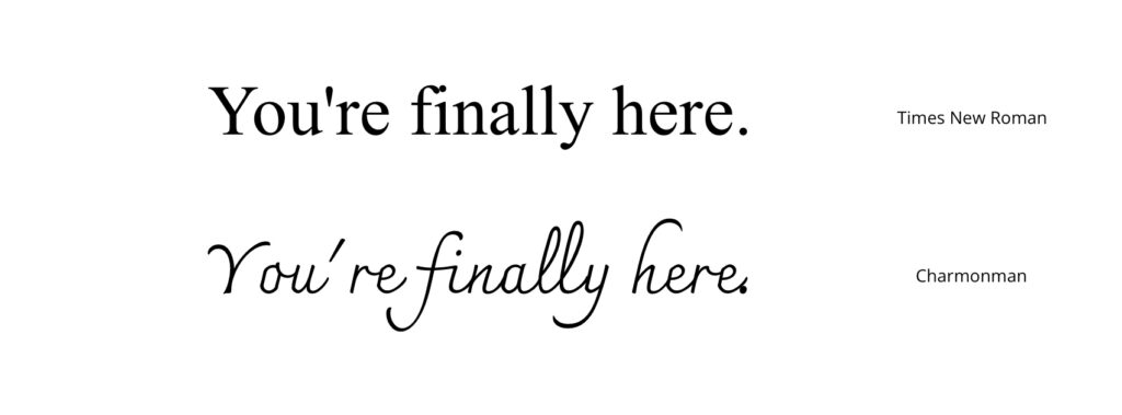
The Evolution of Digital Typography and Readability Standards
The history of screen-based typography has evolved rapidly from the low-resolution limitations of the 1980s to the high-density retina displays of the modern era. Early digital interfaces were constrained by pixel-based fonts like Courier or Times New Roman, which were designed primarily for print. The transition to the web required a fundamental shift toward sans-serif typefaces, which offered superior clarity at smaller point sizes on low-density monitors.
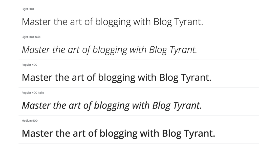
As of 2024, the industry standard for web readability has coalesced around several high-performance typefaces that prioritize x-height—the height of lowercase letters relative to uppercase letters—and generous character spacing. These attributes are critical for maintaining legibility across responsive layouts that must transition seamlessly from desktop monitors to handheld mobile devices.
Top-Tier Typefaces for Modern Web Architecture
The following selection of fonts represents the industry benchmarks for balancing aesthetic versatility with technical performance.
- Open Sans: Developed by Steve Matteson and released in 2010, Open Sans has become a staple of modern web design. Its neutral, friendly appearance is characterized by an upright stress and open forms. With over 1.5 trillion annual views, it remains one of the most widely deployed fonts in the WordPress ecosystem.
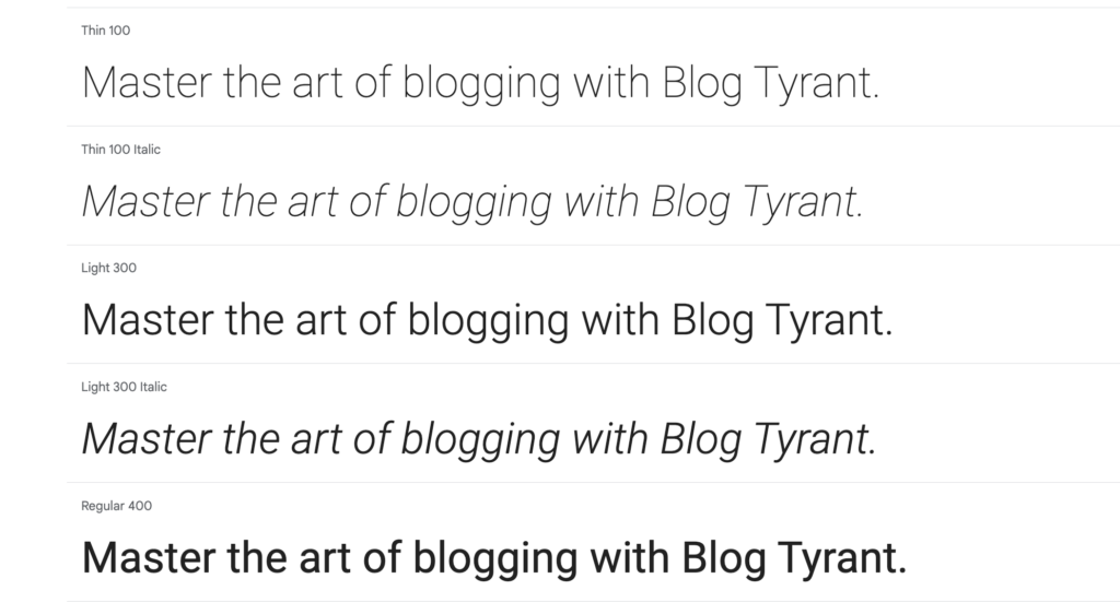
- Roboto: Created as the system font for Android, Roboto is a "neo-grotesque" sans-serif. Its geometric structure combined with friendly, open curves allows it to maintain legibility even when rendered on smaller, high-density smartphone screens.
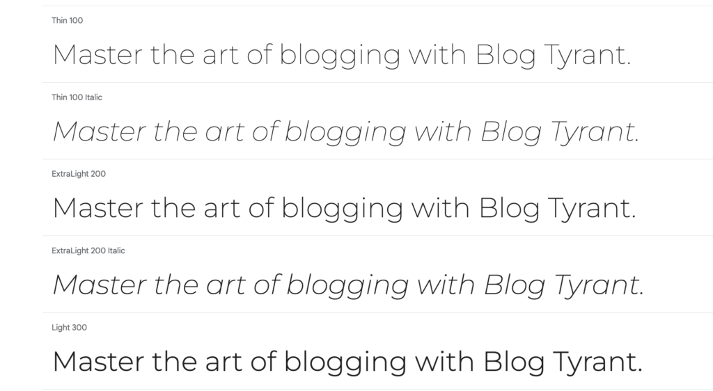
- Montserrat: Inspired by the urban signage of Buenos Aires, this geometric sans-serif offers a modern, sophisticated aesthetic. Its large x-height makes it particularly effective for high-impact headings and editorial-style blog layouts.
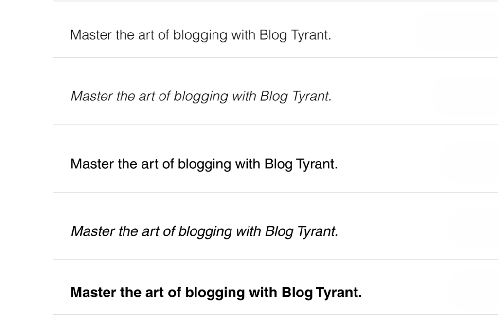
- Helvetica: Often cited as the gold standard of typography, Helvetica’s influence spans decades. Its objective, no-frills design has been adopted by global entities including NASA and BMW. It remains the preferred choice for publishers seeking a timeless, professional appearance.
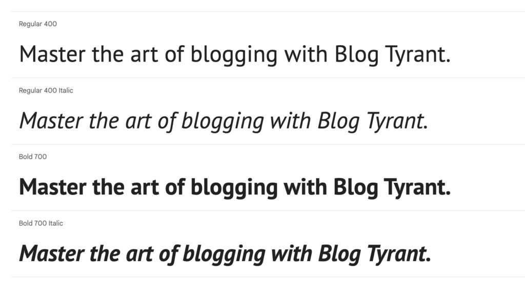
- PT Sans: Commissioned by the Russian Federation, this font family provides an excellent balance between traditional and modern proportions. It is specifically optimized for user interfaces, making it ideal for blogs with extensive navigation menus and sidebars.
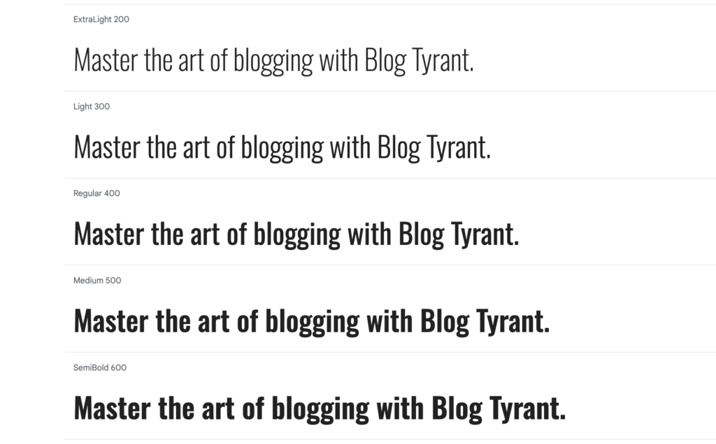
- Oswald: Designed to serve as a modern interpretation of the "Alternate Gothic" style, Oswald is compressed and bold. It is highly recommended for headers and call-to-action buttons where capturing immediate user attention is paramount.
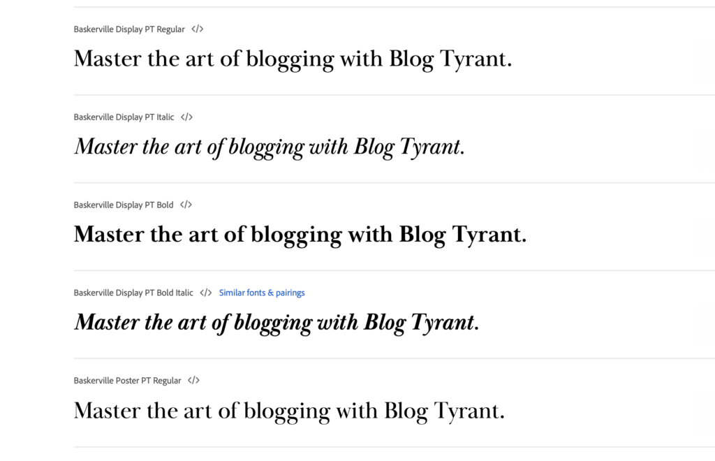
- Baskerville PT: For long-form content, serif fonts like the Baskerville evolution offer a traditional reading experience. The typeface maintains a high degree of readability due to its high contrast between thick and thin strokes, suitable for high-end lifestyle or literary blogs.
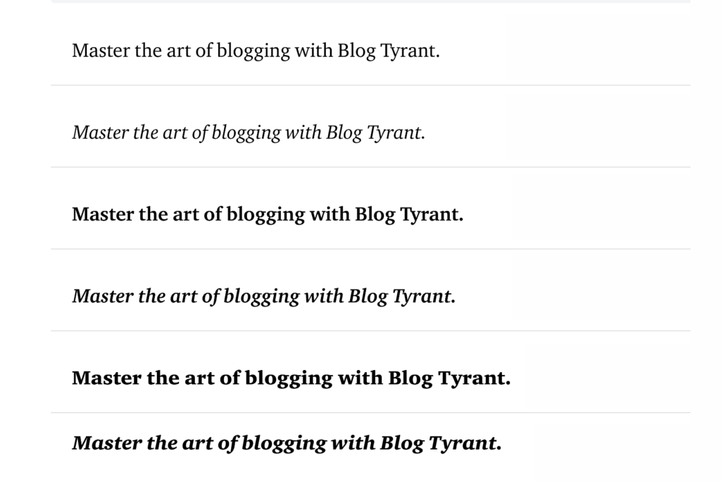
- Charter: Designed by Matthew Carter in 1987, Charter remains a marvel of technical design. Originally engineered for low-resolution output, it translates perfectly to the screen, providing a sophisticated, classic feel without sacrificing clarity.
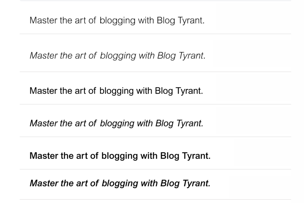
- Arial: Despite its ubiquity, Arial remains a highly functional choice. Its design is based on the humanist tradition, ensuring that it is legible across nearly every browser and device combination in existence.
- Raleway: An elegant, thin-stroke font that is popular in luxury branding. Its distinctive character shapes, such as the unique ‘W’ and ‘g’, provide a bespoke feel for creative portfolios and fashion-focused blogs.
- Lato: Designed by Łukasz Dziedzic, Lato is categorized as a "humanist" sans-serif. It feels warm and approachable in body text while appearing sharp and structured in headlines.
- Ubuntu: Developed for the Ubuntu operating system, this font was specifically crafted to represent a unique brand identity. Its open, airy nature makes it exceptionally easy to read in long-form paragraphs.
- Inter: Currently the industry standard for UI/UX design, particularly within the Figma community. It features an optical sizing axis that adjusts automatically to different font sizes, ensuring maximum clarity in both headings and micro-copy.
Technical Implementation and Best Practices
For website administrators, the integration of these fonts requires careful consideration of performance. Loading excessive font weights or styles can significantly increase a website’s Largest Contentful Paint (LCP) time, a core metric monitored by search engine algorithms.
Integration Strategy:
The industry-standard approach for WordPress users involves utilizing font-loading plugins that support local hosting. By hosting fonts locally rather than relying on external calls to services like Google Fonts, administrators can reduce the number of DNS lookups, thereby improving site speed.
Chronology of Implementation:
- Audit Phase: Evaluate current font usage and identify any redundant weights (e.g., loading both "400" and "500" weights when only one is necessary).
- Optimization: Implement a "subsetting" strategy, where only the required character sets (typically Latin) are loaded, significantly reducing file size.
- Deployment: Use CSS
font-display: swap;to ensure that text remains visible during the font loading process, preventing layout shifts.
Analysis: The Impact on SEO and User Retention
The relationship between font choice and SEO is indirect but potent. While Google’s algorithms do not explicitly penalize a site for using "ugly" fonts, they do penalize sites that provide a poor user experience. According to data from the Web Vitals initiative, sites that suffer from slow loading times—often caused by bloated font files—experience higher bounce rates.
Furthermore, accessibility compliance is a legal and ethical requirement. Fonts with low contrast ratios or poor character differentiation (e.g., confusing ‘1’, ‘l’, and ‘I’) can alienate readers with visual impairments. Choosing fonts that adhere to the Web Content Accessibility Guidelines (WCAG) ensures that a broader audience can engage with the content.
Future Outlook for Web Typography
As display technology continues to advance, the next frontier in web typography is variable fonts. Unlike traditional font files, which require a separate file for every weight and style, variable fonts allow a single file to contain the entire range of weights and widths. This technology promises to reduce site latency while offering designers unprecedented control over typography.
For the modern blogger, the strategy is clear: prioritize readability and technical efficiency. By selecting from the established fonts listed above and adhering to performance-oriented implementation practices, site owners can ensure that their content is not only visually compelling but also optimized for the rigorous demands of the contemporary digital ecosystem.