The CSS translateZ() function is a powerful tool for web developers seeking to imbue their designs with a sense of three-dimensional space. By shifting an element along the Z-axis, this function allows for the creation of depth, making elements appear closer to or farther away from the viewer. However, its effectiveness is intrinsically linked to the presence of either the perspective() function or the perspective property, without which translateZ() has no visual impact. This article delves into the mechanics, applications, and performance implications of translateZ(), offering a comprehensive guide for understanding and implementing this key CSS transform.
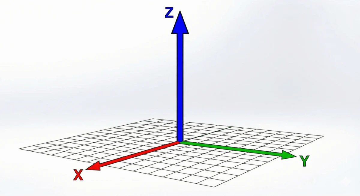
At its core, translateZ() manipulates an element’s position in a virtual three-dimensional space. Unlike standard 2D transformations that only alter an element’s position along the X and Y axes (width and height), translateZ() introduces movement along the Z-axis, representing depth. This means an element can be moved towards the viewer or away from them. For instance, applying transform: translateZ(100px); to an element will pull it 100 pixels closer to the user. Conversely, transform: translateZ(-50px); would push it 50 pixels further away.
The fundamental requirement for translateZ() to render any visible effect is the establishment of a perspective. This is achieved through either the perspective() CSS function, which is applied as part of a transform, or the perspective CSS property, which is typically set on a parent element. Without this crucial context, the browser has no framework to interpret the Z-axis movement, and the element will remain visually static despite the applied transform.
Understanding the Mechanics: How translateZ() Works
The subtlety of translateZ() lies in the fact that browsers, by default, render content on a two-dimensional plane. The concept of depth is not inherently present in how web pages are displayed. When an element is moved along the Z-axis, it doesn’t actually change its pixel dimensions. Instead, its perceived size changes due to the principles of perspective projection. An element moved closer to the viewer appears larger, while an element moved farther away appears smaller. This is analogous to how objects in the real world appear larger when they are near and smaller when they are distant.
Consider a scenario where a .box element is styled with transform: translateZ(100px); on hover, within a container that has perspective: 500px;. When the user hovers over the box, it moves 100 pixels closer to the viewer. This proximity, within the established perspective, causes the box to appear larger on screen. It’s crucial to differentiate this effect from the scale() function or property, which directly alters an element’s dimensions. translateZ() creates an illusion of size change by manipulating perceived distance, not actual size.
The translateZ() function is formally defined in the CSS Transforms Module Level 2 specification, a testament to its role in advancing CSS capabilities for creating richer visual experiences. The syntax is straightforward: translateZ(<length>), where <length> can be a positive or negative value expressed in various CSS units, such as pixels (px), ems (em), rems (rem), or viewport units.
Key Concepts: Perspective, Transform-Style, and Projection
To effectively utilize translateZ(), understanding the interplay between perspective, transform-style, and the concept of projection is essential.

-
Perspective Property: This property is applied to a parent element and defines the strength of the vanishing point for all its 3D-transformed children. A smaller
perspectivevalue creates a more dramatic, foreshortened effect, while a larger value results in a subtler, more realistic perspective. For example, setting.scene perspective: 800px;establishes a viewing distance of 800 pixels from the Z=0 plane. -
Perspective() Function: This function can be applied directly within a
transformdeclaration to an individual element. It sets the perspective for that specific element and its descendants. It’s important to note that theperspective()function must appear before other 3D transform functions within thetransformproperty to have the intended effect. -
Transform-Style: Preserve-3d: For child elements to be positioned and transformed in a 3D context, their parent element must have its
transform-styleproperty set topreserve-3d. This property signals to the browser that the element’s children should be rendered in a 3D space, rather than being flattened onto the parent’s 2D plane.
Illustrative Example: Building a 3D Scene
Consider a simple HTML structure:
<div class="scene">
  <div class="parent">
    <div class="box">translateZ(100px)</div>
  </div>
</div>
To make the translateZ() function visible, we would apply the following CSS:
.scene
  perspective: 800px; /* Establishes the viewing perspective */


.parent
  transform-style: preserve-3d; /* Enables 3D transformations for children */


.box
  transform: translateZ(100px); /* Moves the box 100px closer */
In this setup, the .scene provides the overall perspective. The .parent ensures that its child, .box, can exist and be transformed in 3D. When the .box is translated 100px forward, it appears larger because it is closer to the viewer. Rotating the .parent element to the side would reveal that the .box itself hasn’t grown in size, but rather its distance from the .parent has increased, leading to the perceived size change.
Perspective vs. Perspective(): A Nuanced Distinction
Both the perspective property and the perspective() function serve the same fundamental purpose: defining the projection of a 3D scene. However, their application differs:
-
perspectiveProperty: This is applied to a container element and sets the perspective for all its 3D-transformed descendants. It offers a global perspective for a whole scene or section of a page.
-
perspective()Function: This is applied directly within thetransformproperty of a specific element. It allows for granular control over the perspective applied to that individual element and its children. Crucially, for theperspective()function to work correctly, it must be the first transform function listed within thetransformproperty. For example,transform: perspective(800px) translateZ(100px);is correct, whiletransform: translateZ(100px) perspective(800px);will not yield the desired result.
Performance Optimization: The translateZ(0) Hack
Beyond its aesthetic applications, translateZ() plays a significant role in optimizing web performance, particularly in animations and transitions. Modern browsers often leverage the Graphics Processing Unit (GPU) for rendering complex visual effects. CSS 3D transforms, including translateZ(), are designed to be hardware-accelerated, meaning they are processed by the GPU, which is significantly faster and more efficient for graphical tasks than the Central Processing Unit (CPU).
Developers can strategically employ translateZ(0) to force an element’s rendering onto the GPU. By applying this seemingly innocuous transformation, an element is essentially pushed to a new rendering layer that is handled by the GPU. This can dramatically improve performance by offloading rendering tasks from the CPU, leading to smoother animations, reduced flickering, and a more responsive user interface. This technique is particularly valuable when dealing with complex animations, frequent repaints, or when experiencing performance bottlenecks on less powerful devices.
The rationale behind this optimization is that elements rendered on the GPU are often treated as separate entities that can be manipulated more efficiently without impacting the rest of the page’s rendering on the CPU. This isolation helps prevent cascading repaints and reduces the computational overhead associated with animating elements that would otherwise be handled by the CPU.
Browser Support and Future Outlook
The translateZ() function, along with other CSS 3D transform capabilities, enjoys widespread support across all modern web browsers. This robust compatibility ensures that developers can confidently implement 3D effects without significant concerns about cross-browser compatibility issues. The ongoing evolution of CSS, particularly with the advancements in animation and 3D capabilities, continues to empower designers and developers to create increasingly immersive and interactive web experiences.
As the web evolves, the demand for more sophisticated visual presentations will undoubtedly grow. Features like translateZ() are foundational to achieving these goals, enabling designers to move beyond flat interfaces and embrace the possibilities of depth, dimension, and dynamic visual storytelling. The ability to manipulate elements in three-dimensional space opens up new avenues for user engagement, from intricate product showcases to engaging educational content.
Conclusion
The CSS translateZ() function is a vital component in the toolkit of any modern web developer. It provides a straightforward yet powerful means to introduce depth and dimension into web designs. By understanding its relationship with perspective, transform-style, and the nuances of projection, developers can create visually compelling experiences. Furthermore, the performance optimization benefits of translateZ(0) offer a practical solution for enhancing the responsiveness and smoothness of web applications. As browser support remains strong and the CSS specifications continue to evolve, translateZ() will undoubtedly remain a cornerstone for building the next generation of engaging and performant web interfaces.