The landscape of web development and cascading style sheets (CSS) continues to evolve at a rapid pace, marked by a wave of innovative proposals, progressive enhancements, and specification updates designed to streamline user interface design. Over the past few weeks, frontend engineers, specification authors, and browser vendors have introduced a series of groundbreaking features—ranging from intelligent tooltip behaviors and custom syntax highlighters to advanced grid data extraction and native layout balancing. These developments collectively signal a concerted effort by the web standards community to solve long-standing layout and interaction challenges with native platform solutions rather than heavy JavaScript frameworks.
Interactive Micro-Interactions: Delayed Tooltips and Interest Invokers
User experience design frequently grapples with the delicate balance of making interactive elements discoverable without overwhelming the user through accidental triggers. Addressing this common interface hurdle, developer Abhishek Jakhar recently outlined the structural necessity of implementing delayed-then-instant tooltip behaviors. In traditional web design, tooltips often activate immediately upon cursor hover, creating visual clutter when a user rapidly sweeps their mouse across a dense navigation bar or dashboard.
Jakhar demonstrated how to engineer a system where a deliberate hover duration is required before a tooltip appears, but subsequent tooltips disappear instantly while the user navigates between related elements. Expanding on this concept, developer Chris Coyier introduced a modern, standards-based implementation leveraging experimental web platform features known as interest invokers. Utilizing specialized CSS properties such as interest-delay-start and interest-delay-end, this approach allows developers to natively manage hover intent. Although browser support for interest invokers is currently limited to Google Chrome, the technique serves as a prime example of progressive enhancement, ensuring that foundational accessibility remains intact while cutting-edge browsers gain optimized native performance.
Advancements in Native APIs: The <geolocation> HTML Element
As part of an ongoing industry-wide initiative to simplify complex JavaScript APIs into declarative HTML elements, the web platform has turned its attention toward location services. Historically, integrating the Geolocation API has required managing intricate asynchronous JavaScript calls, handling frustrating permission states, and bridging gaps between diverse hardware signals such as GPS satellites, Wi-Fi networks, and cellular triangulation towers.
To mitigate these complexities, browser vendors and standards groups have begun experimenting with the <geolocation> HTML element. While this native element successfully abstracts much of the underlying imperative logic, it introduces distinct platform constraints, notably regarding strict styling restrictions enforced by user agents. Because cross-browser adoption is currently restricted to Chrome, industry experts have published integration strategies that combine the declarative <geolocation> tag with legacy fallback methods. This dual-approach methodology enables modern development teams to safely adopt upcoming HTML primitives today without alienating users on non-supporting browsers.
Syntax Highlighting and the Custom Highlight API
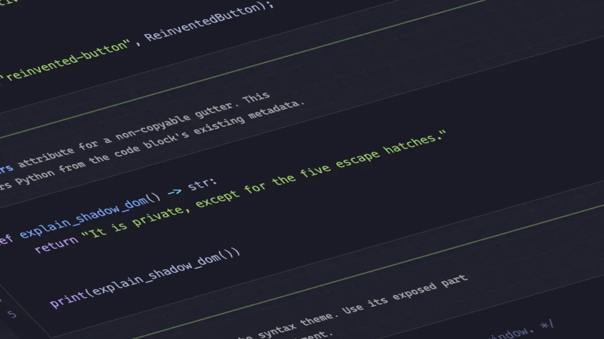
The introduction of the CSS Custom Highlight API has fundamentally shifted how developers approach text styling and content inspection within the browser. Breaking away from traditional, DOM-heavy syntax highlighters that inject hundreds of individual span elements into the Document Object Model, Dave Rupert unveiled MicroLighter—a lightweight syntax highlighter built directly on top of the ::highlight() pseudo-element.

By offloading the visual styling of code blocks entirely to the rendering engine without altering the underlying text nodes, MicroLighter drastically reduces memory consumption and improves execution speeds on large documents. Industry analysis suggests that the widespread adoption of the Custom Highlight API will soon phase out the need for third-party JavaScript parsing libraries in routine documentation sites, blogs, and developer tools, representing a significant win for overall web performance and maintainability.
Extracting Layout Metrics: CSS Grid Variables and Hover Proximity
For years, retrieving structural layout metrics—such as the exact number of active rows, columns, or precise cell coordinates—required complex JavaScript layout calculations using getBoundingClientRect() or programmatic DOM measurements. Layout expert Temani Afif challenged this paradigm by demonstrating advanced techniques for piping CSS Grid information directly into CSS custom properties.
By leveraging modern CSS architectural patterns, developers can now expose grid metrics natively within stylesheets, provided that grid tracks maintain relative consistency. Afif further illustrated the practical applications of this capability by developing a responsive hover proximity detection system entirely in CSS. By calculating spatial relationships through custom properties, interfaces can dynamically alter visual states based on the cursor’s proximity to specific grid cells, opening up entirely new avenues for organic, physics-inspired UI design without a single line of layout-tracking JavaScript.
Design System Decisions: The Dark Mode Debate
The architectural implementation of dark mode themes continues to generate robust discussion within the frontend engineering community. As modern web applications increasingly shift toward sophisticated preference handling, developers are divided on whether to implement a binary two-state toggle (light versus dark) or a comprehensive tri-state system (light, dark, and system-default synchronization).
While prominent CSS authority Lea Verou advocates for streamlined two-state user experiences, fellow web developer Bramus has made a vocal case for tri-state toggles that explicitly give users absolute control over system inheritance. Concurrently, alternative architectural patterns such as the "auto-until-overridden" two-state model—documented by platform contributors like Vale.Rocks—have gained traction. This hybrid methodology automatically respects the operating system’s global preference by default, but seamlessly locks into the user’s manual override choice upon interaction, striking a practical balance between automated user experience and explicit user agency.
Emerging Selectors and Rules: Class Prefix Selectors and named-feature()
The CSS specification pipeline has also advanced several high-impact proposals aimed at reducing stylesheet verbosity and enhancing feature detection capabilities. Bramus introduced the concept of the class prefix selector, a concise syntax designed to target multiple classes matching a specific naming convention using a wildcard affix, such as .something-*.
Historically, developers wishing to target groups of classes sharing a common prefix had to rely on performance-heavy attribute selectors—such as [class^="something-"] or [class*=" something-"]. These attribute selectors force the browser to perform expensive string-matching operations across the DOM. The proposed class prefix selector offers a cleaner, syntactically superior, and computationally optimized alternative that browser engine maintainers anticipate will significantly improve selector matching performance once standardized.

Complementing this selector update is the introduction of the @supports named-feature() function. While traditional @supports queries are exceptional at checking property-value pairs, they have historically struggled to detect highly specific browser behaviors, such as whether a rendering engine correctly applies transforms to anchor-positioned elements. The named-feature() function extends the capability of conditional CSS rules, allowing developers to query nuanced browser capabilities directly within stylesheets and apply defensive styling strategies with surgical precision.
Layout Refinement: Balancing Flexbox Items
Rounding out recent platform updates, Google Chrome has introduced support for flex-wrap: balance. Drawing inspiration from the popular text-wrap: balance property—which automatically distributes text evenly across multiple lines to prevent awkward, ragged line breaks—the new flexbox balancing rule applies identical logic to multi-row or multi-column flexible box layouts.
Authored and documented by layout specialists like Ahmad Shadeed, flex-wrap: balance addresses a long-standing aesthetic issue in responsive design where the final row of a wrapped flex container contains a single, isolated item while preceding rows are fully saturated. By instructing the layout engine to automatically equalize the distribution of items across all generated lines, developers can achieve visually harmonious component grids without resorting to hardcoded widths or complex media queries.
Broader Industry Implications and Outlook
The cumulative impact of these diverse updates highlights a maturing web ecosystem where the boundaries between layout, logic, and presentation continue to blur in favor of native platform capabilities. By shifting responsibilities traditionally handled by external JavaScript libraries back into the CSS engine and HTML specification—such as syntax highlighting, grid metric extraction, and item balancing—the web development community is witnessing a tangible reduction in client-side computational overhead.
As browser vendors continue to experiment with progressive enhancements like interest invokers, native geolocation tags, and advanced conditional rules, frontend engineers are equipped with an increasingly powerful toolkit. These advancements underscore a collective industry movement toward cleaner, faster, and more maintainable codebases as the web platform transitions into its next major evolutionary phase.