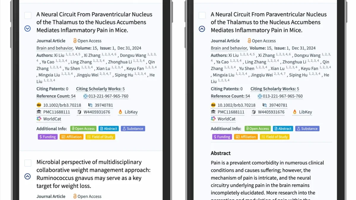
In the realm of digital user interface design, the accordion—a vertically stacked list of headers that can be clicked to reveal or hide associated content—serves as a cornerstone for managing dense information. However, recent usability research has highlighted a recurring friction point: the inconsistent use of icons intended to signify expansion and collapse. Data from the Nielsen Norman Group (NN/g) underscores that the choice of visual signifier is not merely an aesthetic decision, but a critical factor in user behavior, navigation efficiency, and overall site accessibility.
The Evolution of UI Signifiers and User Expectations
For over a decade, web designers have experimented with various symbols to denote interactivity within menus. The evolution of these icons began with simple text-based cues, eventually moving toward the widespread adoption of chevrons, arrows, and plus signs. Historically, the intent behind these icons was to provide a visual shortcut for users to anticipate content behavior. However, the lack of standardization has led to a fragmented user experience.
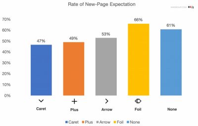
Recent longitudinal studies indicate that users possess deeply ingrained mental models regarding how specific icons should behave. For instance, when a user encounters a navigation menu devoid of any icon, the primary expectation is that the label functions as a direct hyperlink to a new page. When designers introduce ambiguous icons—such as custom graphic shapes or inconsistent symbols—this mental model is disrupted, leading to increased latency as users hesitate to determine the result of their interaction.

Analyzing the Data: Why the Caret Remains the Gold Standard
The NN/g research, which involved controlled testing of thousands of interaction patterns, revealed that the caret (a simple triangle pointing down or to the side) is the most reliable indicator for accordion functionality. Unlike the plus sign (+), which often carries secondary connotations in e-commerce—such as "add to cart" or "zoom in"—the caret is almost exclusively associated with hierarchical expansion.
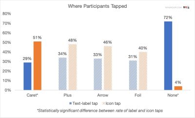
Statistical analysis from these tests shows that when a caret is utilized, the user’s propensity to click the icon specifically increases. This is significant because, in many poorly designed interfaces, users distinguish between the "label" (which they assume is a link) and the "icon" (which they assume is an expander). When a clear, universally understood icon like the caret is used, it solidifies the entire container as a cohesive interactive element, reducing the likelihood of "split-action" confusion.
The Perils of Split-Button Architectures
A growing concern in modern web architecture is the implementation of "split-menu" patterns, where the text label of an accordion header is mapped to a destination URL, while the accompanying icon is mapped to an expansion function. UX researchers have categorized this as a "high-friction" design pattern.
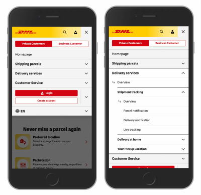
From a technical standpoint, the split-button approach forces the user to perform a precision-based interaction. If the user misses the specific hit area of the icon, they are inadvertently navigated away from their current page. This creates a cascade of negative user experiences: lost context, interrupted workflows, and frustration. Modern standards suggest that if a category contains sub-pages, the most effective approach is to ensure that the header itself controls the expansion, and a secondary "View All" or "Overview" link is provided within the revealed content. This design choice, adopted by global leaders in logistics and e-commerce, such as DHL, ensures that navigation remains predictable and failure-proof.

Chronology of Icon Misinterpretation
The shift in design trends can be traced through the following phases:
- The Early Web (1995–2005): Reliance on text labels and simple hyperlink colors. Navigation was linear, and "accordions" were rarely used due to technical limitations in browser rendering.
- The Dynamic Era (2006–2015): The rise of jQuery and early JavaScript frameworks allowed for the proliferation of the "plus/minus" toggle. While functional, it introduced ambiguity, as these symbols were also utilized for mathematical operations and file management.
- The Modern Standardization (2016–Present): With the dominance of mobile-first design, space became a premium. The industry began moving toward the caret as a cleaner, more efficient, and less "noisy" alternative to arrows and plus signs.
Implications for Accessibility and Cognitive Load
Beyond mere preference, the choice of icon has profound implications for users with cognitive impairments or those utilizing assistive technologies. Overloaded symbols—such as arrows that signify scrolling, pagination, or expansion depending on their orientation—increase the cognitive load on the user. When a user must mentally decode the specific meaning of an arrow based on its context within a layout, the efficiency of the interface drops.
Furthermore, the practice of underlining text to indicate a link remains the most accessible standard for the web. By reserving underlines for navigation and carets for expansion, designers create a clear, semantic distinction that screen readers and users with visual impairments can parse with higher accuracy.
Strategic Recommendations for Designers
The consensus among usability experts is to prioritize clarity over novelty. The following guidelines represent the current industry best practices:
- Prioritize the Caret: Use a downward-pointing caret (▼) for collapsed states and a right-facing or upward-pointing caret for expanded states.
- Avoid Icon Overload: Do not use arrows or symbols to signify that a link is a link. The standard blue, underlined text remains the most recognizable indicator of a destination URL.
- Eliminate Split Actions: Avoid mapping different interactions to the text and the icon within the same header. If a header must be a link, make the entire header a link and utilize a separate, clearly marked UI component for navigation if needed.
- Consistency is Key: Ensure that the interaction pattern is uniform across the entire site. If an accordion behaves differently on the landing page than it does in the support center, the user’s learned behavior is invalidated.
Broader Impact on Digital Infrastructure
The movement toward simplified, standardized icons is part of a larger trend in "inclusive design." As the web becomes the primary interface for essential services—ranging from government portals to logistics and finance—the cost of poor design is no longer just a minor annoyance; it is a barrier to information.
Large-scale enterprise platforms, such as those analyzed in recent studies, have found that by simplifying their navigation icons, they observed a measurable decrease in "pogo-sticking"—a behavior where users navigate to a page, realize it was not their intent, and immediately click the back button. By adhering to established psychological conventions, designers can create interfaces that feel intuitive even to first-time visitors.

Concluding Insights
The debate over accordion icons is emblematic of a broader professional realization: the most successful design is often the one that disappears. When an interface follows established user expectations, the technology becomes invisible, allowing the user to focus entirely on the content. While the creative impulse to design "unique" or "modern" icons is strong, the data suggests that for the sake of utility and accessibility, the standard caret remains the most powerful tool in the designer’s arsenal.
As web standards continue to evolve, the focus must remain on the user’s journey. Whether it is a scholarly search engine or a global logistics platform, the principles of clear signaling, logical interaction hierarchies, and the removal of unnecessary cognitive friction remain the defining markers of high-quality digital product design. By stripping away redundant arrows and avoiding complex, multi-action menus, designers can contribute to a more stable, accessible, and user-centric web environment.