The evolution of responsive web design has reached a critical juncture, yet a significant gap persists between modern browser capabilities and developer adoption. Despite achieving over 94% browser support, CSS Container Queries remain underutilized by the vast majority of the web development community. According to the 2025 State of CSS survey, while 86% of developers are aware of the technology, only 41.4% have integrated it into their workflows. This discrepancy highlights a fundamental misunderstanding in the industry: the tendency to treat container-based styling as a direct, interchangeable alternative to media queries rather than a distinct architectural paradigm.
The Chronology of Responsive Design
To understand the current state of adoption, one must look at the history of web layout. Media queries were introduced as part of the CSS3 specification, providing a mechanism to adjust page layouts based on the characteristics of the viewport—primarily width. For over a decade, this has served as the industry standard for "macro-layout" design, where developers define styles based on the width of the user’s browser or device screen.
However, as the complexity of web applications grew, the limitations of this "viewport-centric" approach became apparent. By the time CSS Container Queries were first proposed, the industry had spent years relying on "hacks" and JavaScript-based observers to force components to adapt to their immediate surroundings. The formal specification for Container Queries arrived to address this exact frustration, yet the transition has been slow. While experts like Kevin Powell have noted that adoption has been historically low, the shift is necessary to support modern, component-based frameworks like React, Vue, and Svelte, where components are intended to be portable and self-contained.
Viewport vs. Container: A Fundamental Distinction
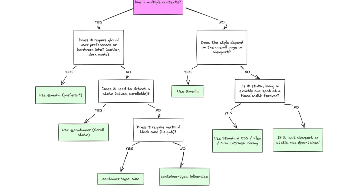
The core technical divide lies in the difference between external and internal observation. Media queries are, by definition, "dumb" observers of the global environment. When a developer writes a media query, they are instructing the browser to monitor the global viewport size. If a developer places a card component inside a grid layout that occupies only a fraction of a wide screen, a media query will still fire based on the 1920px screen width, potentially causing the component to expand or distort in a space that was meant to be narrow.
Container queries shift this focus inward. By defining a parent element with container-type: inline-size, developers grant the browser the ability to monitor the internal dimensions of that specific parent. The logic changes from "Is the screen wide?" to "Is the container holding this component wide enough to support this layout?" This transition is essential for building modular, reusable design systems.
Supporting Data and Market Fragmentation
The argument for adopting container queries is bolstered by the extreme fragmentation of modern hardware. Current industry data indicates there are over 2,300 unique viewport sizes actively accessing the web. Relying on hard-coded breakpoints for such a diverse range of devices is mathematically unsustainable. When developers attempt to accommodate these 2,300 variations using traditional media queries, they inevitably create "magic numbers" in their CSS that lack context.
Container queries provide a solution by decoupling the component from the page structure. When a component is self-aware of its own container’s dimensions, it behaves consistently whether it is placed in a main content area, a sidebar, or a narrow modal window. This is not merely a stylistic preference; it is a structural improvement that enhances the long-term maintainability of large-scale codebases.

Implementation Challenges and Technical Nuances
The reluctance to adopt container queries is often tied to the learning curve associated with their side effects. Developers frequently encounter issues such as the "infinite loop" problem, where an element attempts to query its own size, or layout collapses when container-type: size is used without an explicit height.
- Self-Querying Limitations: A container cannot query itself. To apply styles based on a container’s size, there must be a parent-child relationship. This requires developers to restructure their markup to include a wrapper element.
- Layout Collapse: When using
container-type: size, the browser calculates the container’s height independent of its children. Without explicit height declarations, the container may collapse to 0px, breaking the layout. - Custom Property Restrictions: At present, container queries cannot directly consume custom CSS properties (variables) for their breakpoints. This restriction exists to prevent circular dependencies that could destabilize the browser’s rendering engine.
Despite these caveats, the consensus among front-end engineers is that the benefits of encapsulation far outweigh the initial complexity of refactoring legacy components.
Macro-Layouts vs. Micro-Layouts
A professional framework for modern web development distinguishes between macro and micro layouts. Media queries remain the optimal tool for "macro" layout decisions—global changes such as shifting from a mobile header to a desktop navigation, adjusting page-wide grid structures, or reacting to system-level settings like prefers-color-scheme.
Conversely, container queries are the designated tool for "micro" layouts. Any component that is expected to live in multiple contexts—cards, widgets, buttons, and input groups—should ideally use container queries. By treating these as two separate domains of influence, developers can build interfaces that are both globally responsive and locally intelligent.

Future Implications for Web Standards
The ongoing integration of container style queries, currently in experimental phases, suggests that the CSS working group intends to push this technology further. By allowing developers to query not just size, but also computed styles, the web is moving toward a more declarative and responsive future.
The industry currently stands at a crossroads. As documentation and educational resources for container queries proliferate, the barrier to entry is lowering. The goal is not the total abandonment of media queries, but rather the strategic application of the right tool for the right scope. For the modern developer, the transition to container-aware components represents the next step in the professionalization of CSS, moving away from brittle, screen-dependent code toward a more robust, component-based future.
In conclusion, the data is clear: the web is too fragmented to rely on viewport-based logic alone. By acknowledging the distinct roles of media and container queries, developers can resolve long-standing issues with component deformation and maintenance. The transition requires a shift in mindset—from viewing the browser as a flat screen to viewing it as a nested hierarchy of containers—but the resulting stability and flexibility are the hallmarks of a mature, professional-grade web architecture.