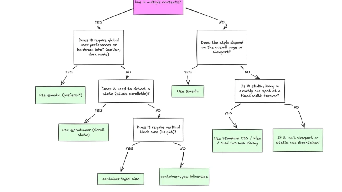
The evolution of responsive web design has reached a critical juncture where the traditional reliance on viewport-based breakpoints is increasingly viewed as an architectural bottleneck. Despite widespread browser support for CSS Container Queries—which currently stands at approximately 94% according to global compatibility metrics—adoption remains paradoxically low. Recent data from the 2025 State of CSS survey indicates that while 86% of web developers are cognizant of the feature, only 41.4% have integrated it into their production environments. This disconnect between capability and implementation highlights a fundamental misunderstanding of the CSS specification and its role in modern component-driven development.
The Historical Context of Responsive Design
To understand why container queries are currently underutilized, one must examine the origins of responsive design. When Ethan Marcotte introduced the concept in 2010, the web was dominated by a relatively small array of screen sizes. Media queries, introduced in the CSS3 specification, provided a mechanism for developers to query the browser’s viewport—the "macro" environment—to adjust layout structure.
For over a decade, this has been the industry standard. However, the rise of component-based architecture (via frameworks like React, Vue, and Angular) created a conflict: developers began building highly modular components that were intended to be reused across different parts of an application. A "card" component designed for a main content area might suddenly be placed into a narrow sidebar. Under the traditional media query model, the card remains unaware of its new, smaller environment, often resulting in layout breakage, overflow, or "cramped" aesthetics.

The Shift from Viewport to Container
The introduction of Container Queries represents a paradigm shift. Rather than asking the browser, "How wide is the screen?" the developer asks, "How much space is available for this specific component?" This is achieved through the container-type and container-name properties. By defining a parent element as a container, child elements can query the parent’s dimensions.
The technical distinction is subtle but profound. Media queries are global, while container queries are local. This locality is what allows for true, context-aware components. When a component is self-contained, its layout logic is decoupled from the global page structure. This prevents the "magic number" problem, where developers define arbitrary pixel-based breakpoints (e.g., 768px for tablets) that fail to account for the actual content density within a component.
Data and Industry Adoption Trends
The reluctance to adopt container queries is not born of a lack of interest, but rather a lack of clarity regarding their practical application. Industry experts, including prominent web developer Kevin Powell, have noted that the "terrible" adoption rate is an anomaly given that "container-aware components" have topped developer wishlists for years.
The fragmentation of the web landscape exacerbates this issue. With over 2,300 unique viewport sizes currently in circulation, attempting to manage layout via global media queries is statistically unsustainable. Each unique device environment introduces potential edge cases that a static, viewport-centric design system cannot easily reconcile. By contrast, container queries allow for a "micro-layout" approach, where the component adapts autonomously, regardless of the screen size of the device.

Implementation Challenges and Technical Nuances
While the benefits are clear, the transition to container-based architecture requires a departure from legacy coding habits. The primary point of confusion lies in the syntax, which mirrors media queries closely enough to lead developers into a "false sense of familiarity."
There are three primary technical considerations that distinguish the two:
- Parent-Child Dependency: A container cannot query its own dimensions, as this would create an infinite circular dependency. Developers must ensure that a wrapper element acts as the container, with the component residing as a descendant.
- Size vs. Inline-Size: Querying a container’s full
size(which includes block/vertical dimensions) can lead to layout collapse if the container is not given an explicit height. The industry standard, therefore, is to prioritizeinline-size(horizontal width) to maintain layout stability. - Variable Limitations: Unlike media queries, container queries cannot currently resolve custom CSS properties (variables) within their conditions. Because custom properties cascade and can be modified by the very queries that might rely on them, the CSS Working Group has placed strict limitations on their use to prevent performance-heavy recalculation loops.
Future Implications for Web Architecture
The implications for the broader web ecosystem are significant. As design systems continue to mature, the focus is shifting toward "atomic" design—creating small, reusable units of interface. Container queries serve as the final piece of the puzzle for these systems, enabling developers to build truly modular libraries that are not "aware" of the global page state.
From a performance standpoint, this shift reduces the complexity of global CSS files. Instead of massive, nested media query blocks that span hundreds of lines, developers can encapsulate layout rules within the component’s own style definition. This leads to cleaner, more maintainable codebases that are less prone to side effects when new features or layouts are added to a site.

Furthermore, the emergence of "Container Style Queries"—an experimental feature—suggests that the industry is moving toward a future where components can respond not just to the size of their environment, but to the state of it. This could eventually allow for components that change appearance based on the computed styles of their parents, such as a component automatically adjusting its contrast or typography based on the background color of the parent container.
Conclusion
The slow adoption of CSS Container Queries is a temporary hurdle in the history of web development, rooted in the comfort of long-standing patterns. As developers increasingly move away from monolithic, page-level design and toward granular, component-based architectures, the utility of container-based logic will become unavoidable.
The transition requires a re-evaluation of the "macro" versus "micro" layout philosophy. By reserving media queries for global layout concerns—such as global navigation, page structure, and user system preferences—and utilizing container queries for component-level responsiveness, developers can create more robust, resilient, and adaptable digital experiences. The tools are present, the browser support is at an all-time high, and the necessity of such a system is underscored by the increasing complexity of the modern, multi-device web. As the industry standardizes on these patterns, the reliance on the viewport as the primary, flawed proxy for design will likely fade, ushering in an era of truly context-aware interfaces.