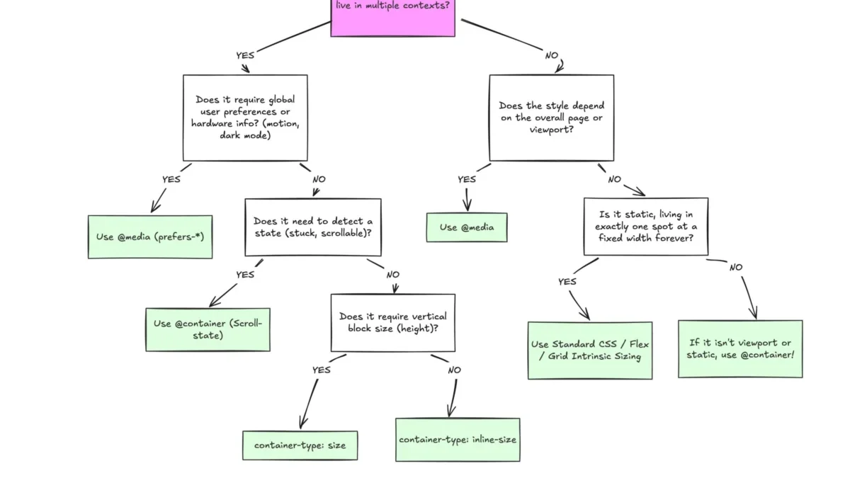
Despite broad browser support, CSS container queries remain a significantly underutilized feature in modern web development, with industry data suggesting a notable gap between awareness and practical implementation. While media queries have served as the standard for responsive design since the early 2010s, the evolution of component-based architecture has rendered the viewport-centric approach increasingly insufficient. By shifting the focus from the browser window to the individual container, developers can create truly modular, context-aware user interfaces.
The Evolution of Responsive Design
The introduction of CSS media queries via the W3C’s CSS3 specification in 2012 fundamentally changed the web. It allowed developers to create responsive layouts that adjusted based on the width, height, and orientation of the user’s viewport. This solved the immediate problem of making desktop websites readable on early smartphones. However, this technology relied on a fundamental proxy: the assumption that a component’s layout should be dictated by the size of the entire screen.
In the subsequent decade, the industry moved toward component-driven development, popularized by frameworks such as React, Vue, and Angular. As components became increasingly reusable, developers faced a persistent challenge: a card component designed for a full-width layout often broke when placed inside a narrow sidebar or a complex grid. Despite this, the industry continued to rely on media queries, leading to bloated CSS files and brittle design systems. The push for a "container query" solution began appearing on developer wishlists as early as 2015, culminating in the official W3C Working Draft and subsequent browser implementation starting around 2022.

Current State of Adoption and Industry Data
According to the 2025 State of CSS survey, the disparity between the adoption of modern CSS features and their availability is stark. While approximately 86% of professional developers are aware of container queries, only 41.4% have integrated them into their production workflows. This stands in contrast to the near-universal support for the technology, which sits at roughly 94% across all major modern browsers, including Chrome, Edge, Firefox, and Safari.
Industry experts, including noted front-end developer Kevin Powell, have highlighted this trend as a critical failure in the modernization of web development practices. The resistance to change appears rooted in a "familiarity bias"—the tendency for developers to treat new features as direct replacements for old ones, rather than as distinct tools for different problems. Because the syntax of @container closely mirrors @media, many developers assume they function with the same logic, leading to implementation errors and a subsequent abandonment of the feature.
Technical Distinction: Viewport vs. Container
The fundamental difference between these two technologies lies in their frame of reference. A media query asks, "How wide is the entire screen?" In contrast, a container query asks, "How much space is available within this specific parent element?"
When a developer uses a media query, they are creating a global rule that often ignores the local context. If a card component is set to display in a horizontal, multi-column format at 1024px, it will attempt to maintain that layout even if it is constrained to a 300px sidebar, resulting in text overflow, distorted imagery, or layout breakage. By utilizing the container-type and container-name properties, developers can decouple the component from the global viewport. This allows the component to transition its internal structure—for instance, switching from a horizontal row to a vertical stack—only when its specific parent container provides enough (or too little) space.

Advanced Use Cases and Fluidity
The integration of container queries extends beyond simple layout adjustments; it enables more sophisticated, fluid design patterns. One of the most significant applications is fluid typography. Previously, developers relied on viewport units (vw, vh) within a clamp() function to scale text. While effective for full-page designs, these units fail when a component is moved to a nested container, as they continue to calculate font size based on the screen width.
By utilizing container-relative units—such as cqi (container query inline-size)—developers can bind typography to the size of the parent container. This ensures that text remains proportional to the component’s actual footprint, regardless of where that component is placed on the page. Furthermore, developers are beginning to use container queries to detect state changes in flexbox layouts. While CSS cannot inherently detect when a row of items wraps to a new line, nesting a container query within a flex item allows for conditional styling that triggers precisely when the available width changes, effectively simulating "wrap-detection" without the overhead of JavaScript-based ResizeObserver APIs.
Limitations and Structural Requirements
While the utility of container queries is high, they are not a panacea. Several constraints must be understood to avoid common pitfalls:
- Self-Querying Restrictions: A container cannot query its own dimensions to change its own styles, as this would create a circular dependency. Developers must ensure that the query is applied to a parent wrapper, which then instructs the child component on how to behave.
- Layout Collapse: When using
container-type: size, the browser calculates the container’s dimensions independently of its contents. If the container lacks an explicit height or aspect ratio, the browser may collapse it to 0px, causing the layout to vanish. Best practice dictates defaulting tocontainer-type: inline-sizewhenever possible. - Custom Property Incompatibility: Currently, container queries cannot directly accept custom CSS properties (variables) as breakpoints. This is due to the potential for complex, recursive cycles where a container query changes a variable that the query itself relies on.
Broader Implications for Web Architecture
The shift toward container-based responsiveness represents a fundamental change in how the web is structured. As the number of unique viewport sizes continues to grow—now exceeding 2,300 distinct device configurations—relying on a set of standardized "mobile," "tablet," and "desktop" breakpoints is increasingly untenable.

The adoption of container queries signals a move toward "intrinsic web design," where the layout emerges naturally from the requirements of the content rather than being forced by arbitrary screen dimensions. This approach significantly reduces the need for complex media query stacks, simplifies the maintenance of design systems, and enhances the portability of components across different applications.
Ultimately, the goal is not to replace media queries entirely. They remain the correct tool for "macro" layout decisions, such as adjusting the overall navigation structure or header for a specific device type. However, for the "micro" layouts—cards, forms, widgets, and sidebars—container queries provide the precision and modularity that modern web development demands. As the industry continues to prioritize modular, performant, and accessible interfaces, the transition from viewport-reliant designs to container-aware systems will likely become the standard for professional web development. Professionals are encouraged to move past the surface-level similarities of these two CSS features and embrace the granular control offered by the container query specification.