Despite broad browser support, CSS container queries remain a significantly underutilized feature in modern web development, often misunderstood as a direct replacement for media queries rather than a distinct tool for component-based architecture. While media queries have served as the cornerstone of responsive design for over a decade, the rise of modular, reusable component libraries has exposed their fundamental limitations. As modern web applications shift toward decentralized UI patterns, the reliance on the global viewport as a reference point for layout logic has become a bottleneck, leading to "brittle" code that fails when components are nested in restricted containers.
A Decade-Long Evolution in Responsive Design
The history of responsive web design is intrinsically linked to the introduction of the media query in CSS3. When Ethan Marcotte coined the term "Responsive Web Design" in 2010, the primary challenge was bridging the gap between desktop monitors and emerging mobile devices. Media queries provided a solution by allowing developers to query the viewport’s width, height, and orientation.
However, the landscape changed significantly with the advent of component-based frameworks like React, Vue, and Svelte. Developers began building self-contained UI elements—cards, sidebars, and navigation menus—that were designed to be dropped into various parts of an application. The limitation became clear: a component defined by media queries behaves according to the browser window’s size, not the size of its parent element. If a "card" component is designed to show a horizontal layout at 800px, it will trigger that layout even if it is placed inside a narrow 300px sidebar, causing the layout to break or overflow.
The push for container queries began in earnest around 2015, with vocal advocacy from developers and design system architects who argued that the viewport was an insufficient "proxy" for layout logic. After years of discussion, the CSS Working Group standardized the container-type and container-name properties. By 2024, support had reached critical mass, with major browsers—including Chrome, Safari, and Firefox—providing stable implementations. Despite this, the 2025 State of CSS survey revealed a significant adoption gap: while 86% of developers are aware of the feature, only 41.4% have implemented it in production environments.

The Technical Distinction: Macro vs. Micro Layouts
The persistent confusion regarding container queries stems from their syntactic similarity to media queries. Both use the @ syntax and similar condition logic, leading many to treat them as synonymous. However, the architectural intent is fundamentally different.
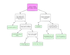
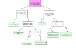
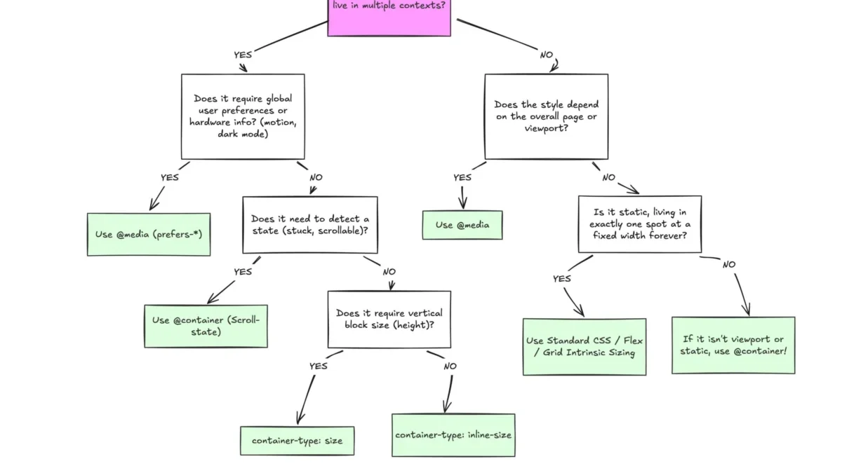
Media queries are designed for "macro-level" layouts. They concern themselves with the global state of the application: the overall page structure, the navigation bar’s behavior on different devices, and global accessibility preferences like prefers-color-scheme or prefers-reduced-motion. They look outward at the environment.
In contrast, container queries are engineered for "micro-level" layouts. They allow a component to look inward at its own context. By setting a container-type: inline-size on a parent element, the child elements within that container can adapt to the available space regardless of where they are placed. This decoupling of component logic from the global viewport is a major shift in web architecture. It allows a card component to be narrow in a grid-based dashboard but expand to a horizontal, detailed view when placed in a full-width blog post, all without the developer needing to manage complex, nested media queries.
Data and Performance Implications
The inefficiency of relying solely on media queries is compounded by the sheer fragmentation of modern hardware. Research into viewport statistics shows that there are currently over 2,300 unique screen sizes in use across the global internet. Hard-coding breakpoints at common increments like 768px or 1024px is a losing battle against the long tail of device resolutions.
When developers rely on media queries to fix component layouts, they often end up with "magic numbers" in their CSS—arbitrary pixel values that correspond to common tablet or mobile widths. These values rarely align with the actual space available to a component within a complex application. This leads to code bloat, as developers must write extensive overrides to account for components being placed in unexpected containers.

By contrast, container queries facilitate "fluid" design. Using the new container-relative units—cqi (container query inline size) and cqb (container query block size)—developers can create typography and spacing that scale naturally with the container. For example, using clamp(1rem, .5rem + 3cqi, 2rem) ensures that text remains proportional to the component’s size, not the screen’s size. This results in cleaner, more maintainable code and a significant reduction in layout-related bugs.
Challenges and Implementation Constraints
While the advantages are clear, adoption is hindered by the learning curve and specific technical constraints that differ from the established media query workflow.
One of the most common pitfalls is the "self-querying" trap. In CSS, an element cannot act as its own container while also being the subject of a query based on that container’s size. Doing so creates a circular dependency, as the container’s size might change based on the styles applied, which would then trigger the query again. Developers must instead ensure that a parent-child relationship exists, where the parent acts as the container and the child adapts accordingly.
Another constraint is the inability to use CSS custom properties (variables) directly within the container query condition. Unlike media queries, which can sometimes be bridged with variables in pre-processors, the live nature of container queries means that querying a variable like min-width: var(--breakpoint) is currently unsupported. This is a deliberate design choice by the CSS Working Group to prevent infinite loops and performance degradation, though it requires developers to manage breakpoints more explicitly within their stylesheets.
Furthermore, querying the size of a container (the block or vertical dimension) requires the container to have an explicit height or aspect ratio. Without these, the browser may default to a height of 0px, causing the layout to collapse. This behavior, while logical to the browser’s rendering engine, often confuses developers who are accustomed to block-level elements expanding to fit their content by default.

Future Outlook and Industry Adoption
The transition toward container-aware design is not merely a technical preference but a necessity for the next generation of web applications. As organizations move toward "Design Systems" and "Component-Driven Development," the ability to ship self-contained, context-aware UI elements is paramount.
Industry experts, including influential figures like Kevin Powell, have argued that the web is moving away from the "page-centric" model that defined the 2010s. In this new era, the component is the unit of authority. The "macro-vs-micro" paradigm is becoming the standard for CSS architecture: media queries for global layout strategy, and container queries for component behavior.
As browser support continues to hold steady at 94% and beyond, the primary hurdle remains cultural rather than technical. Developers are creatures of habit, and the shift from "How big is the screen?" to "How big is the parent?" requires a fundamental change in how CSS is conceptualized. As documentation improves and patterns for common components (such as flex-wrap detection or fluid typography) become standard, the adoption of container queries is expected to climb.
Ultimately, the goal is to move beyond the rigid, breakpoint-heavy design systems of the past. By embracing the flexibility offered by container queries, the web can finally realize a truly responsive architecture—one where components are as modular and adaptable as the data they represent, no longer shackled to the dimensions of the glass they are displayed upon.