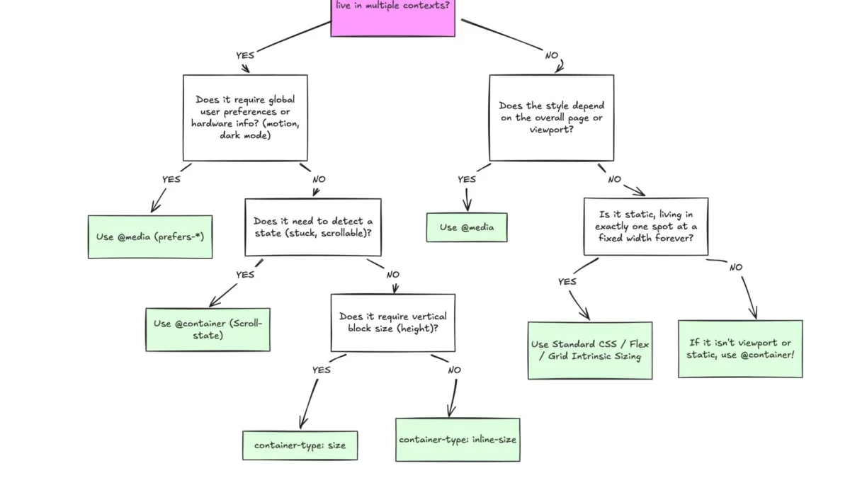
Despite broad browser support, container queries remain an underutilized component of the modern web development toolkit, often misunderstood as mere alternatives to traditional media queries. With a 94% adoption rate across major browsers, this CSS specification represents a fundamental shift in how web interfaces respond to their environments. Unlike media queries, which rely on the viewport as a proxy for layout adjustments, container queries empower individual UI components to adapt based on their specific parent containers. This distinction is critical for building truly modular, reusable, and resilient front-end architectures in an era where thousands of unique device sizes and screen configurations exist.
The Evolution of Responsive Design
The history of responsive design is defined by the viewport. When the concept of "Responsive Web Design" was first introduced, the industry lacked tools to handle the explosion of mobile devices. Media queries provided a necessary, albeit blunt, instrument to query the dimensions of the browser window. For over a decade, developers have used this approach to trigger layout changes—transitioning from single-column mobile views to multi-column desktop grids.
However, as component-based architectures like React, Vue, and Web Components became the industry standard, the limitations of the viewport-centric model became apparent. A card component designed to look perfect in a full-width main column often breaks when placed into a narrow sidebar or a complex dashboard widget. Because media queries only track the browser’s width, they cannot "see" the constrained space of a sidebar, leading to overflow issues and distorted UI elements.
Current Industry Adoption Patterns
Data from the 2025 State of CSS survey provides a sobering look at industry adoption. While 86% of developers are aware of the container query specification, only 41.4% have actively integrated it into their production workflows. This discrepancy suggests a significant knowledge gap, where developers are hesitant to abandon the familiar syntax of media queries for the more granular control offered by the container property.

At the 2026 SmashingConf in Amsterdam, industry experts like Kevin Powell highlighted that this adoption rate is remarkably low, given that container queries were once the most requested feature on CSS community wishlists. The prevailing theory is that because the syntax—@container versus @media—appears deceptively similar, developers assume they function in the same way, leading to early implementation failures and subsequent frustration.
Technical Dissection: Viewport vs. Container
The fundamental difference lies in the reference point. Media queries are "outward-looking," observing the entire page structure and the browser window. They are ideally suited for "macro" layout decisions, such as site-wide headers, footers, and global grid structures.
Conversely, container queries are "inward-looking," focusing on the specific context of a component. By defining a parent element with container-type: inline-size, developers create a scope where the child component can query the available horizontal space. This allows a component to exist independently of its placement. A card can be defined to switch from a vertical stack to a horizontal layout once its parent container exceeds 450 pixels, regardless of whether that parent is a full-page grid or a cramped sidebar.
Implementation Challenges and Best Practices
While the technology is powerful, it is not without potential pitfalls. One common error involves attempting to have an element query its own size. Because a container cannot query its own dimensions without creating a recursive loop, developers must ensure that the container element is a parent to the elements being styled.
Furthermore, using container-type: size requires caution. If a developer queries the block (vertical) size of an element without explicitly setting a height, the browser will collapse that container to zero height because it cannot derive size from the element’s children. For most use cases, container-type: inline-size is the safer and more standard approach.

Another technical hurdle is the current inability to use CSS custom properties (variables) directly within container query conditions. Because custom properties depend on the DOM cascade, allowing them inside query conditions could lead to circular logic where a query triggers a change in a variable that then affects the query itself. Developers should maintain clear, static thresholds when defining their container query breakpoints to avoid these issues.
Fluid Typography and Advanced Layouts
One of the most significant applications of container queries is in the realm of fluid typography. Previously, developers used viewport units (vw, vh) within clamp() functions to scale text. However, this creates a dependency on the browser width, which is often inappropriate for components. By using container query units (cqi, cqw), typography can now scale proportionally to the component’s container, ensuring that a title remains perfectly readable whether it is in a massive hero section or a small sidebar widget.
Additionally, container queries solve the long-standing "flex-wrap" detection problem. In standard CSS, there is no way to detect when flex items wrap onto a new line. By nesting a container query within a flex item, developers can trigger a style change when the item reaches a specific width, effectively simulating a layout event that previously required heavy JavaScript usage.
The Broader Impact on Web Architecture
The industry is currently facing a period of transition. There are over 2,300 unique viewport sizes identified in modern web traffic. The impossibility of designing for every possible screen size makes the traditional "breakpoint-by-device-width" approach increasingly fragile.
By shifting the focus to component-driven design, organizations can significantly reduce the amount of CSS required to maintain complex sites. When components are self-contained and "know" how to adapt to their environment, the need for complex, page-level media query overrides diminishes. This leads to cleaner, more maintainable codebases that are more resistant to layout shifts during future site redesigns.

Strategic Recommendations
For developers and organizations looking to integrate container queries, the path forward is one of selective implementation rather than immediate replacement. Media queries remain the correct tool for macro-level layouts, system preferences (such as prefers-color-scheme), and accessibility settings. Container queries should be reserved for the micro-layouts—the cards, widgets, nav-menus, and content blocks that migrate across different areas of an application.
The following framework is recommended for teams evaluating their CSS strategy:
- Audit Component Usage: Identify components that appear in multiple layouts (e.g., a card in a grid, a list, and a sidebar).
- Standardize Containers: Define explicit container wrappers for these components to ensure predictable sizing behavior.
- Migrate Fluidity: Replace viewport-based units in component styles with container-based units to improve responsiveness within restricted areas.
- Avoid Logic Loops: Ensure that query logic is strictly hierarchical, keeping the container as an ancestor to the affected components.
Conclusion
The arrival of container queries represents the most significant advancement in CSS layout logic since the introduction of Flexbox and Grid. While the initial learning curve and the superficial similarity to media queries have slowed mass adoption, the architectural benefits are undeniable. As the web continues to evolve toward a highly modular, component-based future, the ability for an element to intelligently respond to its specific context is no longer a luxury—it is a necessity. The industry must move past the "viewport-is-everything" mindset and embrace a more granular, context-aware approach to styling. By doing so, developers will be better equipped to handle the increasingly fragmented device landscape, resulting in more robust and truly responsive digital experiences.