Chrome has officially rolled out scroll-triggered animations, marking a significant advancement in web development capabilities and positioning itself as the first browser to implement this innovative feature. Available in the latest Chrome 146 update, this new functionality allows developers to create dynamic visual effects that respond directly to user scrolling behavior, offering a more engaging and interactive online experience.
A New Era of Web Animation
The introduction of scroll-triggered animations represents a notable departure from previous animation paradigms. Unlike scroll-driven animations, which synchronize animation progress with the user’s scroll position or the degree of element intersection with the viewport (e.g., animation-timeline: scroll() or animation-timeline: view()), scroll-triggered animations operate on a more event-based principle. They are designed to execute for a fixed duration once a predefined scroll threshold is met. This mechanism draws parallels to JavaScript’s Intersection Observer API, but crucially, it is implemented directly within CSS animations, streamlining the development process and enhancing performance.
The core of this new feature lies in the timeline-trigger property, specifically timeline-trigger: view() in conjunction with specific timeline ranges, rather than animation-timeline: view(). This distinction is critical: animation-timeline measures the extent of an element’s visibility and reacts accordingly, whereas timeline-trigger waits for the element to enter a defined "view" threshold before initiating an animation.
Understanding the Mechanics of Scroll-Triggered Animations
At its heart, the implementation of scroll-triggered animations involves defining standard CSS @keyframes animations, which specify the visual changes to occur. For instance, a simple @keyframes fade-bg-in rule can be established to alter the background of an element.
/* Define the animation */
@keyframes fade-bg-in
  to
    background: currentColor; /* Changes background to the current color */
This animation is then applied to a specific element, such as a .square class, with a defined duration.
.square
  /* Declare the animation with a 300ms duration */
  animation: fade-bg-in 300ms;
By default, CSS animations execute as soon as their declaration is processed. However, the timeline-trigger property overrides this behavior. When timeline-trigger: --trigger view() entry 100% exit 0%; is applied, the animation is not initiated until the element enters the viewport according to the specified range. The --trigger is an arbitrary identifier, a "dashed ident," used to link the trigger conditions to the animation’s behavior. The entry 100% exit 0% part defines a "timeline range," specifying the scroll zone within which the animation is activated and permitted to remain active.
In this example, entry 100% signifies that the animation triggers when the bottom edge of the .square element enters the viewport. Conversely, exit 0% indicates that the animation’s effect might cease (if still running) when the top edge of the element leaves the viewport. Clarifying these ranges, entry 0% would initiate the animation when the top edge enters. The entry directive pertains to the element’s ingress from the bottom of the scrollport, while exit governs its departure through the top. While this can initially appear complex, the core concept is to define specific scroll-based activation points.
Controlling Animation Behavior with animation-trigger
The animation-trigger property is then used to dictate how the animation behaves once triggered. It references the identifier defined in timeline-trigger and applies specific actions. For instance, animation-trigger: --trigger play-forwards; ensures that the animation plays to completion once the trigger conditions are met.
.square
  /* Declare animation */
  animation: fade-bg-in 300ms;

  /* Animation trigger conditions */
  timeline-trigger: --trigger view() entry 100% exit 0%;

  /* Animation trigger settings */
  animation-trigger: --trigger play-forwards;
The play-forwards keyword specifically means the animation will play from its beginning to its end when the element becomes fully visible. Without an explicitly defined animation-fill-mode (either through the animation shorthand or a separate animation-fill-mode property), the styles applied at the animation’s conclusion are not retained. This results in the animation appearing as a brief "flash" of visual change.
Refining Animation Persistence and Replay
To achieve persistent visual effects, developers can leverage animation-fill-mode. When combined with play-forwards, setting animation: fade-bg-in 300ms forwards; ensures that the styles applied at the end of the animation remain active.
.square
  animation: fade-bg-in 300ms forwards; /* Retain styles after animation */
  timeline-trigger: --trigger view() entry 100% exit 0%;
  animation-trigger: --trigger play-forwards;
However, this combination can lead to an undesirable effect: if the element scrolls partially or entirely out of view and then re-enters, the animation restarts. Depending on the animation’s endpoint, this can again result in a noticeable flash.
Two primary methods exist to address this:
-
The "Lock-In" Method (
play-once): By usinganimation-trigger: --trigger play-once;in conjunction withforwardsfill mode, the animation is guaranteed to play only one time. Once completed, it will not restart, and its final styles will be permanently applied..square /* Play the animation only once */ animation-trigger: --trigger play-once; /* Retain the styles after the single play-through */ animation: fade-bg-in 300ms forwards; timeline-trigger: --trigger view() entry 100% exit 0%; -
The "Back-and-Forth" Method (
play-forwards play-backwards): This approach offers a smoother visual experience.animation-trigger: --trigger play-forwards play-backwards;allows the animation to play forward when the element is fully visible and then reverse as it scrolls out of view. This continuous forward and backward motion eliminates the flash, as the transition out of view is as seamless as the transition into view. Theforwardsfill mode can still be used, ensuring styles are retained even when the animation reverses..square /* Play forward and backward as needed */ animation-trigger: --trigger play-forwards play-backwards; /* Retain styles regardless of direction */ animation: fade-bg-in 300ms forwards; timeline-trigger: --trigger view() entry 100% exit 0%;The rationale behind this is that
play-forwardsinstructs the animation to progress from 0% to 100%, whileplay-backwardsdirects it from 100% to 0%. Theforwardsfill mode ensures that the styles of the completed keyframe (whether 0% or 100%) are preserved.
A Spectrum of Animation Actions
Beyond play-forwards, play-backwards, and play-once, the animation-trigger property supports a broader set of keywords that offer granular control over animation behavior:
none: Useful for disabling triggers conditionally, such as on entry but not exit, or for managing multiple triggers with a singleanimation-triggerdeclaration.play: Plays the animation in the last specified direction, defaulting to forward if no direction has been previously set.pause: Halts the animation at its current progress point.reset: Stops the animation and resets its progress to the beginning (0%).replay: Resets the animation progress to 0% without pausing it.
These animation-action keywords, in conjunction with fill modes, timeline ranges, and the ability to define exit animations within @keyframes, provide developers with multiple pathways to achieve desired visual outcomes. The decoupled nature of these mechanics—actions, fill modes, and timeline ranges—enables logic reuse and enhances flexibility, making them well-suited for scalable design systems.
Advanced Scenarios: Multiple Animations and Staggering
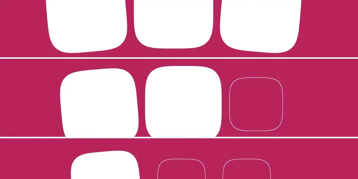
The power of scroll-triggered animations extends to orchestrating multiple animations simultaneously and creating staggered visual sequences. Consider an example involving three squares, each with a base intensify animation and potentially additional rotational animations (rotate-left, rotate-right).
Initial HTML structure:
<div id="squares">
  <div class="square rotate-left"></div>
  <div class="square"></div>
  <div class="square rotate-right"></div>
</div>
Keyframes and base styling:
/* Define animations */
@keyframes intensify
  to
    scale: initial; /* Resets scale to its default value */
    background: currentColor;


@keyframes rotate-left
  to
    rotate: -5deg; /* Rotates element 5 degrees counter-clockwise */


@keyframes rotate-right
  to
    rotate: 5deg; /* Rotates element 5 degrees clockwise */


.square
  /* Set initial scale */
  scale: 70%;
A more sophisticated implementation can stagger these animations using CSS custom properties and calculations. This involves defining a base animation and then applying it along with other animations, with staggered activation ranges.
.square
  scale: 70%; /* Initial scale */
  --base-animation: intensify; /* Define base animation */

  /* Declare animation with duration and fill mode */
  animation: var(--base-animation) 300ms forwards;

  /* Define animation trigger settings */
  --animation-trigger: --trigger play-forwards play-backwards;
  animation-trigger: var(--animation-trigger), var(--animation-trigger); /* For base and rotate */

  /* Declare animation trigger conditions (without specific timeline ranges for entry) */
  timeline-trigger: --trigger view();
  timeline-trigger-active-range-end: normal; /* Animation holds while visible */

  /* Append other animations based on class */
  &.rotate-left
    animation-name: var(--base-animation), rotate-left;


  &.rotate-right
    animation-name: var(--base-animation), rotate-right;


  /* Stagger activation ranges for each child */
  &.square:first-child
    timeline-trigger-activation-range-start: entry 33.3333%;


  &.square:nth-child(2)
    timeline-trigger-activation-range-start: entry 66.6666%;


  &.square:last-child
    timeline-trigger-activation-range-start: entry 99.9999%;
For an even more streamlined approach, especially in modern browsers supporting sibling selectors, functions like sibling-count() and sibling-index() can dynamically calculate staggering intervals.
/* Calculate stagger interval based on the number of siblings */
--stagger-interval: calc(100% / sibling-count());

/* Calculate current element's entry point based on its index */
--entry: calc(sibling-index() * var(--stagger-interval));

/* Declare animation trigger conditions */
timeline-trigger: --trigger view() entry var(--entry) exit 0%;
Orchestrating Triggers: One Element Initiating Others
A powerful application of scroll-triggered animations is the ability for one element to act as a master trigger for animations on other elements. In this scenario, the primary trigger is set on the first square, with a threshold like entry 50% of the viewport. Once this threshold is met, animation-trigger is invoked, initiating animations on all linked elements, with staggered delays applied.
/* Define animations */
@keyframes intensify
  to
    scale: initial;
    background: currentColor;


@keyframes rotate-left
  to
    rotate: -5deg;


@keyframes rotate-right
  to
    rotate: 5deg;


.square
  scale: 70%; /* Initial scale */
  --base-animation: intensify; /* Define base animation */

  /* Calculate stagger interval for animation delay */
  --stagger-interval: calc(300ms / sibling-count());
  /* Calculate current element's animation delay */
  --animation-delay: calc(sibling-index() * var(--stagger-interval));

  /* Declare animation with duration, delay, and fill mode */
  animation: var(--base-animation) 300ms var(--animation-delay) forwards;

  /* Define animation trigger settings */
  --animation-trigger: --trigger play-forwards play-backwards;
  animation-trigger: var(--animation-trigger), var(--animation-trigger); /* For base and rotate */

  &.square:first-child
    /* Declare animation trigger conditions: triggered when 50% of the first square is visible */
    timeline-trigger: --trigger view() entry 50%;
    timeline-trigger-active-range-end: normal;


  /* Append other animations based on class */
  &.rotate-left
    animation-name: var(--base-animation), rotate-left;


  &.rotate-right
    animation-name: var(--base-animation), rotate-right;
A potential caveat arises when using play-backwards with staggered animations. In such cases, the animation delays may not function as expected when reversing, as the delay appears to be incorporated into the reverse playback. This behavior might differ from the standard animation-direction: reverse property and could be an area for future refinement.
Demystifying Timeline Ranges
Timeline ranges are a fundamental component of both scroll-driven and scroll-triggered animations, though their application differs. For scroll-driven animations, animation-range and its longhand properties define the scroll zones that dictate animation progress. In scroll-triggered animations, the syntax is similar but uses distinct properties: timeline-trigger for activation and timeline-trigger-active-range-end for the active duration.
The "activation range" dictates the scroll area where an animation is initiated, while the "active range" determines the period during which the animation remains active, even if the element has moved outside the initial activation zone. For most common use cases, view() entry 100% exit 0% (full visibility) or view() contain (full visibility and element larger than viewport) will suffice.
The view() function itself acts as the viewport in the context of scroll-triggered animations. It can be further refined, for example, view(y 0 5rem) could account for a fixed 5rem header when defining timeline ranges along the y-axis.
Implications and Future Outlook
The introduction of scroll-triggered animations by Chrome signifies a major step forward in the evolution of web interactivity. By bringing sophisticated scroll-based animation capabilities directly into CSS, developers gain more power and flexibility, potentially leading to richer, more dynamic user interfaces without the overhead of complex JavaScript solutions.
The complexity inherent in these new features, particularly the interplay between various CSS properties and concepts like dashed idents and timeline ranges, means there will be a learning curve for developers. However, the decoupling of these mechanics—animation actions, fill modes, and timeline ranges—promotes code reusability and maintainability, aligning well with modern design system principles.
While the full impact and adoption rate of scroll-triggered animations remain to be seen, their potential to transform user experience is undeniable. As browser support expands and developers become more adept at utilizing these tools, we can anticipate a wave of innovative and engaging web designs that respond fluidly to user interaction. The development signifies a continued push towards more performant and expressive front-end technologies, empowering creators to build more immersive digital experiences.