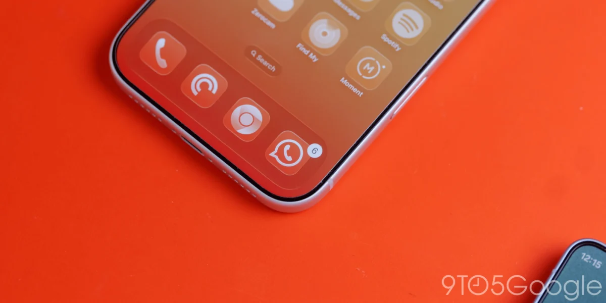
As Google reaches the one-year milestone of its Liquid Glass design initiative, the company has begun a significant rollout of this aesthetic across its iOS ecosystem. This shift marks a deeper commitment to the Material 3 Expressive design language, moving away from the rigid, opaque UI elements that previously dominated Google’s cross-platform applications. By adopting translucent, depth-conscious materials on Apple’s mobile platform, Google is signaling a desire to align its suite of productivity and utility apps more closely with the native design sensibilities of iOS while maintaining its own distinct brand identity.
The Evolution of Google’s Design Language on iOS
For years, Google’s design strategy on iOS was characterized by a "uniformity-first" approach. The company prioritized a consistent look and feel between Android and iOS, often importing Android’s Material Design components directly to the Apple environment. While this achieved brand recognition, it frequently resulted in apps that felt disconnected from the iOS ecosystem, which heavily utilizes system-wide blurs, transparencies, and adaptive background materials.
The introduction of Liquid Glass represents a strategic pivot. By leveraging translucency, Google is creating a visual hierarchy that acknowledges the content-first nature of modern smartphone usage. When a user scrolls through a photo library or navigates a health dashboard, the interface no longer acts as a solid barrier; instead, it serves as a layered, breathable window that provides context about the depth of the data beneath it.
Recent Updates: Google Photos and Health
The most prominent implementation of this update can be found in Google Photos version 7.94. Previously, the floating bottom bar—a staple of the app’s navigation—featured a solid, opaque background that often felt heavy compared to the airy nature of iOS. With the latest update, that bar now utilizes Liquid Glass, effectively blurring the content behind it as the user scrolls.
This transition is not merely aesthetic; it is functional. Users now have the ability to toggle between translucency levels, including a "Default" setting and a "More clear" option. The "More clear" setting is particularly significant for power users who prefer to maximize the visibility of their media, allowing the UI to recede further into the background. Furthermore, in dark mode, the implementation is particularly striking. The default blue accent color, which serves as the current tab indicator, now interacts with the frosted background to create a subtle tint, providing a cohesive and polished look that feels native to the iOS interface.
![Google combines Material 3 Expressive & Liquid Glass on the iPhone [Gallery]](https://9to5google.com/wp-content/uploads/sites/4/2026/03/Liquid-Glass-dock-on-iPhone-17-Pro-Max.jpg?quality=82&strip=all&w=1600)
Similarly, the Google Health platform has received a comprehensive design overhaul. The navigation bar, which houses core utility links, now employs the same frosted glass effect. Perhaps more notable is the "Ask Coach" Floating Action Button (FAB). By applying a frosted treatment to this button, Google is distinguishing it from the rest of the UI, creating a focal point that feels tactile and responsive. This aligns with the "Expressive" component of Material 3, which emphasizes movement, light, and interaction over flat, static shapes.
The Material 3 Migration: A Chronology of Change
The migration to Material 3 on iOS has been a multi-year project for Google, characterized by a staggered rollout across its extensive product portfolio. The following timeline illustrates the scope of this transition:
- 2021–2022: Google announces Material 3 and begins the initial integration into core Android services, focusing on dynamic color and accessibility.
- 2023: Google begins internal testing of Material 3 components for iOS, focusing on navigation rails and typography.
- Early 2024: Initial "straggler" apps like Google Tasks receive a significant UI overhaul, moving away from the older Material Theme design language.
- Late 2024 – Early 2025: The "Liquid Glass" concept is introduced, focusing on depth and translucency to better integrate with iOS standards.
- March 2026 (Current): Google Photos and Health integrate Liquid Glass, marking a phase where the aesthetic is applied to secondary navigation elements rather than just primary buttons.
Despite these advancements, the transition remains incomplete. Productivity staples such as Google Docs, Sheets, and Slides have historically been the slowest to adopt these changes. The complexity of these applications, which rely on dense data grids and specialized editing tools, makes the implementation of modern design elements a delicate balancing act. The goal is to modernize the look without compromising the utility or the complex functionality that professional users require.
Technical Challenges and the Dynamic Color Limitation
A recurring topic in discussions regarding Google’s iOS design is the absence of "Dynamic Color." On Android, Dynamic Color—part of the Material You initiative—extracts colors from a user’s wallpaper and applies them across the system and supported applications. This creates a deeply personalized experience that is a cornerstone of the Android UI.
However, replicating this on iOS poses significant technical and architectural hurdles. Because iOS maintains a sandboxed environment, third-party applications do not have the same level of access to system-level wallpaper data or global accent color settings as they do on Android. While Google could theoretically implement a manual system allowing users to select an accent color that persists across all Google apps, industry analysts suggest that such a feature would feel disjointed. Without deep integration into the system’s own color palette, a manual override might create a confusing user experience where the Google app ecosystem looks disconnected from the rest of the user’s iOS environment.
Consequently, Google has opted for a controlled approach: utilizing universal accent colors (like the signature blue) that remain consistent regardless of the user’s device wallpaper. This approach prioritizes brand consistency over the hyper-personalization found on Android.
![Google combines Material 3 Expressive & Liquid Glass on the iPhone [Gallery]](https://9to5google.com/wp-content/themes/ninetofive/dist/images/google-preferred-source-badge-dark.png)
Analysis of Implications for the Ecosystem
The move toward Liquid Glass on iOS is a clear indicator that Google is moving away from a "one-size-fits-all" design strategy. By embracing the native expectations of iOS users—who are accustomed to the blur effects and translucent layers seen in Apple’s own apps like Files and Apple Music—Google is reducing the friction for new users.
This strategy serves two primary purposes:
- Retention: By making Google apps feel more "at home" on iOS, the company reduces the urge for users to switch to native Apple alternatives. A well-designed, visually pleasing app is more likely to be used frequently.
- Productivity: The focus on translucency and depth is not just for show. In professional apps like Sheets or Docs, a well-managed UI can help users keep track of their position within a document. If a navigation bar is translucent, the user maintains a peripheral awareness of the content beneath it, which can be useful during long-form document review or data analysis.
Future Outlook
As Google continues to refine its design language, the industry expects further refinements to the Material 3 Expressive suite. The transition from flat, solid elements to sophisticated, depth-aware components like Liquid Glass is likely to reach more complex applications in the coming months.
While the "straggler" apps like Docs and Slides are still undergoing testing, the current pace of updates suggests that by the end of 2026, the majority of Google’s iOS portfolio will share a unified, modern aesthetic. The challenge for Google will be to maintain this momentum without over-complicating the UI. As designers often note, "less is more," and the success of the Liquid Glass rollout will ultimately be measured by whether it enhances the user experience or simply adds unnecessary visual clutter.
For now, the integration of Liquid Glass into Photos and Health serves as a benchmark for the company’s current design trajectory. It confirms that while Google is committed to its own internal design standards, it is no longer willing to sacrifice the user experience on competitive platforms for the sake of rigid cross-platform parity. This mature, nuanced approach to design is a hallmark of a company looking to harmonize its diverse product line with the specific strengths and limitations of the platforms upon which it resides.