The past fortnight, while seemingly quiet on the browser update front, has been remarkably active in showcasing innovative advancements and explorations within the web development landscape. This period has highlighted groundbreaking applications of existing technologies, the emergence of novel CSS features, and critical discussions surrounding web accessibility and platform adaptability. From the surprising capabilities of HTML in music creation to the pixel-perfect recreation of classic video games using CSS, developers continue to push the boundaries of what is possible on the web.
Hyperblam: Reimagining Music Creation with HTML
In a demonstration of unconventional web audio utilization, Heydon Pickering has introduced Hyperblam, a project that leverages HTML and Web Components to interact with the Web Audio API, thereby enabling music composition without traditional JavaScript. This innovative approach recontextualizes HTML as a tool for generating complex sonic structures, moving beyond its established role in content presentation. By abstracting the complexities of the Web Audio API into declarative HTML elements and Web Components, Hyperblam aims to democratize music creation for web developers who may not have extensive JavaScript backgrounds. The project’s tagline, "WRITE MUSIC NOT JAVASCRIPT," succinctly captures its core philosophy. While not directly a CSS feature, Hyperblam’s underlying principle of utilizing declarative markup for complex functionalities has strong parallels with the evolution of CSS. The implications of this project could extend to more accessible interactive media creation and a broader understanding of how different web technologies can be integrated for novel user experiences.
CSS Quake: A Nostalgic Rebirth of a Classic Game
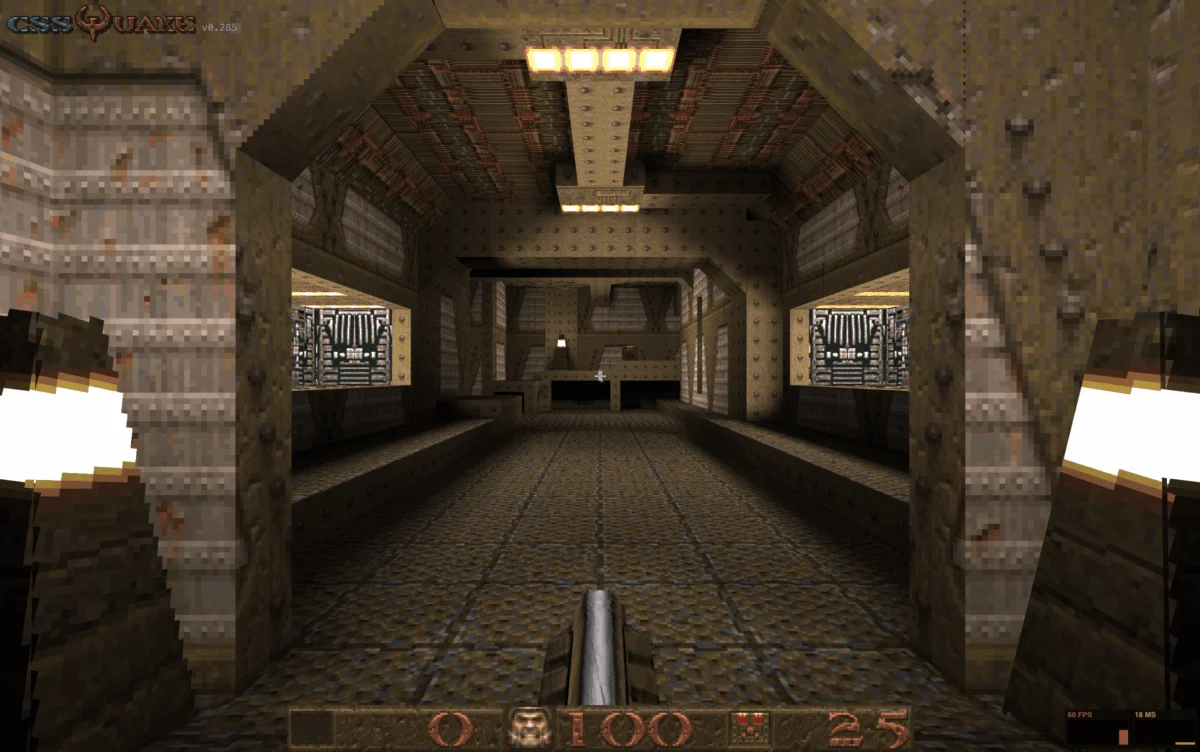
In a remarkable feat of CSS engineering, Layoutit, powered by PolyCSS, has recreated a playable version of the iconic 1996 first-person shooter, Quake, entirely within CSS. This project, dubbed CSS Quake, serves as a direct successor to the previously released CSS DOOM, further solidifying the trend of resurrecting classic video games using advanced styling techniques. The ability to render 3D environments, character movements, and game logic using only CSS is a testament to the increasing power and flexibility of modern CSS. This undertaking required intricate manipulation of CSS properties, likely involving techniques such as advanced grid layouts, complex selectors, and potentially JavaScript for certain interactive elements that are inherently difficult to achieve with pure CSS, though the emphasis remains on the CSS-driven aspects. The recreation not only serves as an impressive technical showcase but also as a nostalgic tribute, allowing a new generation to experience a piece of gaming history and older players to revisit a beloved title in an entirely new context. The development of CSS Quake underscores the ongoing exploration of CSS for more than just visual presentation, pushing it into the realm of interactive application development.

The Evolving Canvas: A Deep Dive into CSS Gap Decorations
Temani Afif’s exploration of CSS Gap Decorations provides crucial insights into a feature that promises to streamline layout design. The article details how developers can now style the spaces created by the gap property in Flexbox, Grid Layout, and multi-column layouts. Historically, the gap property offered a straightforward way to define spacing between items, but direct styling of these gaps was limited. Afif’s work demonstrates a variety of techniques to manipulate these "gap decorations," opening up new possibilities for visual refinement and custom spacing aesthetics. This development is particularly significant as it addresses a long-standing need for more granular control over layout spacing, moving beyond simple uniform gaps. The ability to apply distinct styles, such as borders or background patterns, to these inter-element spaces can lead to more sophisticated and visually rich UIs. The implications are far-reaching, potentially reducing the need for complex workarounds involving pseudo-elements or wrapper divs to achieve custom spacing effects. This enhancement signifies a maturing of CSS layout capabilities, offering designers and developers more intuitive tools for crafting intricate and responsive designs.
Exploring the Potential of CSS random() Experiments
Polypane has released a comprehensive series of experiments showcasing the potential of the CSS random() function. While currently unsupported by most browsers except Safari, the random() function holds significant promise for generative design and dynamic visual effects. Polypane’s experiments illustrate a wide array of applications, including the creation of bokeh effects, falling petal animations, disorganized polaroid stacks, and animated auroras. These examples demonstrate how random() can be employed to introduce unpredictable yet aesthetically pleasing variations into web designs, moving away from static and repetitive elements. The implications of widespread random() support could revolutionize areas like data visualization, abstract art generation on the web, and the creation of more organic and lifelike animations. This deep dive by Polypane serves as a valuable resource, providing a tangible vision of what becomes possible when truly random number generation is integrated directly into CSS, potentially leading to more engaging and unique user interfaces. The experiments underscore the ongoing push for more dynamic and data-driven styling capabilities within CSS.
Enhancing Select Element Responsiveness with field-sizing
Manuel Matuzović’s informative piece highlights the recent introduction and baseline status of the field-sizing CSS property, specifically field-sizing: content, for <select> elements. This feature addresses a common design challenge: achieving fluid width for <select> elements that accurately reflects the width of their currently selected <option>. Previously, controlling the width of select boxes often required JavaScript or complex CSS hacks. The field-sizing: content property now offers a declarative and robust solution, allowing the select box to automatically adjust its width to accommodate the longest option text or the selected option’s text, whichever is greater. Matuzović also points out a crucial interaction: when the size attribute is used on a <select> element (transforming it into a listbox), field-sizing: content overrides the default behavior to display all options, rather than a fixed number. This advancement is a significant step towards more accessible and aesthetically pleasing form elements, reducing development overhead and improving the user experience across various devices and screen sizes. The widespread adoption of this property, now baseline in Firefox, marks a notable improvement in the standardization of form element styling.
The Evolving Landscape of CSS Theming
Una Kravets has provided a comprehensive overview of modern CSS theming techniques, emphasizing the synergy between several recently standardized features. Her explanation delves into the functionalities of @property, light-dark(), contrast-color(), and @container style(), all of which have recently achieved baseline status across major browsers. This confluence of features represents a paradigm shift in how dynamic and adaptable theming can be implemented directly within CSS. @property enables the creation of custom properties with defined types and inheritance, providing a robust foundation for theming. light-dark() and contrast-color() offer powerful tools for automatically adjusting colors based on user preferences or content, enhancing accessibility and visual comfort. Furthermore, @container style() allows styles to adapt based on the characteristics of parent containers, enabling more sophisticated component-level theming. Kravets’ discussion, coupled with recent explorations of contrast-color() by other developers, signals a new era of sophisticated, native CSS theming capabilities that reduce reliance on JavaScript and offer greater performance and maintainability. The implications are profound for creating highly personalized and responsive user experiences, from dark mode implementations to adaptive branding.

Platform Agnosticism: Rethinking Website Functionality
Bramus’s insightful analysis argues for a more nuanced approach to website design, challenging the notion that websites must function identically across all platforms. The core of his argument centers on the diverse input modalities and user preferences inherent to different devices and operating systems. He advocates for abandoning the pursuit of perfect cross-platform parity in favor of designing experiences that are optimized for the primary interaction methods of each platform. Bramus highlights three compelling web platform features that exemplify this principle: interest invokers, overscroll actions, and the Document Picture-in-Picture API. Each of these features is designed to behave differently based on the underlying platform, leveraging unique capabilities to provide a more intuitive and efficient user experience. This perspective shift is critical in an era of diverse computing environments, encouraging developers to embrace platform-specific strengths rather than striving for a one-size-fits-all solution. The broader impact of this philosophy could lead to more engaging, performant, and accessible web applications that feel native to the environments in which they are accessed.
Web Engines Hackfest: A Glimpse into the Future of Web Standards
While the broader web development community was still processing developments from events like CSS Day, the Web Engines Hackfest in A Coruña, Galicia, convened to discuss the future of web engines and standards. Marina Aïsa’s detailed documentation of the two-day event provides a valuable window into these critical discussions. Her account highlights not only the technical talks but also the collaborative spirit of attendees, fostering a rich exchange of ideas and networking opportunities. The Hackfest agenda covered a wide range of topics pertinent to the evolution of web technologies, with a particular emphasis on improving web accessibility. The integration of activities like hiking and wall climbing alongside intensive technical sessions underscores a growing trend in industry events to foster creativity and cross-disciplinary thinking. Aïsa’s personal goal to attend such an event next year reflects the perceived value and importance of these gatherings in shaping the future of the web. The discussions surrounding browser capabilities and accessibility at the Hackfest are instrumental in ensuring the web remains an inclusive and powerful platform for all users.
Emerging Web Platform Features on the Horizon
Despite a recent lull in major stable browser updates, the pipeline for new web platform features remains robust and exciting. While specific details on upcoming stable releases are not yet public, the ongoing development in experimental and beta browsers suggests significant advancements are on the horizon. These include potential enhancements to rendering engines, new APIs for interactivity, and further refinements to existing CSS capabilities. Developers are encouraged to monitor resources like the "Quick Hits" section of CSS-Tricks, which serves as an early indicator for these updates, including those from developmental browsers. The upcoming release of Chrome 150, anticipated to ship imminently, is expected to bring several of these nascent features into wider availability, marking a transition from experimentation to widespread adoption. The continuous evolution of web standards and browser implementations ensures that the web remains a dynamic and ever-expanding platform for innovation.