
Recent developments in Cascading Style Sheets (CSS) and web platform standards have introduced a wave of advanced capabilities aimed at resolving long-standing developer pain points. Over the past several weeks, front-end engineers and specification authors have released pioneering solutions for interactive UI elements, browser-native geolocation management, syntax highlighting, and grid-based mathematical mapping. These updates reflect a broader, industry-wide effort to reduce reliance on heavy JavaScript libraries while expanding the native declarative power of the web.
UI Interactivity: Intelligent Tooltips and Modern Interest Invokers
User interface ergonomics, particularly regarding tooltips and hover states, have historically required complex JavaScript event listeners to prevent accidental triggers while maintaining responsiveness. Recently, developer Abhishek Jakhar proposed a refined behavioral model for tooltips: a delayed activation paired with instant deactivation. Under this paradigm, a cursor must linger over a target element for a designated duration before the tooltip appears, preventing accidental pop-ups during rapid cursor movement. Conversely, once the cursor leaves the target region, the tooltip disappears immediately.
Building upon this concept, developer Chris Coyier introduced a modern, HTML-native implementation utilizing emerging browser specifications known as interest invokers. This approach leverages two dedicated CSS properties: interest-delay-start and interest-delay-end. While current browser implementation is limited to experimental channels in Google Chrome, the technique exemplifies progressive enhancement—allowing developers to deploy advanced UX patterns for supported environments while gracefully falling back for others. Industry analysts note that standardizing these states natively within the browser engine eliminates layout thrashing and reduces the computational overhead previously associated with custom JavaScript debounce handlers.
Bridging Hardware and Markup: The Native <geolocation> Element
For over a decade, implementing location-based services required utilizing the JavaScript Geolocation API, a system historically plagued by complex permission states, hardware handshakes across GPS satellites, Wi-Fi networks, and cellular towers, and notoriously difficult permission-revocation workflows.
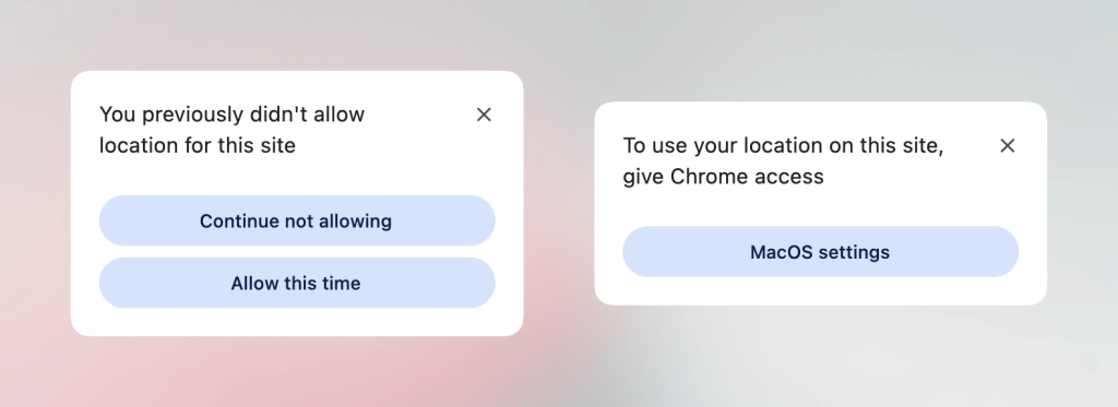
To mitigate these complexities, browser vendors and standards bodies have introduced the native <geolocation> HTML element. While this new element significantly streamlines the authorization flow, it introduces unique styling constraints and currently remains exclusive to Chrome-based runtimes. To bridge the gap between legacy implementations and cutting-edge standards, developers have published transitional patterns that combine the new HTML element with the traditional JavaScript Geolocation API. This hybrid methodology enables production-ready geolocation features today, ensuring cross-browser compatibility while preparing codebases for the eventual widespread adoption of the native tag.
High-Performance Syntax Highlighting via the Custom Highlight API
Syntax highlighting in technical documentation and code-sharing platforms has traditionally relied on heavy Document Object Model (DOM) manipulation, where parsers wrap individual tokens in span elements containing inline classes. This approach inflates memory consumption and slows down rendering times for large documents.
Addressing this performance bottleneck, developer Dave Rupert introduced MicroLighter, a lightweight syntax highlighter built upon the W3C Custom Highlight API. By utilizing the ::highlight() pseudo-element, MicroLighter applies styling rules directly to text ranges without altering the underlying DOM tree. This method preserves semantic markup integrity, accelerates rendering speeds, and significantly reduces the memory footprint of text-heavy web pages. Early benchmarking indicates that highlight-based syntax coloring offers substantial performance gains over traditional token-wrapping strategies, particularly on mobile devices with constrained processing power.
Mathematical Layout Mapping: Extracting Grid Information into CSS Variables
One of the most persistent limitations of CSS Grid layout has been the inability to feed layout metrics—such as the total number of rows, columns, and specific cell coordinates—back into CSS custom properties (variables) for dynamic styling calculations.
CSS expert Temani Afif recently demonstrated a breakthrough technique enabling developers to expose CSS grid metadata directly to custom properties. By establishing uniform column widths, developers can now programmatically track grid indexes and apply complex spatial logic entirely through stylesheets. This breakthrough has immediate applications in interactive design, such as calculating hover proximity—where elements dynamically scale, shift, or illuminate based on their precise spatial distance to the user’s cursor. Web architects view this development as a vital step toward bridging the gap between layout geometry and visual feedback without relying on JavaScript mouse-tracking coordinates.
Architectural Debates: The Dark Mode Toggle Paradigm
As dark mode implementation becomes a standard requirement for modern web applications, the industry remains divided over user state management. Architectural discussions have centered on two primary methodologies: the traditional two-state toggle (light versus dark) and the tri-state toggle (light, dark, and system preference inheritance).
Proponents of the two-state model argue for interface simplicity, minimizing cognitive load for the end-user. Conversely, advocates for the tri-state approach maintain that users require explicit control to override operating system preferences independently. Emerging consensus among interface designers favors an "auto-until-overridden" two-state configuration, which respects the user’s operating system preferences by default while allowing manual overrides that persist across browsing sessions. This debate highlights the ongoing challenge of balancing user autonomy with interface minimalism in modern web design.
Selectors and Feature Queries: Class Prefix Selectors and named-feature()
The standardization pipeline has also introduced powerful selector enhancements designed to improve both developer ergonomics and stylesheet performance. Prominent web standards advocate Bramus recently detailed the proposed class prefix selector syntax, which allows developers to target multiple classes sharing a common naming convention using a wildcard prefix:
.something-*
  /* Declarations */
This syntax offers a cleaner, highly optimized alternative to legacy attribute selectors such as [class^="something-"] or [class*=" something-"]. Because attribute selectors force the rendering engine to scan string values across the DOM, they can introduce performance bottlenecks in large-scale applications. The dedicated class prefix selector is engineered to integrate natively with browser parsing optimizations, promising faster selector matching times once implemented.
Concurrently, the introduction of the @supports named-feature() function addresses long-standing limitations in conditional CSS loading. While traditional @supports rules evaluate property-value pairs, named-feature() allows developers to query highly specific browser behaviors and internal layout engine capabilities—such as whether a browser correctly honors CSS transforms within anchor-positioning contexts. Supported initially in Chrome, this function expands the capability of progressive enhancement strategies, enabling developers to write resilient, future-proof stylesheets for advanced layout engines.
Layout Refinement: Balancing Wrapped Flex Items
Concluding the recent wave of CSS innovations is the introduction of flex-wrap: balance in Chrome. Analogous to the established text-wrap: balance property used for typographic layout, this new rule automatically distributes flex items evenly across multiple lines or columns, eliminating awkward orphan items on final rows. Ahmad Shadeed and other layout specialists have documented the utility of this feature in responsive component design, noting that it removes the need for manual media queries or hardcoded item widths in flexible UI components.
Broader Impact and Industry Implications
The convergence of these features—ranging from spatial grid mapping and native interest invokers to high-performance custom highlights and advanced feature queries—signals a mature phase in web platform evolution. By shifting complex behavioral and spatial calculations from JavaScript to native CSS and HTML specifications, browser vendors are empowering developers to build faster, more accessible, and resource-efficient web applications. As these experimental specifications move from early implementation stages toward broad cross-browser standardization, the fundamental capabilities of web development continue to expand, setting a new benchmark for performance and user experience.