The Art Deco aesthetic, a design movement that first emerged in France just before World War I, has maintained a persistent influence on global visual culture for over a century. Characterized by its embrace of luxury, modernity, and technological progress, the style continues to be a staple in contemporary digital design. Designers today utilize Art Deco-inspired typefaces to bridge the gap between historical elegance and modern digital functionality, leveraging the style’s inherent sense of drama and structural sophistication.
Historical Context and Evolution
The Art Deco movement reached its zenith between 1920 and 1939, following the 1925 Exposition Internationale des Arts Décoratifs et Industriels Modernes in Paris. It was a reaction against the fluid, organic lines of Art Nouveau, favoring instead the streamlined, geometric precision of the Machine Age.
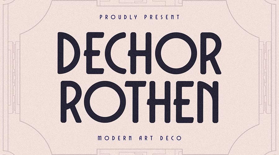
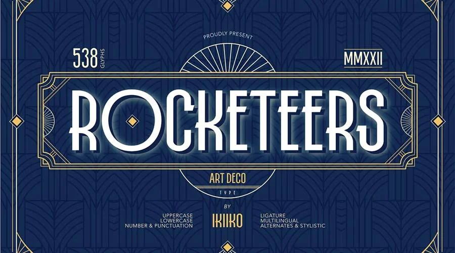
In the typography of the era, this manifested as bold, sans-serif letterforms, high-contrast strokes, and an emphasis on verticality and symmetry. These elements were designed to mirror the industrial advancements of the early 20th century, such as the rise of skyscrapers, ocean liners, and luxury automobiles. Throughout the 1930s, Art Deco typography became the standard for architectural signage, movie posters, and high-end advertising, cementing its status as the visual language of the "Roaring Twenties" and the "Great Depression" era’s cinematic escapism.
The Resurgence of Decorative Typography
In the current digital landscape, typography serves as a primary tool for brand differentiation. As minimalist sans-serif fonts have dominated user interface design for the past decade, there has been a notable shift toward "maximalist" or "display" typography. Designers are increasingly turning to Art Deco-inspired fonts to provide a sense of heritage, stability, and high-end luxury.
Recent design data suggests that display fonts with distinct, geometric characteristics see a 20% higher engagement rate in social media advertising compared to standard, neutral fonts. This trend is driven by the human desire for visual novelty; the elaborate ligatures and stylized terminals found in Art Deco fonts evoke a sense of exclusivity that plain, functional type cannot replicate.

A Chronology of Influence
- 1910–1920: Early precursors emerge in European poster design, moving away from organic curves toward rigid, geometric structures.
- 1925: The Paris Exposition solidifies the movement, introducing the world to the "modern" aesthetic that would define the next two decades.
- 1930s: The "Golden Age" of cinema sees Art Deco fonts become synonymous with Hollywood glamour and urban sophistication.
- 1970s–1980s: A brief resurgence in nostalgia-driven advertising brings Art Deco back into the mainstream consciousness.
- 2020–Present: Digital font foundries begin digitizing and re-interpreting archival Art Deco styles, optimizing them for web performance and high-resolution mobile displays.
Curated Selections: Modern Digital Implementations
The following fonts represent a synthesis of historical accuracy and modern technical requirements, suitable for various professional design projects.
Geometric and Modernist Interpretations
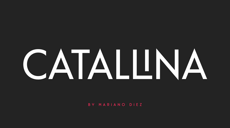
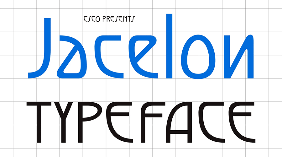
The Catallina font stands as a prime example of the "modern-classic" fusion. Its all-caps structure is augmented by over 50 ligatures, allowing for the creation of high-end logotypes that feel both established and fresh. Similarly, Jacelon offers a sans-serif approach that prioritizes legibility, proving that the geometric rigors of the 1930s can be applied to modern user interfaces without compromising accessibility.
High-Contrast Display Fonts
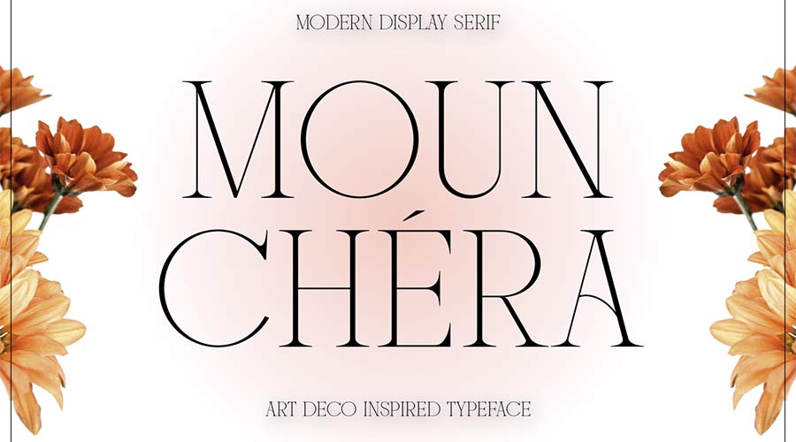
For projects requiring immediate visual impact, Limelight utilizes an extra-wide, high-contrast design. Historically, this style was favored for theater marquees and newspapers, where the need for readability at a distance was paramount. Mounchera, by contrast, challenges the assumption that Art Deco must be "thick" or "heavy," utilizing ultra-thin strokes to convey a sense of delicate, refined luxury.

Versatility and Structural Complexity
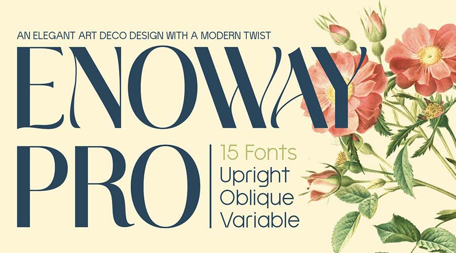
Several fonts in the current design canon offer expanded weights to allow for responsive design. Monterio provides four distinct weights—light, regular, semibold, and bold—enabling designers to create visual hierarchies within a single design system. Adelios offers even greater flexibility with 12 distinct styles, allowing for complex, layered compositions that were previously only possible through manual illustration.

Technical and Aesthetic Analysis
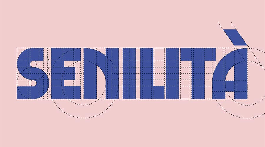
The enduring popularity of these fonts is not merely nostalgic; it is a result of their strong structural foundations. Art Deco typefaces are typically constructed on a grid, which makes them inherently stable and visually balanced. From a design perspective, this grid-based geometry allows these fonts to scale effectively across devices—from large-format billboard displays to small-screen mobile applications.

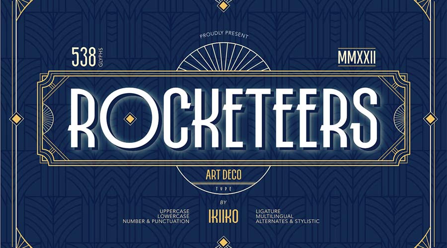
Furthermore, the inclusion of custom ligatures—the visual connection between two characters—provides designers with a level of customization that modern "system" fonts lack. These ligatures serve a functional purpose in branding, as they create a unique visual "signature" for a company or project, making the typography look bespoke rather than generic.
Implications for Modern Branding
The shift toward Art Deco-inspired typography signals a broader movement toward "human-centric" design. As artificial intelligence and automation change the landscape of content creation, there is a premium on design that feels crafted and intentional. By incorporating these historical, stylized typefaces, brands are attempting to signal quality, human craftsmanship, and a connection to a more glamorous past.
However, designers must be cautious. The high level of detail in Art Deco fonts can sometimes impede accessibility if not used correctly. Industry best practices suggest reserving these typefaces for display purposes—headlines, logotypes, and hero sections—rather than body copy, where high-contrast strokes and unconventional character shapes can cause visual fatigue.
Conclusion
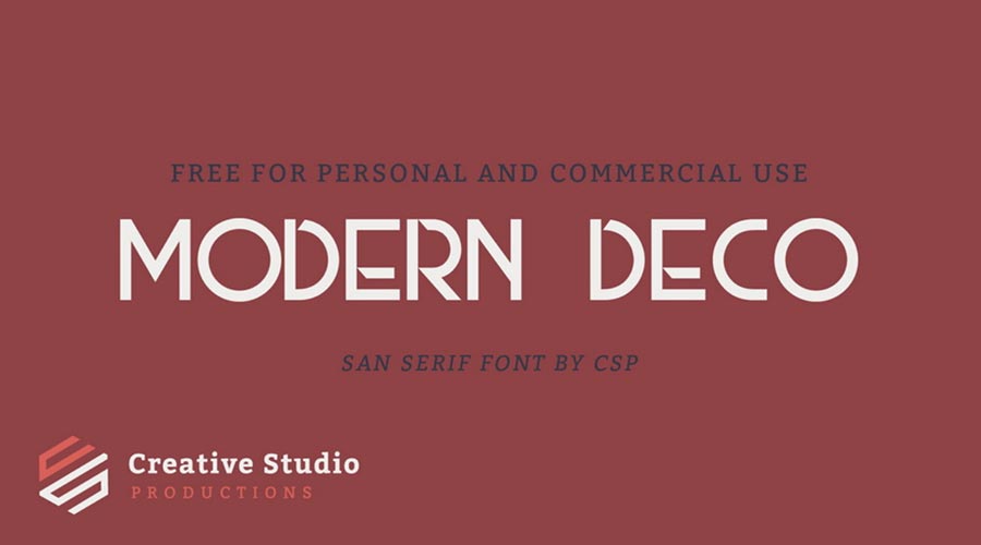
The evolution of the Art Deco aesthetic from the machine-driven optimism of the 1920s to the digital precision of the 2020s demonstrates the versatility of the style. Whether through the bold, unapologetic weight of Tyllon or the subtle, geometric elegance of Decondol, these fonts continue to provide designers with a robust toolkit for storytelling. By understanding the historical context and the technical parameters of these typefaces, modern creators can continue to utilize this "timeless" aesthetic to add depth, character, and a sense of enduring elegance to their digital projects. As design trends continue to cycle, the Art Deco influence serves as a reminder that the most effective design often draws its power from a balance of structural integrity and aesthetic flair.