The fundamental goal of user interface design is to minimize cognitive load, allowing visitors to navigate digital ecosystems without friction. Among the most common patterns in contemporary web development is the accordion—a vertical stack of headers that can be clicked to reveal or hide associated content. While seemingly simple, the choice of iconography used to signify these interactive elements significantly impacts user behavior. Recent research from the Nielsen Norman Group (NN/g) provides empirical evidence suggesting that the design community’s reliance on varied, often ambiguous icons is causing measurable confusion, ultimately undermining the utility of navigation menus.
The Evolution of Accordion Navigation
In the early days of the web, navigation was largely static. As site architectures grew more complex, the need for space-saving design patterns became paramount. The accordion emerged as a primary solution for mobile-first interfaces, where screen real estate is at a premium. However, the lack of a standardized universal signifier for these elements has led to a fragmented user experience.
Historically, designers have experimented with a variety of symbols, including plus signs, right-facing arrows, chevrons, and custom graphics. Each choice carries its own set of semantic baggage. For example, a "plus" sign is frequently associated with "add to cart" or "create new," while arrows are often perceived as indicators of directional movement or page-to-page navigation. This lack of standardization has created a scenario where users must relearn the navigation logic of every new website they visit.
Analyzing the Data: How Icons Influence Interaction
The NN/g study, which utilized eye-tracking and usability testing across diverse demographics, revealed that the specific icon chosen by a designer dictates how users interact with the entire component, not just the icon itself.
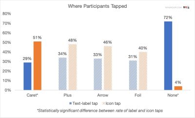
The findings were striking: when no icon was present, the overwhelming majority of test participants assumed that clicking the menu item would trigger a page transition. This aligns with standard web conventions where text-only navigation implies a link to a new destination. Conversely, when an icon was present, the hit area—the region a user targets—shifted.

Data shows that when a caret (a downward-pointing triangle) is used, users are significantly more likely to interact with the icon itself rather than the text label. This behavior suggests that the caret acts as a stronger psychological "affordance" for expansion than other symbols. When designers use ambiguous icons, such as arrows that might signify a "next" page, users frequently experience a disconnect, leading to frustration when the site performs an unexpected action, such as expanding a list instead of loading a new URL.
The Perils of Split-Button Architectures
One of the most problematic patterns identified in the research is the "split menu" or "split-button" architecture. In these designs, the text label is treated as a link to a category page, while the icon is treated as a trigger to expand a submenu.
From a technical and user-experience perspective, this is often a failure of design. Users rarely perceive the distinction between these two touch points. In mobile environments, where precision is hindered by the size of a human finger, users frequently trigger the expansion when they intended to navigate to the page, or vice versa. The resulting "double-action" requirement creates a complex interaction model that is rarely intuitive.
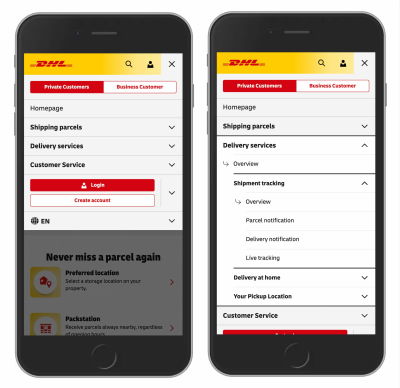
Industry leaders, such as logistics giant DHL, have moved toward a more streamlined approach. By removing the split-button complexity and ensuring that the main category header either acts as a primary link or a pure accordion trigger—with internal navigation links provided within the expanded content—brands can reduce error rates and improve the speed of user tasks.
Cognitive Load and Symbol Overloading
The issue of "symbol overloading" is a critical concern for modern UX professionals. When a single icon is used to represent multiple functions across a site, users become conditioned to pause and interpret the symbol, which interrupts the flow of information.
For instance, the plus sign is perhaps the most heavily overloaded symbol in UI design. It can mean "zoom in," "add to library," "create a new account," "increase volume," or "expand text." When a user encounters a plus sign in an accordion menu, they must resolve this ambiguity. Research indicates that this micro-second of hesitation, when repeated across a navigation menu, significantly increases the total time required for a user to find their desired content.

Similarly, arrows (both side-facing and down-facing) are often misinterpreted as "forward" or "down" movement through a paginated sequence. This is particularly problematic in multi-level navigation where nested accordions may exist. If a user sees a right-facing arrow, their primary mental model is that they are moving to a new section, not expanding a nested list.
Recommendations for Best Practices
Based on the current body of usability research, a set of best practices has emerged to standardize the interaction of accordion menus:
- Prioritize the Caret: The downward-pointing caret is currently the most reliable signifier for expansion. It carries the least amount of "noise" and is widely understood by users as a tool to reveal hidden content.
- Maintain Consistency: If a caret is used, it should be used consistently across the entire site. Changing icons within the same interface creates unnecessary cognitive load.
- Underline for Links: If an element is designed to take the user to a new page, it should not have an expansion icon. Instead, it should rely on traditional styling, such as an underline or a distinct color, to signal its function as a hyperlink.
- Avoid Split Actions: Eliminate the need for users to distinguish between clicking a label and clicking an icon. If a section needs to be both a link and an expander, the best practice is to include an "Overview" or "All" link inside the expanded content area.
- Simplify for Mobile: On mobile devices, the tap target should be generous. By making the entire row the trigger for the accordion, designers can avoid the common error of missed clicks on small icons.
Broader Implications for Web Accessibility
The push for standardized icons is not merely a matter of aesthetic preference or efficiency; it is an issue of accessibility. Users with cognitive impairments or those who rely on screen readers benefit immensely from predictable UI patterns. When symbols are used in non-standard ways, users who rely on muscle memory and established patterns are disproportionately affected.
Furthermore, as the web continues to transition into a "content-first" medium, the ability for users to quickly scan and parse navigation is essential. The "information scent"—the clues that lead a user to believe they are moving toward their goal—must remain strong. When an accordion acts as a barrier because the user cannot determine if the icon will take them to a new page or show them more options, the information scent is broken.
Conclusion: The Value of Simplicity
The findings from recent UX studies, including those by the Nielsen Norman Group, serve as a reminder that the most effective design is often the most invisible. There is a frequent temptation in the design community to innovate for the sake of uniqueness, yet the data confirms that when it comes to fundamental navigation, predictability is the ultimate virtue.
By adhering to standard conventions—such as using a simple caret for expansion and avoiding the clutter of split-button patterns—designers can create more inclusive, efficient, and usable digital environments. As the web evolves, the emphasis must remain on the user’s intent. Whether a user is searching for a specific product, reading a research article, or navigating a complex corporate site, the interface should facilitate their journey, not force them to solve a puzzle. The evidence is clear: for better web design, we must stop overcomplicating the simple act of showing and hiding information. Simplicity is not just a design choice; it is a fundamental requirement for the modern, accessible, and functional web.