In the contemporary landscape of graphic design, the philosophy of "less is more" has transitioned from a niche stylistic preference to a foundational requirement for effective communication. Minimalist typography, characterized by its reliance on clean lines, balanced proportions, and the intentional omission of decorative embellishments, serves as the backbone for modern UI/UX design, corporate branding, and editorial layouts. As digital interfaces become increasingly cluttered with information, designers are turning toward minimalist typefaces to ensure maximum legibility and cognitive ease for the end user.
The Evolution and Utility of Minimalist Typefaces
The history of minimalist design traces back to the early 20th century, drawing heavy inspiration from the Bauhaus movement and the Swiss Style (International Typographic Style) of the 1950s. The core objective was the pursuit of objectivity and neutrality in visual communication. Today, this tradition persists in the digital age. Research in cognitive psychology suggests that high-legibility fonts—those with generous kerning and consistent stroke widths—reduce the "cognitive load" on readers, allowing them to process information significantly faster than they would with ornate or high-contrast serif faces.

In practice, a minimal font is defined by its reductionist aesthetic. By stripping away extraneous flourishes, serifs, or complex ligatures, these fonts allow the content to occupy the foreground. This is critical for mobile applications, where screen real estate is limited, and for branding, where a logo must remain recognizable across various scales, from a favicon to a large-format billboard.
A Curated Selection of Modern Minimalist Fonts
Designers seeking to refine their digital libraries can utilize a variety of high-quality, free-to-use typefaces that balance aesthetic sophistication with functional versatility. The following selections represent a cross-section of current typographic trends:

1. Geometric and Sans-Serif Foundations
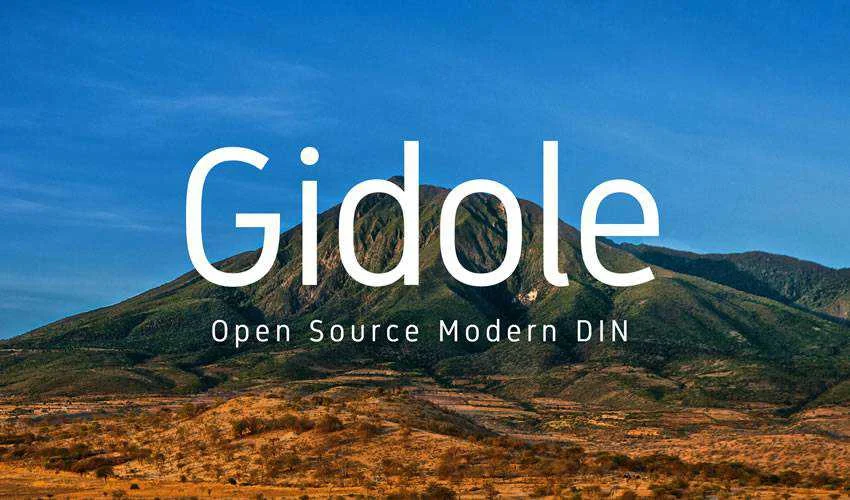
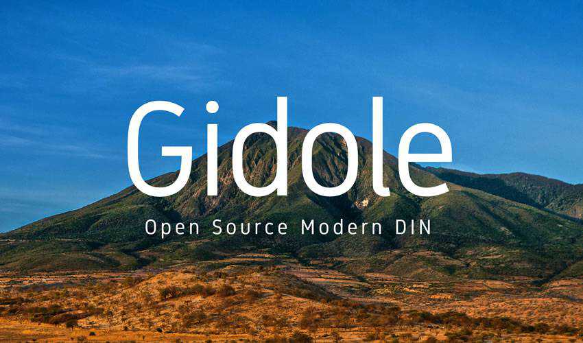
- Gidole: An open-source, modern DIN-style font that offers a structured, industrial feel. Its geometric precision makes it ideal for branding projects that require a sense of reliability and technical accuracy.
- Raleway: A versatile sans-serif that has become a staple for web designers. Its thin, elegant weight provides a refined look for headers, while its extensive range of diacritics and stylistic alternates makes it a robust choice for multilingual projects.
- Spartan MB: A modern, open-source geometric family derived from the classic League Spartan. With seven distinct weights, it is exceptionally well-suited for responsive web design, where varying levels of visual hierarchy are required.
2. Specialized and Display Typefaces
- Giraffey: This tall, condensed typeface is specifically designed for high-fashion and beauty industries. Its narrow stance allows for impactful headlines that command attention without overcrowding the page.
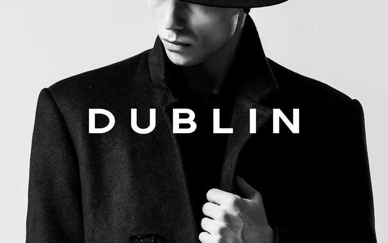
- Dublin Minimal: Featuring sharp edges and a bold, authoritative presence, this display typeface is tailored for headers that require a strong, uncompromising visual statement.
- Telegrafico: Inspired by the aesthetic of 20th-century Italian typography, this all-caps sans-serif provides a historical, architectural quality to posters and editorial headlines.
3. Monospaced and Technical Options

- Minimal Mono: For developers and designers working on technical documentation or interface design, this monospaced font offers a sharp, consistent rhythm. Its availability in regular, bold, and black variants ensures it remains legible across all device resolutions.
Technical Considerations and Implementation
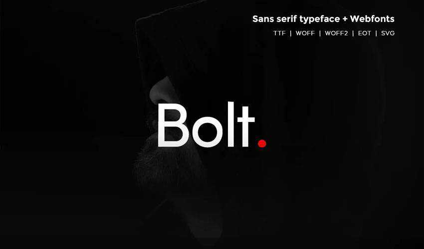
Selecting a font is not merely an aesthetic decision; it is a technical one. When choosing a typeface for a digital project, designers must evaluate the font’s performance in terms of rendering. Webfonts (WOFF/WOFF2) must be optimized to ensure that site load times remain within the recommended 2-second threshold, a key metric for both user experience and search engine optimization (SEO).

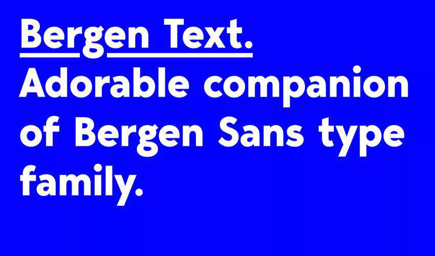
Furthermore, the "x-height" of a font—the height of the lowercase letters relative to the uppercase letters—plays a major role in legibility at small sizes. Typefaces like Bergen Text are specifically engineered for this purpose, featuring a balanced x-height that maintains clarity in dense paragraphs or sidebar text.
The Economic and Practical Impact on Design Workflows
The current accessibility of high-quality, free-to-use fonts has fundamentally shifted the economic barrier to entry for independent designers and small businesses. Previously, licensing premium typefaces required significant capital. Today, the rise of open-source platforms and generous licensing models—such as the SIL Open Font License—allows creators to integrate professional-grade typography into commercial projects without the burden of licensing fees.

However, professionals must exercise caution regarding licensing agreements. While fonts like Gidole, Axis, and Follana are generally offered for both commercial and personal use, others, such as Muller or Uni Neue, may offer only specific weights for free, with the full family locked behind a commercial license. A failure to audit these licenses during the initial project phase can lead to legal complications for corporate clients.

Future Trends: The Intersection of Minimalist Design and Accessibility
Looking ahead, the trajectory of minimalist typography is increasingly intertwined with accessibility standards. The Web Content Accessibility Guidelines (WCAG) emphasize the necessity of high-contrast, clear, and scalable typography for users with visual impairments. Minimalist fonts are inherently more compliant with these guidelines due to their lack of decorative noise.

As we move toward a future of augmented reality (AR) and wearable technology, the requirement for minimalist fonts will only intensify. In an AR environment, where text must be rendered instantly against complex real-world backgrounds, the simplicity of a typeface will be the deciding factor in whether information is readable or discarded as visual interference.

Summary of Best Practices for Designers
To ensure that the chosen typeface serves the intended design goal, consider the following checklist:

- Hierarchy: Use condensed fonts for headers and high-legibility, high-x-height fonts for body copy.
- Contrast: Ensure the font weight provides enough contrast against the background color, adhering to at least a 4.5:1 ratio for standard text.
- Variable Flexibility: Opt for font families that include multiple weights (e.g., Seb Neue or Spartan MB) to allow for greater control over layout and emphasis.
- Licensing Audit: Always confirm the specific terms of use on the provider’s website to verify if the font is truly free for commercial application.
- Performance: Test the font file size to ensure it does not negatively impact the page speed index of your website or application.
Conclusion
Minimalist typography remains a cornerstone of effective visual storytelling. By stripping away the unnecessary, designers can focus on the core message, ensuring that their work remains timeless, legible, and impactful. Whether you are developing a new brand identity, a mobile application, or a printed editorial piece, the fonts listed above provide a foundational toolkit for achieving professional results. As the design industry continues to evolve, the demand for clean, functional, and aesthetically superior typography will remain a constant, reinforcing the enduring value of minimalist design principles. By carefully selecting typefaces that offer both stylistic alignment and technical reliability, designers can ensure their work stands the test of time in an increasingly fast-paced digital environment.