In the contemporary landscape of digital and print design, the philosophy of "less is more" has become a cornerstone of visual communication. Minimalist typography, defined by its clean lines, generous kerning, and absence of ornamental flourishes, has transitioned from a niche aesthetic to a standard requirement for modern user interfaces, corporate branding, and editorial layouts. As designers strive to create high-legibility environments that minimize cognitive load for the end-user, the demand for accessible, high-quality, and versatile minimalist typefaces has reached an all-time high.
The rise of the minimalist movement in typography traces back to the early 20th-century Bauhaus school, which championed the idea that form should follow function. By stripping away the decorative serifs and intricate stroke variations of the Victorian era, designers were able to focus on the structural integrity of letterforms. Today, this historical context informs the creation of modern sans-serif and slab-serif fonts, which prioritize clarity above all else. With the proliferation of high-resolution mobile displays and the increasing complexity of data-heavy web environments, these fonts provide a necessary reprieve for the eye, ensuring that content remains the primary focus of any design.

Defining the Minimalist Aesthetic in Typography
At its core, a minimalist font is characterized by geometric consistency and high legibility. These typefaces avoid complex ligatures and unnecessary stylistic embellishments. By utilizing consistent stroke widths and balanced proportions, they enable a design to maintain a sense of order. According to recent user experience (UX) research, clean, sans-serif fonts significantly reduce reading fatigue in digital environments. A study by the Nielsen Norman Group suggests that optimal font choice can improve task completion times and information retention by as much as 15% when compared to cluttered or overly stylized typefaces.
A Curated Selection of Contemporary Minimalist Typefaces
The following selection highlights high-quality, accessible fonts that serve as essential tools for any professional designer’s library. These fonts have been selected based on their versatility, weight diversity, and compatibility with modern design software.

Versatile Sans-Serifs and Geometric Designs
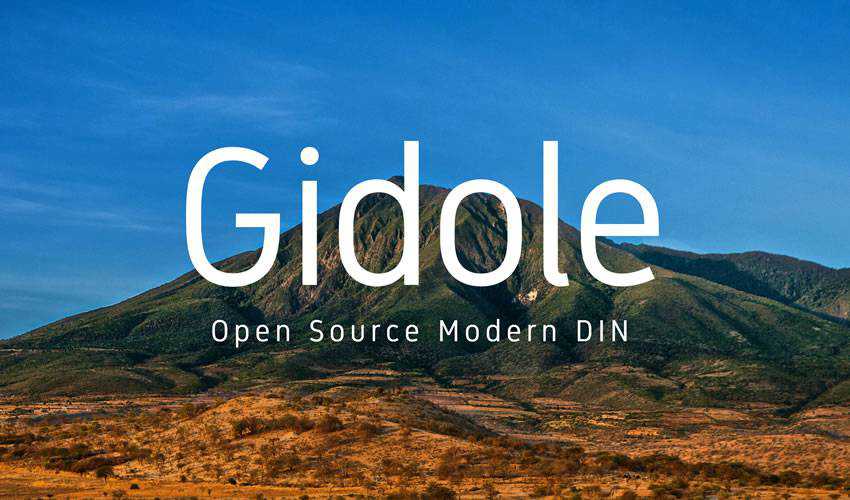
The Gidole Open Source Modern DIN is a prime example of the evolution of the DIN (Deutsches Institut für Normung) style. Originally designed for industrial applications, this modern iteration brings a refined, elegant quality to contemporary branding. Similarly, the Spartan MB font family—derived from the classic League Spartan—offers a robust geometric foundation. With seven distinct weights, it provides designers with the flexibility to create hierarchical structures within a layout, from bold, attention-grabbing headlines to crisp, legible body text.
For projects requiring a balance of personality and minimalism, the Raleway typeface remains an industry standard. Originally conceived as a single thin weight, its expansion into a comprehensive family featuring stylistic alternates and diacritics has made it a favorite for high-end editorial work. Its ability to shift from an elegant, thin display font to a functional, highly readable body typeface is a testament to its design versatility.
Niche Applications: Monospaced and Slab-Serif
Minimal Mono offers a contemporary take on the traditional typewriter aesthetic. In the current design climate, where "coder-chic" has become a popular design trend, monospaced fonts are no longer relegated to text editors. They are increasingly used in web layouts to establish a sense of technical precision and structural honesty.

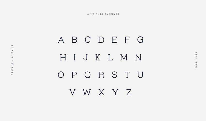
Conversely, the Virtuous Slab font provides a bridge between the softness of a sans-serif and the grounding weight of a slab-serif. By maintaining a clean, minimalist profile, it allows for a sense of permanence and authority in logo design, a quality often sought after in corporate identity projects where the "modern-classic" look is desired.

Specialized Display and Headline Typefaces
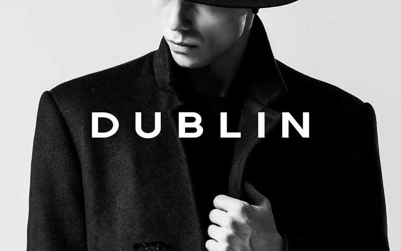
For high-fashion or beauty branding, the Giraffey free font offers a tall, condensed stature that commands attention. Its verticality creates a sense of sophistication and exclusivity, essential for luxury retail applications. For projects in the hospitality sector, the Relica Trio provides a rounded sans-serif aesthetic that feels approachable and warm without sacrificing the clean lines of a minimalist typeface. This is particularly effective for businesses like cafes or boutiques, where brand identity must feel both professional and welcoming.
Chronology of Modern Font Accessibility
The accessibility of these high-quality fonts has been made possible by a shift in how type foundries and independent designers distribute their work.

- 2010–2015: The "Free Font" movement gains momentum, driven by the emergence of platforms like Google Fonts and various independent design marketplaces. This period saw the normalization of licensing high-quality type for free or "pay-what-you-want" models.
- 2016–2020: The rise of subscription-based asset platforms changed the economics of font acquisition, allowing designers to access premium libraries without the prohibitive per-font licensing costs that previously hindered small-scale agencies.
- 2021–Present: Open-source development has matured, with GitHub and similar repositories becoming the primary hubs for experimental and highly refined minimalist typefaces, such as the Gidole and Athena projects.
The Economic and Practical Implications for Designers
From a business perspective, the availability of free, high-quality fonts has democratized the design process. Small startups and individual entrepreneurs can now access the same typographic tools as large, established corporations, leveling the playing field in branding. However, the abundance of choice brings its own set of challenges. Designers must now curate their libraries with a focus on "font pairing"—the art of combining two or more typefaces to create a cohesive visual narrative.

Industry professionals suggest that when selecting a font, one must consider the "x-height" and the "aperture" of the characters. A larger x-height generally improves readability on mobile devices, while a wide aperture prevents letters like ‘e’ and ‘a’ from closing up at small sizes. When reviewing a typeface for a project, the inclusion of comprehensive glyph sets, numerals, and, where possible, multilingual support, should be the primary technical criteria for selection.

Conclusion and Future Outlook
The trajectory of design suggests that minimalism will remain a dominant force in visual communication. As augmented reality (AR) and virtual reality (VR) interfaces begin to occupy more space in the consumer consciousness, the need for fonts that prioritize legibility in three-dimensional, high-contrast environments will become even more critical.

The collection presented here represents only a fraction of the digital resources available to the modern creator. By integrating these minimalist fonts into a design library, professionals can ensure that their work remains clean, sophisticated, and effective in an increasingly crowded visual landscape. As technology continues to evolve, the fundamental principles of good typography—clarity, proportion, and balance—will remain the enduring hallmarks of great design. Designers are encouraged to audit their current libraries regularly, removing redundant or poorly constructed files in favor of these high-utility, minimalist options that stand the test of time.