Beyond the Chat Bubble: Rethinking AI Interface Modalities for True User-Centric Design

The design community has entered a period of conversational tunnel vision. Because Large Language Models (LLMs) are trained on dialogue, the industry has collectively decided that the chat bubble is the natural home for every AI capability. While the chat interface is a viable and powerful option for many tasks, it is one tool in an expansive toolkit. UX and Product teams must be intentional about the modalities we choose for how users provide their data and commands, and how the system presents its output. Modality refers to the way a person uses their senses—seeing, hearing, touching, speaking, or typing—to interact with a system. To pick the best method, one must consider what the user aims to achieve, their current location, and the cognitive effort they are already expending. This approach prioritizes adapting the interface to the user, rather than forcing the user to adapt to the interface.
The limitations of a purely conversational AI are starkly illustrated by a hypothetical scenario: a traveler rushing through a noisy airport after a last-minute gate change. Juggling a roller bag and a coffee, they need to quickly access their airline app to find their new departure gate. A chat-based AI interface, in this context, would likely fail spectacularly. It would demand the traveler stop, balance their belongings precariously, and type a lengthy booking reference number into a small chat window. Upon submission, the system might respond not with a clear, prominent gate number, but with a dense paragraph detailing the meteorological phenomena causing the delay, burying the crucial information at the very end. This experience, while perhaps not causing them to miss their flight, would undoubtedly leave a lasting impression of anxiety and underscore a perceived lack of user understanding by the company. The airline, in this instance, may have developed a sophisticated AI, but the interface proved to be a critical failure point, demanding physical dexterity the traveler lacked and cognitive focus they could not spare. This article explores how to avoid such scenarios by rigorously evaluating the physical and cognitive load of users to align both input and output modalities with their immediate intent.
The Myth of the Do-It-All Chatbot
The ubiquity of the chatbot stems from its perceived simplicity and flexibility from a product development standpoint. It appears to be a blank slate capable of handling any user input. However, a text-heavy interface often imposes a high "adaptation load," significantly increasing the cognitive demands placed upon users. Over time, this cognitive burden can evolve into a psychological tax, where individuals must consciously alter their natural thought processes to accommodate the limitations of a machine.
When an interface relies solely on conversation, it presents a dual challenge: a linguistic barrier for input and a cognitive hurdle for output.
Input: The Linguistic Barrier of the Text Box
A blank chat box presents a significant obstacle for users attempting to discover an AI tool’s capabilities. Unlike traditional graphical interfaces with their menus and buttons that clearly signal available options, chat interfaces often lead to "choice paralysis." Users are forced to guess the AI’s potential, resorting to remembering precise phrasing or technical jargon to achieve desired results.
Consider a data analyst needing to identify a specific trend within a spreadsheet. A conventional tool might offer intuitive filter or sort buttons. In a chat interface, this task transforms into a linguistic challenge, requiring the analyst to articulate complex logic in a complete sentence. Similarly, a manager attempting to reschedule a team calendar intuitively uses drag-and-drop functionality. Describing these shifts via a text prompt adds an unnecessary layer of effort, making a simple task feel considerably more arduous.
Designing for input necessitates acknowledging that composing a prompt is inherently a creative act. It requires users to translate a vague thought into a specific command. For many professionals, this presents a significant linguistic barrier. A graphic designer might possess a clear vision for an image but struggle to articulate the nuances of lighting or texture in a text prompt. In such cases, a slider or a color picker serves as a far more effective input method than a text box.
Having addressed the linguistic barrier of prompt construction, it is crucial to examine the other facet of the conversational burden: the cognitive cost imposed by AI responses delivered in dense blocks of text.
Output: The Cognitive Cost of Reading Long Text
When an AI responds with lengthy textual outputs, the burden of interpretation is shifted entirely to the user. Text, by its nature, is a serial medium; the brain must process words sequentially to extract meaning, a process that consumes time. While sequential reading is indispensable for complex analyses, such as intricate legal arguments or detailed medical histories, relying on text for data that visual formats convey more efficiently creates friction. Visual methods, conversely, enable parallel processing. A chart, for instance, can be scanned, and a pattern identified in a fraction of a second.
Imagine requesting a project status update from an AI. Instead of a color-coded dashboard, the user receives three paragraphs detailing every task completed that week. The user must then meticulously read the entire response, mentally synthesizing the information to extract the single piece of data they require. The efficiency of a quick visual check is replaced by the demand of a reading assignment.
The cognitive tax of this process is amplified when professional stakes are high. A physician requiring a patient’s vital signs needs a clear numerical display, not a narrative description of the readings. A stock trader seeking to identify a price spike requires an immediate line graph, not a written account of price movements over the past hour. In both scenarios, a text-based response forces professionals into a slow, error-prone extraction process precisely when speed and accuracy are paramount.
A Taxonomy of Input and Output Modalities
Before selecting an interface modality, practitioners require a shared vocabulary for the available options. The following table maps common input and output modalities to contexts where each excels. This is not a ranking system; rather, it acknowledges that each modality has a specific role to play within a given workflow.
Designing for modality inherently requires a strong focus on accessibility. While visual dashboards offer rapid insights for many, designers must also provide screen-reader-optimized audio alternatives for users with visual disabilities. Ultimately, modality choices should aim to multiply pathways to information.
Input Modalities
| Modality | Best For | Example Contexts | Cognitive & Physical Rationale |
|---|---|---|---|
| Button / Tap | Single-step, binary actions | Launching a feature; confirming an alert | Eliminates recall overhead by utilizing recognition; maximizes execution speed during time-sensitive tasks. |
| Voice | Hands-busy or eyes-busy contexts | Field technician query; driving navigation | Offloads physical interaction to speech, though bounded by ambient noise and social privacy norms. |
| Natural Language Chat | Ambiguous or exploratory queries | Researching options; asking follow-up questions | Offers users freedom in what they can say; however, the user must figure out how to phrase their request clearly. |
| Form / Wizard | Structured, multi-field data entry | Filling out a contract; configuring a report | Keeps users from missing information by breaking down a complicated task into clear, step-by-step visual sections. |
| GUI (Filters, Sliders, Drag-and-drop) | Complex parameter setting or spatial tasks | Scheduling; data filtering; image editing | Prevents mistakes and ensures users don’t miss information by dividing complicated tasks into clear, step-by-step visual parts. |
| Multi-modal (Image + Text) | Visual input paired with description | Uploading a design mockup with annotation | Reduces the effort of explaining things because users can reference an object instead of having to describe it only with words. |
| Gesture | Hands-free spatial interaction | Waving a hand to acknowledge an alert in a sterile operating room | Allows physical interaction without touching a surface. This keeps users safe and clean in contaminated environments and allows for quick input or acknowledgement. |
Output Modalities
| Modality | Best For | Example Contexts | Cognitive & Physical Rationale |
|---|---|---|---|
| Push Notification / Alert | Time-sensitive, ambient awareness | Price spike alert; task completion notice | Provides a quick update that the user can process at a glance. It delivers information without demanding a full break in concentration from their primary task. |
| Audio Summary | Hands-busy or eyes-busy contexts | Status updates while walking; conversational voice agents providing real-time navigation | Delivers information directly to the user’s ear. Removes the need to look at a screen, keeping the user safe and aware of their physical surroundings while moving or working. |
| Short Text Summary | Focused queries needing brief answers | Definition lookup; single-metric status | Gives a fast answer to a direct question. Users can read a short sentence quickly without experiencing the fatigue of scanning paragraphs of text. |
| Visual Dashboard | High-density, comparative analysis | Project status; resource allocation | Enables visual trend and outlier detection. Avoids the mental effort of reading data line-by-line and cross-referencing in real time. |
| Interactive Canvas | Generative or iterative creative tasks | Design iteration; layout adjustment | Allows users to manipulate the output instead of asking an AI to move it via text instructions. Reflects a natural way to interact with the output. |
| Inline Confirmation | Guided task flows needing feedback | Step-by-step configuration wizard with in-line validation | Provides visual proof that the system recorded a choice correctly. Reduces users’ anxiety about wondering if an error occurred. |
Table 1: Input and Output Modality Taxonomy. Use this as a reference during the Task Audit to identify candidate modalities before narrowing to a recommendation.
The Cognitive Spectrum of Modality, illustrated in Figure 2, maps how mental effort scales across various interaction methods. This spectrum is a critical tool for designers to visualize the shift from low-effort, ambient interactions to high-effort, focused experiences. By understanding where a specific task falls on this spectrum, teams can determine whether a user requires a "glanceable" output that minimizes mental processing or a high-density format that supports deep analytical thinking.
With this taxonomy established, the next step is to apply a rigorous method to select the optimal input and output combination. Practitioners must ground this selection process in the user’s real-world environment and context.
Task Audit: A Framework for Modality Selection
To choose the right interaction method, practitioners should complete a Task Audit before interface design commences. A formal Task Audit serves as a framework to transition from assumptions about user behavior to evidence-based decision-making. This process gathers data about the physical, social, and cognitive context in which work is actually performed, which then drives all input and output modality decisions.

The audit should focus on four key areas:
- Physical Constraints: The user’s environment, available tools, and physical limitations.
- Social Constraints: The presence of others, privacy considerations, and collaborative needs.
- Cognitive Load: The mental effort required to understand and operate the system, including memory, attention, and decision-making demands.
- Intent: The user’s immediate goal and desired outcome.
The audit aims to answer two fundamental questions for every feature:
- What is the user trying to achieve, and what is their immediate intent?
- What are the environmental and contextual factors that will influence how they interact with the system?
To gather evidence for this audit, several UX research methods can be employed:
1. Contextual Inquiry and Observation
This method provides the most direct insight into how people work in their natural settings, yielding the richest data for identifying physical constraints on both input and output. Observation is crucial because users often engage in "hidden work"—small steps or workarounds they may forget to mention in an interview or environmental details they overlook due to adaptation.
- The Approach: Visit the user’s actual workspace—be it a field site, warehouse, or office floor. Request that they perform the task under study and observe meticulously.
- What to Look For: This method is particularly revealing for identifying Input Constraints and Output Constraints. Pay attention to how users hold devices, the presence of protective gear, lighting conditions, noise levels, and the physical space they occupy.
2. Focused Interviews
Interviews are essential for uncovering the mental models and decision points that observation alone cannot capture. They are most valuable for understanding Cognitive Load.
- The Approach: Conduct one-on-one sessions with end-users and stakeholders responsible for the outcome. Utilize a structured protocol focused on specific tasks, requesting narratives about past successes and failures rather than general opinions.
- What to Look For: Probe for users’ thought processes, the challenges they encounter, and how they overcome them. Ask about moments of frustration or confusion, and what information they find most critical at different stages of a task.
3. Collaborative Workshops
Workshops are vital for defining task boundaries and establishing required fidelity levels. Product managers and stakeholders bring foundational knowledge of system requirements, while researchers apply audit criteria.
- The Approach: Use workshops to build a shared Task Inventory. Gather designers, engineers, product managers, and business analysts to map out every step of a process. Product managers and business analysts ensure factual accuracy, while the research team applies audit criteria to each step.
- What to Look For: Identify the sequence of actions, dependencies between tasks, and the criticality of each step. Assess where information is currently accessed and how it is used.
Once field evidence is gathered through these research channels, map the findings directly against the Modality Taxonomy. Each documented physical or social constraint systematically eliminates mismatched interfaces. This process removes design guesswork, narrowing architectural choices to the specific input and output combinations that can realistically function within the user’s environment.
By grounding input and output modality decisions in field evidence rather than interface convention, the resulting design reduces adaptation load for the user and provides a robust justification for the resources needed to create an optimal experience.
Input/Output Alignment Matrix
With the Task Audit findings in hand, an Input/Output Alignment Matrix can be used to map user intent to specific modality combinations. This matrix is organized by what the user is trying to accomplish at a given moment, a distinction that matters significantly. If a user’s intent shifts throughout a single workday, the interface should adapt accordingly.
Selecting the wrong modality for a user’s context can lead to frustration. Users may feel mentally drained if information is delivered through a difficult-to-process format, such as a lengthy status update solely in text. They might also experience anxiety about whether an action was completed correctly when a precise command is lost within a long chat exchange. Ultimately, the system can force users into cumbersome workarounds, compelling them to adapt to the machine’s methods rather than operating in their most effective, natural way.

Table 2: Input/Output Alignment Matrix. Map user intent to modality combinations using Task Audit evidence. The two added rows (Monitoring/Alert and Guided Task Completion) cover common enterprise and mobile scenarios not captured in simpler frameworks.
When teams coordinate these factors, they can move beyond the automatic default of adding a chatbot. Visual layouts enable rapid scanning. Structured inputs remove the burden of constructing perfect sentences. Audio outputs can serve users whose hands and eyes are otherwise occupied. The right modality combination respects the user’s physical and cognitive state at the moment of interaction.
Case Study: Adaptive Modality for Field Technicians
The Problem: Cognitive Overload in High-Risk Environments
Field technicians servicing high-voltage electrical grids often face a dangerous misalignment of interface modality. Traditionally, these technicians relied on ruggedized tablets for technical manuals and status updates. However, the physical constraints of the job—wearing heavy protective gloves and working at significant heights in bucket trucks—made interacting with a standard touch interface nearly impossible on-site. Furthermore, attempting to read complex, text-heavy diagnostic reports on a screen while maintaining situational awareness created a high cognitive load, increasing the risk of safety errors.
Research Methods: Capturing the Reality of the Field
To address this, researchers conducted a Task Audit using several methods. First, Contextual Inquiry and Observation revealed that technicians frequently worked in "hands-busy, eyes-busy" states, where any manual input was a significant barrier. Researchers observed technicians wearing mandatory thick protective gloves, making precise screen taps difficult and often triggering incorrect commands. High-altitude environments introduced severe screen glare, washing out the display and rendering text illegible even at maximum brightness. Technicians also faced the physical safety risk of manipulating a heavy tablet while balanced precariously, creating a distraction that could lead to dangerous slips. These factors, combined with the constant need to monitor live wires and the surrounding environment, meant technicians could not safely dedicate their eyes or hands to a standard tablet interface, confirming the severity of the eyes-busy and hands-busy constraints.
Second, Focused Interviews with veteran technicians validated these findings. They confirmed that operational challenges, including thick gloves, screen glare, and safety risks, were common across multiple sites, solidifying the need for a non-touch, voice-first solution. Interviews also surfaced a critical cognitive constraint: the need for "glance verification" of vital signs, such as voltage and temperature trends, rather than being forced to read lengthy narrative descriptions of system health. Technicians stressed their primary need was immediate, unambiguous verification—"Is this safe?" or "Where is the fault?"—not an exhaustive diagnostic report, indicating that a text-heavy response was detrimental to their workflow.
These methods confirmed that the environment necessitated a departure from traditional chat or form-based AI interfaces.
The Resolution: A Multi-Modal Handoff Solution
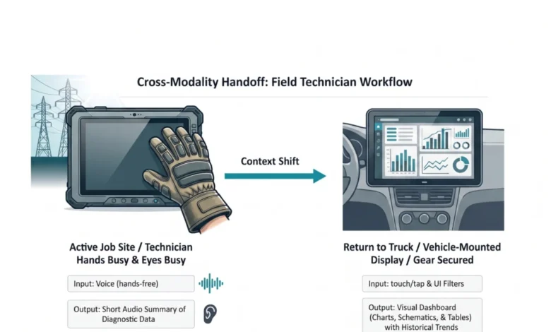
The resulting solution implemented an adaptive modality handoff designed to mitigate the physical and cognitive barriers. While active on a job site, technicians utilize voice input to query the system, allowing them to remain productive while wearing thick gloves that would otherwise hinder precise touchscreen interaction. The AI responds with a short audio summary of immediate diagnostic data. This audio feedback bypasses screen glare issues and allows the technician to maintain situational awareness of the high-voltage grid without compromising safety. By providing immediate answers to fault locations through audio, the system meets the technician’s need for glance verification via a hands-free, eyes-free channel.
Once technicians return to their vehicles and secure safety gear, a system automatically hands off workflows to a 15-inch visual dashboard mounted inside the vehicle. This larger display allows for parallel processing of historical trend data and wide electrical grid maps, overcoming the limitations of smaller ruggedized tablets. This case study, derived from an actual field audit for a national utility provider, demonstrates how implementing this adaptive approach reduced diagnostic time by twenty percent and increased daily tool adoption among field crews.
Designing for the Environment
An AI capability is only as usable as the interface that delivers it. Researchers and designers must resist the allure of the path of least resistance. Building a chatbot is fast and familiar, a practice common for decades. However, constructing an interface that feels like a natural extension of how someone already works is more challenging and ultimately more impactful.
The process should begin by stepping away from the screen. The Task Audit necessitates presence in the actual places where work happens: the field site, the warehouse floor, the operating room. The physical and social realities of these spaces are not edge cases; they are the design brief.

The future of AI interface design lies in a diverse ecosystem of visual, vocal, haptic, and ambient modalities, calibrated to user intent and environmental context. The chat window is one tool within that ecosystem, suitable for specific jobs, but often the wrong tool for tasks to which it is reflexively assigned.
In order to create the greatest likelihood of acceptance and use of the AI capability offered to users, the modality must fit the person and the place.
Where to Start
To begin immediately, conduct a lightweight version of the Task Audit before the next design sprint. Spend two hours observing the workflow in its actual environment. Conduct three to five interviews with individuals performing the task. Involve a Product Manager or analyst in a 90-minute workshop to build a task inventory and apply the audit questions. While complete data may not be gathered, there will be sufficient evidence to make a defensible modality recommendation grounded in data rather than convention.
A Modality Task Audit Template can assist teams in this process. This worksheet can be taken directly to field observations, allowing design and product teams to document specific physical barriers before writing any code.
The template includes sections for:
- Part 1: Physical Reality Check: Observing users in their workspaces and noting the state of their hands, visual focus requirements, and ambient noise levels.
- Part 2: Cognitive Baseline: Rating the mental effort required for specific workflows based on reading density and verification anxiety.
- Part 3: Handoff Map: Charting user journeys across different environments and documenting required input and output at each stage.
While significant investment is often placed on training smarter AI models, equal attention must be paid to human interfaces. A brilliant underlying model packaged within a simplistic text interface ultimately fails. By observing actual work environments and aligning interaction modalities accordingly, adaptation friction can be significantly reduced.