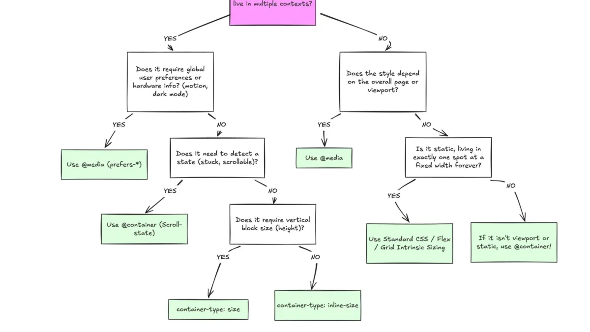
Despite broad browser support, container queries remain one of the most underutilized and frequently misunderstood advancements in modern front-end web development. While media queries have served as the backbone of responsive design for nearly two decades, the evolution of the web into a component-driven ecosystem has rendered them insufficient for the complex, modular interfaces of today. By allowing components to adapt to their immediate parent container rather than the global viewport, container queries offer a granular level of control that promises to redefine how developers build scalable, reusable user interfaces.
The Evolution of Responsive Design
The introduction of CSS Media Queries in 2009 via the W3C recommendation marked a turning point in web history. For the first time, developers could conditionally apply styles based on the width of the user’s device, ushering in the era of "responsive design." However, this approach relied on a fundamental proxy: the viewport. By tying a component’s appearance to the browser window’s dimensions, developers created a rigid dependency. A sidebar component, for instance, might look perfect on a 1024px tablet, but if that same component were moved to a smaller sidebar or a different grid layout, the media query would fail to reflect the actual space available to that specific element.
The push for container queries began in earnest around 2017, as the industry transitioned from page-centric development to component-based architectures using frameworks like React, Vue, and Angular. The "CSS Wishlist" of 2019 featured container queries as a top priority for developers, reflecting the widespread frustration with "media query bloat"—the practice of writing countless overrides to account for every possible screen size.

Current State of Adoption
Despite the CSS Working Group finalizing the specification and major browsers—including Chrome, Edge, Firefox, and Safari—reaching a consensus of approximately 94% global support, real-world adoption remains sluggish. According to the 2025 State of CSS survey, while 86% of developers report awareness of the feature, only 41.4% have integrated it into their production workflows.
Industry experts, including noted CSS educator Kevin Powell, have characterized this adoption rate as disproportionate to the feature’s utility. At the 2026 SmashingConf in Amsterdam, discussions highlighted that many developers continue to approach container queries with the same mental model as media queries, leading to implementation errors. The failure to adopt is not necessarily a lack of interest, but rather a persistent inertia caused by the long-standing habit of "viewport-first" thinking.
The Technical Distinction: Macro vs. Micro Layouts
To understand why container queries are a necessary evolution, one must distinguish between "macro" and "micro" layouts. Media queries are, by definition, "macro" tools. They excel at managing the structural skeleton of an entire page: the global header, the main navigation, and the overarching grid system. They respond to the "big picture" of the viewport.
Conversely, container queries function at the "micro" level. They allow a component to query its own environment. If a card component is placed inside a narrow sidebar, it can now be instructed to stack its contents vertically. If that same card is moved into a wide, main-content area, it can automatically transition to a horizontal layout. This shift transforms the component from a static entity into a "context-aware" object.

The Mechanics of Implementation
The implementation of container queries requires two distinct steps: defining the container and applying the query.
- Container Definition: A parent element must be established as a container using the
container-typeproperty (typically set toinline-size) and optionally assigned acontainer-name. - The Query: Using the
@containerat-rule, styles are applied based on the available space within that specific container.
This approach resolves the "overflow" issues common in complex grids, where elements would previously cramp or deform because they were responding to the 1920px width of a desktop monitor rather than the 300px width of the column they occupied.
Advanced Capabilities and Fluidity
One of the most significant advantages of this technology is the introduction of container-relative units: cqi (container query inline size), cqb (container query block size), and others. When combined with the clamp() function, these units enable "fluid typography." Unlike viewport-relative units (vw), which scale fonts based on the browser window, container-relative units allow text to scale proportionally to its parent container. This ensures that a headline inside a small card does not become unreadably large or small when the card is moved to a different part of the application.
Furthermore, container queries can act as a bridge for complex layouts that were previously impossible to handle with pure CSS. For example, detecting when flex items wrap to a new line has historically required JavaScript-based ResizeObserver APIs. By using a container query, developers can now trigger style changes when a flex item hits a specific threshold, effectively creating a CSS-only "state detection" mechanism.

Strategic Limitations and Considerations
While powerful, container queries are not a universal replacement for media queries. There are notable architectural constraints:
- The Self-Query Restriction: A container cannot query itself. If a developer attempts to apply a container query to an element and then style that same element based on its own query, it creates an infinite loop. This necessitates the use of wrapper elements, which can slightly increase DOM complexity.
- Size Collapsing: If a developer sets
container-type: sizeon an element without an explicit height, the container may collapse to zero height, as it ignores the height of its children. In most practical scenarios,inline-sizeis the safer, more robust choice. - Custom Property Incompatibility: Unlike media queries, container queries cannot currently evaluate custom properties (CSS variables). This is a deliberate design choice by the CSS Working Group to prevent circular dependencies, as custom properties cascade and could theoretically be modified by the very queries that rely on them.
Industry Implications and Future Outlook
The shift toward container queries represents a broader movement toward "intrinsic web design"—a philosophy where layouts are defined by the content and the container rather than arbitrary device breakpoints. As the number of unique viewport sizes on the modern web continues to proliferate—with over 2,300 variations currently tracked—relying on media queries to "catch them all" is becoming an unsustainable task for developers.
The transition to container-based architecture requires a shift in how teams structure their CSS. Instead of building for "mobile, tablet, and desktop," developers must begin building for "component states." This modular approach not only improves code maintainability but also drastically reduces the amount of override code required to fix layout glitches.
As education around these features continues to grow, it is expected that the gap between awareness and adoption will narrow. The tools provided by modern browsers have effectively solved the "responsive nightmare" that defined the last decade of web development. It is now up to the development community to abandon the outdated reliance on the viewport and embrace a more localized, context-aware methodology. By focusing on the component’s needs rather than the device’s limits, developers can ensure that the web remains a fluid, accessible, and performant medium for years to come.