Unlocking Visual Storytelling: A Comprehensive Guide to Adobe Lightroom Color Grading LUTs

Adobe Lightroom’s Look-Up Tables (LUTs) offer photographers and designers a powerful, efficient method to elevate the aesthetic appeal of any photograph. These digital presets serve as a shortcut to applying professional-grade color grading effects, becoming an indispensable tool in the modern digital artist’s arsenal. By intelligently adjusting elements such as color saturation, tonal curves, and white balance, Lightroom LUTs enable users to imbue their images with specific moods, emotions, and even convey the passage of time, transforming raw captures into compelling visual narratives. This article delves into a curated selection of these transformative tools, providing a detailed exploration of their capabilities and applications.
The core functionality of color grading LUTs lies in their ability to systematically alter the color and tonal characteristics of an image. Unlike manual editing, which can be time-consuming and require extensive technical knowledge, LUTs provide pre-defined settings that can be applied with a single click. This efficiency is particularly valuable for professionals who handle large volumes of imagery or require a consistent aesthetic across a project. The impact of these presets extends beyond mere beautification; they are instrumental in establishing a distinct visual language, whether for a brand, a personal portfolio, or a specific creative project.
A significant advantage of utilizing Lightroom LUTs is the democratization of advanced color grading techniques. What once required deep expertise in color theory and complex software manipulation is now accessible to a wider audience. This accessibility fosters creativity and allows individuals to focus more on the conceptual aspects of their photography rather than getting bogged down in technical minutiae. Furthermore, the ability to save time on editing translates directly into increased productivity, allowing creators to dedicate more resources to shooting and concept development.
The following sections will explore various categories of Lightroom color grading LUTs, highlighting their unique characteristics and potential applications. Each category represents a distinct approach to manipulating color and tone, offering a diverse palette for visual storytelling.
Warm Tone Lightroom Color Grading: Embracing the Sun’s Embrace
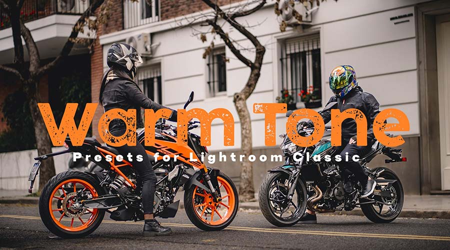
The Warm Tone Lightroom Color Grading presets are designed to infuse photographs with inviting hues of orange, red, and yellow. These presets are particularly effective in enhancing landscapes, imbuing them with a sun-drenched, glowing quality, and can also add a flattering warmth to portrait photography. The underlying principle is to shift the color temperature towards the warmer end of the spectrum, simulating natural light conditions that evoke feelings of comfort, energy, and vibrancy. For instance, a landscape shot taken on an overcast day can be transformed into a scene bathed in the rich light of late afternoon, adding depth and emotional resonance. Similarly, portraits can benefit from a subtle warming effect that enhances skin tones and creates a more intimate feel.
The application of these warm tones can be linked to psychological responses. Warm colors are often associated with happiness, enthusiasm, and a sense of welcome. In marketing and branding, the strategic use of warm tones can evoke feelings of approachability and positivity, making them ideal for lifestyle photography, food blogs, or any content aiming to create a friendly and engaging atmosphere. The ability to achieve this effect with a single preset not only saves time but also ensures consistency in brand messaging, a critical factor in today’s visually saturated digital landscape.
Cool Tone Color Grading for Lightroom: The Allure of Serenity and Depth
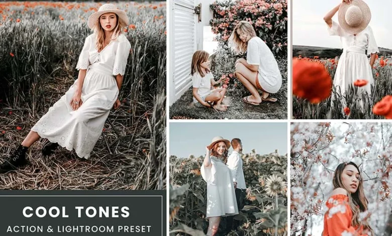
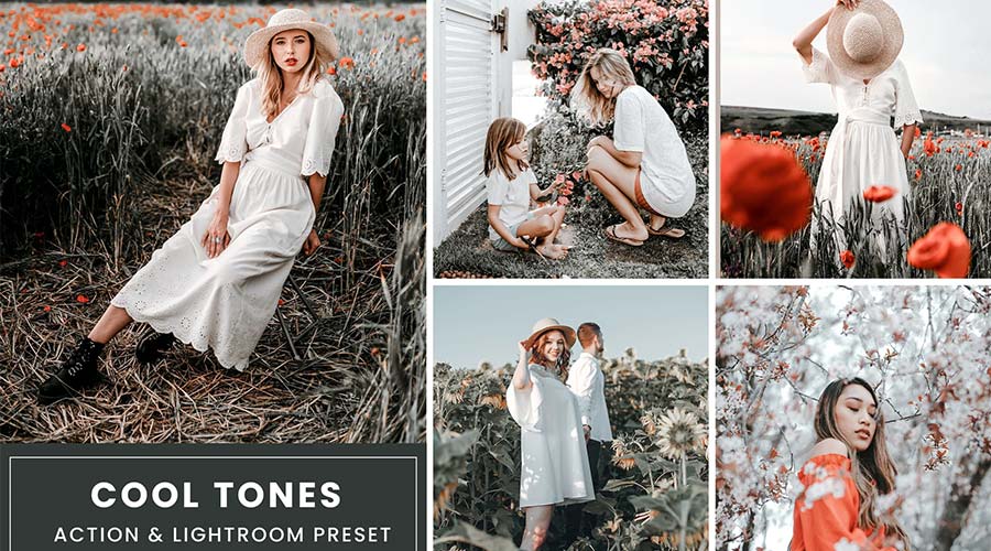
Conversely, Cool Tone Color Grading presets are engineered to accentuate cooler color palettes, introducing shades of blue, cyan, and green. These presets are adept at making subjects "pop" by creating a visual contrast against warmer backgrounds or by establishing a serene, sophisticated, or even melancholic atmosphere. This technique is frequently employed in genres like fashion photography, where a cool, crisp aesthetic can lend an air of elegance and modernity. It can also be used to evoke a sense of calm and tranquility in landscape photography, particularly in scenes depicting water bodies or twilight.

The psychological impact of cool tones often relates to feelings of calmness, professionalism, and a sense of spaciousness. In design and branding, cool tones can convey reliability, trust, and a forward-thinking approach. For photographers looking to create a distinct artistic signature, cool-toned presets offer a powerful way to differentiate their work. The subtle manipulation of these tones can transform a mundane scene into something more dramatic or ethereal, demonstrating the profound influence of color on perception.
Vintage Film Color Grading Presets: A Nostalgic Journey
The Vintage Film Color Grading presets offer a pathway to recapturing the aesthetic of classic analog photography. These collections are curated to emulate the unique color shifts, grain, and tonal characteristics inherent in traditional film stocks. By applying these presets, photographers can imbue their digital images with a sense of history, nostalgia, and artistic depth. The appeal lies in the inherent imperfections and organic feel of film, which often translates into a more emotionally resonant and timeless image.
These presets are versatile, finding application in portraiture, travel photography, and even product shots where a retro or artisanal feel is desired. The rich, often subdued, color palettes and the subtle introduction of film grain can add a tangible texture and a story-telling element to digital captures. The process of emulating film has become increasingly popular as digital photography matures, with many seeking to combine the convenience of digital capture with the timeless allure of analog aesthetics.
Cinematic Lightroom Color Grading: Hollywood’s Visual Language
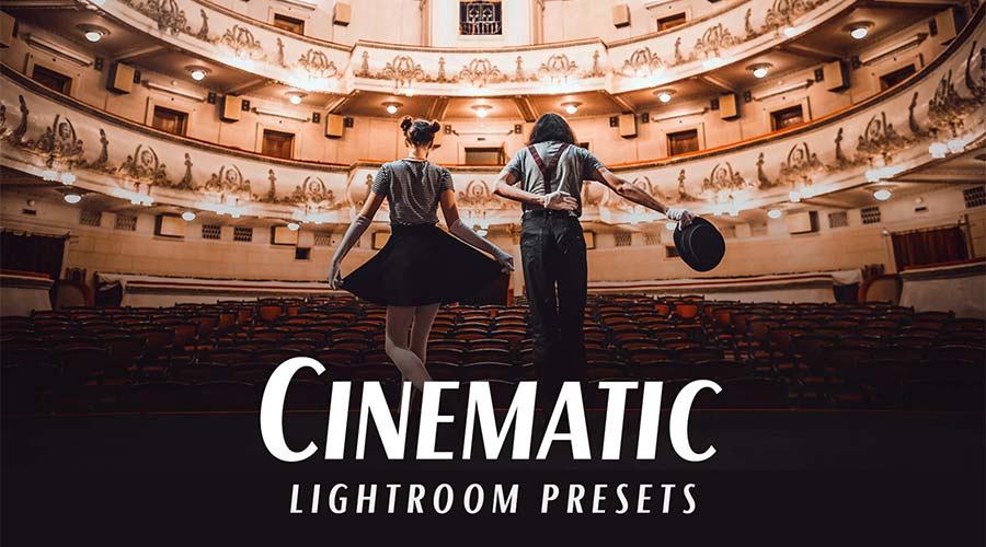
Cinematic Lightroom Color Grading presets are designed to replicate the distinctive looks popularized by the film industry. These presets often involve carefully calibrated adjustments to color temperature, contrast, and saturation to evoke specific moods and genres, from gritty dramas to vibrant blockbusters. They offer an accessible route to achieving a polished, professional, and dramatic visual style that is instantly recognizable.
The impact of cinematic color grading is profound, as it directly influences the viewer’s emotional response and perception of the narrative. By employing these presets, photographers can lend their work a sense of epic scale, intense emotion, or refined artistry, akin to a still frame from a feature film. This is particularly useful for storytelling projects, event photography, or any work aiming for a high-impact visual presentation. The ability to achieve such sophisticated looks with minimal effort is a testament to the power of these digital tools.
Muted Tone Lightroom Color Grading: Understated Elegance
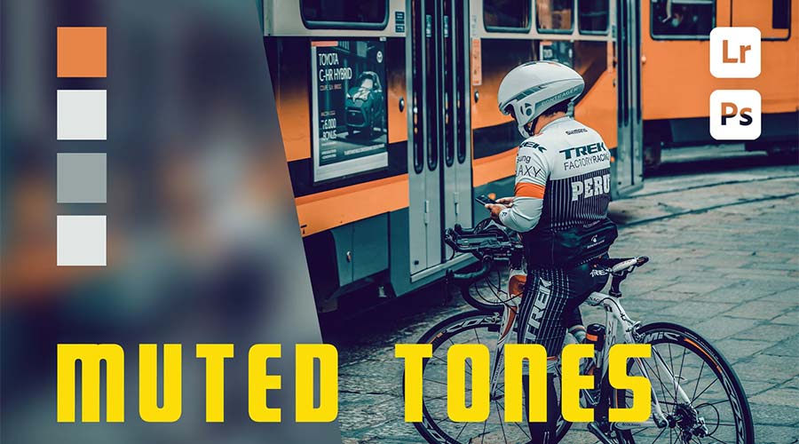
Muted Tone Lightroom Color Grading presets are ideal for creating a sophisticated and understated aesthetic. These presets reduce the intensity of colors, resulting in a softer, more subdued palette that can evoke a sense of calm, seriousness, or a minimalist appeal. They are particularly well-suited for lifestyle photography, fashion editorials, and any genre where a dark, moody, or subtly elegant atmosphere is desired.

The power of muted tones lies in their ability to draw attention to form, texture, and composition rather than overwhelming the viewer with vibrant colors. This approach can lend an air of maturity and refinement to an image, making it feel more grounded and less ostentatious. For photographers aiming for a distinctive, art-house feel, muted tone presets offer a powerful and efficient means to achieve their vision.
Rich Color Color Grading for Lightroom: Depth and Vibrancy
In contrast to muted tones, the Rich Color Color Grading presets aim to enhance and deepen the existing colors within an image, creating a sense of vibrancy and intensity without appearing oversaturated. Inspired by the evocative qualities of a good cup of coffee, these presets often introduce warm, rich tones that add depth and character to photographs. The large number of presets within such collections ensures that photographers have ample options to find the perfect effect for their specific project, whether it’s a portrait, a landscape, or a still life.
The impact of rich colors can be significant, drawing the viewer’s eye and creating a more immersive experience. These presets are particularly effective in bringing out the natural beauty of subjects, making them feel more tangible and appealing. In genres like food photography or travel blogging, where the visual appeal of the subject is paramount, rich color presets can significantly elevate the final output.
Matte Finish Color Grading Lightroom Presets: Dramatic Texture
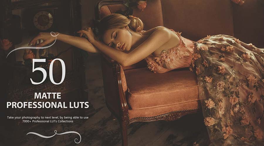
Matte Finish Color Grading presets are designed to impart a subtle, desaturated, and often slightly darker tone to photographs, mimicking the look of matte photographic paper or certain film stocks. These presets can add a dramatic, cinematic quality to images, lending them a sophisticated and timeless appeal. The desaturation effect reduces the intensity of colors, creating a more understated and refined look, while the matte finish can soften highlights and introduce a gentle texture.
These presets are highly versatile and can be adapted to various photographic genres, including fashion, portraiture, and landscape photography. The ability to adjust these presets further allows for fine-tuning to achieve the perfect balance between drama and subtlety. The matte finish can be particularly effective in conveying a sense of introspection or understated elegance, making it a popular choice for artistic and editorial work.
Pastel Tone Color Grading LUTs: Softness and Lightness
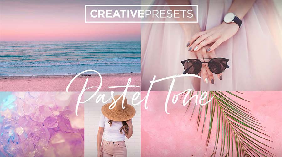
Pastel Tone Color Grading LUTs are characterized by their soft, delicate color palettes, featuring gentle hues of pink, lavender, mint green, and baby blue. These presets are exceptionally well-suited for portrait photography, especially for subjects like children or newborns, and for enhancing the ethereal beauty of landscape photography. They create a light, airy mood, evoking feelings of tenderness, innocence, and serenity.

The application of pastel tones can transform an image into something dreamlike and visually soothing. They are perfect for creating a gentle aesthetic that is both appealing and memorable. The subtle shifts in color temperature and saturation achieved by these LUTs can add a touch of magic to everyday scenes, making them feel more special and inviting.
Desaturated Lightroom Color Grading: Moody and Contemporary
Desaturated Lightroom Color Grading presets are designed to reduce the intensity of colors, resulting in a moodier and more contemporary aesthetic. These presets are particularly effective for urban landscapes, street photography, and any genre where a grittier, more artistic, or introspective feel is desired. By lowering the saturation and often adjusting contrast and tonal curves, these presets can create a sophisticated and visually striking look.
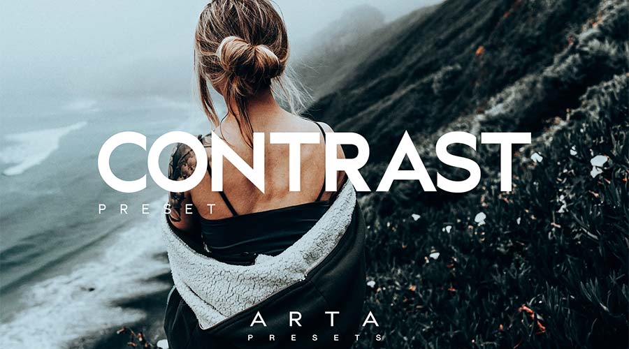
The impact of desaturation can be profound, shifting the focus from the vibrancy of color to the underlying forms, textures, and emotions within an image. This approach can lend a photograph a sense of depth and complexity, encouraging viewers to engage with the image on a deeper level. For photographers seeking to establish a unique artistic voice, desaturated presets offer a powerful tool for creating a distinctive and memorable visual style.
High Contrast Color Grading Presets: Striking Visual Impact
High Contrast Color Grading presets are designed to create dramatic and visually striking images by enhancing the difference between the darkest shadows and the brightest highlights. This technique can make images appear more dynamic, punchy, and impactful, drawing the viewer’s eye and creating a sense of depth and dimension. These presets are excellent for subjects that benefit from a bold and assertive presentation, such as architecture, dramatic portraits, or action shots.
The principle behind high contrast is to amplify the visual information within an image, making it more engaging and memorable. By carefully manipulating tonal curves and color balance, these presets can transform ordinary photographs into works of art with a powerful visual presence. The ability to achieve such high-end effects with minimal effort underscores the value of these tools for photographers seeking to make a strong visual statement.
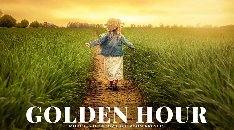
Golden Hour Color Grading: The Magic of Twilight
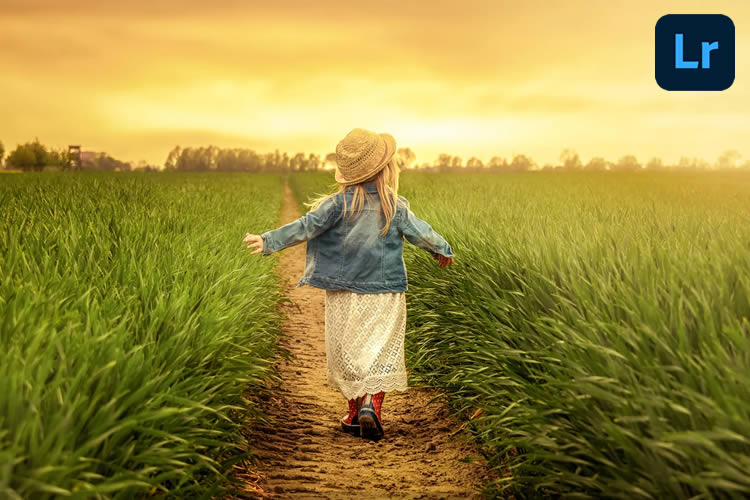
The "golden hour," the period shortly after sunrise or before sunset, is renowned for its warm, soft, and flattering light. Golden Hour Color Grading LUTs are designed to either enhance existing golden hour light or to simulate its effect on photographs taken at other times of day. These presets imbue images with a warm, radiant glow, adding a sense of magic and romance.
These LUTs are incredibly versatile, working well with a wide range of subjects, from landscapes and cityscapes to portraits and still life. The warm, ethereal quality of the golden hour light can evoke feelings of peace, beauty, and nostalgia, making it a cherished aesthetic in photography. By applying these presets, photographers can capture the enchanting ambiance of this special time of day, regardless of when the photo was actually taken.
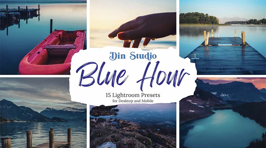
Blue Hour Color Grading for Lightroom: Moody and Serene
The "blue hour," the period of twilight just before sunrise or after sunset, is characterized by its cool, deep blue hues. Blue Hour Color Grading presets are designed to capture this distinct atmospheric quality, adding a moody, serene, and often dramatic feel to photographs. These presets are particularly effective for landscapes, cityscapes, and portraits where a cool, tranquil, or mysterious ambiance is desired.
The gentle, eye-pleasing effect of blue hour tones can transform ordinary scenes into captivating visual narratives. They evoke a sense of calm and introspection, making them ideal for capturing the quiet beauty of the world at dawn or dusk. The ease with which these presets can be implemented makes them a valuable tool for photographers seeking to add a sophisticated and atmospheric touch to their work.
Sunset Glow Lightroom Color Grading: Vibrant Hues of Dusk
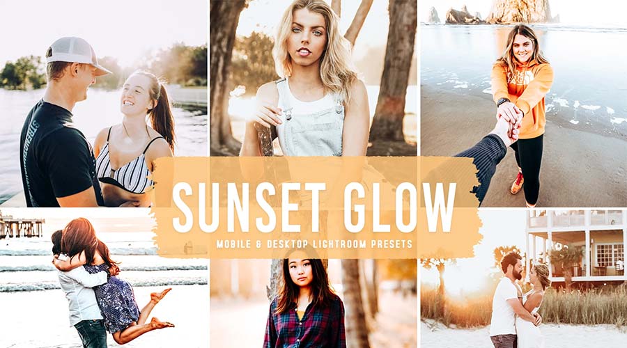
Sunset Glow Lightroom Color Grading presets are designed to replicate the vibrant, warm, and often dramatic colors of a sunset. These presets can enhance existing sunset imagery or imbue photographs taken in less ideal lighting conditions with a sun-kissed, radiant effect. They are perfect for adding a touch of warmth, optimism, and breathtaking beauty to any photograph.
These presets are especially effective in transforming dull or low-light photos into visually stunning compositions. The gorgeous glow of a sunset, with its rich oranges, pinks, and purples, can evoke feelings of wonder and awe. The ability to achieve this captivating effect with a single click makes these LUTs an invaluable asset for photographers looking to add a dramatic and evocative touch to their work.
Infrared Color Grading Presets: Otherworldly Aesthetics
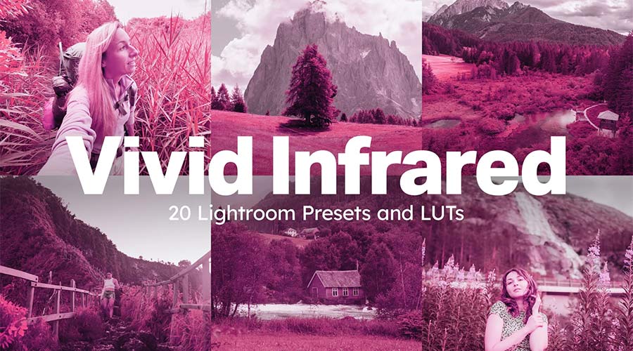
Infrared Color Grading presets offer a unique and imaginative approach to image manipulation, designed to create otherworldly visual effects reminiscent of infrared photography. These presets introduce surreal color shifts and tonal alterations, transforming familiar scenes into something extraordinary and dreamlike. Multiple styles are typically available within these collections, each offering a distinct interpretation of infrared aesthetics.
These presets are ideal for photographers looking to experiment with unconventional looks and push the boundaries of visual expression. They can add a sense of mystery, wonder, and artistic intrigue to any image, opening up a vast realm of creative possibilities. The ability to achieve such distinct and unusual effects with ease makes these LUTs a powerful tool for artistic exploration.
Cross Processed Color Grading Lightroom Presets: Bold Color Statements
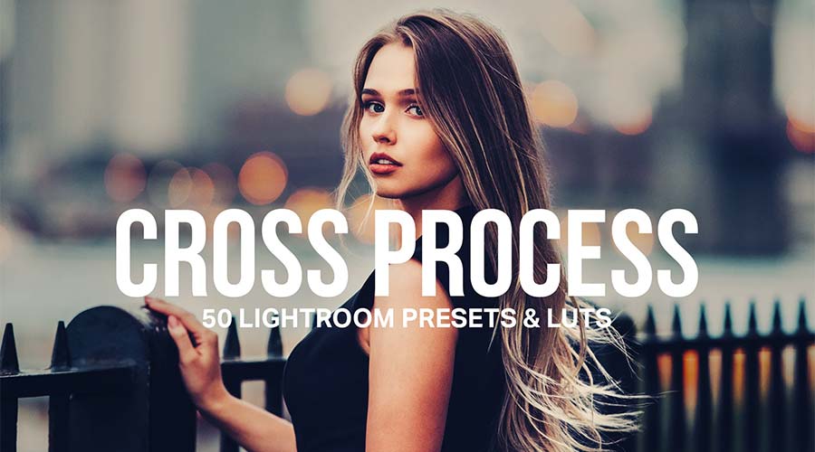
Cross Processed Color Grading Lightroom presets are designed to create striking and unconventional color shifts, often resulting in bold and eye-catching images. This technique, inspired by traditional film cross-processing, involves manipulating color to produce unique and sometimes unexpected results, such as intensified hues or unusual color combinations.

These presets are excellent for photographers who want to make a strong color statement and create images that stand out from the ordinary. Whether it’s enhancing a dominant hue or creating a deliberately stylized look, cross-processed LUTs offer a powerful way to add a unique artistic signature to photographs. The ability to select a desired color and let the preset do the work ensures both efficiency and impact.
Bleach Bypass Color Grading LUTs: Understated Nostalgia
Bleach Bypass Color Grading LUTs are characterized by their desaturated, high-contrast aesthetic, reminiscent of a specific film processing technique. This effect results in an understated, gritty, and often nostalgic tone, with reduced saturation and increased contrast. These LUTs are an excellent choice for fashion photography, landscape images, or any genre where a touch of vintage feel or a more serious, artistic mood is desired.

The desaturated and high-contrast nature of bleach bypass can lend images a timeless quality and a sense of depth. It strips away the vibrancy of color, drawing attention to the form, texture, and emotional resonance of the subject. The professional effects achievable with these LUTs can elevate ordinary photographs to a more artistic and impactful level.
Color Pop Lightroom LUTs: Vibrant Accents
Color Pop Lightroom LUTs are designed to add a vibrant, attention-grabbing touch to photographs by selectively enhancing specific colors. These presets can transform images from dull to vivid with a single click, making them perfect for creating dynamic social media content, striking web graphics, or impactful print materials.
The power of a "color pop" effect lies in its ability to immediately draw the viewer’s eye to the most important elements of an image. By strategically saturating key colors while keeping others more subdued, these presets create a sense of focus and visual hierarchy. This technique is highly effective for product photography, advertising, or any application where immediate visual impact is crucial.
Seasonal Color Grading: Autumn, Spring, Summer, and Winter
The inclusion of seasonal color grading LUTs provides photographers with tools to perfectly capture the essence of each time of year.
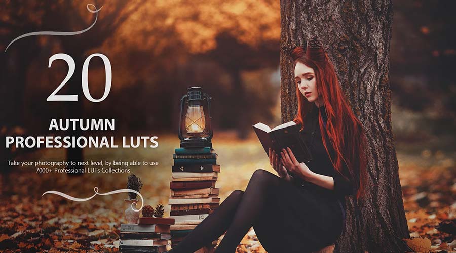
- Autumn Color Grading presets infuse images with the rich, warm, and earthy tones characteristic of fall, evoking the cozy and vibrant spirit of the season. These presets often offer cinematic quality, transforming images with an array of options to celebrate the beauty of autumn.
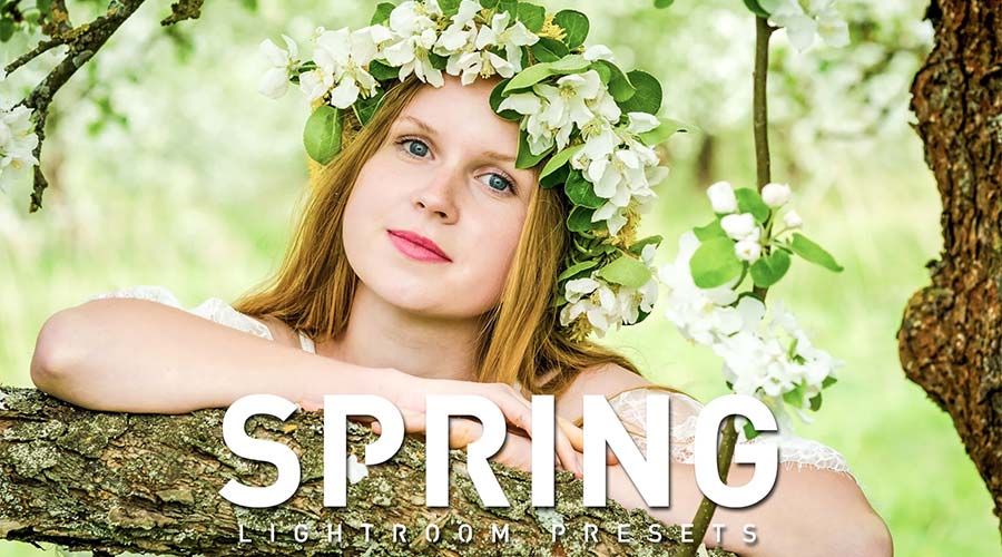
- Spring Color Grading LUTs are designed to bring out the fresh, vibrant colors associated with spring, such as lush greens, soft yellows, and bright whites. These presets are ideal for nature photography and portraits, capturing the sense of renewal and growth that defines the season.
- Summer Color Grading LUTs aim to accentuate the rich, warm, and intense tones of summer. These presets are perfect for enhancing beach scenes, outdoor activities, and any photograph that benefits from a sun-kissed, energetic feel, making summer shots even more radiant.
- Winter Color Grading LUTs create a sharp, cool, and often dramatic style reminiscent of winter landscapes. These presets focus on various shades of blue and white, offering multiple ways to make a statement with fashion, lifestyle, and outdoor images, capturing the crisp beauty of the season.
By offering these diverse categories of color grading presets, Adobe Lightroom empowers creators to not only enhance their photographs but also to craft compelling visual narratives, effectively communicate emotions, and achieve a professional, polished aesthetic with remarkable efficiency. The continuous development and accessibility of these tools solidify their position as essential components in the modern photographer’s and designer’s toolkit.