The selection of a typeface in logo design serves as the cornerstone of visual communication, acting as the primary vehicle for a brand’s personality, values, and market positioning. While design trends evolve with technological advancements, the fundamental principle remains: a font is not merely a collection of characters, but a silent narrator of a brand’s history. From the authoritative stature of serifs to the approachable nature of handwritten scripts, the typographical choice dictates how a consumer perceives a company within the first milliseconds of interaction.
The Evolution of Typographical Branding
Typography has undergone a significant transformation since the mid-20th century, moving from purely functional print requirements to the high-stakes world of digital-first branding. Historically, logos were constrained by the physical limitations of printing presses and sign painting. Today, the challenge has shifted toward multi-platform scalability. A logo must now remain legible as a high-resolution header on a 27-inch monitor and as a 16-pixel favicon on a mobile browser.
Data from recent design industry surveys suggest that consistent brand presentation across all platforms can increase revenue by up to 23%. This underscores the necessity for designers to move beyond aesthetic preference and toward functional, performance-based font selection.
Key Considerations for Professional Font Selection
Selecting a logo font requires a rigorous evaluation process that transcends subjective taste. Professional designers utilize a standard rubric to ensure that the chosen typeface aligns with the business’s long-term objectives.
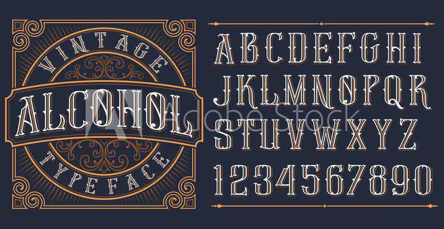
- Legibility and Scalability: A font must maintain its integrity across various mediums, including print, digital, and embroidered merchandise. Complex, ornate typefaces often fail when reduced to small dimensions.
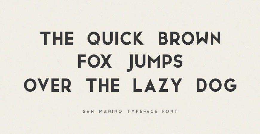
- Brand Alignment: The typeface must reflect the company’s core values. For instance, geometric sans-serifs are frequently associated with innovation and efficiency, while traditional serif fonts evoke stability and institutional authority.
- Licensing Compliance: Legal risks associated with improper font licensing remain a critical concern for design agencies. Many fonts categorized as "free" are restricted to personal use, necessitating the purchase of commercial licenses for client work. Failure to secure proper licensing can lead to significant copyright litigation, an increasingly common issue in the digital age.
Quick Reference: Strategic Font Categories
For designers seeking to optimize the selection process, the following categorization provides a roadmap based on industry-standard applications:
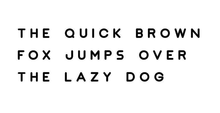
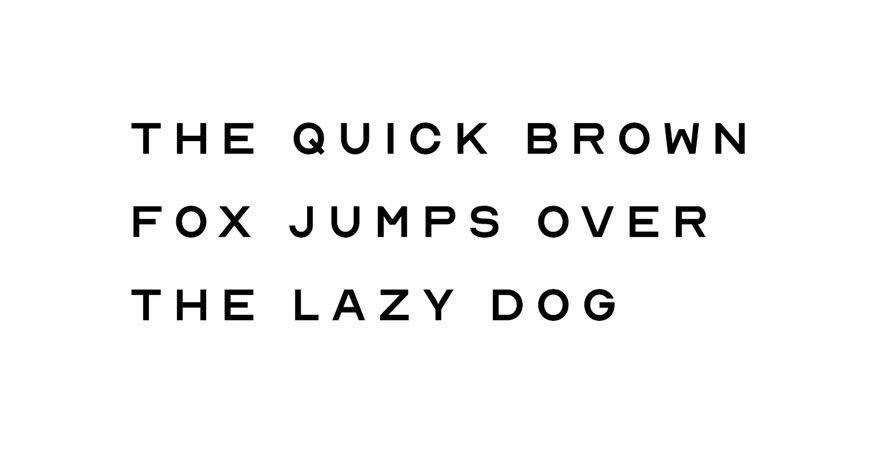
- Minimalist Geometric: Best suited for technology and fashion sectors, these fonts (such as Nord) leverage clean lines to convey transparency and modernism.
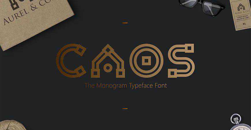
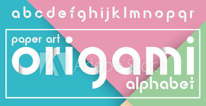
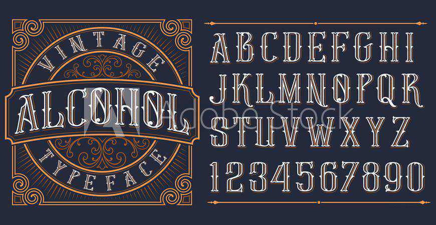
- Monogrammatic: Ideal for high-end luxury goods and institutional services, these designs (such as Augor) prioritize visual recognition through unique letterform customization.
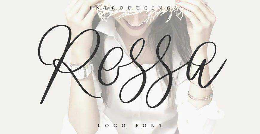
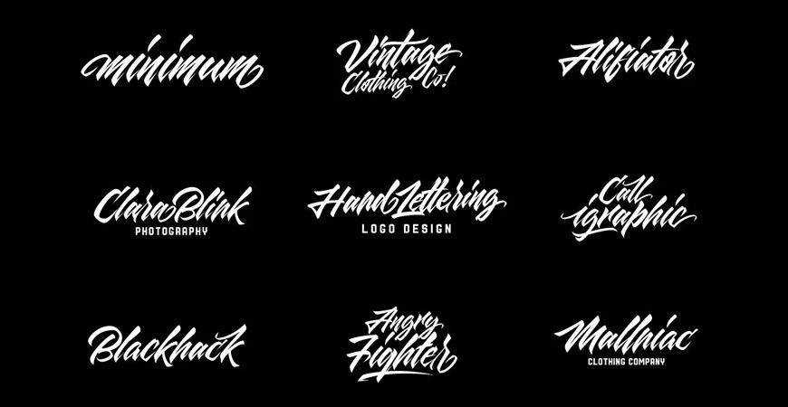
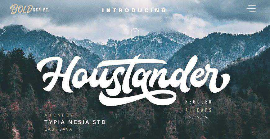
- Script and Handwritten: Used predominantly in hospitality and boutique retail, these styles provide a human-centric, artisanal narrative.
- Futuristic and Abstract: These typefaces (such as Lequire) are increasingly utilized by fintech and SaaS startups to project a forward-thinking, digital-native identity.
A Chronological Perspective on Design Trends
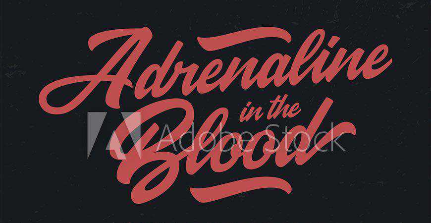
The last decade has seen a notable shift toward "de-branding"—a phenomenon where major luxury and tech houses simplify their logos to minimalist sans-serif wordmarks. This trend was largely driven by the need for mobile optimization. However, market analysis indicates a growing "design fatigue," with many emerging brands now pivoting back toward expressive, custom-lettered display fonts to differentiate themselves in a crowded marketplace.
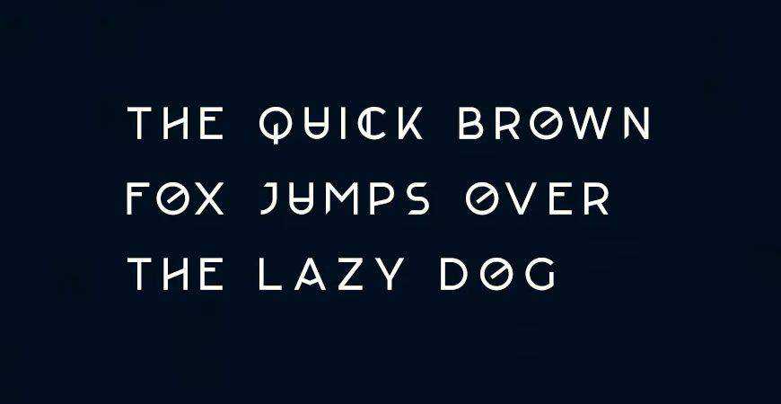
In 2024 and 2025, the focus has shifted toward "variable fonts," which allow for a single file to contain multiple weights and widths. This innovation has fundamentally changed the landscape of logo design, offering unprecedented flexibility for responsive branding.
Industry Commentary and Design Philosophy
Leading voices in the design community emphasize that typography is the most impactful element of a brand identity. "When a designer selects a font, they are choosing the tone of voice for that brand," notes a senior design lead at a top-tier global agency. "If the typeface is wrong, the message is lost before the consumer even reads the words."
Industry experts argue that the shift toward data-driven design has not diminished the importance of artistic intuition. Instead, it has created a synergy where analytics guide the choice of weight and structure, while creative direction determines the stylistic flourishes that create an emotional connection with the target audience.
The Legal and Ethical Landscape of Font Licensing
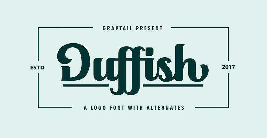
The democratization of design tools has led to a rise in copyright disputes regarding font usage. Designers are advised to adhere to a strict policy of verification. Before implementing a font into a client’s visual identity:
- Confirm the specific license type (Desktop, Web, App, or E-pub).
- Check for restrictions on embedding or modifying the font file.
- Retain documentation of the license purchase for the duration of the project.
It is a common misconception that web-available fonts are "public domain." Most high-quality typefaces are intellectual property protected by international copyright laws. Using a font without the appropriate commercial license can result in "cease and desist" orders, which can irreparably damage a client’s brand reputation during a critical launch phase.
Broader Implications for Brand Identity
The impact of a well-chosen logo font extends beyond aesthetics; it is a fundamental driver of brand equity. A cohesive brand identity, anchored by a distinct and readable typeface, fosters trust and encourages repeat consumer behavior. Conversely, a disjointed visual identity—characterized by inappropriate font pairings or poor legibility—can signal a lack of professionalism and organizational instability.
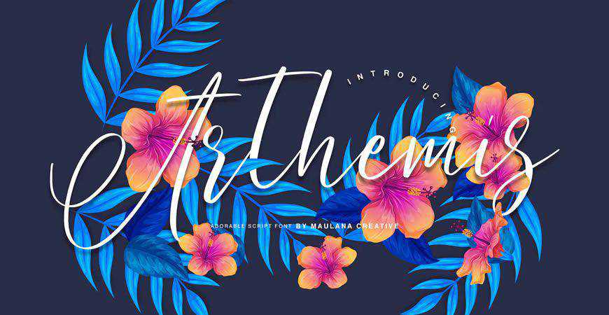
As businesses continue to navigate an increasingly fragmented media environment, the role of the logo as a constant, recognizable anchor becomes even more vital. Whether a brand opts for a classic serif that communicates heritage or a cutting-edge futuristic display font that signals disruption, the decision must be rooted in a deep understanding of the audience.
Future-Proofing Your Design Strategy
For professionals, the key to longevity in the field is a commitment to continuous learning regarding typographic trends and technical advancements. As screen resolutions increase and augmented reality interfaces become more prevalent, the requirements for logo fonts will continue to evolve.
Designers are encouraged to build a curated library of high-quality, licensed typefaces that offer a balance of versatility and character. By maintaining a balance between the artistic demand for uniqueness and the technical necessity for clarity, designers can ensure that their work stands the test of time, effectively communicating the brand’s mission for years to come.

The process of selecting a font is, in essence, the process of defining a business’s identity. It is an exercise in restraint, strategy, and creative vision. As the digital landscape continues to expand, those who master the nuances of typography will remain at the forefront of the design industry, shaping the visual culture of the next generation.