Typography serves as the silent ambassador of digital content, dictating not only how a message is perceived but also how long a reader remains engaged with a platform. In the landscape of modern blogging, where user experience is a primary metric for search engine optimization (SEO) and audience retention, the selection of a typeface is a foundational technical decision. Poor font choices often lead to increased bounce rates, as visual fatigue and illegibility prevent users from consuming content effectively.

The evolution of digital typography has transitioned from limited, system-default fonts to a vast ecosystem of high-performance web typefaces. Today, font selection must account for cross-platform responsiveness, accessibility for visually impaired users, and the psychological impact of design aesthetics.
The Psychological and Technical Impact of Typography
Digital typography functions as the non-verbal tone of a brand. Research in cognitive psychology suggests that specific font characteristics—such as stroke width, x-height, and terminal shape—influence the speed at which the brain processes information. Sans-serif fonts are generally favored for screen reading due to their uniform stroke weights, which remain legible even on low-resolution displays or when scaled down for mobile devices.
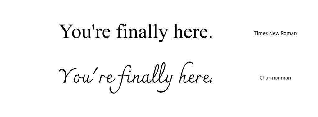
Conversely, serif fonts are frequently employed to convey authority, tradition, and academic rigor. The integration of web-safe fonts—those pre-installed on most operating systems—versus web-hosted fonts (such as those from Google Fonts) remains a critical consideration. While web-hosted fonts allow for greater creative freedom, they can introduce latency issues if not implemented with efficient caching and optimization techniques.
Categorizing the Top 13 Typefaces for Modern Blogs
The following selection represents the industry standard for legibility, aesthetic versatility, and technical performance across contemporary web browsers.
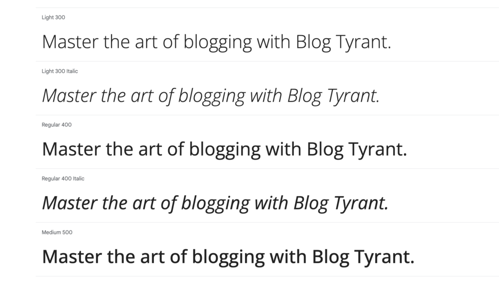
1. Open Sans: The Universal Standard
Developed by Steve Matteson and released in 2010, Open Sans has become the gold standard for neutral, high-readability web content. Its open letterforms and high legibility make it an ideal candidate for long-form blog articles. Its widespread adoption—exceeding trillions of annual views—ensures it renders consistently across almost all user devices.
2. Roboto: The Responsive Powerhouse
Introduced by Google in 2011 as the primary interface font for Android, Roboto is engineered for varying screen densities. Its "neo-grotesque" style offers a geometric structure that maintains balance, making it highly effective for blogs that prioritize mobile-first design.
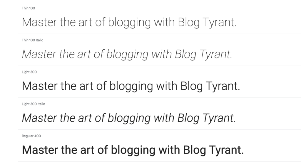
3. Montserrat: Geometric Elegance
Inspired by mid-20th-century signage in Buenos Aires, Montserrat provides a sophisticated, urban aesthetic. With its large x-height and wide character widths, it is particularly well-suited for lifestyle, fashion, and creative portfolio blogs.
4. Helvetica: The Professional Benchmark
Since its inception in 1957, Helvetica has maintained its status as the most recognizable typeface in professional design. Its lack of decorative flourishes makes it the ultimate "no-frills" option for corporate or technical blogs where clarity and neutrality are paramount.
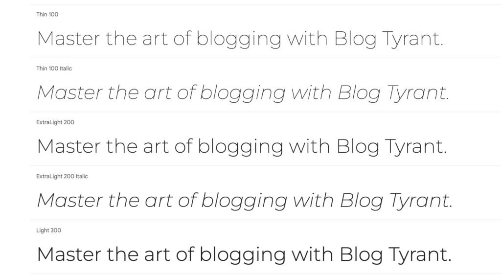
5. PT Sans: Regional Utility
Commissioned by the Russian Federation, PT Sans was designed to bridge the gap between traditional Cyrillic and Latin alphabets. Its compact structure makes it an excellent choice for headings that need to capture attention without sacrificing the approachable nature of a blog.
6. Oswald: Gothic Assertiveness
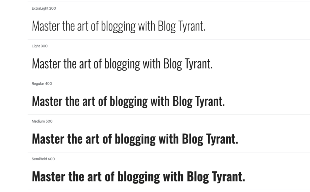
Oswald is a digital adaptation of the "Alternate Gothic" style. Its condensed, bold nature is optimized for titles and headers, providing a punchy, assertive tone that performs exceptionally well in competitive niches like food or music journalism.
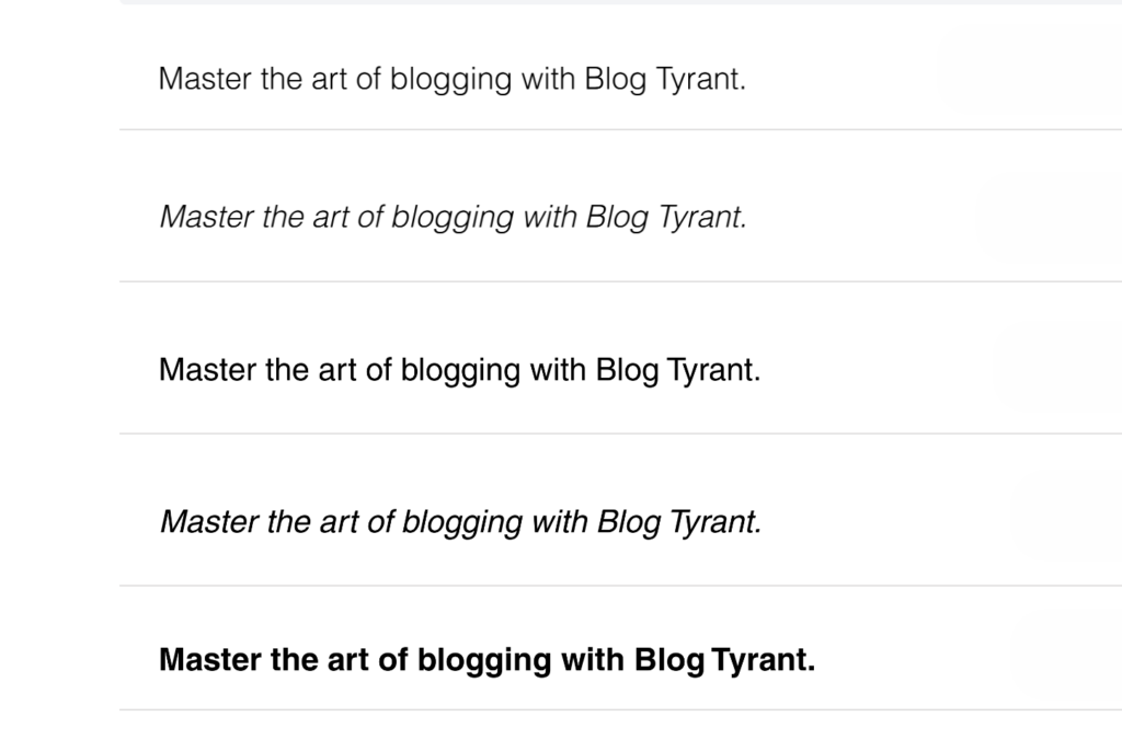
7. Baskerville PT: The Serif Revival
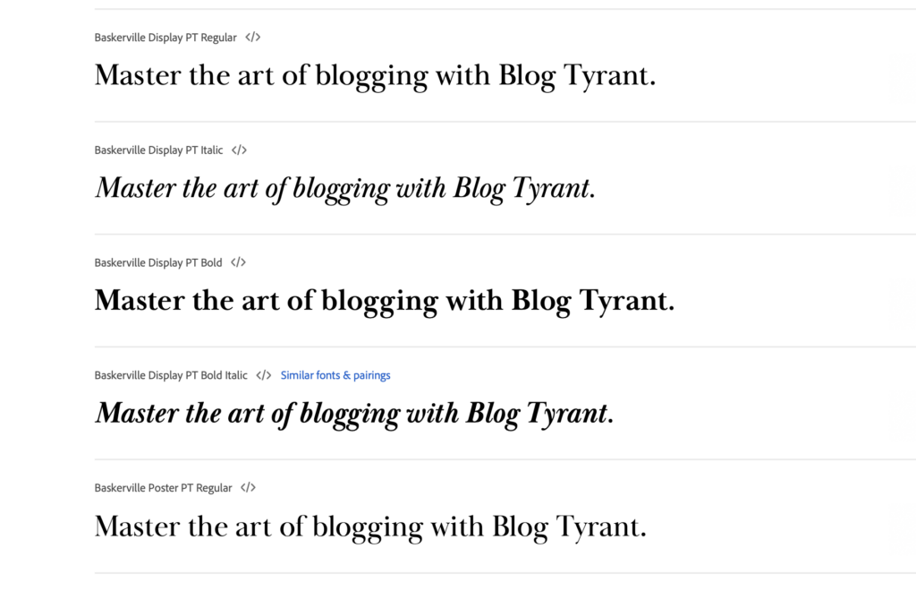
For publications focusing on literature or history, Baskerville PT offers a modern take on 18th-century English typography. While it retains the sophisticated flair of a classic serif, the PT version is specifically tuned for the high-pixel density of modern digital screens.
8. Charter: High-Resolution Clarity
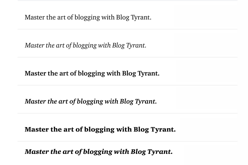
Designed by Matthew Carter in 1987, Charter was ahead of its time. It was created to look crisp on low-resolution laser printers, a design philosophy that translated perfectly to the modern digital era. It offers a "transitional" look that feels both historic and contemporary.
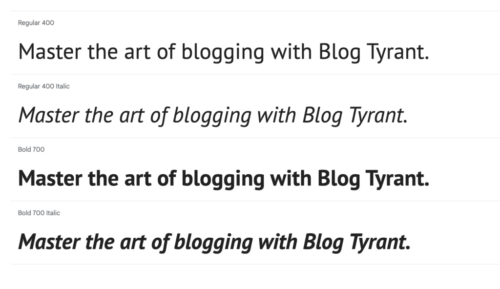
9. Arial: The Familiar Choice
Often criticized by design purists for its ubiquity, Arial remains a highly functional, safe choice for bloggers who require maximum compatibility. Its design is based on decades of legibility studies, ensuring that it remains readable regardless of the user’s specific device or browser settings.
10. Raleway: Minimalist Sophistication
Raleway is a display-oriented typeface that excels in minimalism. Its unique geometric forms and elegant ligatures make it a preferred choice for high-end, luxury-focused blogs where the visual presentation of the text is as important as the content itself.
11. Lato: Humanistic Warmth
Designed by Łukasz Dziedzic, the name "Lato" means "summer" in Polish. The font captures this warmth through its rounded edges and open apertures. It is frequently utilized by educational and health-related blogs to convey a sense of empathy and professionalism.
12. Ubuntu: Open-Source Versatility
Developed for the Ubuntu operating system, this font is the quintessential "humanist" typeface. It is highly legible, even at small sizes, making it a reliable workhorse for long-form body copy.
13. Inter: The Modern Interface Standard
Inter is currently the preferred typeface for UI/UX designers, serving as the default font for the design platform Figma. Its design focuses on optical sizing, meaning the typeface automatically adjusts its legibility parameters based on the size at which it is rendered.
Technical Implementation and Best Practices
Adding custom fonts to a content management system like WordPress requires careful technical consideration to prevent performance degradation. The use of plugins like "Custom Fonts" by Brainstorm Force allows administrators to host fonts locally. Local hosting is generally superior to calling fonts from external servers (like Google’s CDN) because it reduces the number of HTTP requests, thereby improving page load speeds—a key factor in Core Web Vitals assessment.
Optimal Configuration Guidelines:
- Font Pairing: Maintain a maximum of two font families per site—one for headings and one for body text.
- Hierarchical Sizing: Body text should generally range between 16px and 18px to prevent eye strain, while headings should scale at a ratio of 1.3 to 1.9 relative to the body text.
- Contrast Ratios: Ensure the color contrast between the font and the background meets Web Content Accessibility Guidelines (WCAG) to accommodate users with vision impairments.
- Weight Limitation: Avoid importing every available weight (e.g., thin, extra-light, bold, heavy) of a font family. Loading unnecessary weights significantly increases page load time. Stick to the essential weights: 400 (regular) and 700 (bold).
Broader Implications for Content Strategy
The selection of a font is a strategic business decision. Data from user experience studies consistently show that readability correlates directly with "time on page." When a reader encounters a site that is difficult to scan, the cognitive load increases, leading to a higher likelihood of abandonment.
In an era where attention spans are measured in seconds, the clarity of a typeface is a prerequisite for content monetization and audience growth. By aligning typography with the specific tone of the content and adhering to web performance standards, publishers can create a more inclusive and effective digital environment. As web technology continues to evolve, the emphasis on accessibility and performance will remain the primary drivers for future typographic innovation in the blogging industry.