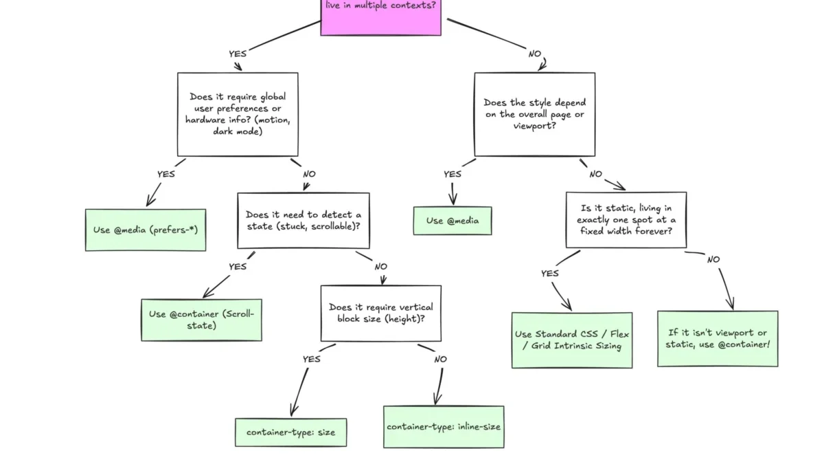
The landscape of modern web development has undergone a fundamental shift with the introduction of CSS Container Queries, a feature designed to decouple component responsiveness from the constraints of the browser viewport. Despite achieving a 94% adoption rate across major browser engines, the industry remains hesitant to transition from traditional media queries, with recent data from the 2025 State of CSS survey indicating that only 41.4% of developers have integrated this technology into their production workflows. This discrepancy highlights a critical gap in architectural understanding, as developers continue to rely on viewport-based logic for components that are increasingly required to function in diverse, modular environments.
A Brief History of Responsive Architecture
The concept of responsive design was popularized in 2010 by Ethan Marcotte, who introduced the idea of fluid grids, flexible images, and media queries to accommodate the burgeoning variety of screen sizes. For over a decade, the media query (defined by the @media rule) served as the primary tool for web developers to adjust layouts. By querying the width and height of the browser viewport, developers could trigger layout changes that adapted the page to desktops, tablets, and smartphones.
However, as component-based architecture—driven by frameworks like React, Vue, and Web Components—became the industry standard, the limitations of the viewport-centric model became apparent. A component designed to look ideal in a full-width header would often break when placed within a narrow sidebar, even if the total viewport width remained large. The community began calling for a "container-aware" solution as early as 2019, leading to the development and eventual standardization of the CSS Containment Module Level 3.
The Technical Divide: Viewport vs. Context
The fundamental confusion surrounding container queries stems from their syntax, which mimics the familiar structure of media queries. When a developer writes @container (min-width: 450px), the intent is often conflated with a viewport check. However, the browser interprets this as a request for information about the parent element, not the screen itself.

Media queries are inherently "dumb" in the context of modular design; they possess no awareness of the layout hierarchy. They treat the entire browser window as the sole source of truth. In contrast, container queries allow an element to act as a self-contained unit. By defining a parent as a container via the container-type and container-name properties, developers can create components that adapt their internal styles based exclusively on the space provided by their immediate surroundings.
This shift moves the developer away from "macro" layouts—the overall page structure—and toward "micro" layouts, where the focus is on the granular, reusable elements of an application. As noted by industry experts, there are currently over 2,300 distinct viewport sizes cataloged in modern web traffic. Attempting to manage design breakpoints for every potential combination of these sizes is mathematically and operationally unsustainable. Container queries resolve this by allowing the component to react to its own container’s dimensions, regardless of the screen size of the device.
Data and Adoption Trends
The slow adoption of container queries is particularly striking given the long-standing demand for the feature. Kevin Powell, a prominent voice in the CSS community, emphasized this issue during the 2026 SmashingConf in Amsterdam, characterizing the adoption rates as "terrible" relative to the industry’s previous excitement for the feature.
The 2025 State of CSS survey provides a granular look at this trend. While 86% of the developer population reports an awareness of container queries, the conversion to active usage remains under 50%. Analysts suggest this is not due to a lack of technical capability, but rather a high barrier of entry regarding mental model shifts. Legacy codebases are often heavily reliant on media query frameworks, and refactoring these into container-based systems requires a significant investment in time and testing.
Advanced Applications: Fluid Typography and Flexbox
Beyond simple layout adjustments, container queries have opened new avenues for fluid design. Historically, responsive typography relied on viewport-relative units (vw or vh). When a component was moved to a narrow container, these units often forced font sizes to remain disproportionately large.

By utilizing container-relative units—such as cqi (container query inline-size)—developers can now create fluid typography that scales dynamically within a card or sidebar. Coupled with the CSS clamp() function, this allows for highly sophisticated, self-correcting layouts that maintain aesthetic integrity regardless of where they are placed on the page.
Furthermore, container queries provide a workaround for the limitations of CSS Flexbox. While flex containers can wrap content when space is limited, CSS lacks a native :wrapped pseudo-class to detect this event. By nesting a container query within a flex item, developers can trigger style changes the moment the item is forced to wrap, effectively providing a hook for responsive states that were previously only accessible through heavy, performance-intensive JavaScript ResizeObserver scripts.
Implementation Challenges and Best Practices
Transitioning to a container-based workflow is not without its risks. The most common pitfall is the attempt to query an element against itself, which leads to infinite loops and browser rendering errors. A container cannot query its own dimensions because the act of applying styles could change the size of the container, triggering a recursive loop. Therefore, a proper parent-child relationship is required, often necessitating an extra wrapper element.
Additionally, querying based on a container’s size (block height) can lead to "collapsed" layouts. If a container is set to container-type: size without an explicit height, the browser renders it at zero pixels, as it ignores the height contribution of its children. Experts recommend relying on inline-size (horizontal width) as the default approach to avoid these rendering issues, utilizing block-level constraints only when absolutely necessary.
Finally, the inability to use CSS custom properties (variables) within a container query condition—such as (min-width: var(--breakpoint-lg))—remains a point of contention. This limitation exists to prevent the circular dependencies that would arise if a container query changed the value of the very variable it was using for its condition.

Future Implications for Web Standards
The move toward container queries represents a broader industry trend toward "component-first" development. As the web becomes increasingly modular, the browser’s role is shifting from a document viewer to an application runtime. For developers, this necessitates a more disciplined approach to CSS.
The "macro" vs. "micro" layout distinction serves as a useful framework for the future. Media queries remain the correct tool for global page structure, system-level preferences (such as dark mode or reduced motion), and device-specific capabilities. However, for the myriad of components that populate a modern dashboard, feed, or interface, container queries are the superior choice.
As the developer community continues to grapple with the fragmentation of device sizes, the reliance on container queries is expected to grow. The primary challenge for the next several years will be the refactoring of legacy systems and the education of a new generation of developers to prioritize component-level context over global viewport assumptions. While the transition may be slow, the technical benefits—cleaner code, better component reusability, and more robust layout control—are clear indicators that the future of responsive design lies within the container.