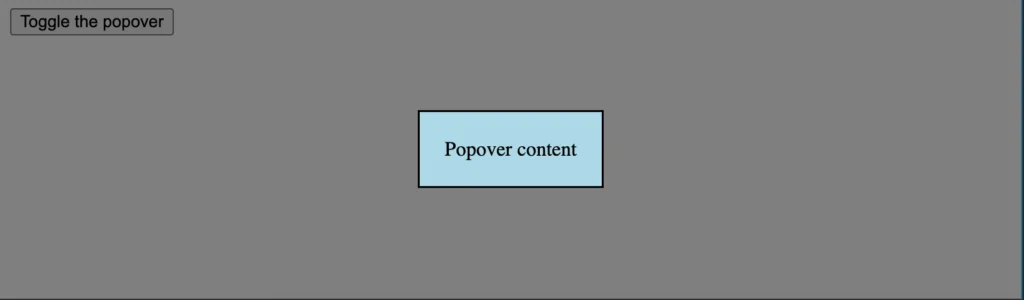
For over two decades, modal windows have served as indispensable tools in web development, significantly enhancing user experience by allowing for the presentation of focused content and the efficient execution of tasks without disrupting the user’s workflow. These overlays, often implemented using JavaScript and HTML, are ubiquitous across both desktop and mobile interfaces. However, a fundamental and largely overlooked advancement within the HTML and JavaScript specifications offers a streamlined, native solution: the popover attribute. This article delves into the capabilities and implementation of this powerful, yet underutilized, feature, examining its potential to revolutionize how developers approach interactive UI elements.
The Evolution of Modals and the Emergence of a Native Solution
The concept of modal dialogs in web design emerged as a direct response to the limitations of traditional page loads. Early web pages relied on full page reloads for most interactive elements, leading to a disjointed and often slow user experience. Modals, on the other hand, allowed for dynamic content display and user interaction within the current page context, dramatically improving responsiveness and engagement. Developers initially relied on complex JavaScript libraries and custom code to create these overlays, a process that often involved significant boilerplate and potential for inconsistencies across different browsers.
The introduction of the popover attribute represents a significant step towards native browser support for such UI patterns. This attribute, along with its counterpart popovertarget, aims to standardize the creation of modal-like interfaces, reducing reliance on external scripts and simplifying development. The goal is to provide a built-in, accessible, and performant way to present temporary content that overlays the main document.
Unpacking the HTML Structure for Native Modals
Implementing a native modal using the popover attribute is remarkably straightforward, requiring minimal HTML markup. The core of this functionality lies in two key attributes: popovertarget and popover.
The popovertarget attribute is applied to an element that will serve as the trigger for the modal. This is typically a button or a link. Its value must correspond to the id of the element that will display the modal content.
The popover attribute, conversely, is applied to the element intended to be the modal’s content. This element must also possess a unique id that is referenced by the popovertarget attribute of its trigger.
A basic implementation would look like this:
<!--
  The "popovertarget" attribute on the button links to the "id"
  of the element that will function as the popover content.
-->
<button popovertarget="modal-content-example">Open Modal</button>

<!--
  The element with the "popover" attribute and a corresponding "id"
  will be displayed as the modal.
-->
<div id="modal-content-example" popover>
  This is the content of the native modal.
</div>
When a user clicks the button with popovertarget="modal-content-example", the browser automatically handles the display of the div with id="modal-content-example" and the popover attribute. This inherent functionality liberates developers from writing JavaScript to toggle visibility, manage focus, or handle basic dismissal actions, such as clicking outside the modal.
Styling the Native Modal: Leveraging CSS for Visual Control
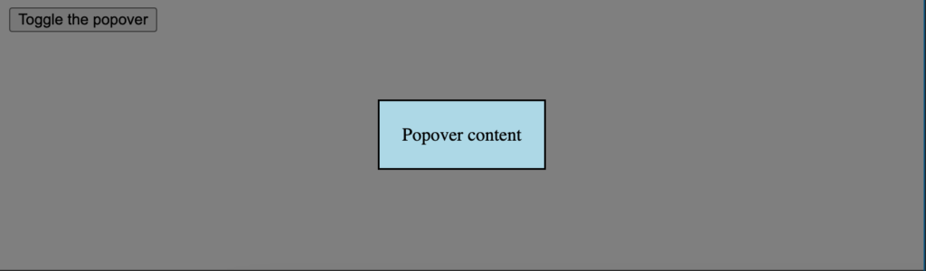
While the HTML structure provides the core functionality, the native popover element, by default, does not include the visual cues typically associated with modals, such as a semi-transparent backdrop that dims the underlying content. Developers are expected to implement these stylistic elements using CSS.
The content of the popover element itself can be styled using standard CSS selectors. For instance, to apply a background color, padding, and borders to the modal’s content area:
/* Styling the content of the popover */
[popover]
  background: #ffffff; /* White background for the modal content */
  padding: 30px;
  border: 1px solid #ccc;
  box-shadow: 0 4px 8px rgba(0, 0, 0, 0.1);
  border-radius: 8px;
  max-width: 500px; /* Limit the width for better readability */
  margin: auto; /* Center the modal horizontally if it's block-level */
The crucial aspect for creating the modal "backdrop" effect, the dimming layer that visually separates the modal from the main content, is achieved through a less commonly known, albeit increasingly standardized, pseudo-element: ::backdrop. This pseudo-element is specifically designed to style the backdrop of elements that are displayed in the browser’s top layer, which includes popover elements when they are active.
/* Styling the "modal background" or backdrop */
[popover]:-internal-popover-in-top-layer::backdrop
  background: rgba(0, 0, 0, 0.6); /* Semi-transparent black backdrop */
  backdrop-filter: blur(5px); /* Optional: Add a blur effect to the background */
The :-internal-popover-in-top-layer prefix indicates that this is a browser-specific implementation or a proposed standard that is still being finalized. However, this selector is becoming the de facto method for styling the modal backdrop. The ::backdrop pseudo-element allows developers to control the opacity, color, and even apply visual effects like blurs to the area behind the modal, effectively creating the familiar visual hierarchy of a modal interface.
It is important to note that browser support for these features, particularly the ::backdrop pseudo-element in conjunction with popover, is still evolving. While major browsers like Chrome and Edge have implemented support, developers should always consult the latest compatibility tables (e.g., Can I Use) to ensure their implementation is robust across target audiences.
Beyond the Basics: Advanced Features and Accessibility Considerations
The native popover attribute offers more than just basic modal functionality. It supports different popover types, namely auto and manual.
-
popover="auto"(Default): When set toauto, the popover automatically dismisses when the user clicks outside of it or presses the Escape key. This behavior is ideal for tooltips, menus, and simple notifications where immediate dismissal is desired. -
popover="manual": Withmanual, the popover only dismisses when the user explicitly triggers a dismiss action, such as clicking a dedicated close button within the popover content. This type is more suited for forms, confirmation dialogs, and scenarios where the user needs to complete a specific action before the modal can be closed.
Furthermore, the popover attribute inherently enhances accessibility. By being a native HTML feature, it is designed to integrate seamlessly with assistive technologies like screen readers. The browser handles the management of focus, ensuring that when a popover opens, focus is directed to its content, and when it closes, focus is returned to the element that triggered it. This built-in accessibility significantly reduces the burden on developers to manually implement these crucial aspects, which are often overlooked in custom JavaScript solutions.

Data and Industry Adoption
The adoption of new HTML features often follows a predictable pattern. Initially, they are introduced as experimental or proposed standards, then gain traction in leading browsers, and eventually become widely supported and integrated into development workflows. The popover attribute is currently in this transitional phase.
While precise adoption statistics for popover are nascent, its underlying principles are well-established in UI design. Modal dialogs are a cornerstone of modern web applications, and the global market for web development tools and frameworks continues to expand. Industry analysts project continued growth in the demand for efficient and user-friendly web interfaces. The availability of native solutions like popover is expected to contribute to this growth by lowering development barriers and promoting best practices.
For example, a survey by Statista in 2023 indicated that over 70% of web developers use JavaScript frameworks, many of which offer their own modal components. The emergence of native HTML solutions could potentially streamline these processes, offering a performant alternative to framework-specific implementations for simpler modal needs.
Expert Reactions and Future Implications
The introduction of the popover attribute has been met with cautious optimism within the developer community. Many acknowledge its potential to simplify common UI patterns.
"The popover attribute is a game-changer for creating accessible and performant modal-like experiences without relying on heavy JavaScript libraries," commented a senior frontend developer at a leading tech firm, who preferred to remain anonymous due to ongoing project roadmaps. "It aligns with the web’s ongoing push towards more semantic and declarative HTML, which ultimately leads to cleaner code and better maintainability."
However, some express a need for wider browser support and more extensive tooling. "While the concept is fantastic, ensuring consistent behavior across all major browsers, especially older versions, remains a hurdle," noted another developer. "We’re eager to adopt it more broadly, but thorough testing and polyfills might be necessary for broader rollout in the immediate future."
The broader implications of the popover attribute are significant:
- Reduced Reliance on JavaScript Frameworks: For many common modal use cases, the need for large JavaScript libraries may diminish, leading to faster load times and a smaller bundle size for web applications.
- Enhanced Performance: Native browser implementations are typically highly optimized, offering superior performance compared to JavaScript-based solutions that might involve DOM manipulation and complex event handling.
- Improved Accessibility Standards: By providing a standardized and accessible way to implement modals, the
popoverattribute encourages developers to build more inclusive web experiences. - Simplified Development Workflow: The declarative nature of the
popoverattribute reduces boilerplate code and the complexity associated with managing modal states, allowing developers to focus on core application logic.
A Glimpse into the Future of Interactive Web Elements
The popover attribute is a testament to the ongoing evolution of web standards, aiming to provide developers with more powerful, built-in tools. As browser support matures and developer understanding grows, we can anticipate seeing this native solution adopted for a wide array of use cases, from simple tooltips to complex form dialogs. By embracing the popover attribute, developers can create more efficient, accessible, and performant web interfaces, paving the way for a more streamlined and enjoyable user experience across the digital landscape. The future of interactive web elements is clearly leaning towards native solutions, and the popover attribute is a significant step in that direction.