The CSS translateX() function is a fundamental tool in the web developer’s arsenal, enabling precise horizontal manipulation of elements on a webpage. This function, a core component of the transform property, allows for the displacement of an element either to the left or right, dictated by the sign of its argument. Positive values shift an element to the right, while negative values move it to the left. Its elegant simplicity belies its power in creating dynamic and engaging user interfaces.
At its heart, translateX() is defined within the CSS Transforms Module Level 1, a testament to its foundational role in modern web design. The syntax is remarkably straightforward: translateX(<length-percentage>). This means the function accepts a single argument, which can be either a fixed length (like pixels, ems, or ch units) or a percentage. This flexibility allows developers to control the extent of the horizontal shift with a high degree of accuracy, adapting to various design needs and screen sizes.
Understanding the Arguments: Lengths and Percentages
The <length-percentage> argument is the sole input for translateX(). When a <length> is provided, such as translateX(80px), the element will move precisely 80 pixels to the right. Conversely, translateX(-24ch) would shift the element 24 characters’ width to the left. The use of relative units like ch (character width) offers a degree of responsiveness, ensuring that the translation scales with the font size of the surrounding text.
The <percentage> option offers an even more dynamic approach. translateX(50%) will move the element to the right by 50% of its own width. This is a crucial distinction; the percentage is relative to the element’s own dimensions, not its container’s. Similarly, translateX(-100%) would shift the element entirely off to the left, by its full width. This relative scaling makes translateX() invaluable for creating fluid layouts that adapt gracefully to different screen resolutions and element sizes.
Basic Usage: Bringing Elements to Life
The most common application of translateX() is in creating smooth entry animations. Consider a typical sidebar navigation menu. Initially, the sidebar might be positioned entirely off-screen to the left, achieved with transform: translateX(-100%);. This declaration ensures that when the page loads, the sidebar is not visible. Combined with a CSS transition property, such as transition: transform 0.2s ease-in;, the element is prepared for animation.
When a user interacts with a menu button, a JavaScript-driven process toggles an .open class onto the sidebar. The CSS rule .sidebar.open transform: translateX(0); then effectively cancels out the initial off-screen translation, smoothly sliding the sidebar into view from the left. This technique is a cornerstone of modern mobile and responsive design, providing an intuitive and visually pleasing user experience. The ease-in timing function ensures the animation starts slowly and accelerates, mimicking a natural motion.
Advanced Applications: Marquees and Skeleton Loaders
Beyond simple reveal animations, translateX() plays a vital role in more complex UI patterns. The creation of an "infinite marquee" component, often used to display rotating logos, sponsor banners, or scrolling announcements, is a prime example. By animating the transform property with translateX(), developers can achieve a seamless, continuous scroll.
A typical implementation involves defining a @keyframes animation, such as marquee-scroll. This animation might dictate that at the beginning (0%), the element is at its original position (transform: translateX(0);), and at the end (100%), it is shifted left by half its own width (transform: translateX(-50%);). For the marquee to be truly infinite, the animation-iteration-count is set to infinite within the animation shorthand property. This creates a loop where the content continuously scrolls across the screen, providing a dynamic way to present information without requiring user interaction. The linear timing function ensures a constant speed for the scroll, preventing any jarring changes in pace.

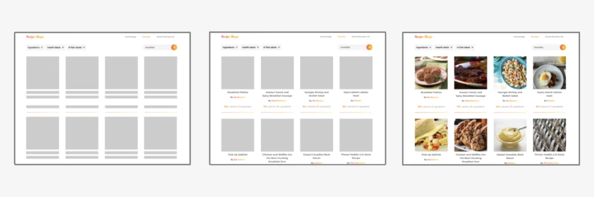
Another sophisticated use case is in creating "skeleton loaders." These are placeholder elements that mimic the layout of content before it has fully loaded, preventing jarring shifts in the user interface. Skeleton loaders can be simple gray boxes, but a more engaging approach involves a "shimmer" effect. This is often achieved using the ::after pseudo-element.
The pseudo-element is initially positioned off-screen to the left using transform: translateX(-120%);. A shimmer animation then gradually moves this pseudo-element across the skeleton component. The animation keyframes define a transition from transform: translateX(-120%); at 0% to transform: translateX(120%); at 100%. This creates a sweeping visual effect, resembling a light source moving across the placeholder. The background property for this pseudo-element is typically a linear-gradient that is transparent at the edges and features the highlight color in the middle, enhancing the shimmer effect. The infinite iteration count ensures this animation repeats until the actual content replaces the skeleton. This technique significantly improves perceived loading times and user satisfaction by providing a smooth, visually dynamic transition.
The Independence of Transform: No Layout Disruption
A critical characteristic of translateX() and other CSS transform functions is their non-interference with the document flow. Unlike properties like margin, which can push surrounding elements and trigger complex layout recalculations (reflows), translateX() merely alters the visual rendering of the element. The space the element originally occupied in the layout remains reserved, as if the element were still in its initial position. This isolation is immensely beneficial for performance, as it minimizes the computational cost associated with layout adjustments.
For instance, if an element with the class .translated is given transform: translateX(80px);, it will appear 80 pixels to the right of its original position. However, any elements that would have followed it in the normal document flow will remain in their expected positions, not shifted by the translated element’s new visual location. This predictability makes translateX() a reliable choice for animations and visual adjustments where maintaining the integrity of the overall layout is paramount. This contrasts sharply with older methods that might have involved absolute positioning and manual offset calculations, which were prone to breaking layouts.
Navigating Pointer Pseudo-Class Challenges
While powerful, translateX() can present specific challenges when applied directly to pointer pseudo-classes like :hover. If an element is translated significantly off-screen on hover, the cursor might move away from the element’s visual representation. This can cause the :hover state to be lost, snapping the element back to its original position. As the cursor re-enters the original position, the :hover state is re-established, and the element translates again. This can result in a continuous flickering loop, disrupting user interaction.
A robust solution to this common issue involves a structural adjustment. Instead of applying the transform: translateX() directly to the element that triggers the hover effect, it’s best to wrap that element in a parent container. The :hover pseudo-class is then applied to this parent element, while the translateX() transformation is applied to the child element.
Consider the problematic scenario: .bad:hover transform: translateX(160px); . Here, the element itself is translated on hover. The more reliable approach is: .parent:hover .good transform: translateX(160px); . In this case, when the user hovers over the .parent container, the .good child element is translated. This ensures that the hover state remains active as long as the cursor is over the parent container, regardless of the child’s visual displacement, thus preventing the flickering issue and providing a seamless interactive experience.
Browser Support and Specification
The translateX() function boasts excellent browser support across all modern web browsers. Its widespread adoption is a testament to its utility and the stability of the CSS Transforms Module Level 1 specification, which defines its behavior. This broad compatibility allows developers to implement translateX() with confidence, knowing it will function consistently for the vast majority of their audience. The specification, currently in an Editor’s Draft, continues to evolve, but the core functionality of translateX() is well-established and unlikely to undergo drastic changes. This stability provides a solid foundation for web development projects that rely on its capabilities for creating sophisticated visual effects and intuitive user interfaces. The ongoing development of the specification ensures that the CSS transform capabilities will continue to expand, offering even more creative possibilities for web designers and developers in the future.