The Art Deco aesthetic has been part of the design world for over a century, representing a defining era of visual culture that continues to influence modern graphic design. Emerging in the 1920s and flourishing through the 1930s, Art Deco—or Arts Décoratifs—was a movement that celebrated modernity, technological progress, and a bold departure from the organic, flowing lines of Art Nouveau. Today, its legacy persists through a wide spectrum of media, from high-end branding and editorial layouts to digital interface design. For contemporary designers, the most accessible entry point into this aesthetic is through typography. By integrating Art Deco-inspired typefaces, designers can imbue their projects with a sense of historic luxury, geometric precision, and refined elegance.
Historical Context and the Evolution of a Style
The movement takes its name from the 1925 Exposition Internationale des Arts Décoratifs et Industriels Modernes in Paris. During this period, the world was emerging from the constraints of the First World War and entering a decade characterized by rapid industrialization, the rise of the machine age, and a newfound obsession with speed and luxury.
Art Deco typography reflected this cultural shift. Unlike the ornamental styles that preceded it, Art Deco lettering emphasized symmetry, streamlined shapes, and a balanced, often monumental structure. It became the visual language of the era’s architecture—seen in the spires of the Chrysler Building—and its cinema, fashion, and advertising. Following the Great Depression, the style evolved into "Streamline Moderne," which favored even more aerodynamic and simplified forms, a trend that continues to inform modern sans-serif display fonts.
The Anatomy of Art Deco Typography
Art Deco fonts are defined by specific structural characteristics that distinguish them from other historical typographic movements:
- Geometric Simplification: Characters are often constructed using circles, squares, and straight lines.
- High Contrast: Many fonts utilize extreme variations between thick and thin strokes, creating a sense of drama and visual "glitz."
- All-Caps Dominance: The movement frequently utilized uppercase lettering to project strength and authority, a common practice in building signage and film posters of the 1930s.
- Stylized Ligatures: Unique connections between characters, often inspired by architectural motifs, allow for a decorative flourish without sacrificing the overall sense of order.
- Varied Weight: Whether ultra-thin and sophisticated or bold and heavy, the consistency of the weight within a character set is paramount to maintaining the "machine-age" aesthetic.
Curated Selection of Modern Art Deco Typefaces
The following fonts represent a diverse range of interpretations of the Art Deco style, suitable for various professional design applications:

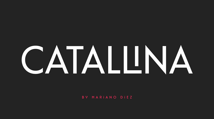
- Catallina: An all-caps typeface that stands out for its extensive range of ligatures. It is particularly effective for high-impact logo design where a touch of "snazziness" is required.
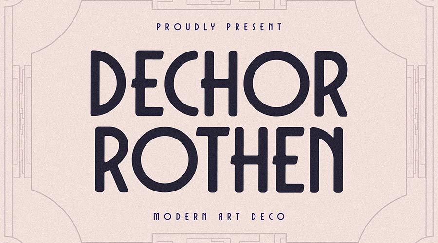
- Dechor Rothen: A modern, rounded interpretation. Its versatility across three distinct formats makes it an essential tool for designers looking to balance historical charm with modern legibility.
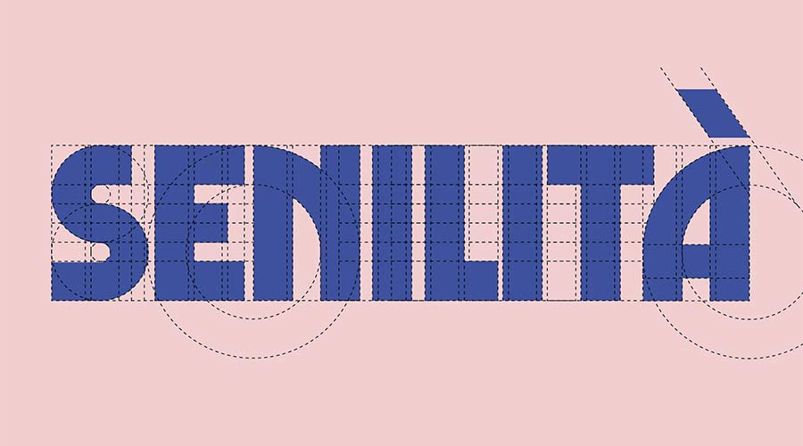
- Senilita: By blending the classic Art Deco framework with an extra-bold weight, this font serves as an ideal choice for editorial headlines that require immediate reader attention.
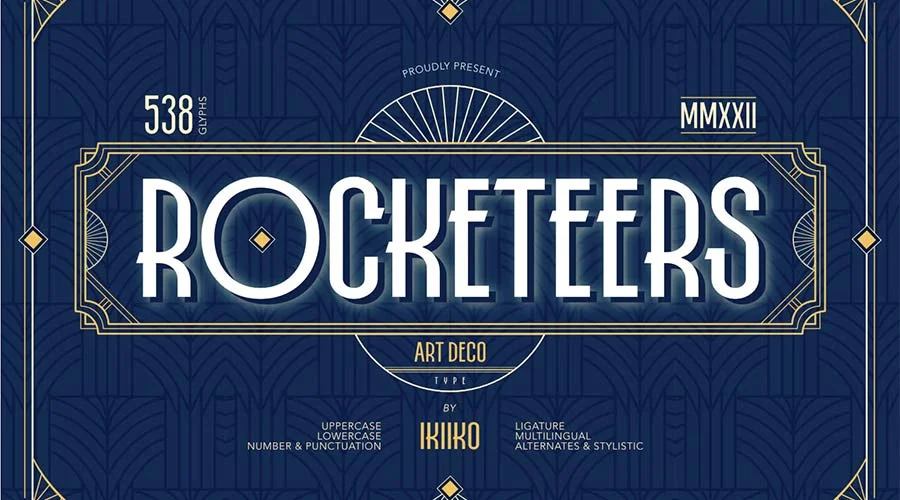
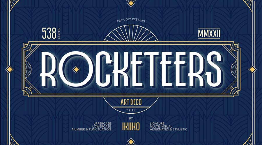
- Rocketeers: Offering both upper and lowercase variants, this font is a primary choice for projects requiring a blend of retro charm and functional, readable body text or sub-headers.
- Limelight: Inspired by the high-contrast cinema era, its wide, bold letterforms are purpose-built for cinematic titling and display applications.
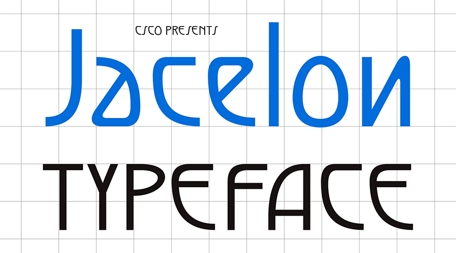
- Jacelon: This sans-serif variant prioritizes legibility, providing a contemporary solution for brands that want to reference the 1920s without appearing overly archaic.
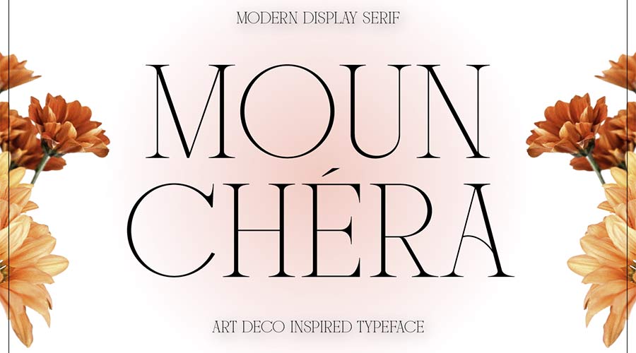
- Mounchera: Demonstrating that the style can handle delicacy, this font uses ultra-thin lines to evoke a sense of high-fashion sophistication.
- Art Deco Monogram: Specifically engineered for identity design, this font offers the geometric constraints necessary for creating professional-grade, interlaced monograms.
- Tyllon: An urban-influenced typeface that captures the "soaring" spirit of 1930s skyscrapers, making it perfect for bold, monumental headlines.
- Monterio: Providing four distinct weights, this font is a workhorse for print projects where visual hierarchy must be established through weight changes rather than decorative clutter.
- Modern Deco: A clean, minimal approach that strips the movement down to its essential geometric forms, perfect for contemporary minimalist branding.
- Enoway Pro: A hybrid design that merges the geometric structure of Art Deco with the ornamental, organic flourishes of Art Nouveau, offering a unique decorative edge.
- Transcity: Utilizing rounded ligatures, this font feels friendly yet sophisticated, making it a natural fit for service-oriented branding.
- Adelios: With 12 distinct styles, this font provides the most flexibility for complex design systems requiring variations for different contexts.
- TT Modernoir: A French-inspired family that offers a range of weights, from fragile light to commanding bold, suitable for diverse luxury applications.
- Monsante: Perhaps the most "authentic" sounding in its execution, this font mimics the hand-painted signage of 1920s Broadway, offering a sense of established prestige.
- Florisha: Uniform character heights give this font a rhythmic quality that is highly effective for screen-based reading.
- Cocosignum Maiuscoletto: Drawing from Italian design history of the 1930s, this font offers a refreshing alternative to the standard "Great Gatsby" style of Deco.
- Ring Link: A contest-winning typeface that incorporates a subtle techno-futuristic vibe, bridging the gap between historical nostalgia and digital-age aesthetics.
- Buenos Aires NF: An outline-based typeface that carries an athletic, active energy, suitable for projects that require a dynamic, high-contrast visual.
- Italiana: Sourced from Google Fonts, this typeface honors the tradition of Italian calligraphic influence on print media, offering a timeless, elegant serif option.
- Quincento: Captures the aristocratic essence of the era through its tall, thin, and highly refined letterforms.
- Decoment: A showstopper typeface that prioritizes detail and intricate geometry, best suited for short, impactful text bursts.
- Decondol: Relies on strict symmetry to achieve a professional, refined, and highly readable output.
- Rousseau Deco: A display-focused font that offers unique character sets to elevate standard titles into branded design elements.
The Economic and Cultural Implications of Revivalist Typography
The sustained interest in Art Deco fonts is not merely a nostalgic trend; it is an economic driver in the creative industry. Businesses and brands consistently turn to these typefaces to leverage the "halo effect" of the 1920s—a period associated with prosperity, high-quality craftsmanship, and cultural excitement. By utilizing these fonts, designers are essentially borrowing from the visual equity of an era that promised a better, more efficient, and more glamorous future.
From a design strategy perspective, the use of these fonts allows for a "fast-track" to professional aesthetics. Because Art Deco is inherently structured and balanced, even a novice designer can achieve a polished result by simply applying these typefaces to a clean layout. For professional agencies, the availability of high-quality free fonts in this style reduces overhead costs while maintaining the ability to produce luxury-tier visual assets.
Conclusion: Maintaining the Legacy
As we move further into the 21st century, the relevance of Art Deco typography remains undiminished. Its ability to marry the mechanical precision of the industrial age with the decorative desires of the human spirit ensures its place in the modern designer’s toolkit. Whether for a high-fashion editorial, a tech startup seeking a retro-futuristic brand identity, or a local business wanting to project an image of established quality, these 25 fonts provide a comprehensive starting point for any creative endeavor. By understanding the historical context and the structural nuances of the Art Deco movement, designers can ensure that their work remains not only functional but also timelessly elegant.