The cascading style sheets (CSS) ecosystem is experiencing a profound period of modernization, driven by collaborative efforts among browser vendors, specifications bodies, and the front-end developer community. Over recent weeks, a flurry of innovative proposals, API introductions, and performance-driven layout tools have captured the attention of web developers globally. These updates collectively address long-standing developer pain points, including tooltip performance, responsive layout data exposure, syntax highlighting efficiency, and granular feature detection. As modern browsers rapidly implement these capabilities, front-end engineers are shifting toward native platform solutions that reduce reliance on heavy JavaScript libraries.
Native Tooltip UX and the Rise of Interest Invokers
User experience design often dictates that interface elements must balance accessibility, responsiveness, and visual cleanliness. Tooltips have traditionally presented a dilemma regarding timing: instantaneous pop-ups create visual clutter during rapid cursor movement, while sluggish tooltips make interfaces feel unresponsive.
Addressing this balance, developer Abhishek Jakhar recently outlined a structured approach to tooltip interaction design, advocating for a delayed trigger followed by an instant dismissal. This methodology prevents accidental activations while ensuring that once a user is finished viewing information, the element vanishes without delay. Expanding on this concept, developer Chris Coyier introduced a modern implementation leveraging native "interest invokers." This emerging standard introduces two distinct CSS properties: interest-delay-start and interest-delay-end. Although current implementation is limited to Chromium-based environments, the introduction of interest invokers highlights a growing industry trend toward handling complex user interactions natively via declarative HTML and CSS attributes rather than complex JavaScript event listeners.
Bridging the Gap with the <geolocation> HTML Element
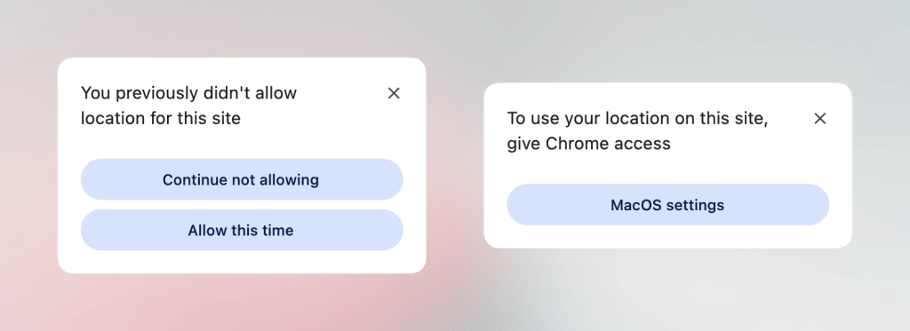
Location-based web services have historically relied on the JavaScript Geolocation API, a system historically complicated by reliance on underlying hardware dependencies—including GPS satellites, Wi-Fi triangulation, and cellular network towers. Furthermore, managing user permission states and revoking or altering access dynamically often required convoluted UI workarounds.
To streamline this process, browser architects have begun exploring native integration through the proposed <geolocation> HTML element. Designed to simplify location requests directly within markup, this element manages core permission flows natively. However, early technical evaluations note significant styling restrictions within the shadow DOM of these native components. To bridge the gap between forward-looking standards and production readiness, developers are currently adopting progressive enhancement strategies. By pairing the emerging <geolocation> element with the established JavaScript Geolocation API, engineering teams can deploy future-proof location features that gracefully degrade across browsers lacking native support.
Performance-Driven Syntax Highlighting via Custom Highlights
Syntax highlighting has traditionally demanded heavy parsing overhead, frequently requiring DOM manipulation libraries that inject hundreds of colored <span> elements into a document. The introduction of the Custom Highlight API has fundamentally shifted this paradigm, enabling developers to style arbitrary text ranges without altering the underlying DOM structure.
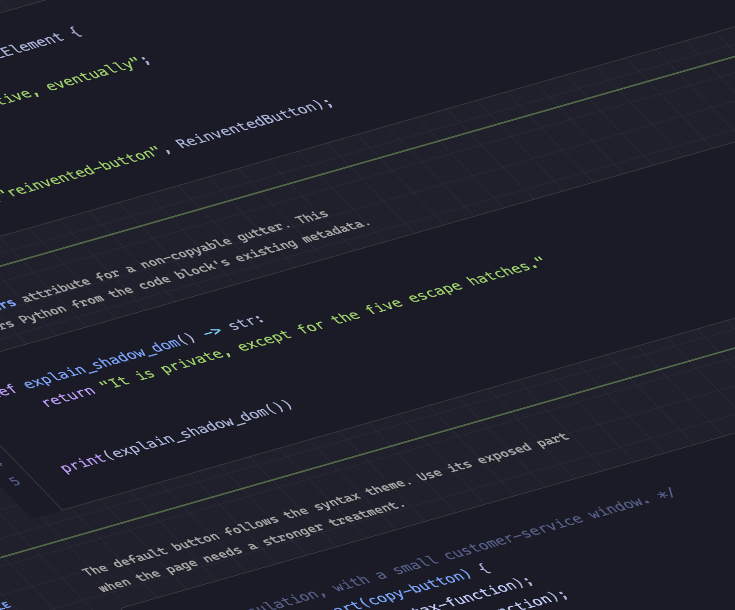
Capitalizing on this capability, developer Dave Rupert released MicroLighter, a lightweight syntax highlighter built directly on top of the ::highlight() pseudo-element. By decoupling visual styling from structural markup, MicroLighter significantly reduces memory consumption and execution time during page rendering. Industry analysts view this as part of a broader movement toward utilizing CSS custom highlights for search text matching, grammar checkers, and collaborative document editing tools natively on the web platform.
Extracting CSS Grid Layout Intelligence into Variables
For years, CSS has operated as a one-way communication channel: developers supply style instructions, and the browser calculates the layout. However, modern CSS specifications are increasingly bridging the gap between layout computation and style application. Temani Afif recently demonstrated a technique for exposing CSS Grid layout metrics—specifically row and column counts, alongside individual cell coordinate indexes—directly into CSS custom properties.
This breakthrough allows developers to calculate spatial relationships, such as hover proximity, purely through style sheets. By feeding grid dimensions into variables, dynamic hover effects that previously required continuous getBoundingClientRect() JavaScript loops can now be handled efficiently by the browser’s layout engine. While current iterations require uniformly sized columns, the underlying concept signals a paradigm shift toward truly data-aware CSS architectures.
The Dark Mode Debate: Two-State Versus Tri-State Toggles
As dark mode becomes a standard expectation across digital interfaces, the debate over user preference toggles has intensified. Design systems typically oscillate between two-state systems (explicit light or dark) and tri-state systems (light, dark, or system-inherited).
Developer Lea Verou has publicly championed a streamlined two-state model, arguing that excessive configuration options add cognitive load for users. Conversely, developer Bramus advocates for tri-state toggles to accommodate nuanced user preferences in complex enterprise applications. Meanwhile, independent implementations like the "auto-until-overridden" approach documented by Vale.Rocks offer a compromise, honoring operating system preferences by default while allowing persistent manual overrides. This ongoing discourse highlights the lack of a universal UI standard for theme management, leaving product teams to weigh accessibility against interface simplicity.
Enhancing Performance with the Class Prefix Selector
CSS selector performance has long been a critical concern for large-scale enterprise web applications. Attribute selectors—such as [class^="something-"] or [class*="something-"]—have historically allowed developers to target elements based on partial class name matches, but these selectors force browsers to scan broad string patterns across every element, impacting rendering performance.
To resolve this bottleneck, Bramus introduced a specification proposal for the class prefix selector. Utilizing a syntax structured as .something-*, this native selector allows developers to target families of classes sharing a common prefix with significantly higher computational efficiency. Performance benchmarks suggest that native prefix matching will drastically outperform legacy attribute-based selectors, offering a cleaner, more readable syntax for design systems and utility-first CSS frameworks.
Precise Feature Detection Through @supports named-feature()
As web standards evolve at an accelerated pace, developers frequently encounter scenarios where traditional feature detection falls short. Standard @supports queries can evaluate property-value pairs, but they often fail to detect complex rendering interactions, such as whether a specific browser respects CSS transforms when applied alongside modern anchor positioning.
Addressing this limitation, the introduction of the @supports named-feature() function allows developers to query highly specific browser behaviors. Currently rolling out in Chrome, this function enables conditional styling based on granular browser capabilities rather than broad property support. Industry experts anticipate that named-feature() will reduce runtime JavaScript feature sniffing (such as Modernizr checks), enabling more robust progressive enhancement strategies for cutting-edge CSS layouts.
Balancing Flexible Layouts with flex-wrap: balance
Text balance has long benefited from layout properties like text-wrap: balance, which automatically distributes text evenly across lines to prevent awkward orphans and ragged margins. However, multi-line flexible box layouts have historically suffered from similar distribution imbalances, particularly when the final row of a flex container contains fewer items than preceding rows.
Bringing parity to flexible layouts, Chrome has introduced experimental support for flex-wrap: balance. Documented extensively by layout expert Ahmad Shadeed, this property automatically calculates the optimal distribution of flex items across multiple rows or columns, ensuring visually harmonious interfaces without manual media query interventions. This addition reinforces the platform’s commitment to automated typographic and geometric balance.
Broader Industry Implications
The rapid deployment of these CSS features underscores a definitive maturation of the web platform. By migrating responsibilities traditionally handled by external JavaScript libraries—such as syntax highlighting, spatial proximity calculations, and complex feature detection—directly into native browser engines, developers can build faster, more resilient applications.
As standards bodies finalize specifications for class prefix selectors, interest invokers, and native layout variables, the boundary between layout computation and visual styling continues to blur. Engineering teams are advised to monitor browser implementation matrices closely, adopting progressive enhancement workflows to ensure modern web applications remain performant, accessible, and future-proof as autumn unfolds.