The Art Deco movement, which first emerged in France during the mid-1910s and reached its zenith during the 1920s and 1930s, continues to exert a profound influence on contemporary graphic design. Characterized by geometric shapes, streamlined forms, and a sense of opulent modernity, this aesthetic has transcended its origins in architecture and industrial design to become a staple of digital typography. As design trends oscillate between minimalist utility and decorative revivalism, the demand for high-quality, period-accurate, and accessible typefaces has surged. This report examines the historical significance of Art Deco typography and provides an extensive curation of current, high-quality free fonts available for designers seeking to integrate this timeless elegance into modern projects.
A Century of Aesthetic Dominance: The Evolution of Art Deco
The Art Deco style originated as a reaction against the fluid, organic lines of Art Nouveau. Following the devastation of World War I, the movement represented a collective desire for progress, luxury, and social modernization. By the 1925 Exposition Internationale des Arts Décoratifs et Industriels Modernes in Paris, the movement had solidified its visual language: bold, linear, and symmetrical.
Typography from this era was inextricably linked to the rapid industrialization of the early 20th century. Designers of the period prioritized clean, sans-serif letterforms, often incorporating the influence of cubism and the machine age. Throughout the 1930s, the style evolved into "Streamline Moderne," featuring longer, horizontal lines that suggested speed and aerodynamic efficiency. Today, this legacy persists because the movement’s inherent focus on balance and high-contrast weight makes these fonts exceptionally effective for branding, editorial headers, and luxury packaging.
Chronological Context and Modern Application
The resurgence of Art Deco in the 21st century can be traced to the broader interest in "vintage modernism." While the 1920s were defined by the high-society glitz of the Jazz Age, modern designers utilize these fonts to evoke a sense of heritage, reliability, and high-end sophistication. Unlike purely historical fonts, modern adaptations often include expanded glyph sets, multilingual support, and digital-first optimizations that ensure legibility on high-resolution screens—a factor that early 20th-century typographers could not have anticipated.
Curated Selection of Contemporary Art Deco Typefaces
The following list comprises 25 notable typefaces that effectively bridge the gap between historical accuracy and modern usability.

Geometric and Bold Styles
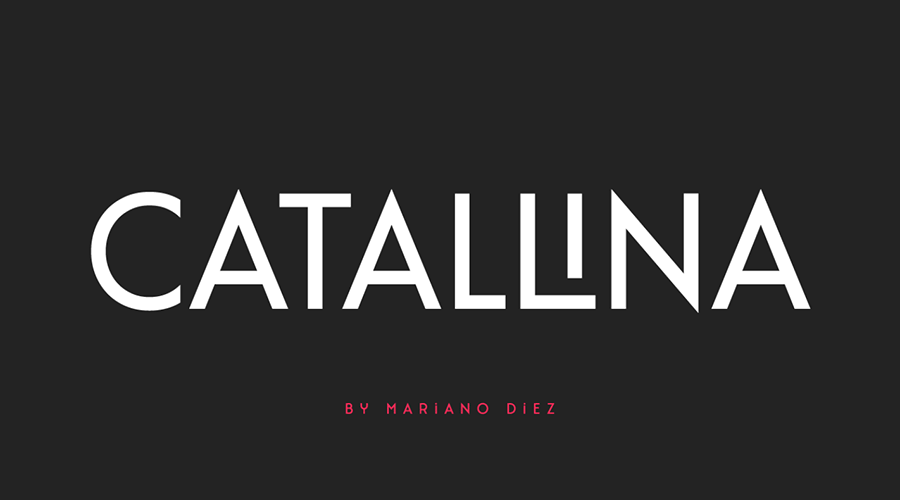
- Catallina: An all-caps typeface that leans into the theatrical nature of the 1920s, offering over 50 ligatures for custom typographic arrangements.
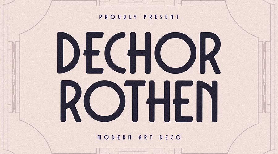
- Dechor Rothen: Featuring rounded, thick terminals, this font is particularly effective for high-impact display headers.
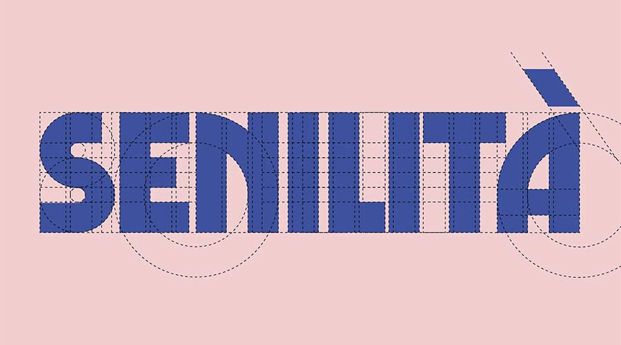
- Senilita: By blending an extra-bold weight with traditional Art Deco geometry, this font serves as an ideal choice for modern magazine titles.
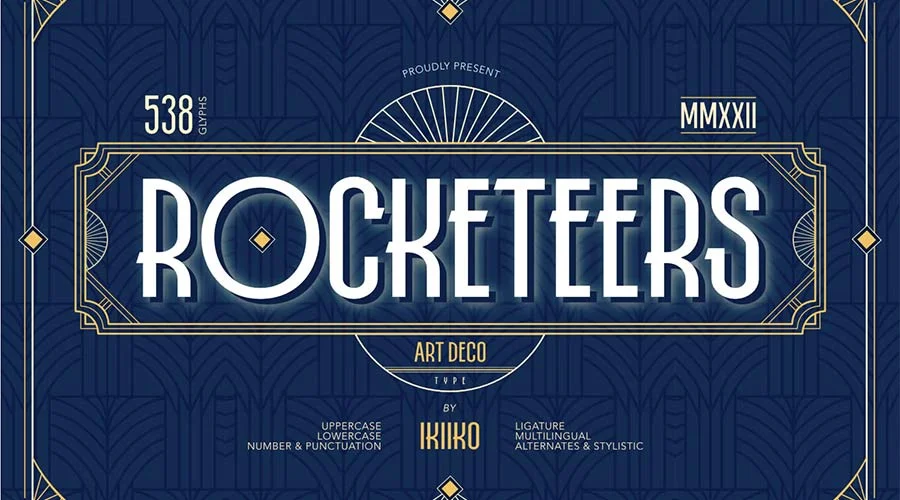
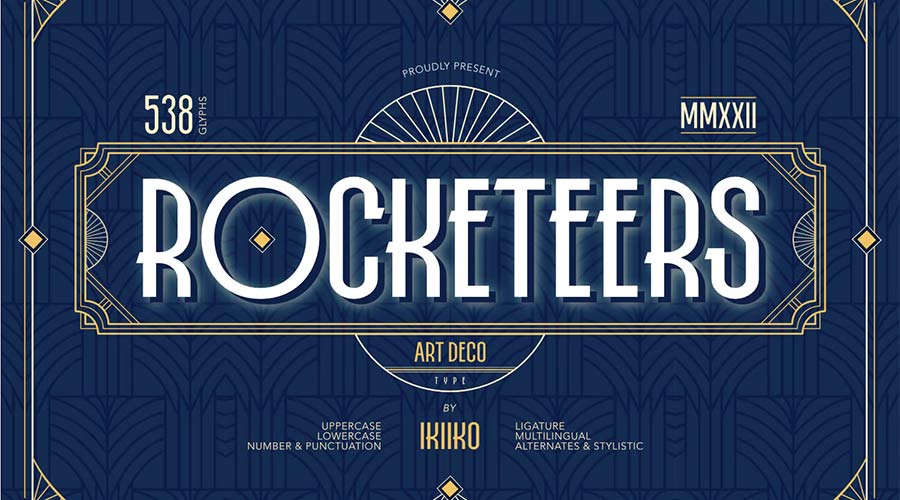
- Rocketeers: A versatile option that supports both upper and lowercase, making it suitable for more extensive copy than traditional all-caps display fonts.
- Limelight: A high-contrast font that captures the wide, expansive letterforms often seen on Broadway playbills from the mid-1930s.
Minimalist and Modernist Interpretations
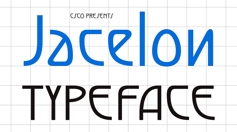
- Jacelon: This font prioritizes legibility, stripping away excessive ornamentation to offer a "clean" Art Deco look suitable for contemporary corporate identity.
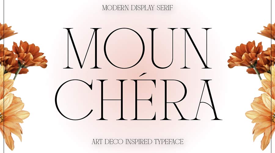
- Mounchera: Proving that the aesthetic is not limited to heavy weights, this typeface uses ultra-thin lines to achieve a sophisticated, airy elegance.
- Modern Deco: A sans-serif design that utilizes subtle geometric tweaks to maintain a retro feel without sacrificing readability in small-to-medium display sizes.
- Florisha: With uniform character heights, this font provides a consistent, rhythmic quality that works well in digital grid systems.
- TT Modernoir: A diverse font family that ranges from delicate thin weights to robust, heavy strokes, reflecting the French influence on the movement.
Niche and Decorative Variations
- Art Deco Monogram: Designed specifically for personal branding and luxury stationery, this font focuses on interlocking symmetry.
- Tyllon: Blends urban street-style boldness with the traditional Art Deco silhouette, ideal for modern nightlife or fashion-forward branding.
- Enoway Pro: A unique hybrid that fuses the ornamental complexity of Art Nouveau with the structure of Art Deco.
- Transcity: Emphasizes playfulness through rounded ligatures, providing a softer, more approachable take on the style.
- Adelios: Offering 12 distinct weights, this font is a powerhouse for designers looking to build a cohesive visual system across multiple media formats.
- Monsante: Evokes the luxury of the era, providing a high-status feel that is frequently requested for premium packaging.
- Cocosignum Maiuscoletto: Inspired by 1930s Italian design, this font offers a distinct, angular look that deviates from the more common American "Great Gatsby" style.
- Ring Link: Incorporates a "techno" vibe, suggesting how Art Deco might have looked had it continued to evolve into the digital age.
- Buenos Aires NF: An outline-style font that brings a sporty, energetic element to the typically formal Art Deco genre.
- Italiana: A classic, calligraphic-inspired font that brings a sense of refined history to newspaper and editorial headers.
- Quincento: Utilizes tall, thin letters to mimic the aristocratic, vertical look of early 20th-century luxury advertisements.
- Decoment: A high-detail typeface that serves as a showstopper for creative projects requiring a high level of visual intricacy.
- Decondol: Focuses on geometric symmetry, offering a balanced, harmonious look that is highly scalable.
- Rousseau Deco: Features specialized characters that provide a custom-designed appearance without the need for manual vector editing.
- Monterio: A comprehensive family (light to bold) that provides enough variation to manage entire brand identity projects.
Professional Implications for Modern Designers
The inclusion of these fonts in a design library provides several strategic advantages. First, the use of historical typography provides an immediate "contextual anchor," allowing a brand to borrow the perceived values of the 1920s—quality, resilience, and style—without having to explicitly state them. Second, the prevalence of these fonts in the "free" domain allows for low-cost, high-impact design updates, enabling small businesses and independent designers to achieve a professional, luxury aesthetic on a limited budget.
However, design experts caution that the key to using Art Deco in the modern era is restraint. Because these fonts are highly decorative, they are best utilized in "hero" positions—logos, primary headlines, or key pull-quotes. Combining an Art Deco display font with a clean, modern sans-serif body text (such as Inter or Roboto) creates a sophisticated balance that avoids the trap of "thematic clutter."
Conclusion: The Endurance of the Deco Aesthetic
The Art Deco movement survives not as a static relic, but as a living language of design. By utilizing these free, high-quality digital assets, contemporary designers are able to participate in a century-long tradition of visual storytelling. As digital platforms continue to demand more unique and emotive typography, the geometric, bold, and inherently glamorous nature of Art Deco will undoubtedly remain a vital tool in the professional designer’s toolkit. Whether for a high-end brand refresh or a stylized editorial project, these fonts offer a bridge to a bygone era of design while remaining firmly planted in the requirements of the modern market.