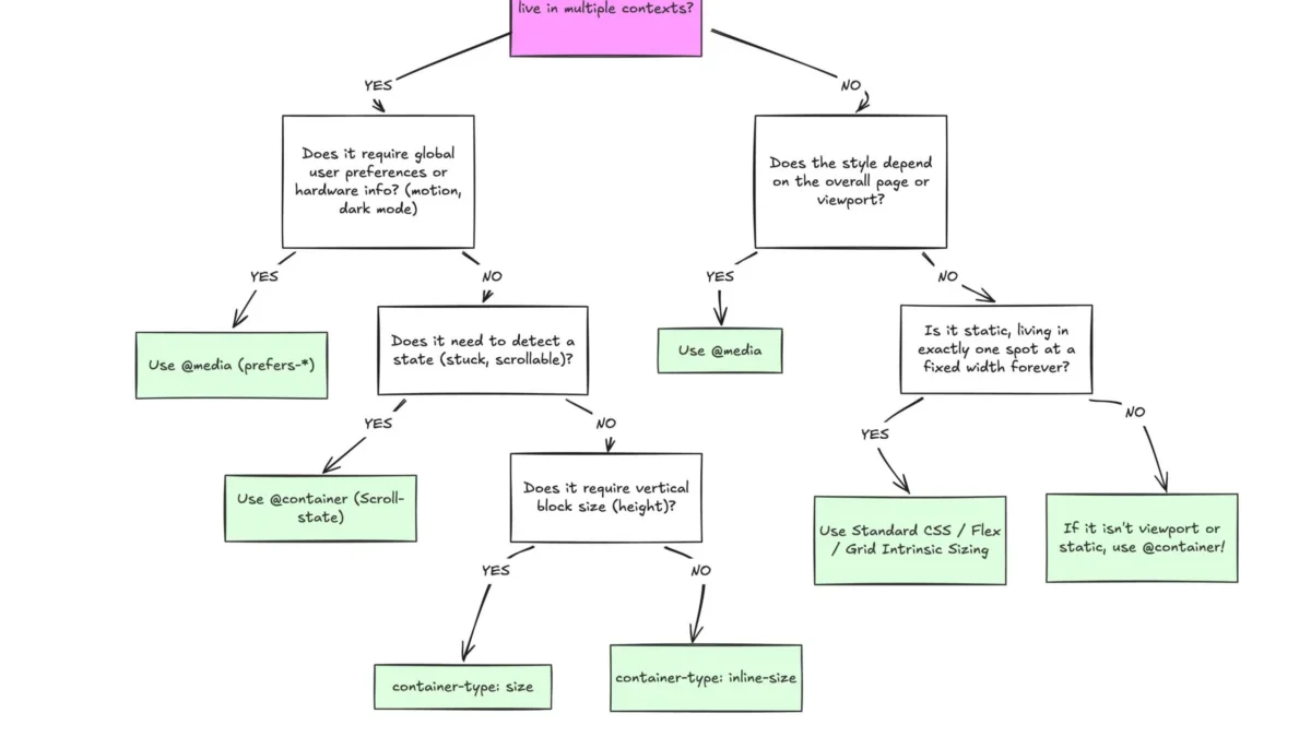
Despite broad browser support, CSS container queries remain a largely underutilized tool in the modern web development toolkit, often misunderstood as mere alternatives to traditional media queries. While media queries have served as the cornerstone of responsive design for over a decade, the shift toward component-based architecture has necessitated a more localized approach to layout management. Container queries represent a significant evolution in CSS, enabling developers to build truly modular interfaces that adapt based on their specific parent containers rather than the global viewport width.
The Evolution of Responsive Design
The concept of responsive design was popularized in 2010 by Ethan Marcotte, who introduced the idea of using fluid grids and media queries to allow layouts to adjust to the user’s screen. For years, this was the industry standard. However, as web applications grew more complex, the limitations of viewport-based design became apparent. Media queries are inherently "dumb" in their decision-making process; they look only at the total width of the browser window. If a component is placed inside a sidebar that occupies only 25% of the screen, a media query will still evaluate the component’s layout based on the full 100% width of the browser, often leading to layout breakage or cramped UI elements.
The demand for a more granular solution culminated in years of lobbying by the developer community. According to historical CSS wishlists, the ability for an element to "know" its own size was the most requested feature for nearly a decade. Browser vendors finally answered this call with the CSS Containment Module Level 3, which brought container queries to the mainstream.
Adoption and Browser Compatibility
As of early 2026, container queries boast approximately 94% global browser support, according to data from Can I Use. Despite this, industry adoption has been tepid. The 2025 State of CSS survey highlighted a significant "knowledge-action gap": while 86% of developers reported awareness of the feature, only 41.4% have actively integrated it into their production environments.
Experts, including prominent web educator Kevin Powell, have characterized this adoption rate as disproportionately low relative to the feature’s utility. The primary barrier appears to be a conceptual overlap; because the syntax of @container mirrors that of @media, developers often default to the familiar patterns they have used for years, failing to realize that the two serve distinct logical purposes within a system.
Technical Distinction: Macro vs. Micro Layouts
To understand the implications of container queries, one must distinguish between "macro" and "micro" layouts. Media queries remain the superior tool for macro-level structural decisions—such as shifting a page from a single-column layout to a multi-column dashboard, adjusting for dark mode, or responding to high-contrast accessibility settings. These are global changes that affect the entire document flow.
Conversely, container queries excel at the micro-level. They allow individual components—such as data cards, navigation widgets, or specialized forms—to be self-contained. By using the container-type: inline-size; property, a component can track its own available horizontal space. If a card is moved from a wide main content area to a narrow sidebar, it can trigger its own responsive breakpoints independently of the rest of the page. This eliminates the "proxy" problem where the viewport is used as a stand-in for the actual space available to an element.

Advancements in Fluid Typography and Layout Logic
The transition to container queries also facilitates more advanced fluid typography. Traditionally, developers used vw (viewport width) units to scale text. While effective, this technique often resulted in text that was either too large or too small when a component was moved to a different context. With the introduction of container-relative units like cqi (container query inline-size), typography can now scale proportionally to the container.
Furthermore, container queries offer a workaround for the long-standing challenge of detecting flex-wrap states. Standard CSS cannot natively detect when flex items wrap to a new line, a task that previously required JavaScript-based observers. By nesting a container query within a flex item, developers can now trigger style changes—such as shifting from a vertical to a horizontal orientation—the moment the flex parent provides enough room for the items to sit side-by-side.
Implementation Challenges and Constraints
Despite their advantages, container queries are not a universal replacement for media queries. Several constraints must be managed:
- Infinite Loops: A container cannot query itself. If a developer attempts to apply a container query to an element that also defines the container, the browser enters a circular dependency. Developers must wrap the target component in a parent container to establish a clear query-target relationship.
- Size Collapse: Querying the
sizeproperty (which includes vertical height) can cause a container to collapse to a height of zero if the container does not have explicit dimensions, as the browser calculates the container size without relying on the contents. Most developers are encouraged to useinline-sizeto avoid this issue. - Custom Property Restrictions: Current specifications do not allow for querying custom CSS variables directly. Because CSS variables cascade, allowing them in queries could lead to unpredictable performance hits and complex infinite loops, limiting their use to fixed unit values.
The Future of Component Architecture
The shift toward container queries represents a broader movement toward "Component-Driven Development." By moving the logic of responsiveness from the page level to the component level, developers can create more modular and reusable codebases. This approach reduces the need for complex, page-specific CSS overrides, as components are now responsible for their own presentation regardless of where they are placed in the DOM.

As the industry continues to move away from monolithic page templates, the reliance on container queries is expected to grow. While the initial learning curve involves unlearning a decade of "viewport-first" thinking, the benefits—greater code maintainability, reduced reliance on JavaScript for layout detection, and more resilient UIs—make it an essential skill for modern front-end engineering.
In conclusion, the decision to use a container query over a media query should be guided by the scope of the layout. If the style change is intended to affect the entire application, the media query remains the appropriate choice. If the style change is intended to improve the adaptability of a reusable component, the container query is the superior, more efficient, and semantically correct tool. The industry is currently in a transition period, and as documentation and design patterns mature, container queries will likely become as fundamental to web development as flexbox or grid layouts.