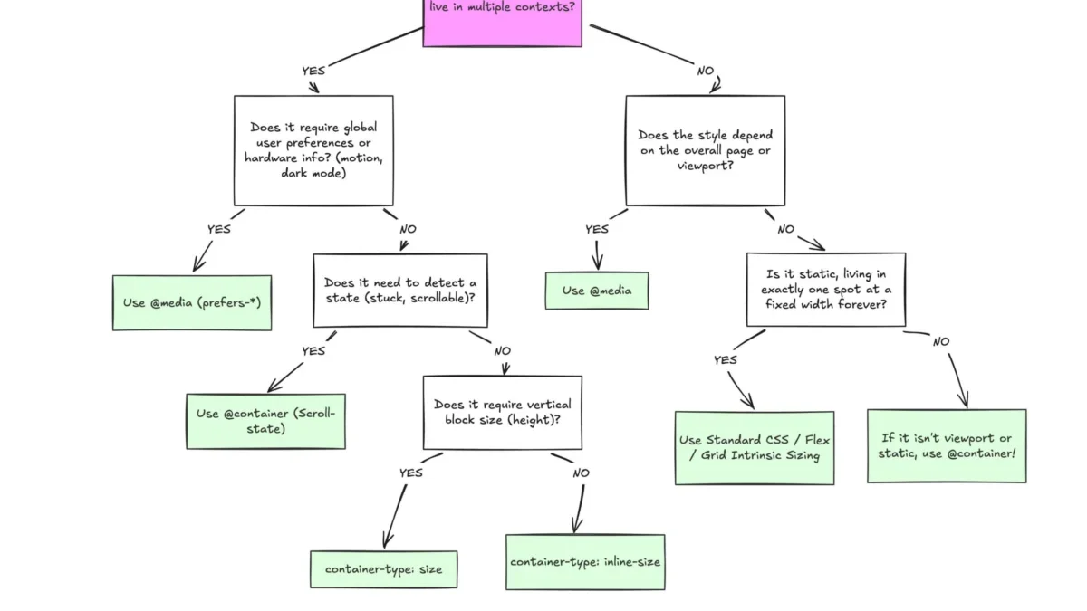
Despite broad browser support, CSS container queries remain a vastly underutilized and frequently misunderstood tool in the modern web development toolkit. While media queries have served as the cornerstone of responsive design for nearly two decades, the shift toward component-based architecture has revealed significant limitations in viewport-based logic. As the digital landscape moves toward highly modular, reusable interface elements, container queries offer a necessary evolution, allowing components to adapt to their immediate environment rather than the dimensions of the entire screen.
The Evolution of Responsive Design
The concept of the "responsive" web was popularized in 2010, when Ethan Marcotte introduced the idea of fluid grids, flexible images, and media queries. At the time, this was a revolutionary approach to handling the emerging diversity of mobile devices. Media queries allowed developers to apply styles based on the width, height, and orientation of the browser window. However, this system relies on the viewport as a proxy for layout; it assumes that if the screen is large, the element should be large, and if the screen is small, the element should be small.
In the years that followed, the web shifted away from page-centric design toward component-based design. Libraries like React, Vue, and Web Components encouraged developers to build isolated, reusable UI elements. A card component, for instance, might be placed in a wide main content area, a narrow sidebar, or a constrained modal window. When using traditional media queries, that card cannot "know" how much space it has; it can only "know" how wide the browser window is. This leads to brittle code where components break when moved to different parts of an application.

Industry Adoption and Data Trends
Despite the clear theoretical advantages of container queries—which finally allow for context-aware styling—industry adoption has lagged significantly. According to the 2025 State of CSS survey, while awareness of the feature is high at 86%, actual utilization sits at approximately 41.4%. This discrepancy is striking given that the feature currently enjoys over 94% browser support, effectively making it a standard tool for modern development.
The delay in adoption is largely attributed to the initial learning curve. Because the syntax of @container mirrors that of @media, developers often mistakenly assume they serve the same functional purpose. This cognitive bias has led to a stagnation in migration, as teams continue to rely on the familiar, albeit limited, logic of viewport-based design. Experts, including influential web developer Kevin Powell, have publicly noted that the failure to pivot toward container-based logic represents a missed opportunity to simplify complex CSS architectures and reduce reliance on JavaScript-based layout observers.
Technical Distinction: Viewport vs. Container
The fundamental difference between the two systems lies in the point of reference. Media queries are "outward-looking," querying the global environment of the browser. In contrast, container queries are "inward-looking," querying the specific parent element that holds the component.
This shift has profound implications for how developers handle layout complexity. For example, a card component designed with flex-wrap might benefit from knowing when it has been forced into a single-column layout. Media queries cannot detect internal layout events, such as when flex items wrap to a new line. Conversely, container queries enable the styling of an element based on its parent’s width, allowing for fluid typography and dynamic component states that remain stable regardless of where they are placed in the DOM.

Implementation Challenges and Side Effects
While container queries solve many longstanding problems, they introduce new considerations that developers must navigate. One of the primary pitfalls is the "self-querying" trap. A container cannot query its own dimensions, as this would create an infinite loop of style calculations. Developers must instead ensure that a proper wrapper element is defined as the container, with the child component responding to that wrapper’s size.
Furthermore, querying a container’s physical size (height) rather than its inline-size (width) can lead to layout collapse. Because the browser calculates a container’s dimensions without reference to its children when container-type: size is declared, the element may default to a height of zero pixels if not explicitly constrained. Industry best practices currently suggest a preference for inline-size queries, which align with the natural flow of web content and avoid these structural pitfalls.
Another limitation currently facing the implementation of container queries is the inability to pass custom properties directly into the query condition. Unlike media queries, which can often be managed through CSS variables for breakpoint consistency, container queries require hard-coded values. This is due to the way CSS variables cascade, which could theoretically cause circular dependencies if allowed within the query logic.
Broader Implications for the Web
The transition from viewport-based to container-based responsive design represents a shift toward more resilient, modular, and maintainable front-end code. As the number of unique viewport sizes continues to grow—now exceeding 2,300 distinct dimensions in the wild—the folly of designing exclusively for the "viewport" becomes increasingly apparent.

By offloading layout responsibility to the container, developers can create "intrinsic" designs that react to the reality of the interface rather than the speculation of the device type. This approach not only improves the robustness of UI components but also reduces the technical debt associated with managing hundreds of media query breakpoints across a large-scale application.
Future Outlook
As the community continues to move toward more complex layout patterns, the role of container queries is expected to expand. The ongoing development of "container style queries," currently in experimental stages, promises to allow developers to query not just the size, but the computed styles of a parent element. This would represent the next logical step in the maturation of CSS, moving closer to a true "component-first" styling model.
Ultimately, the underutilization of container queries is not a failure of the technology, but a symptom of the inertia inherent in web development workflows. As legacy codebases are refactored and new frameworks gain traction, the adoption of these queries is projected to rise. The shift is not merely about using a new CSS rule; it is about adopting a philosophy of localizing layout logic, ensuring that components are as portable and self-sufficient as the modern web requires them to be. For teams looking to future-proof their designs, the integration of container queries is no longer an optional optimization—it is an essential practice for the next generation of web design.