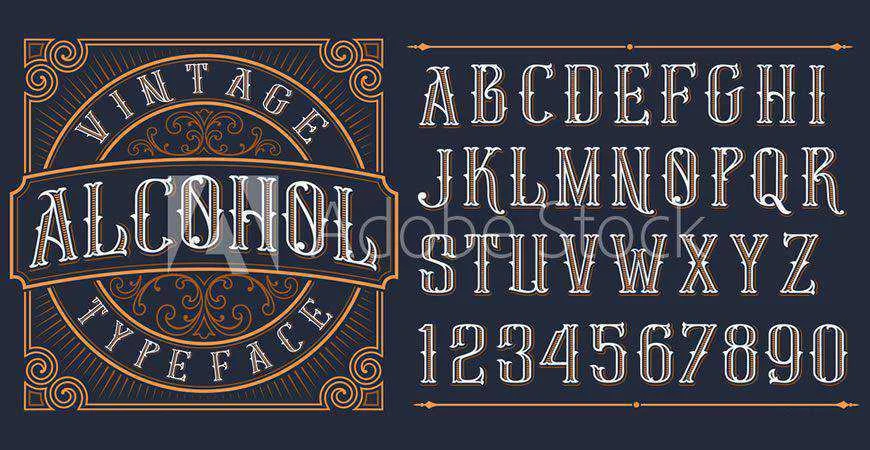
Typography serves as the visual voice of a brand, functioning as a silent communicator that conveys personality, authority, and intent long before a consumer reads a single word of copy. In the competitive landscape of corporate design, the selection of a logo font is not merely an aesthetic choice but a strategic business decision. A study by the Stanford Persuasive Technology Lab found that 75% of users judge a company’s credibility based on its website design, with typography cited as a primary factor in perceived trustworthiness. As visual identity becomes increasingly fragmented across digital platforms, the need for versatile, scalable, and distinctive typefaces has never been greater.
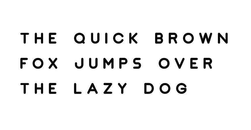
The history of brand typography traces back to the early 20th century, when industrialization necessitated clear, reproducible marks for mass-produced goods. From the classic serifs of heritage brands like Tiffany & Co. to the radical minimalism of contemporary tech giants like Google and Airbnb, the evolution of logo design has mirrored broader shifts in design philosophy. Today, the design process must account for responsiveness; a logo must remain legible on a massive billboard, a smartphone screen, and a social media avatar simultaneously.
The Strategic Importance of Typeface Selection
When designers embark on the process of creating a brand identity, they are essentially encoding a set of values into visual symbols. A serif font, characterized by small decorative strokes at the ends of letters, traditionally signals reliability, heritage, and sophistication. Conversely, sans-serif fonts—which lack these strokes—are perceived as modern, efficient, and accessible. According to the Journal of Consumer Research, fonts with higher visual weight and boldness are frequently associated with strength and stability, whereas lighter, more intricate script fonts are linked to luxury, creativity, and personal service.
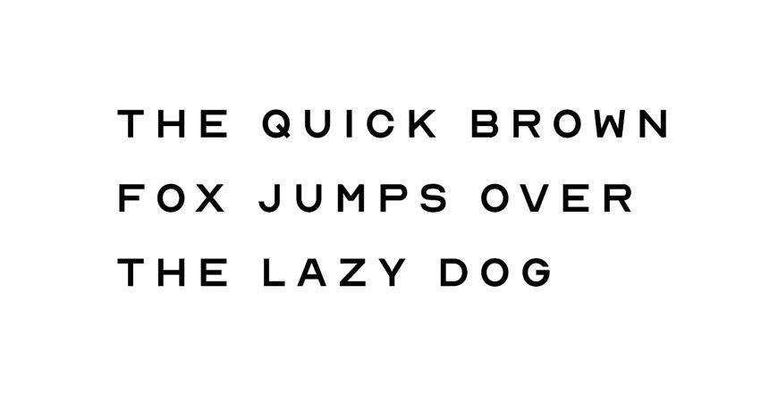
For designers, the selection process is governed by a rigorous set of criteria. Beyond aesthetic appeal, a font must possess:
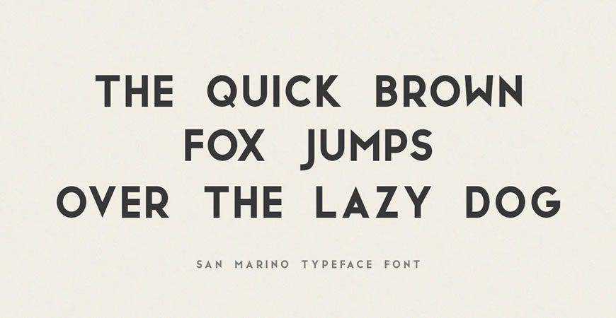
- Legibility: The ability to be read easily at various sizes and resolutions.
- Scalability: Performance across diverse media, from physical signage to mobile applications.
- Versatility: The capacity to maintain brand recognition when paired with secondary typography.
- Licensing Compliance: The legal right to use the font for commercial or client-facing applications.
Categorical Breakdown of Logo Typography
To navigate the vast landscape of available typefaces, designers often categorize fonts by their emotional and functional utility.
Minimalist and Geometric Frameworks
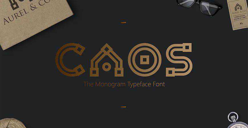
Minimalism remains the gold standard for tech startups and corporate service providers. Fonts like Nord and JUST Sans represent a move toward geometric purity. These fonts leverage mathematical balance, ensuring that the brand image feels orderly and professional. The rise of these fonts coincides with the "blanding" trend in corporate design, where companies strip away ornamentation to prioritize functional clarity in an information-heavy digital environment.
Monogrammatic Sophistication
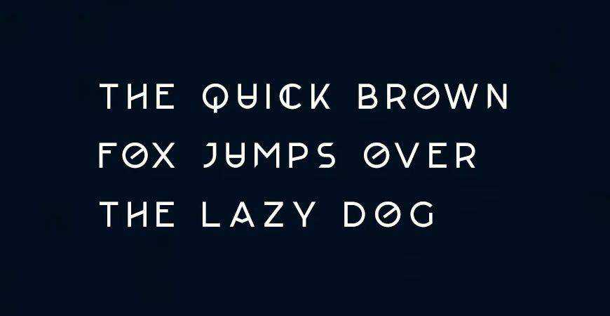
Monograms are the hallmark of legacy and luxury. Typefaces like Augor allow for the creation of unique, interlocking letterforms that serve as a standalone mark. Historically, these designs date back to medieval stonemasonry and royal seals, but they have been repurposed for the modern era to signify exclusivity and craftsmanship.
Script and Handwritten Expressions
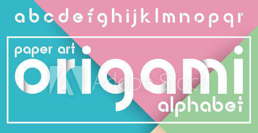
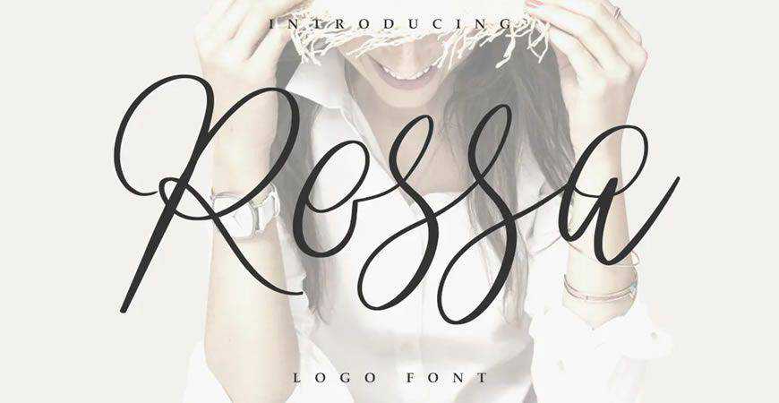
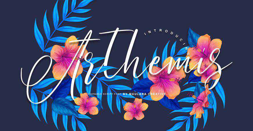
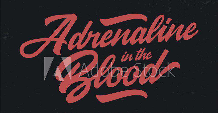
Script fonts, such as Rossa or Southwave, inject a sense of human touch into an increasingly automated world. These are essential for sectors where emotional connection is paramount, such as hospitality, beauty, and independent retail. The challenge with script fonts is maintaining readability, which is why refined, balanced calligraphic styles are preferred over overly intricate, flourish-heavy options.
The Functional Edge of All-Caps and Display Fonts
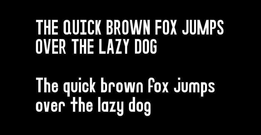
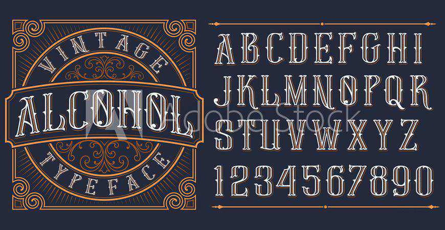
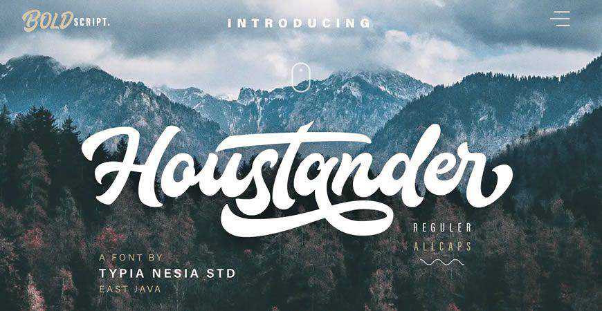
When a brand needs to project power and volume, all-caps fonts are the industry standard. Typefaces like Stag provide a bold, blocky aesthetic that commands attention. In contrast, display fonts—such as Fritz or Boltz—are engineered for impact. These are typically used for logos that aim to disrupt a market or appeal to younger, trend-driven demographics.
Data-Driven Design Considerations
Industry reports from platforms like Envato and Adobe Stock indicate a 40% increase in the demand for variable fonts—typefaces that allow for real-time adjustments to weight, width, and slant without requiring separate files. This technological shift addresses a major pain point in responsive design: the need for a single, adaptable font that functions perfectly on any screen size.
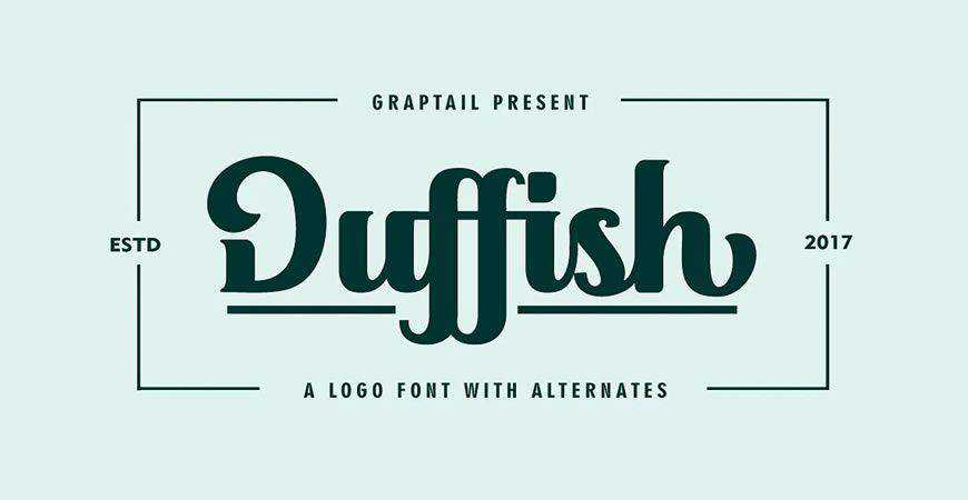
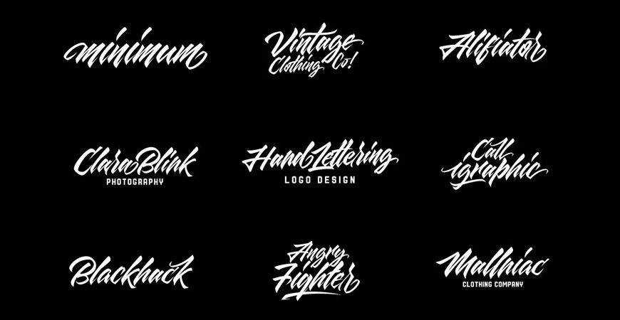
Furthermore, the "First Impression" metric remains a critical KPI for brand designers. Psychologists have observed that the brain processes visual information 60,000 times faster than text. Therefore, the typeface serves as the "hook" that draws the consumer into the brand story. If the font conflicts with the brand’s messaging—such as using a playful graffiti font for a high-end financial firm—it creates a cognitive dissonance that can result in lost revenue and diminished brand loyalty.
Legal Implications and Licensing Best Practices
A common pitfall for emerging designers is the misunderstanding of font licensing. Many high-quality typefaces are available for free download under "Personal Use" licenses. However, using these for commercial logos without a proper "Commercial" or "Enterprise" license exposes the client to significant legal liability, including potential lawsuits for copyright infringement.
Designers must adhere to a strict audit process:
- Verify the License Type: Ensure the license explicitly covers "Commercial Logo Design."
- Understand Embedding Rights: Determine if the font file can be legally embedded in web assets.
- Client Transferability: Confirm whether the client holds the rights to use the font if they decide to expand their brand identity independently in the future.
- Documentation: Keep a digital log of all font licenses purchased for every project to protect against future litigation.
The Future of Brand Typography
As we look toward the future, the integration of Artificial Intelligence in design is reshaping how we view typography. Generative tools are now capable of suggesting font pairings based on sentiment analysis of a brand’s mission statement. However, the human element remains irreplaceable. The nuances of kerning, tracking, and the subtle adjustments required to make a logo feel "right" are still best handled by experienced designers who understand the cultural weight of the chosen letterforms.
The selection of a logo font is the foundational act of brand building. It is a synthesis of art and mathematics, where every curve and line must support the business’s goals. Whether a brand opts for the clean, futuristic lines of Lequire or the rustic, artisanal charm of Wild Nature, the goal remains the same: to create a visual marker that is timeless, recognizable, and deeply aligned with the brand’s core purpose. By focusing on readability, emotional resonance, and legal compliance, designers can ensure that their client’s brand identity not only stands out in a crowded marketplace but endures for years to come.