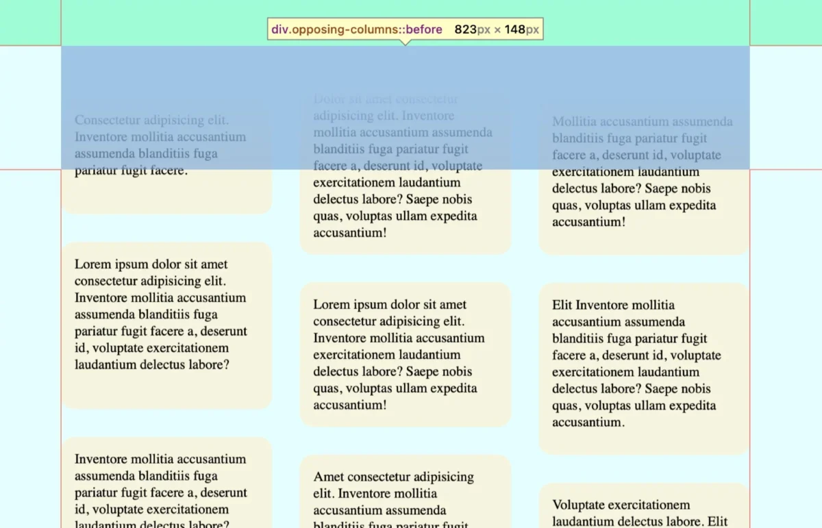
The dynamic world of web design frequently sees ambitious concepts emerge from the minds of creative developers, some of which initially appear unconventional before gradually winning over audiences. A prime example of this phenomenon is the captivating effect of creating columns of content that move in opposing directions as a user scrolls through a webpage. This seemingly complex visual flourish, which can initially spark a moment of skepticism, is now readily achievable thanks to the burgeoning capabilities of modern CSS, particularly scroll-driven animations. This article delves into the technical intricacies and creative potential of implementing such an effect, offering a comprehensive guide for developers and designers alike.
A Note on Accessibility and Browser Support
It is crucial to acknowledge that this particular interactive element is designed to be sensitive to user preferences regarding motion. For the effect to be visible, users must have reduced motion settings disabled. As of the current development phase, browser support is primarily focused on Chrome and Safari. Developers should remain cognizant of these factors and consider fallback mechanisms for broader compatibility and accessibility.
The Genesis of the Concept
The initial idea of constructing visually striking columns that exhibit counter-directional movement during user scrolling might strike some as an abstract design challenge. However, the underlying principle is to create an engaging user experience that draws attention to content without being overly distracting. This effect leverages the user’s natural interaction with a webpage – scrolling – to introduce a subtle yet captivating animation. The underlying technology, scroll-driven animations, represents a significant advancement in CSS, empowering developers to synchronize animations directly with scroll positions, thereby unlocking a new dimension of interactive web design. This approach not only simplifies the implementation of complex animations but also fosters a more intuitive and responsive user interface.
HTML Structure: The Foundation of the Effect
The foundational markup for this scroll-driven animation is remarkably straightforward, relying on a hierarchical structure that CSS can then manipulate. The core components include a parent container, identified by the class opposing-columns, which encloses several child elements, each designated as opposing-column. Within each of these column elements reside individual content pieces, marked with the class opposing-item. This nested arrangement provides the necessary structure for the subsequent styling and animation.
<div class="opposing-columns">
  <!-- Column 1 -->
  <div class="opposing-column">
    <div class="opposing-item">...</div>
    <div class="opposing-item">...</div>
    <div class="opposing-item">...</div>
  </div>
  <!-- Column 2 -->
  <div class="opposing-column">
    <div class="opposing-item">...</div>
    <div class="opposing-item">...</div>
    <div class="opposing-item">...</div>
  </div>
  <!-- Column 3 -->
  <div class="opposing-column">
    <div class="opposing-item">...</div>
    <div class="opposing-item">...</div>
    <div class="opposing-item">...</div>
  </div>
</div>
This minimal HTML structure underscores the power of CSS in transforming simple elements into a sophisticated interactive experience. The heavy lifting, in terms of visual presentation and animation, is handled entirely by stylesheets.
Styling the Parent Container: Establishing the Visual Framework
To ensure optimal presentation and prevent visual clutter on smaller screens, the opposing columns effect is strategically applied only to larger viewports. This responsive design approach acknowledges that the visual impact of this animation is best appreciated on displays with ample screen real estate.
/* Applied to larger screens only */
@media screen and (width >= 50rem)
  .opposing-columns
    display: flex;
    gap: 2rem;
    max-inline-size: min(90dvi, 50rem);
    margin-inline: auto;
Within this media query, the .opposing-columns element is styled as a flex container, enabling the horizontal arrangement of its child columns. A gap property introduces consistent spacing between these columns, while max-inline-size and margin-inline: auto ensure the container is centered and appropriately sized within larger viewports.
Implementing a Masking Effect: The Illusion of Fading
A key element in creating the illusion of items disappearing as they scroll out of view is a sophisticated masking effect. This involves carefully orchestrating the appearance and disappearance of content at the boundaries of the parent container. The outer columns are designed to move upward on scroll, while the central column moves downward. As these items traverse the container’s edges, they need to fade out seamlessly.
This is achieved through a combination of background colors and pseudo-elements. First, a document-wide background color variable, --opposing-bg, is established.
@media screen and (width >= 50rem)
  :root
    --opposing-bg: lightcyan; /* Example background color */
    background-color: var(--opposing-bg);


  .opposing-columns
    /* Previous styles remain */
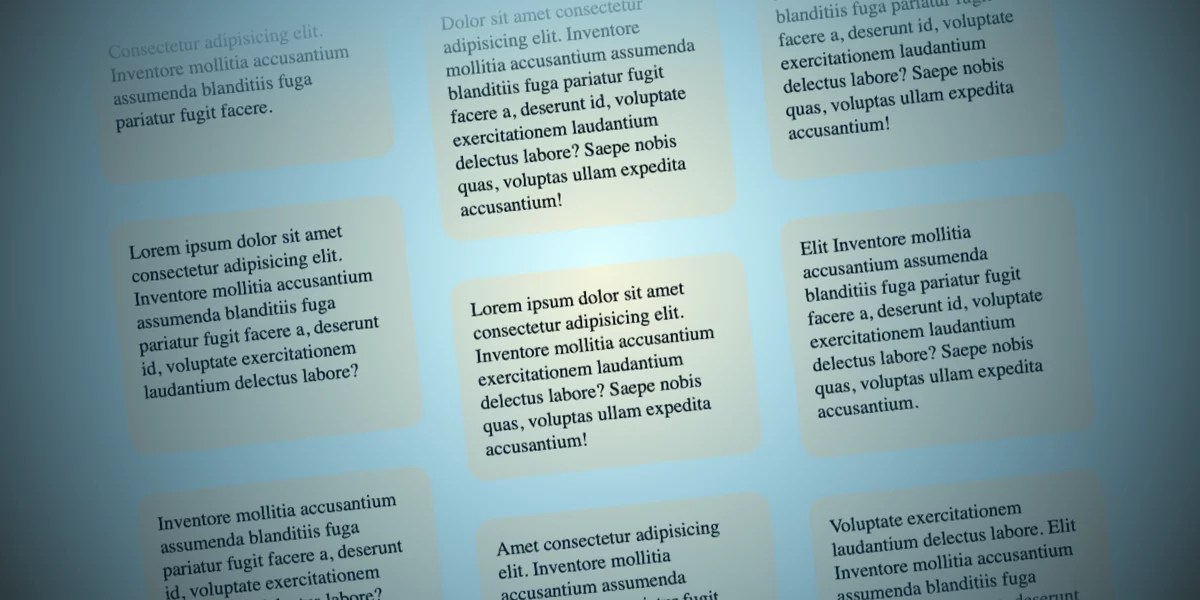
Subsequently, this same background color is applied to the :before and :after pseudo-elements of the .opposing-columns container. These pseudo-elements are strategically positioned to create a visual buffer at the top and bottom of the container.
@media screen and (width >= 50rem)
  :root
    --opposing-bg: lightcyan;
    background-color: var(--opposing-bg);


  .opposing-columns
    /* Previous styles remain */

    &:before,
    &:after
      content: "";
      position: absolute;
      inset-inline: 0;
      block-size: calc(var(--opposing-mask) * 3); /* Defined below */
      pointer-events: none;
      z-index: 1;
By setting position: absolute and z-index: 1 on these pseudo-elements, they are layered above the main content but below any potential overlay. This stacking context is crucial for the masking effect. The pointer-events: none; ensures that these pseudo-elements do not interfere with user interactions with the underlying content.
A new CSS variable, --opposing-mask, is introduced to define a vertical spacing around the parent element. This variable contributes to the visual separation between the parent container and its child columns, and also influences the size of the masking pseudo-elements.
@media screen and (width >= 50rem)
  :root
    --opposing-bg: lightcyan;
    --opposing-mask: 3rem; /* Example mask size */
    background-color: var(--opposing-bg);


  .opposing-columns
    display: flex;
    gap: 2rem;
    max-inline-size: min(90dvi, 50rem);
    margin-inline: auto;
    margin-block: var(--opposing-mask, 3rem); /* Apply margin using the variable */
    position: relative; /* Establish positioning context */
The block-size of the pseudo-elements is then calculated using this --opposing-mask variable, multiplied by three. This creates a significant vertical area for the masking effect to operate within.
@media screen and (width >= 50rem)
  :root
    /* Previous styles remain */


  .opposing-columns
    /* Previous styles remain */

    &:before,
    &:after
      content: "";
      position: absolute;
      inset-inline: 0;
      block-size: calc(var(--opposing-mask) * 3);
      pointer-events: none;
      z-index: 1;
The visual fade-out is achieved by applying gradient backgrounds to these pseudo-elements. The :before pseudo-element, positioned at the top, receives a top-to-bottom gradient that transitions from the document’s background color (--opposing-bg) to transparent. This effectively masks content as it scrolls into view from the top.
@media screen and (width >= 50rem)
  :root
    /* Previous styles remain */


  .opposing-columns
      /* Previous styles remain */

      &:before,
      &:after
        /* Previous styles remain */


      &:before
        background-image: linear-gradient(
          to bottom,
          var(--opposing-bg) var(--opposing-mask),
          transparent
        );
        inset-block-start: calc(var(--opposing-mask) * -1); /* Position above the container */

      /* ... :after styles below */


}
Conversely, the :after pseudo-element, located at the bottom, uses a reversed gradient (bottom-to-top) to create a similar fading effect as content scrolls out of view at the bottom. The inset-block-start and inset-block-end properties are used to position these pseudo-elements precisely relative to the parent container’s boundaries, ensuring they overlap the content as intended.
@media screen and (width >= 50rem)
  :root
    /* Previous styles remain */


  .opposing-columns
      /* Previous styles remain */

      &:before,
      &:after
        /* Previous styles remain */


      &:before
        /* Previous styles remain */


      &:after
        background-image: linear-gradient(
          to top,
          var(--opposing-bg) var(--opposing-mask),
          transparent
        );
        inset-block-end: calc(var(--opposing-mask) * -1); /* Position below the container */


}
This clever use of gradients and pseudo-elements creates the illusion that items are smoothly fading out of existence as they move beyond the visible area of the parent container, without altering their actual opacity.
Column Layouts: Structuring the Content Flow
Before delving into the animation itself, it’s essential to establish the layout of the content within each column. Each .opposing-column is designed to be a flex item within the parent flex container. This allows for flexible sizing and distribution of space. The flex shorthand property is employed to define these characteristics: flex: 1 1 10rem;. This translates to:
flex-grow: 1: Allows the column to grow and take up available space.flex-shrink: 1: Allows the column to shrink if necessary.flex-basis: 10rem: Sets an initial size for the column.
@media screen and (width >= 50rem)
  /* Previous styles remain */

  .opposing-column
    flex: 1 1 10rem;
Furthermore, to precisely control the spacing between individual items within each column, the .opposing-column is transformed into a grid container. This allows for the straightforward application of the gap property to introduce vertical spacing between the .opposing-item elements.
@media screen and (width >= 50rem)
  /* Previous styles remain */

  .opposing-column
    flex: 1 1 10rem;
    display: grid;
    gap: 2rem; /* Spacing between items */
While Flexbox could also achieve spacing with gap in certain contexts, switching to CSS Grid offers a more concise solution for this specific layout requirement, where the default row direction of Flexbox would need to be overridden to column.
The Animation: Bringing Scroll-Driven Dynamics to Life
This is the core of the interactive experience, where the magic of scroll-driven animations is harnessed. The setup thus far has prepared the elements to flow in and out of the parent container. Now, the scrolling behavior is introduced.
The animation-timeline property is the linchpin of this technique. Unlike traditional CSS animations that run based on a set duration from the moment of page load, animation-timeline allows animations to be synchronized with scroll events. This means the animation’s progress is directly dictated by the user’s scrolling action, a concept central to "scroll-driven animations."
Two primary functions are supported: scroll() and view(). The scroll() function synchronizes an animation with the scroll position of a specific element. In contrast, the view() function tracks an element’s progress as it enters and exits the "scrollport" – the visible, scrollable area of its container.
For this particular effect, the view() function is the more appropriate choice. The design hinges on the elements’ entrance and exit from the defined scrollable area within the parent container, rather than their absolute scroll position. The view() function provides granular control over where an animation begins upon entering the scrollport and where it concludes upon exiting.
The syntax for animation-timeline is as follows:

/* Official syntax */
animation-timeline:  view([ <axis> || <'view-timeline-inset'> ]?);
Initially, the animation-timeline is set to view(), and the animation-range is defined as entry cover. This signifies that the animation should commence the instant an element enters the scrollport (entry) and conclude when it has completely left the area (cover).
@media screen and (width >= 50rem)
  /* Previous styles remain */

  .opposing-column
    /* ... */
    animation-timeline: view();
    animation-range: entry cover;
To ensure the animation spans the entire visual range of the element’s interaction with the scrollport, the animation-range is further refined to entry 0% cover 100%. This explicitly sets the animation’s start point at 0% entry into the scrollport and its endpoint at 100% cover by the scrollport.
@media screen and (width >= 50rem)
  /* Previous styles remain */

  .opposing-column
    /* ... */
    animation-timeline: view();
    animation-range: entry 0% cover 100%;
Finally, the animation-timing-function is set to linear. This ensures the animation proceeds at a constant pace throughout its duration, without any acceleration or deceleration, providing a smooth and predictable visual flow.
@media screen and (width >= 50rem)
  /* Previous styles remain */

  .opposing-column
    /* ... */
    animation-timing-function: linear;
    animation-timeline: view();
    animation-range: entry 0% cover 100%;
While these properties define how the animation will run, the actual movement is defined by @keyframes. Three distinct animations are created to achieve the opposing motion:
scroll1: For the first column, it animates thetransformproperty from a downward offset to an upward offset.scroll2: For the second column, it animates from an upward offset to a downward offset, effectively reversingscroll1.scroll3: For the third column, it introduces a slightly different, staggered motion, animating from a moderate downward offset to a moderate upward offset.
These animations are defined using the --opposing-mask variable to ensure they are responsive to the defined spacing.
@keyframes scroll1
  from  transform: translateY(var(--opposing-mask));
  to  transform: translateY(calc(var(--opposing-mask) * -1));


@keyframes scroll2
  from  transform: translateY(calc(var(--opposing-mask) * -1));
  to  transform: translateY(var(--opposing-mask));


@keyframes scroll3
  from  transform: translateY(calc(var(--opposing-mask) * .66));
  to  transform: translateY(calc(var(--opposing-mask) * -.33));
To manage these animations efficiently, CSS variables are introduced for their names:
@media screen and (width >= 50rem)
  :root
    --opposing-bg: lightcyan;
    --opposing-mask: 3rem;
    --animation-1: scroll1;
    --animation-2: scroll2;
    --animation-3: scroll3;

    /* ... other styles */
These animation variables are then applied to each respective column using :nth-of-type selectors:
@media screen and (width >= 50rem)
  /* Previous styles remain */

  .opposing-column
    /* Previous styles remain */


  :where(.opposing-column:nth-of-type(1))
    animation-name: var(--animation-1);


  :where(.opposing-column:nth-of-type(2))
    animation-name: var(--animation-2);


  :where(.opposing-column:nth-of-type(3))
    animation-name: var(--animation-3);
Respecting User Preferences: Reduced Motion
A critical aspect of modern web development is ensuring accessibility. In line with this principle, the animations are disabled when a user has indicated a preference for reduced motion. This is achieved through a media query targeting (prefers-reduced-motion: reduce). Within this query, the animation property is set to unset for the .opposing-column elements, effectively disabling all animations. Concurrently, the masking pseudo-elements are also removed (content: unset;) to prevent any potentially jarring visual artifacts in a reduced-motion context.
@media (prefers-reduced-motion: reduce)
  .opposing-column
    animation: unset;

    &:before,
    &:after
      content: unset;
Broader Implications and Future Directions
The advent of scroll-driven animations, as exemplified by the opposing columns effect, represents a significant leap forward in CSS capabilities. While browser support is still maturing, particularly with Firefox noted as a pending implementer, the potential for creating highly interactive and engaging web experiences is immense.
For developers, the ability to tie animations directly to scroll events opens up a new palette of creative possibilities. This can range from subtle parallax effects and animated progress indicators to more complex narrative-driven sequences that unfold as the user scrolls.
To ensure broader compatibility during this transitional period, developers can leverage the @supports at-rule. This allows for conditional application of styles, enabling a graceful fallback experience for browsers that do not yet support animation-timeline: view(). For instance, a traditional animation timeline could be implemented as a fallback for non-supporting browsers.
@supports (animation-timeline: view())
  /* Styles for browsers supporting scroll-driven animations */
  /* ... (all the styles defined above) */
 @supports not (animation-timeline: view())
  /* Fallback styles for browsers that do not support scroll-driven animations */
  /* Example: Implement a standard animation timeline */
  .opposing-column
    animation-name: /* A standard animation */;
    animation-duration: 10s; /* Example duration */
    animation-iteration-count: infinite;
    animation-timing-function: linear;
The techniques demonstrated here are merely scratching the surface of what scroll-driven animations can achieve. As browser support expands and developer experimentation continues, we can anticipate an even richer landscape of dynamic and responsive web designs, where user interaction is seamlessly woven into the visual fabric of the web. The conversation around innovative implementations and alternative approaches remains open, inviting further exploration and collaboration within the developer community.