How to Make a Gantt Chart in Google Sheets
How to make a Gantt chart in Google Sheets? It’s easier than you think! Gantt charts are visual project management tools that help you organize tasks, deadlines, and dependencies. They’re incredibly useful for keeping projects on track, and Google Sheets provides a simple and powerful platform for creating them.
In this guide, we’ll walk you through the steps of creating a Gantt chart in Google Sheets, from the basics of setting up your chart to advanced techniques for customization and data visualization. Whether you’re a seasoned project manager or just starting out, this comprehensive guide will empower you to effectively use Gantt charts to manage your projects with confidence.
Introduction to Gantt Charts

Gantt charts are visual project management tools that display a project’s tasks and their timelines in a bar chart format. They provide a clear and concise overview of the project’s schedule, allowing for better planning, tracking, and communication.Gantt charts are a valuable tool for project managers because they help visualize project dependencies, identify potential delays, and track progress effectively.
They enable efficient communication and collaboration among team members, stakeholders, and clients.
Benefits of Using Gantt Charts
Gantt charts offer numerous benefits for project management, making them an essential tool for successful project completion.
- Improved Project Planning:Gantt charts help visualize the project’s timeline, allowing for better planning and resource allocation. By breaking down the project into smaller tasks, it becomes easier to estimate the time required for each task and create a realistic schedule.
- Enhanced Task Management:Gantt charts provide a clear overview of all project tasks, their dependencies, and deadlines. This enables efficient task management, allowing teams to prioritize tasks, allocate resources effectively, and track progress in real-time.
- Effective Communication:Gantt charts serve as a common platform for communication among team members, stakeholders, and clients. They provide a visual representation of the project’s progress, enabling everyone to stay informed about deadlines, task assignments, and potential delays.
- Risk Identification and Mitigation:Gantt charts help identify potential risks and bottlenecks within the project schedule. By visualizing task dependencies, managers can anticipate potential delays and implement mitigation strategies to prevent disruptions.
- Increased Accountability:Gantt charts hold team members accountable for their assigned tasks and deadlines. The visual representation of tasks and deadlines creates a sense of responsibility and encourages timely completion.
Types of Gantt Charts
Gantt charts can be customized to meet specific project needs and preferences. Here are some common types of Gantt charts:
- Basic Gantt Chart:This type of chart displays tasks and their durations in a simple bar chart format. It’s ideal for small projects with limited dependencies.
- Milestone Gantt Chart:This chart highlights key project milestones, providing a clear roadmap for project progress. It’s useful for tracking major achievements and ensuring the project stays on track.
- Resource-Loaded Gantt Chart:This chart displays tasks, durations, and the resources assigned to each task. It helps visualize resource allocation and identify potential resource conflicts.
- Interactive Gantt Chart:These charts allow for real-time updates and collaboration. Users can adjust task durations, add dependencies, and track progress directly within the chart.
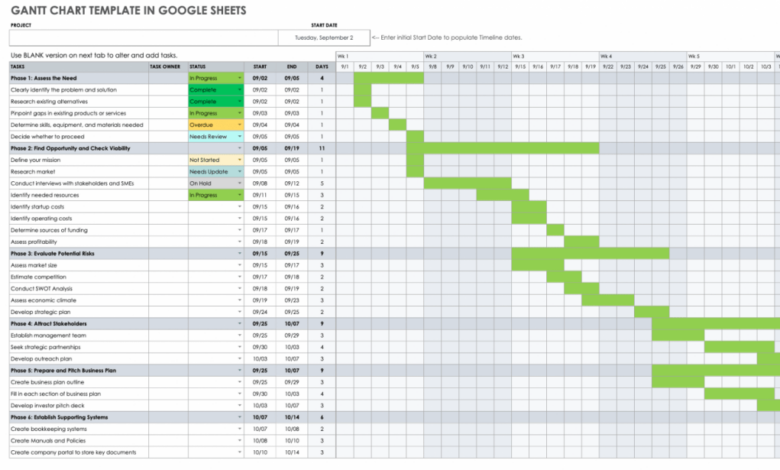
Creating a Gantt Chart in Google Sheets
Gantt charts are a powerful tool for project management, offering a visual representation of tasks, timelines, and dependencies. Google Sheets provides a user-friendly environment for creating and managing these charts, making them accessible to anyone.
Creating a Gantt chart in Google Sheets is a breeze! You can use the built-in chart function to visualize your project timeline, making it easy to track progress and deadlines. While I’m busy organizing my own project timelines, I’m also intrigued by the upcoming house panel to hold public hearing on unexplained aerial sightings – I’m curious to see what new information will be shared.
Back to my Gantt chart, though – I need to make sure I allocate enough time for each task to ensure a successful outcome.
Creating a Basic Gantt Chart
Creating a Gantt chart in Google Sheets involves several steps. The first step is to set up your spreadsheet. This involves creating columns for task names, start dates, end dates, and durations. You can also include columns for resources, dependencies, and other relevant information.
- Task Names:The first column should be for task names. Enter each task in a separate row.
- Start Dates:The next column is for start dates. Enter the date when each task is scheduled to begin.
- End Dates:The following column is for end dates. Enter the date when each task is scheduled to be completed.
- Durations:You can create a column to calculate the duration of each task by subtracting the start date from the end date. The formula to use would be:
=End Date- Start Date.
Once you have your data entered, you can create a visual representation of your tasks. This is where the Gantt chart comes into play. To create a Gantt chart, you can use the following steps:
- Select the data range: Select the cells containing your task names, start dates, and end dates.
- Insert a chart: Go to the “Insert” menu and select “Chart”.
- Choose the Gantt chart type: In the chart editor, select “Gantt chart” from the chart types.
- Customize the chart: You can customize the appearance of your Gantt chart by adjusting colors, fonts, and other formatting options. You can also add a title and labels to make it more informative.
Adding Dependencies
Dependencies represent the relationships between tasks. For example, a task might depend on the completion of another task before it can start. In Google Sheets, you can add dependencies to your Gantt chart by using the following steps:
- Create a dependency column: Add a new column to your spreadsheet labeled “Dependencies”.
- Enter dependencies: In this column, enter the task names that each task depends on. For example, if Task B depends on Task A, you would enter “Task A” in the “Dependencies” column for Task B.
- Update the chart: Once you have added dependencies, update your Gantt chart to reflect these relationships. The chart will automatically adjust to show the dependencies between tasks.
Adding Resources
Resources represent the people, equipment, or materials needed to complete tasks. You can add resources to your Gantt chart by following these steps:
- Create a resource column: Add a new column to your spreadsheet labeled “Resources”.
- Enter resources: In this column, enter the names of the resources needed for each task.
- Update the chart: Once you have added resources, update your Gantt chart to reflect these resources. The chart will automatically adjust to show the resources allocated to each task.
Formatting Options
Google Sheets provides a wide range of formatting options for customizing your Gantt chart. These options include:
- Colors: You can change the colors of the bars representing your tasks to visually distinguish them.
- Fonts: You can change the font style, size, and color to enhance readability.
- Gridlines: You can add or remove gridlines to make the chart easier to read.
- Labels: You can add labels to the bars representing your tasks to provide more information.
- Chart title: You can add a title to your Gantt chart to make it clear what it represents.
Using Gantt Charts for Project Planning: How To Make A Gantt Chart In Google Sheets

Gantt charts are powerful tools for visualizing project timelines and managing tasks effectively. They provide a clear overview of project activities, their durations, dependencies, and progress. By using a Gantt chart, you can gain valuable insights into your project’s schedule and identify potential roadblocks early on.
Visualizing Project Timelines
Gantt charts are designed to depict the timeline of a project, allowing you to see the start and end dates of each task. The horizontal axis represents the project timeline, while the vertical axis lists the tasks involved. Each task is represented by a horizontal bar, whose length corresponds to the task’s duration.
The bars are positioned along the timeline to indicate the start and end dates. This visual representation provides a clear understanding of the project’s overall duration and the timing of individual tasks.
Tracking Progress and Identifying Roadblocks
Gantt charts can be used to track the progress of tasks and identify potential roadblocks. By updating the progress of each task on the chart, you can see how the project is progressing against the planned timeline. This allows you to identify tasks that are behind schedule and proactively address potential delays.
Additionally, the dependencies between tasks can be highlighted, enabling you to identify potential bottlenecks or risks that could impact the project’s timeline.
Making a Gantt chart in Google Sheets is surprisingly easy, especially if you’re familiar with the basics of spreadsheet functions. You can quickly visualize your project timeline and dependencies by using the built-in charting tools. And when you’re feeling inspired to use up some wilted veggies, check out this delicious pajeon recipe that’s perfect for using up those forgotten greens.
Once you’ve finished that tasty treat, you’ll be ready to tackle your Gantt chart with renewed energy!
Adjusting the Gantt Chart Based on Project Changes or Delays, How to make a gantt chart in google sheets
Projects are dynamic and often require adjustments. Gantt charts provide a flexible framework for accommodating changes and delays. When a task is delayed, the corresponding bar on the chart can be adjusted to reflect the new start and end dates.
This ensures that the Gantt chart remains an accurate representation of the project’s current status. Similarly, if new tasks are added or existing tasks are modified, the chart can be easily updated to reflect these changes.
Advanced Gantt Chart Techniques

While basic Gantt charts are valuable for project visualization, advanced techniques can unlock greater insights and control. These techniques enhance the chart’s functionality and provide more comprehensive project management capabilities.
Conditional Formatting
Conditional formatting empowers you to highlight specific tasks based on their status, priority, or other criteria. This visual cue streamlines project monitoring and quickly identifies tasks requiring attention. For instance, you can format tasks marked “Overdue” in red, tasks nearing their deadline in yellow, and completed tasks in green.
Using conditional formatting, you can easily distinguish between tasks that are on track, behind schedule, or ahead of schedule. This helps you prioritize your work and ensure that you are meeting your deadlines.
Interactive Gantt Charts
Data visualization tools allow you to create interactive Gantt charts that respond to user input. These charts enhance user engagement and offer dynamic insights. For example, hovering over a task bar can reveal detailed information like its start and end dates, assigned resources, and dependencies.
Clicking on a task can open a dedicated window with more in-depth details, including progress reports, risk assessments, and communication logs.
Creating a Gantt chart in Google Sheets is surprisingly easy, especially with the built-in features. You can use it to visualize and manage your projects, from planning a school event to organizing your classroom curriculum. Speaking of school, you might be interested in this article on 7 facts about the state of edtech in schools , which explores the current trends and challenges in educational technology.
Once you’ve absorbed those insights, you can come back to your Gantt chart and see how you can use it to maximize your own educational endeavors!
Interactive Gantt charts can be used to create dynamic dashboards that provide real-time updates on project progress. This can help you to identify potential problems early on and take steps to mitigate them.
Integration with Other Project Management Tools
Integrating Gantt charts with other project management tools optimizes workflow and streamlines data sharing. For instance, you can connect your Google Sheets Gantt chart to a project management platform like Trello or Asana. This integration allows you to update tasks in the Gantt chart directly from these platforms, ensuring data consistency and eliminating manual data entry.
Integrating your Gantt chart with other project management tools can help you to automate your workflow and improve collaboration. This can save you time and effort, and help you to keep your projects on track.
Best Practices for Gantt Chart Creation
Creating effective Gantt charts goes beyond simply plotting tasks and deadlines. A well-designed Gantt chart is a powerful tool for project management, facilitating clear communication, efficient collaboration, and ultimately, successful project completion. By adhering to best practices, you can create Gantt charts that are visually appealing, easy to understand, and provide valuable insights into project progress.
Choosing the Right Colors and Formatting
The colors and formatting you use in your Gantt chart play a crucial role in its visual clarity and effectiveness. A well-chosen color palette can highlight key information, differentiate task types, and make the chart easier to read and interpret.
Here are some tips for choosing the right colors and formatting:
- Use a limited color palette: Avoid using too many colors, as this can overwhelm the viewer and make it difficult to distinguish between tasks. A maximum of 5-7 colors is generally recommended.
- Choose contrasting colors: Ensure that the colors you use have sufficient contrast to make the text and bars easily readable. For example, a dark blue bar on a light gray background would be easy to read, while a light blue bar on a white background might be difficult to see.
- Use color to convey meaning: Assign specific colors to different task types, such as “completed,” “in progress,” or “on hold.” This can help team members quickly understand the status of each task.
- Use consistent formatting: Maintain consistency in the formatting of your chart, including font size, font style, and bar thickness. This will make the chart look professional and ensure that it is easy to read.
Collaborating on Gantt Charts with Team Members
Gantt charts are most effective when they are shared and collaboratively updated by team members. This ensures that everyone is on the same page and that the chart accurately reflects the project’s current status. Here are some best practices for collaborating on Gantt charts:
- Use a shared platform: Utilize a cloud-based spreadsheet platform like Google Sheets, which allows multiple users to edit the chart simultaneously.
- Establish clear roles and responsibilities: Designate specific individuals or teams to be responsible for updating specific sections of the chart. This helps to avoid confusion and ensure that the chart is accurate.
- Communicate effectively: Encourage team members to communicate any changes or updates to the chart promptly. This can be done through comments, email, or regular team meetings.
- Regularly review and update the chart: Schedule regular meetings or check-ins to review the Gantt chart and ensure that it is up-to-date. This helps to keep everyone informed about project progress and identify any potential roadblocks.
Conclusion
With a clear understanding of how to create and use Gantt charts in Google Sheets, you’re equipped to manage your projects with greater efficiency and clarity. Remember, Gantt charts are powerful tools for visualizing your project timeline, tracking progress, and identifying potential roadblocks.
By mastering these techniques, you’ll gain valuable insights and improve your project management skills, leading to more successful outcomes.