
CSS translateZ() Function: Adding Depth and Optimizing Performance in Web Design
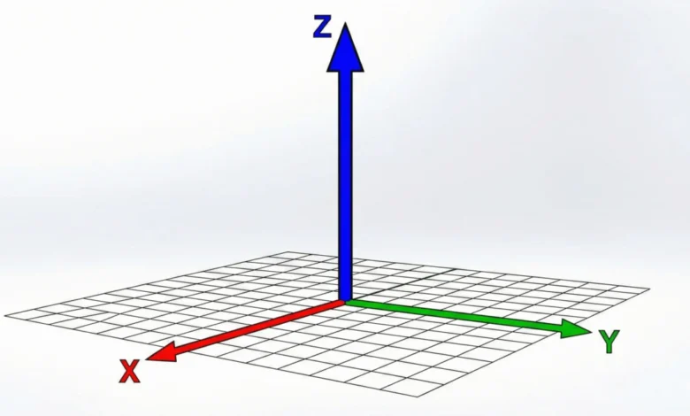
The CSS translateZ() function is a powerful tool for web developers looking to imbue their designs with a sense of depth and spatial dimension. By manipulating an element’s position along the Z-axis in a three-dimensional (3D) space, translateZ() allows for visual effects that can draw users closer or push them further away from the screen, fundamentally altering the perceived layout and interaction of web content. This capability, however, is not inherently visible without a crucial prerequisite: the establishment of a perspective.
At its core, translateZ() shifts an element along the Z-axis. In a 2D browser environment, this axis is typically invisible. However, when combined with either the perspective() function or the perspective CSS property, this Z-axis movement becomes visually apparent. Without one of these perspective-enabling mechanisms, translateZ() will have no discernible effect, as the browser lacks the framework to interpret and render depth.
A practical demonstration of translateZ() in action often involves an interactive element, such as a box on a webpage. When a user hovers over this box, and if the necessary perspective is in place, the box will appear to move closer. This visual cue can be striking, making the element seem larger. It is vital to understand that this perceived enlargement is not a result of the scale() function or property, which directly alters an element’s dimensions. Instead, it’s an illusion created by the element moving closer to the viewer’s vantage point in 3D space, a concept distinct from scaling.
The translateZ() function is formally defined within the CSS Transform Module Level 2 specification, outlining its syntax and behavior for developers.
Syntax and Arguments
The syntax for translateZ() is straightforward: translateZ(<length>). It accepts a single argument, which must be a <length> value. This length determines the distance the element is shifted along the Z-axis.
- Positive Lengths: A positive value, such as
translateZ(100px)ortranslateZ(5rem), moves the element closer to the viewer. This is what typically creates the illusion of the element growing larger. - Negative Lengths: Conversely, a negative value, such as
translateZ(-50px)ortranslateZ(-8em), pushes the element further away from the viewer. This can make an element appear smaller or recede into the background.
The application of translateZ() is always done in conjunction with the transform property in CSS. For instance:
.box
  transform: translateZ(100px);
The Crucial Role of Perspective
The challenge with translateZ() lies in its reliance on a 3D rendering context. Browsers, by default, render web pages on a flat, 2D canvas. Elements are positioned based on their height and width, with no inherent notion of depth. The Z-axis, representing depth, is not visually rendered unless explicitly enabled.
To make translateZ() effective, a perspective must be established. This can be achieved in two primary ways:
- The
perspectiveProperty: This property is applied to a parent element, establishing a vanishing point for all its 3D-transformed children. It defines the strength of the perspective effect. A smaller value creates a more dramatic, intense perspective, while a larger value results in a subtler effect. - The
perspective()Function: This function is applied directly within thetransformproperty of an element. It defines the perspective for that specific element. Crucially, when used within atransformdeclaration, theperspective()function must precede other 3D transform functions liketranslateZ().
Furthermore, for child elements to be rendered in a 3D context influenced by their parent’s perspective, the transform-style property of the parent element must be set to preserve-3d. This tells the browser to maintain the 3D transformations of its children, rather than flattening them into the parent’s 2D plane.
Consider the following HTML structure:
<div class="scene">
  <div class="parent">
    <div class="box">translateZ(100px)</div>
  </div>
</div>
To enable translateZ() to work on the .box, the CSS would be structured as follows:
.scene
  perspective: 800px; /* Establishes the overall perspective for the scene */


.parent
  transform-style: preserve-3d; /* Ensures children are rendered in 3D */


.box
  transform: translateZ(100px); /* Moves the box 100px closer to the viewer */
In this setup, when the user hovers over .box (assuming a hover effect is applied to trigger translateZ()), the box will appear to move closer, creating a sense of depth. If the .parent element were then rotated, it would become evident that the .box itself hasn’t increased in size but has simply shifted its position in 3D space relative to the .parent.
Perspective vs. Perspective()
While both the perspective property and the perspective() function serve to define an element’s projection, they differ in their application and scope.
The perspective Property
The perspective property is applied to a container element. It dictates the strength of the perspective for all 3D-transformed children within that container. This approach is often used to set a consistent depth perception across a group of elements.
.container
  perspective: 600px; /* Defines the perspective for all children */


.child-element-1
  transform: translateZ(150px); /* Affected by the 600px perspective */


.child-element-2
  transform: translate3D(50px, 100px, -75px); /* Also affected by the 600px perspective */
The perspective() Function
The perspective() function, on the other hand, is applied directly within the transform property of a specific element. It allows for more granular control over perspective for individual elements. A critical detail is its placement: it must appear before other 3D transform functions in the transform declaration to be effective.
.element
  /* Incorrect placement: perspective() should come first */
  transform: translateZ(100px) perspective(500px);


.element
  /* Correct placement: perspective() precedes translateZ() */
  transform: perspective(500px) translateZ(100px);
This distinction is important for developers to grasp when implementing complex 3D effects, ensuring that their desired perspective is correctly applied.
Optimizing Web Performance with translateZ(0)
Beyond its visual applications, translateZ() offers a significant advantage in web performance optimization, particularly through the strategic use of translateZ(0). Modern web browsers leverage the Graphics Processing Unit (GPU) for rendering complex visual elements, which is considerably faster and more efficient than the Central Processing Unit (CPU) for tasks involving visual transformations and animations.

By applying translateZ(0) to an element, developers can signal to the browser that this element should be rendered on the GPU. This is often referred to as "offloading" the rendering to the GPU. This technique can prevent common animation glitches, such as flickering or stuttering, and result in smoother, more fluid transitions and animations.
This performance hack is particularly beneficial for elements undergoing frequent visual changes or animations. If a developer encounters an animation that appears glitchy or unacceptably slow, adding translateZ(0) to the animated element is a common and effective troubleshooting step. It essentially forces the browser to treat the element as a 3D object, triggering hardware acceleration.
For example, consider an element that fades in and out:
.animated-element
  opacity: 0;
  transition: opacity 0.5s ease-in-out;
  /* Other styling */


.animated-element.visible
  opacity: 1;
If this animation experiences performance issues, adding translateZ(0) could resolve it:
.animated-element
  opacity: 0;
  transition: opacity 0.5s ease-in-out;
  transform: translateZ(0); /* Triggers GPU acceleration */
  /* Other styling */


.animated-element.visible
  opacity: 1;
This simple addition can make a substantial difference in the perceived smoothness and responsiveness of web interfaces, especially on less powerful devices or in complex rendering scenarios.
Underlying Mechanisms and Broader Impact
The ability of translateZ() to manipulate depth and contribute to performance optimization highlights the evolving capabilities of CSS in creating rich, interactive, and performant web experiences. The integration of 3D transforms into web design opens up new avenues for visual storytelling, user engagement, and sophisticated interface design.
The impact of these techniques extends beyond mere aesthetics. In an era where user experience is paramount, features that enhance engagement and reduce frustration are invaluable. The ability to create immersive visual environments through translateZ() and related 3D transforms can lead to higher user retention rates and more positive brand perceptions. Moreover, the performance benefits ensure that these visually appealing designs remain accessible and performant across a wide range of devices and network conditions.
As web browsers continue to evolve and hardware acceleration becomes more sophisticated, the utilization of CSS 3D transforms, including translateZ(), is likely to become even more prevalent. Developers are increasingly empowered to create experiences that were once the exclusive domain of desktop applications or specialized software, all within the familiar environment of a web browser. The ongoing development of CSS specifications, such as the CSS Transform Module Level 2, ensures that these capabilities will continue to expand, offering even more creative and functional possibilities for the future of web design.
Browser Support and Future Outlook
The translateZ() function enjoys broad support across all modern web browsers, making it a reliable tool for developers. Its integration into the CSS Transform Module Level 2 signifies its standardization and widespread adoption. As web technologies advance, we can anticipate further refinements and extensions to 3D transform capabilities, enabling even more sophisticated and performant visual effects on the web.

